

Colors determine whether a layout looks cohesive or arbitrary. Anyone who knows where colors are managed in InDesign, how swatches can be saved, and which color space suits which output medium will work with much more confidence. This guide takes you through the most important tools for working with colors, from the first fill color to color harmony with Adobe Color. It is based on the video tutorial from the "Learn InDesign" series.
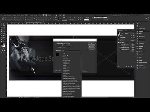
The video is only loaded from YouTube when you play it – data (including your IP address) is then transmitted to YouTube/Google. More in the privacy policy
Key Takeaways
- You can find colors in InDesign in several places: in the Tools panel, in the Control panel, and in the "Swatches" panel.
- CMYK is the print color space, RGB the screen color space. Decide what you are publishing for before you start designing.
- Saved swatches ensure recognizability. Work with a few basic colors that run through the entire design.
- With the eyedropper and a function for image colors, you can pick up colors directly from photos.
- With ASE files, you can exchange color palettes between documents and with clients.
- Adobe Color provides you with color harmonies such as complementary or triadic colors as well as entire thematic palettes.
Step-by-Step Guide
Getting to Know the Places for Colors
Before you assign a color, you should know where InDesign manages it. Every object can have a fill color and additionally a stroke color. You can find both in the Tools panel, where you switch between them with a click. Clicking the field opens a small selection with a few standard colors. The same function is also in the Control panel at the top.

Control Panel or Swatches Panel?
The Control panel is suitable for quick changes. Its drawback: it disappears as soon as you continue working with the Selection tool (V), which quickly becomes annoying. The "Swatches" panel on the right, on the other hand, stays open, can be resized, and shows all saved colors. It is therefore my preferred option. Draw a rectangle, select it, and click a color in the panel.
Defining Colors in the Color Picker
Double-clicking the fill color opens the Color Picker. There you can enter values in RGB mode, CMYK mode, or Lab mode, but you can also use a hex code. The hex code acts like a unique identifier for a color that can be recognized at any time. If you hold down the eyedropper in the Color Picker and move it over an image, the values change live under the cursor. This way you can pick up colors directly from the image.

Only Confirmed or Really Saved?
If you confirm a color chosen in the Color Picker, it is applied to the object, but it does not appear in the "Swatches" panel. Such a color is not saved and cannot easily be reused later. Since colors are constantly repeated in professional layouts, you will usually save them. This is the only way to create the continuity that produces a calm and recognizable overall look.

Creating a New Swatch
Open the menu of the "Swatches" panel, which is marked by the three small lines, and choose "New Swatch". In the dialog, you assign a name. You can name it freely, such as "Pink", or have the name generated from the color value. Below that, you specify whether it is a process color or a spot color. For normal printing, you stick with process colors. You use spot colors deliberately, for example for die-cut contours or other special markings. Then confirm with OK.

Understanding the CMYK Color Mode
In the same dialog, you choose the color mode. CMYK stands for Cyan, Magenta, Yellow, and Key, where Key refers to black. This print color space works with subtractive color mixing: every additional layer of color takes brightness away from the result. Imagine you paint yellow, green, red, and black on top of each other on a sheet of paper; eventually the result becomes very dark. If you are designing for print, CMYK is the right choice.
Classifying the RGB Screen Color Space
RGB stands for Red, Green, and Blue and is optimized for displays. Additive color mixing applies here, in which light components add together. If you set red, green, and blue each to the maximum value of 255, white results. In the CMYK space, it works the other way around: all four values at 100 percent produce a rich black. The difference is fundamental, so you should always match the color space to your output medium.
Deleting and replacing colors
If you select a color in the panel and click the trash can icon at the bottom, it will be removed. If it is already used in the layout, InDesign asks for a replacement color. This way you can, for example, replace a mustard yellow tone with another color without having to adjust each object individually. If you remove all the remaining colors, only the desired color value remains in the document.

Picking up a color from a photo
For a coherent overall look, it is worth picking up colors from the photo. Select your rectangle, activate the Eyedropper in the toolbox (keyboard shortcut I) and click in the image. The area immediately takes on the sampled tone. The Eyedropper is a handy tool, but not always the best choice, because photos usually contain several colors.

Picking up the main colors of an image
A newer feature detects the five dominant colors of an image and provides them as a group. Apply the tool to the image and add the desired tones to the "Swatches" panel with one click. If a tone isn't quite right, use the Eyedropper again until it fits, and then save it as a new swatch in the CMYK space. You can repeat this fine-tuning as often as you like.

Organizing and grouping swatches
Over time, many colors accumulate. To deal with this, create folders or groups and name them sensibly, for example after the project. You can delete empty groups again, and existing colors can be re-sorted at any time. Keep the palette lean, then it stays clear and you find colors faster.

Importing colors from other documents
If you need colors from another document, copy an element with that color to the clipboard (Ctrl + C on Windows, Command + C on macOS) and paste it into the target document with Ctrl + V or Command + V. The associated swatch is automatically copied along with it. If the element is also linked to other swatches, these also come into the document. A mistake can be undone with Ctrl + Z or Command + Z.

Exporting color palettes as an ASE file
If you want to share a complete palette, select the desired colors in the panel, open the context menu and choose "Save Swatches". The format used is ASE, that is, Adobe Swatch Exchange. Afterwards you can close the document, because the file contains only the colors.

Loading an ASE file
In a new or existing document, you load the palette via "Load Swatches". The colors are then imported. This approach is particularly suitable for clients with fixed corporate colors. You create a company's basic colors once as an ASE file, and every employee works with the same, predefined palette.
Applying color to strokes
Strokes work exactly like fill colors. Select the object, set a stroke color in the Control panel and adjust the stroke weight if necessary. With the arrow icon, you swap fill and stroke. Opacity and tints can also be adjusted if you want to experiment further.

Finding color harmonies with Adobe Color
You can find Adobe Color in the sidebar or via the menu under "Color". There you drag the color wheel to the desired position and have suitable compositions suggested to you. Choose, for example, a color rule such as "Complementary". For yellow, this results in blue. Other rules deliver triads of three colors or shades of a single color. You can add any combination to your swatches with one click.

Discovering themes
In the "Themes" tab, you enter a term, such as "Winter". Adobe Color then suggests matching color compositions that you can use directly in your designs. Especially if you are not yet very familiar with color, this gives you a helpful guide to how colors work together.
Summary ??? Colors in InDesign: Using Swatches, Color Modes, and Adobe Color Properly
Colors in InDesign are far more than a click on a field. You work most efficiently when you use saved swatches, choose the right color space for your output medium, and pick up colors specifically from images or documents. With ASE files, you keep house colors consistent, and Adobe Color provides you with inspiration for harmonious compositions. Try out the tools on a project of your own, and the workflows will quickly become second nature.
FAQ
What is the difference between CMYK and RGB?CMYK is the print color space and works with subtractive color mixing. RGB is intended for screens and works with additive color mixing.
Why should I save colors as swatches?Saved colors can be reused at any time and ensure a consistent appearance throughout the entire document.
How do I pick up a color from a photo?Select the object, activate the Eyedropper with the keyboard shortcut I, and click in the image. For multiple colors, use the function for picking up the main colors of an image.
What is an ASE file?ASE stands for Adobe Swatch Exchange. It is an exchange format with which you can save color palettes and load them again in other documents.
How do I replace a color throughout the entire document?Delete the color in the "Swatches" panel. If it is already in use, InDesign asks for a replacement color, which is then applied to all affected objects.
What does Adobe Color offer me?Adobe Color helps you find matching color harmonies, such as complementary or triadic colors, and provides themed collections as inspiration. The colors can be added directly to your swatches.

