

A strong poster doesn't need an overloaded look, but clear rules. In this tutorial, you design a DIN A2 poster for a fictional photo exhibition in Stuttgart. You learn how a design grid organizes your elements, how to create cohesion with a single spot color, and how image effects connect photos and background. At the end, you check the resolution and ink coverage and prepare the file for the print shop.
The video is only loaded from YouTube when you play it – data (including your IP address) is then transmitted to YouTube/Google. More in the privacy policy
Key Takeaways
- A clean grid with margins, columns, and rows ensures order and recognizability.
- A rich black made from CMYK values looks more saturated in print than pure 100% black.
- A few font styles are enough: Bold for what is important, Light for everything secondary.
- A spot color that repeats across typography, images, and lines creates continuity.
- The Luminosity effect blends photos with the background color and integrates them into the layout.
- Before exporting, you check the image resolution (PPI) and total ink coverage (300%).
Step-by-Step Guide
Create a Document with Bleed
Press Ctrl+N to open a new document. Deactivate the Facing Pages option, since you are designing a single-page poster. Set the page size to 420 × 594 mm, set all margins to 10 mm, and activate the chain icon so the values are applied to all sides. In the info area, enter 3 mm for the bleed. The red line at the edge later shows you where the cut will be made, so that no white slivers appear.

Create a Design Grid
Press the W key to switch between Layout mode and Preview mode. Then, under Layout, Create Guides, set up a grid with 12 rows and a 10 mm gutter, as well as 8 columns. Choose Margins as the reference so that the guides are aligned to the 10 mm margins. This way, you automatically keep important elements away from the edge and keep an eye on symmetry.

Lock Guides
Once the grid is set, you should fix it in place before doing any further work. Go to View, Grids & Guides and choose Lock Guides. This way, the lines won't shift by accident when you carelessly move the mouse across the document.

Define Rich Black as the Background
Draw a rectangle across the entire page and fill it with black. You will notice that 100% K looks more like anthracite on the screen. Therefore, create a new swatch in the Swatches panel and enter the CMYK values 50, 0, and 100, supplemented by 100% black. The result is a deep black with a slight violet shimmer, which you can pick up again later in the photo effect.

Lock the Background
Select the rectangle and press Ctrl+L to lock it. On a solid-color area, this is especially practical, since you no longer accidentally move anything when placing text and images.

Set the Headline in Handel Gothic
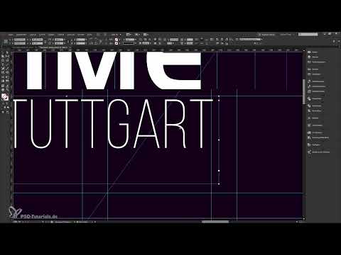
With the Type tool, place a text frame at the top of the page and type "FaceTime". Change the text color to white and select Handel Gothic Bold. The font comes from Adobe Fonts and can be activated via the Creative Cloud. Activate All Caps, set the size to about 170 pt, and adjust the tracking so that the line extends to the left and right grid lines.

Structure the Subtitle with Bebas Neue
Create a second text frame for "Fotoausstellung in Stuttgart" and set it in Bebas Neue. The font is slim and looks modern. The principle is simple: you set "Fotoausstellung" in Bold, since it is the relevant information. You format "in Stuttgart" in Light. The size is about 78 pt, and you can adjust the tracking to the width of the grid.

Create a spot color
Create a new swatch with the CMYK values C 67, M 81, Y 29 and K 3. The result is a purple blackberry tone. Use it to color the word "Time" in your headline. This gives you the first accent, which will later run through the entire poster.

Use cube shapes as a design element
Above the headline, place small square shapes with an edge length of about 22.5 mm. Hold down the Shift key while scaling so that the proportions are preserved. With Alt and Shift, copy the shape and move it to the right along the grid. Three shapes in the same color are enough for a first rhythm.

Create a color matrix with Adobe Color
Enter the color value in the Adobe Color tool and select shades. Add the resulting palette to the swatches. Color the left square with a very light tone, the middle one with the original tone, and the right one with a dark violet. This creates a graduated color progression that looks calm and yet shows dynamism.

Place and crop the first image
Draw a rectangular frame in the appropriate grid field and place the photo via File, Place. With the Content tool, move the image within the frame until the desired crop is right. Make sure to hide distracting elements such as a dog's nose and not to cut off the person's ear. In the end, the crop should look calm and deliberately chosen.

Arrange more images in the grid
Place the other photos in rectangular frames that are each three cells wide and extend to the bottom bleed. Make sure the heads don't sit too low and the shoulders remain visible. For the second image, you crop at the top around the eyebrows. In the third photo with the tattooed person, however, the head remains completely intact.

Apply the Luminosity effect to the photos
Select all three images and choose the Luminosity effect in the Effects panel. This converts the photos to black and white and blends them with the color of the background. Only with the violet deep black does the desired look emerge. A pure black, on the other hand, would make the images look flat and cold.

Repeat the spot color as lines
With the Line tool, draw a long line in the 10 mm gutter between two grid cells. Fill it with the spot color, move it to the left, and reduce the opacity to 80%. Then adjust width and height to the images. The color should only set accents, not dominate. If you limit yourself to a few places, the design stays calm and high-quality.

Increase display quality
If edges look pixelated, this is usually due to the reduced display quality. Click on the pasteboard and set the display to high quality. The display immediately becomes sharp without anything changing in the actual file.

Add white elements for continuity
Draw white rectangles without a stroke and place them in spots that are already structured by the grid and color. Copy the element and distribute it at suitable positions in the lower and upper areas. Such recurring elements convey to the viewer that the poster was created as a cohesive whole.

Add the date in the grid
Set the date in Bebas Neue Bold. Increase the font size significantly so that the day stands out as the central piece of information. Format the month more slimly, by contrast. Use the deep black for the text again and then check whether the day sits in the grid and in the optical center.

Info line with web address and location
At the bottom, on the 10 mm line, add the web address, the note "free" and the location "Stadttheater Stuttgart". Copy the text frame and move it up each time using Shift and the arrow key. This creates a staircase effect in which Bold and Light alternate. Adjust the tracking of each line until the widths match.

Fine-tuning the image crop
If you want to scale the image, hold Shift and drag a corner handle. This keeps the image content proportionally linked to the frame size. This way you can, for example, make a person's ear disappear behind the purple bar and have the shoulder extend to the bleed.

Checking the image resolution
Open the Links panel and check the effective resolution of the scaled images. In the video it is 291 PPI. Ask your print shop which value it requires. For posters in DIN A2 format, 200 PPI is often cited, but some print shops require more, for example 417 PPI.

Checking ink coverage via the Separations Preview
Open the Separations Preview via Window, Output. Enter the limit your print shop requires, for example 300%. All areas above it are marked in red. In the video, small overshoots are acceptable, so if in doubt you adjust the value slightly and then close the window again.

Making a typographic correction
When comparing with the template, you notice that the headline should contain an exclamation mark instead of the "i". Correct the character in the headline accordingly and check whether the tracking still fits the line after the change.

Creating a raster effect with strokes
Draw a white line with the Line tool and choose "wide" as the stroke type. This creates a fine structure that is laid over images and typography. If needed, move the line while holding the spacebar. This way you avoid unwanted offsets.
Multiplying strokes via Transform
Under Object, open Transform and choose Move. Enter, for example, 8 mm and click Copy. With Ctrl+Alt+4 you repeat the transformation as often as needed until the desired number of lines has been created. On Windows systems, you should not use the key combination Alt+F4, as it closes the program.
Organizing layers and setting the blending mode
Put all strokes on their own layer and lock it if necessary. Reduce the layer's opacity to 80%. In the Effects panel, choose the blending mode "Overlay". The lines now blend with the background and disappear in dark areas without dominating the design.

Working around export issues with large vector files
If the PDF export gets stuck because of many vectors, you can transfer the layer to Photoshop. Create a file there in the size of the poster, drag the lines into it and export them as a PNG. Then place the PNG file back onto the InDesign document. This relieves the prepress process and lets you export the poster reliably.

Summary – Designing a poster: step-by-step guide for DIN A2 in InDesign
You have seen that a convincing poster relies on a few clearly defined rules: a clean grid, a deep black as the base, a spot color and reduced typography. The image design with the luminosity effect and the consistent use of the accent color ensure continuity. Before printing, you check resolution and ink coverage, and then nothing stands in the way of a clean result.
FAQ
Why do I need a 3 mm bleed?The bleed ensures that no white edges appear when cutting. Background areas should extend beyond the trim edge.
Why is 100% black often not rich enough in print?Pure K100 often looks anthracite on screen and does not achieve real depth in print. A deep black made from several CMYK channels, on the other hand, looks richer.
What is the design grid for?The grid structures all elements and ensures symmetry. At the same time, it keeps important content 10 mm away from the edge.
Why should I lock guides?Locked guides do not shift when you move objects or click on them unintentionally. This saves time and nerves.
What resolution do I need for images in the poster?That depends on your print shop. 200 PPI is often cited, but some print shops require more, such as 300 to 417 PPI.
What does an ink coverage of 300% mean?The total ink coverage indicates how much ink in total is printed on an area. Values above your print shop's limit can lead to problems, such as slow-drying ink.
How do I achieve a calm, uniform image effect?The luminosity effect converts photos to black and white and blends them with the background color. This makes the images look color-integrated.
Why do I use only one spot color?A single accent color that repeats in typography, lines and images looks harmonious and creates recognizability.

