Tocreate impressive movie postersand generate cinematic effects, it is essential to skillfully apply the editing techniques of light and color. In this guide, you will learn how to selectively color and adjust the strip lighting in your project to create a dark and captivating atmosphere.
Main insights:
- The use of gradient applications allows for precise control over light intensity and color.
- Contrast and color depth are crucial for creating the desired mood in your composition.
- With targeted brush strokes, you can enhance the effects and vary the character of your light sources.
Step-by-Step Guide to Adjusting Strip Lighting
First, we start by inserting the strip lights. These have already been photographed but need to be adjusted to achieve the desired effect. Begin on the right side of the image, where pure white will be added as strip lighting.
Selecting the right contrast is essential. In this step, the protagonist's face becomes less saturated, which draws more attention to the light sources. We will create an adjustment layer with a gradient application for this purpose.
The gradient application works with black and white by default. Here, we primarily focus on the white color as we want to intensify the light. Move the white slider to the left to increase the light component and enhance the brightness of the strip lights.

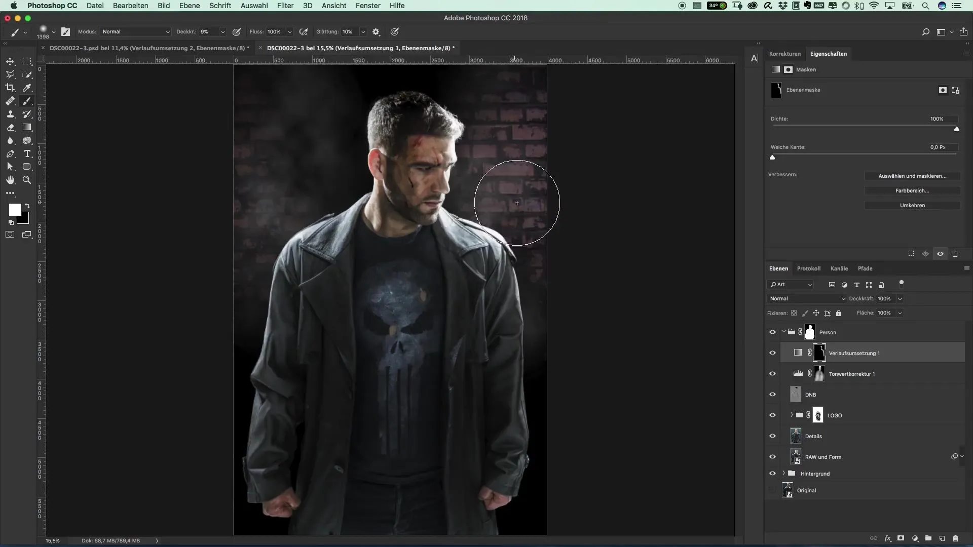
Once the adjustments to the lights have been made, confirm your settings. Now you need to invert the mask. This means that we will paint with a brush in the areas where we want to increase the contrast. Focus on editing the areas along the contours.
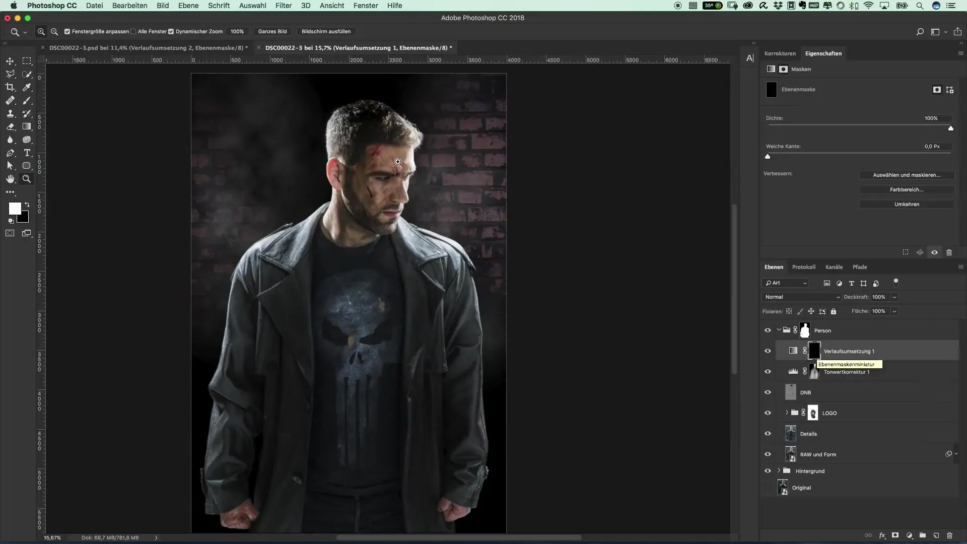
Regularly check the result and adjust the opacity to achieve the best effect. Reducing it to about 10% ensures that the strip lights do not appear too dominant. If this is the case, further adjustments in the hidden hand areas need to be made to preserve the natural shape.
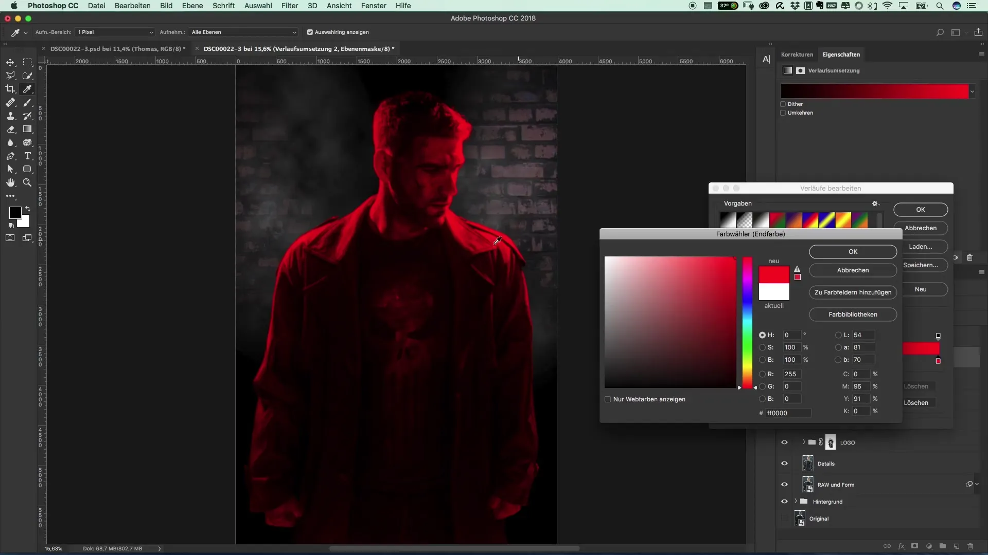
Now we come to the most exciting part: coloring the lights. Create a new gradient application as before and select bright red to highlight the strip lights with a dramatic color change. Here you can see how the dark areas remain black while the whites change to red.

With the intensity control, you can determine how strong the red hue appears on the lights. Slide the corresponding slider to the left to optimize the effect. If you decide to use a different color like blue or green, the procedure remains the same.
After adjusting the desired red intensity, repeat the procedure with a brush to gently integrate the color. Start with a low opacity of about 20% to gradually color the strip lights.
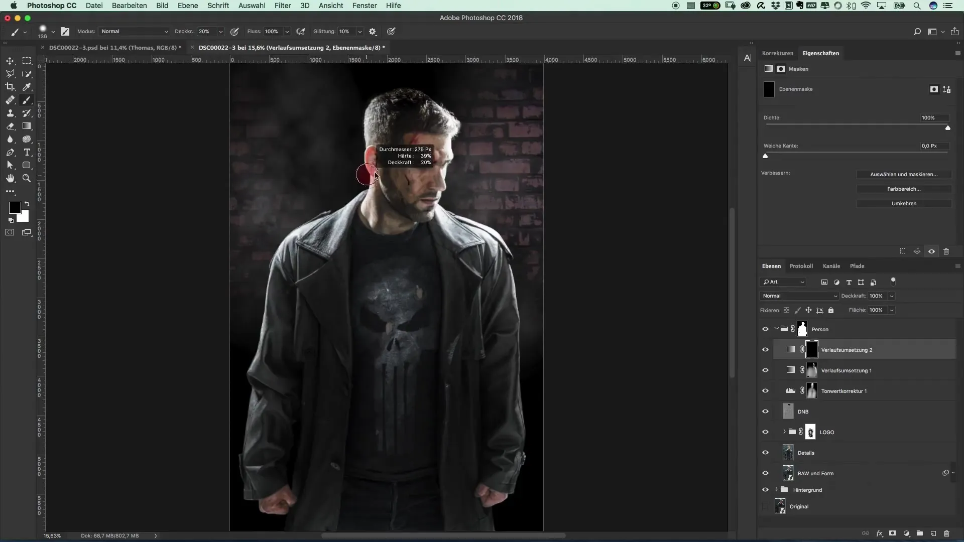
Be sure to clearly highlight the contours. You should also cover the area extensively with reduced opacity of about 10% to achieve a homogeneous color distribution. If necessary, go back and darken areas that appear too bright or unremarkable.
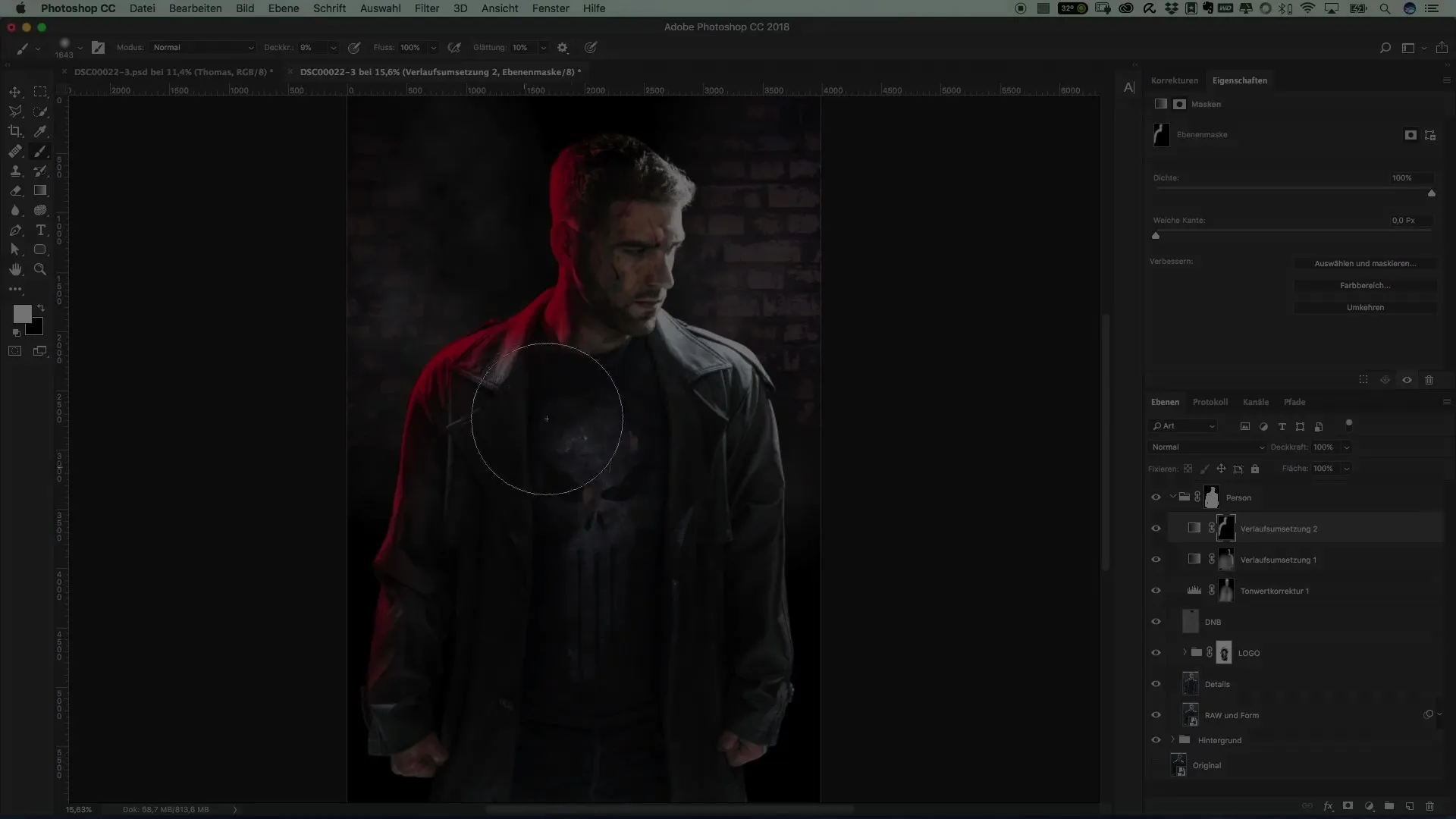
Finally, you should critically review all areas of the graphic once more. Optimize the light mood to match the somber styleof ThePunisher. Once everything is well placed, you will have an impressive result.
Summary – Guide to Color Design of Light Shades in the Style of The Punisher
The aim of this guide was to show you how to color strip lighting in your project with various gradient applications and brushes while controlling the accuracy of contrasts. This results in not only a visually appealing composition but also an immersive effect for your night scenes.
FAQ
How do I add strip lights to my image?Start by photographing the lights and then create an adjustment layer with a gradient application.
How can I adjust the brightness of my lights?Use the gradient application to move the white slider to the left, which increases the brightness.
Can I experiment with different colors?Yes, color adjustment is flexible. You can change the color as you wish by simply selecting a different color in the gradient application.
How long does the entire editing process take?The duration varies depending on the complexity of your design and can range from a few minutes to several hours.
Is it necessary to adjust the opacity?Yes, opacity helps control the intensity of colors and effects, allowing you to achieve a harmonious overall picture.


