
A good nude photo often comes into being in the studio, but the final polish decides whether a clean shot becomes an image that stays in the memory. This is exactly where this guide comes in. You will learn how to edit selected images from a studio series in Lightroom's Develop module without distorting the character of the shot. A shoot with an old factory wall, an industrial floor and a modern designer chair serves as the example. You will find out which sliders you should move, why each image needs its own fine-tuning and how to transfer settings to an entire series.
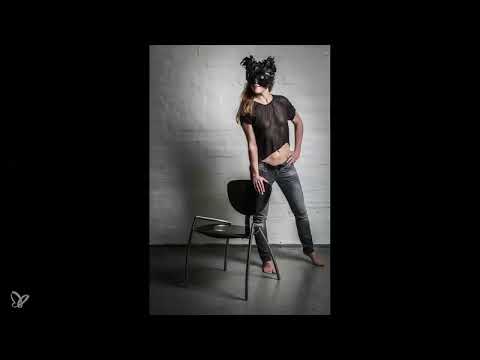
The video is only loaded from YouTube when you play it – data (including your IP address) is then transmitted to YouTube/Google. More in the privacy policy
Key Takeaways
- Edit as little as possible, because you already have light, exposure and framing well under control in the studio.
- Clarity emphasizes shadows and structures, but should be used in moderation on skin. A value around 80 is a good starting point.
- Raised shadows (about 10 to 15) bring back detail in dark areas of the image, especially when you are working with clarity.
- You should generally enable chromatic aberration and profile corrections, as well as the camera standard as the color profile.
- Highlights and whites determine the character of walls and backgrounds, while the vibrance slider reduces color intensity.
- Copy and paste saves a lot of time, but if the lighting situation has changed, you need to readjust the values.
Step-by-Step Guide
Step 1: Open the Develop module and start cautiously
Open the selected image in the Develop module. The basic rule is: as little as possible. A studio series already has its strengths at the time of shooting, because you control the light and exposure. Subsequent adjustments such as sharpness, framing, brightness, contrast or skin tone are legitimate tools, but should be used selectively and sparingly.

Step 2: Reduce the highlights to regain detail
Start with the highlights. First pull them down a little to see how much detail is still present in the bright areas. If the light comes from one side, the wall quickly loses its structure. Since the factory character should be preserved, in the example you can pull the highlights down almost completely. This brings out the brick character clearly.

Step 3: Use clarity in moderation
The clarity slider is among the most effective tools for this type of image. It intensifies shadows, contrasts and structures, such as the shadow cast on the wall. First pull the slider to the right until you clearly see the effect, and then reduce it again. Pay particular attention to the upper body, because with too much clarity the skin quickly looks almost transparent. In the example, a value around 80 proved to be a pleasant range.

Step 4: Raise the shadows
When you work with clarity, you should raise the shadows at the same time. Clarity can additionally darken dark areas, and with slightly raised shadows you regain detail there. A value between 10 and 15 is a good guide. This way the atmosphere of the image is preserved without the black looking too flat.

Step 5: Correct lens errors and choose the camera standard
Generally enable the options for chromatic aberration and profile corrections. Every lens brings small imaging errors, which Lightroom can reliably correct for RAW files. Also tick both checkboxes so that the camera data is applied. For the color profile, choose the camera standard instead of Adobe's default profile. This way the image adopts the color settings that you defined on the camera.

Step 6: Guide the eye with highlight priority
A trick that many photographers like to take advantage of is highlight priority. Pull the highlights down slightly at the edge of the image. This moves the subject into the center, and the wall no longer looks so flat. The effect of the image changes noticeably without you having to intervene heavily.

Step 7: Read the image in full screen
Switch to full-screen mode and view the image as if you were reading a book: from top left to bottom right. Pay attention to whether anything else catches your eye, such as distracting differences in brightness or image elements at the edge. Also check the skin tone, as changes to light and clarity strongly affect it. In the first example image, the skin tone was consistent, so no further correction was necessary here.

Step 8: Subtly increase the sharpness
As the last step of the basic editing, you increase the sharpness. In the example, the slider ended up at around 50, which is a good middle value. It's better to adjust subtly and check in full-screen view whether the edges look natural. Excessive sharpness quickly makes skin and surfaces look artificial.

Step 9: Check the progression of the corrections
Then go through all the editing steps from beginning to end. Often an image initially looks a bit flat or low in contrast after editing. With a few targeted adjustments, this can easily be corrected. The history helps you assess the overall effect and recognize the common thread of your editing.

Step 10: Copy the settings and apply them to other images
Using "Copy Edit" and "Paste," you transfer all settings to another image in the series. This very advantage makes RAW converters so practical: you save a lot of time. With similar lighting, this works reliably, but if conditions have changed, you will need to readjust.

Step 11: Correct the skin tone when the lighting has changed
If the light has changed between shots, the copied values no longer fit. In the example, the softbox had moved from the upper right to a different position. As a result, the skin looked unhealthy in the shadows. In this case, significantly reduce the clarity and lower the shadows again a bit, but only so far that the detail in the background is preserved. Power outlets and other small details can safely remain in the image if they contribute to the contrast between old and new.

Step 12: Reduce the color using the Vibrance slider
If the image looks too colorful, reduce the Vibrance slider. The color intensity then noticeably decreases, and the image approaches a black-and-white look. However, the goal is not complete desaturation, but a slight hint of color. It is best to make this decision in full-screen view so you can judge the effect at full size.

Step 13: Raise the whites and highlights again
If you previously lowered the whites and highlights for the shot, you often have to raise them a bit again after a change in the lighting situation. Make sure that the highlight priority also suits the subject again. In this way, the image becomes brighter again without losing its character.

Step 14: Apply a graduated filter for the dark corner
A slight vignette gives many images a personal style. However, an image corner can become too dark as a result, in the example the lower left corner. Apply a graduated filter at exactly this spot and carefully brighten the area. Afterwards, check the image crop once more to make sure the overall composition is coherent.

Step 15: Check the final selection and export
Copy the final settings to the remaining shots in the series and look at each image once more in full-screen view. Finally, you export the selected files for different purposes: once for print, once for the internet, and once for photo prints. Each variant thus gets the resolution and size that make sense for its use.

Summary ??? Fine-tuning in Develop Mode: Carefully Editing Nude Photos in Lightroom
Fine-tuning in Develop mode thrives on restraint and targeted adjustments. You begin with the highlights to preserve detail, and then work with clarity and shadows so that structure and atmosphere are retained. Lens corrections, the camera standard, and subtle sharpening form the technical foundation. With highlight priority, you draw the eye to the subject, and with vibrance and graduated filters you adjust color and brightness. If you copy the settings to other images, always check the skin tone and the lighting situation, because this is precisely where it is decided whether the series looks coherent.
FAQ
How much editing makes sense for studio shots?As little as possible. Exposure, light, and framing should already be right at the time of shooting; post-processing serves for fine-tuning.
Why should I choose the camera standard instead of the Adobe standard?The camera standard adopts the color settings of your camera, so the image matches what you set in the studio.
Why do I need to raise the shadows when I increase clarity?Clarity strengthens contrasts and can additionally darken dark areas. Raised shadows bring detail back there.
Can I transfer settings to other images?Yes, via Edit copy and Paste. If the light or framing differs, you should readjust the values afterward.
How can I tell whether the skin has been edited too heavily?View the image in full screen and pay particular attention to the shadow areas. If the skin looks blotchy, transparent, or unhealthy, reduce the clarity or correct the shadows.


