A decisive influence on the user experience is the choice of fonts in your app. Fonts are not just purely aesthetic elements; they significantly contribute to the readability and comprehensibility of the text. In this tutorial, you will dive deep into the world of typography and learn the basics and best practices for using fonts in app design.
Key Insights
The most important aspects for successful font design in apps are:
- Focus on the body text.
- Keep the font size between 15 and 25 pixels.
- Use appropriate line spacing, ideally between 120% and 145% of the font size.
- Limit the line length to 45 to 90 characters.
- Avoid system fonts to create a unique feeling.
Step-by-Step Guide
1. Understand the Basics of Typography
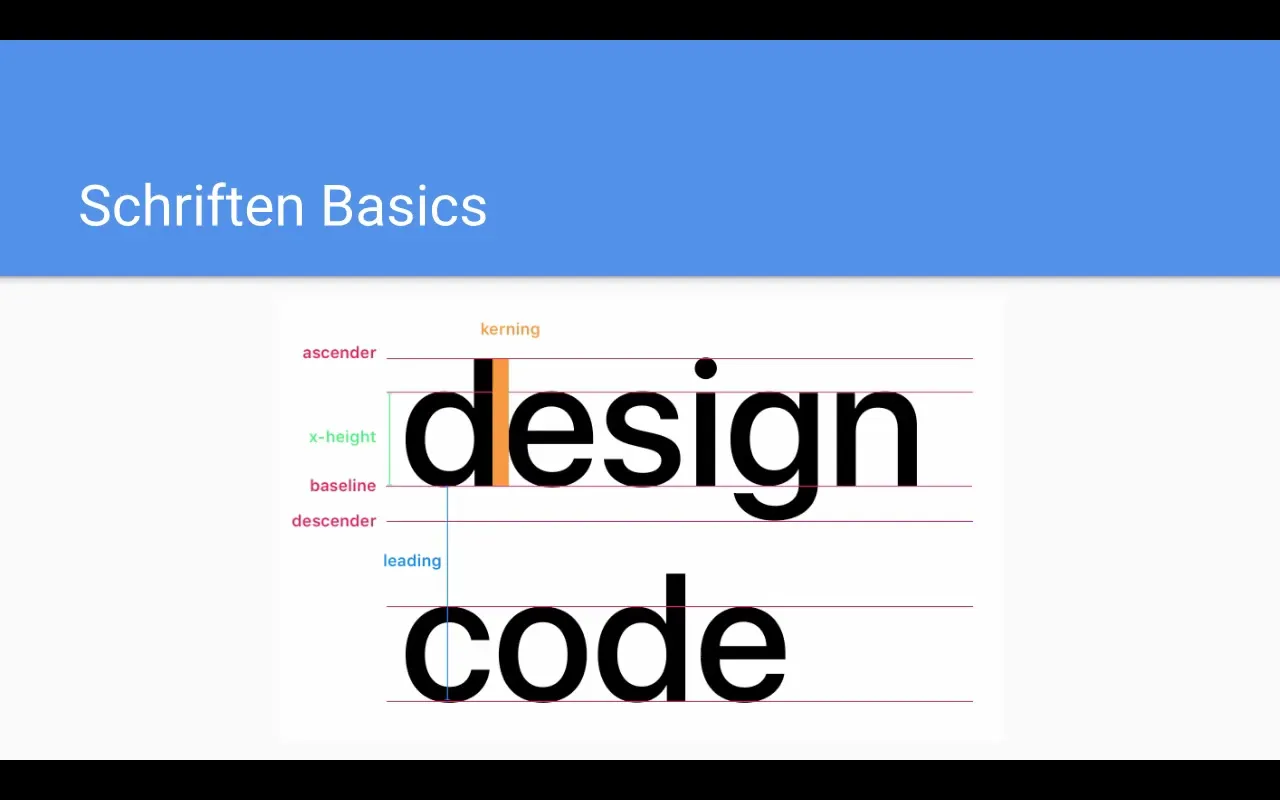
At the outset, it is important to learn basic terms related to fonts. The baseline is the line on which the letters sit. The x-height describes the height of lowercase letters and is the most important reference point for font size. Additionally, there is the ascender and the descender, which determine the maximum heights and depths of the letters.

Kerning is the space between the letters, while leading describes the height of the text lines.
2. Five Rules for Good Typography
To optimize readability in your app, you should observe five fundamental rules. The first rule states that the focus should be on the body text. This text accounts for about 70 to 80% of the content of your app, which is why good readability here is particularly important.
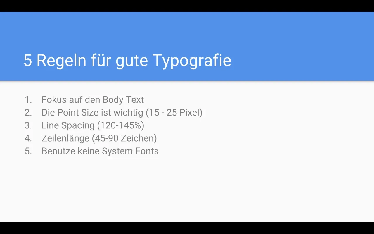
The second rule pertains to point size. This should be between 15 and 25 pixels. For headings, larger font sizes are generally preferred, but the body text must not be smaller than 15 pixels.
3. Spacing and Line Length
The third rule relates to line spacing, which should be between 120% and 145% of the font size. This ensures that the user can read the text without issues, without mixing up the lines.
Rule four addresses line length, which should be between 45 and 90 characters. This is recommended to minimize the reader's eye movement and facilitate the flow of reading.
4. Avoiding System Fonts
The fifth rule is not to use system fonts. By choosing individual typefaces, you create a unique and engaging design for your app.
5. Choosing the Right Fonts
San Francisco is the default font of iOS and serves as a good example of a modern app typeface. You can also use fonts like Helvetica, Roboto, or Open Sans, all of which promote readability.
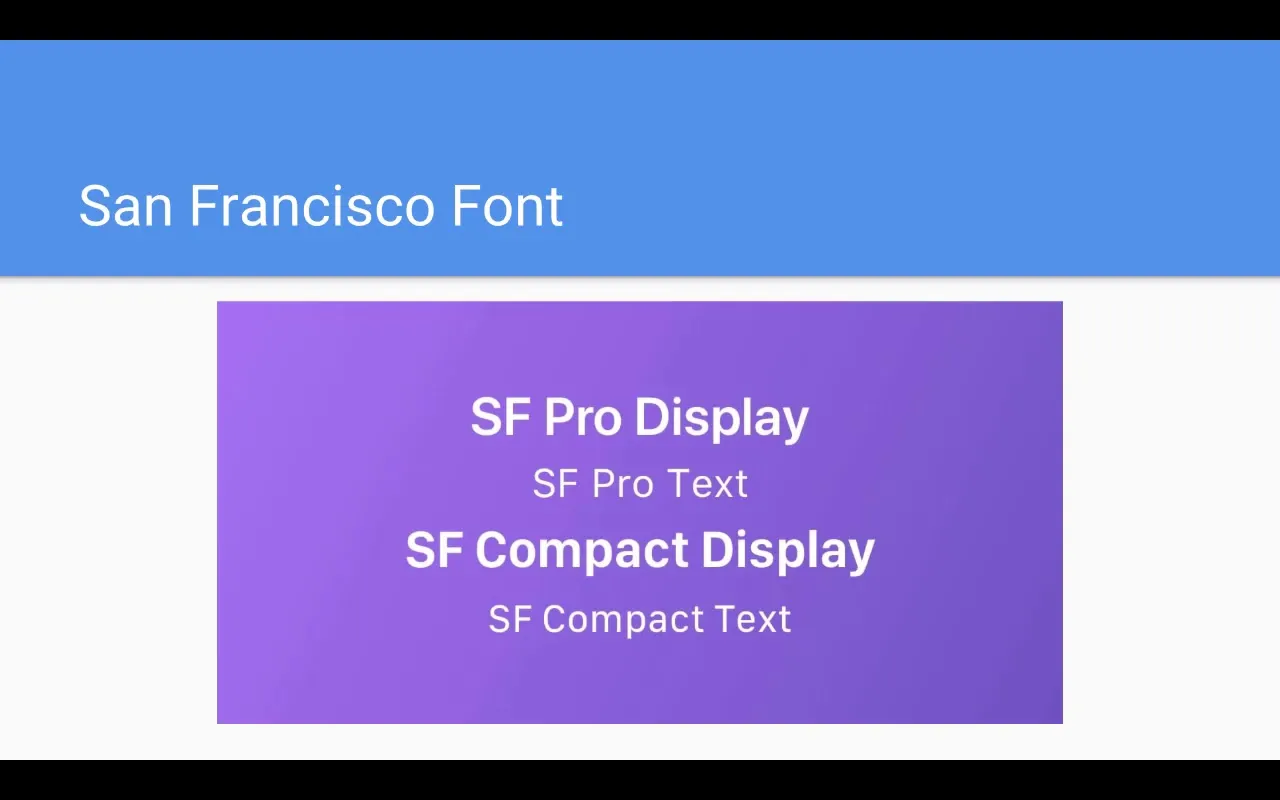
These fonts are not only appealing but also widely used, which makes their use in app designs sensible.
6. Optimizing Font Size
Fonts should be used in hierarchical sizes to guide the user through the text. For body text, 15 to 19 pixels are optimal, while headings should be at least 20 pixels in size.
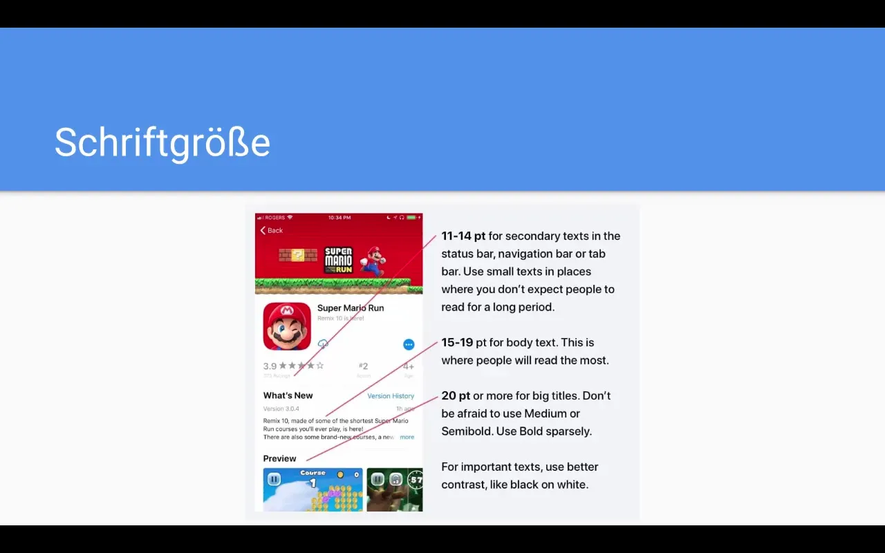
Ensure that the contrast between text and background is strong enough to ensure good readability.
7. Font Requirements and Weighting
The font weight should vary to highlight different types of text. A weight of regular is suitable for normal body text, while headings can be highlighted with bold or semibold.
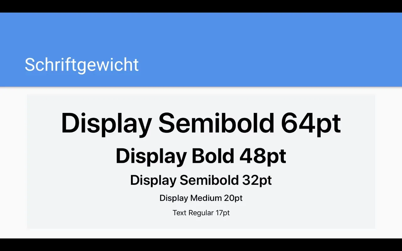
Larger font sizes allow you to use thinner typefaces that are still easy to read.
8. Typographic Best Practices
A high contrast between text and background ensures greater attention. Always use a high contrast for headings, while a dark gray might be appropriate for body text.
Ensure that all lines of text are color-coordinated and harmonious to create a consistent look.
9. Using Font Resources
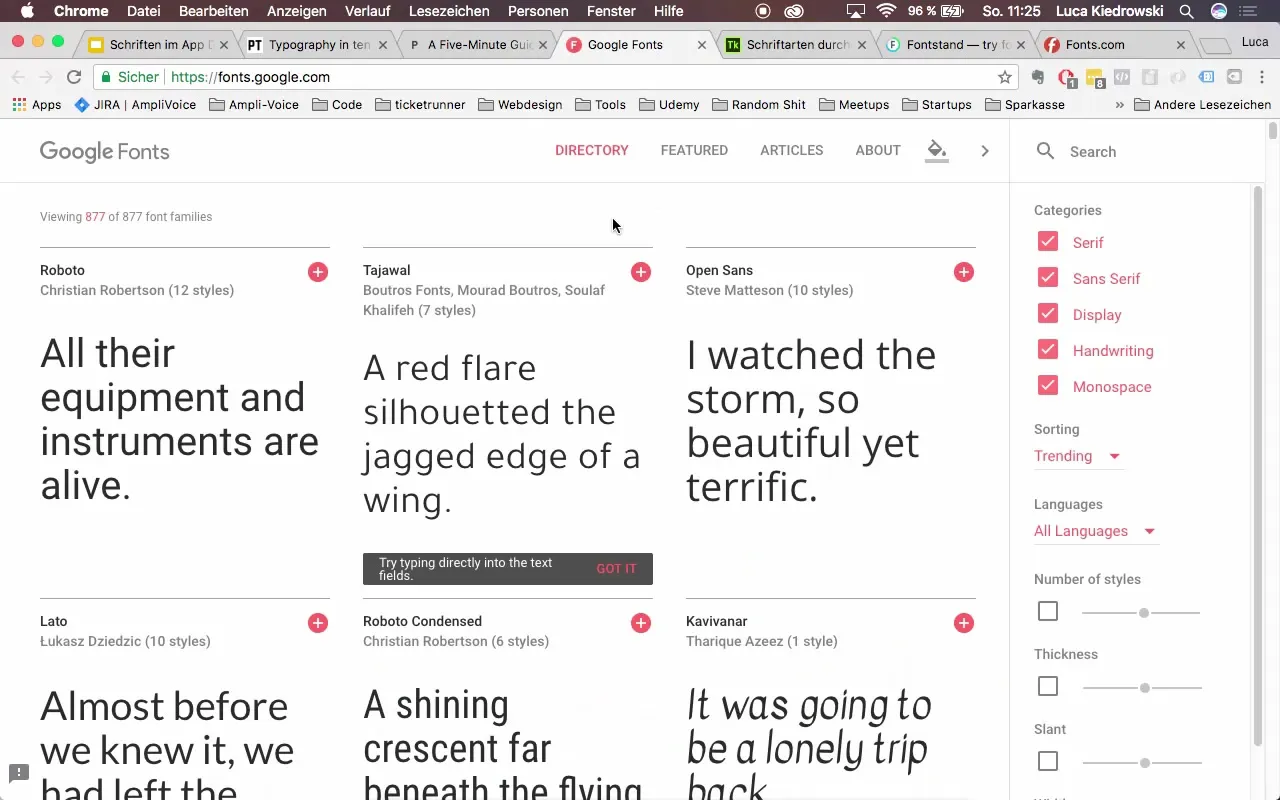
There are numerous online resources to find the right font. Websites like Google Fonts or Adobe's Typekit offer a wide selection of fonts for experimentation and selection.
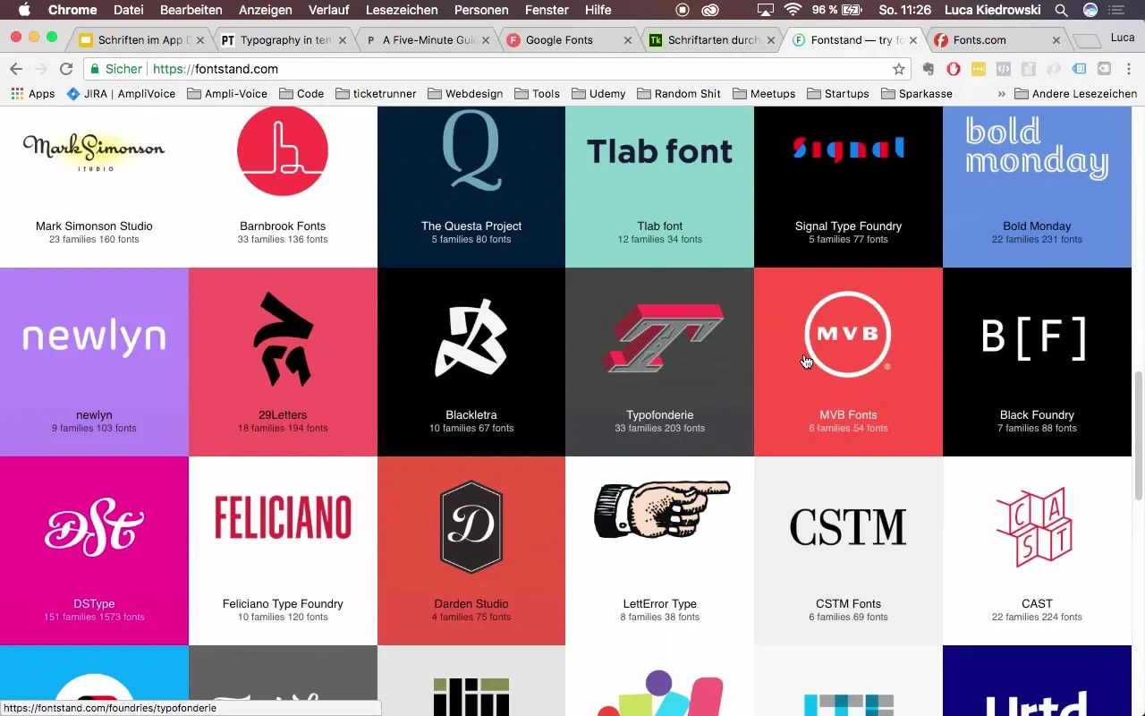
Also visit sites like fontstand.com or fs.com to discover more inspiring fonts.
Summary – Fonts in App Design: Basics and Best Practices
The choice and application of fonts in your app design is crucial for the user experience. Adhere to the mentioned rules and select fonts that are both aesthetically appealing and functional to enhance readability and user engagement.
Frequently Asked Questions
What is kerning?Kerning is the space between the letters.
What should the font size for body text be?The font size for body text should be between 15 and 25 pixels.
Why should system fonts be avoided?System fonts can make the design appear uniform and inconspicuous.
What line spacing is ideal?The ideal line spacing is between 120% and 145% of the font size.
When should fonts in an app be changed?Fonts should be adjusted based on the content and importance of the text.


