Colors are more than just aesthetic elements; they are tools to evoke emotions, guide users, and shape the overall experience of your app. In this tutorial, you will learn how to effectively use colors to make your app vibrant and inviting. Whether you are a beginner or an experienced designer, insights into the proper use of colors can significantly enhance their impact.
Key Insights
Colors play a crucial role in user interface design. Stick to basic color palettes, use contrasts to highlight important elements, and choose colors that work harmoniously together. Monochromatic, analog, and complementary color schemes are useful approaches to create engaging designs.
Step-by-Step Guide
1. Basics of Color Theory
The choice of the right colors is a challenge that requires a lot of practice. To get started, it's important to familiarize yourself with the basics of colors. Primary colors are red, yellow, and blue. These colors are the foundation for creating all other colors. Secondary colors are formed by mixing two primary colors.

2. Color Psychology
Colors influence user behavior. They can guide attention and evoke certain emotions. An example from nature shows that colors like blue are often associated with trust and security. For buttons, for example, you can use appealing, attention-grabbing colors to emphasize certain actions.
3. Applying Colors in Design
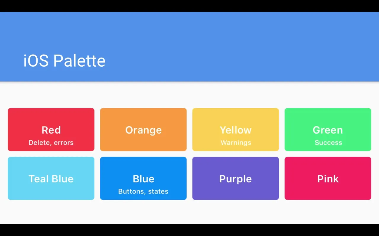
To make your app attractive, you should use colors according to color psychology. For warnings, red can be used, while green is associated with positive feedback. To encourage user interaction, you should align your color scheme with the common colors of the platforms you serve.
4. Monochromatic Color Palettes
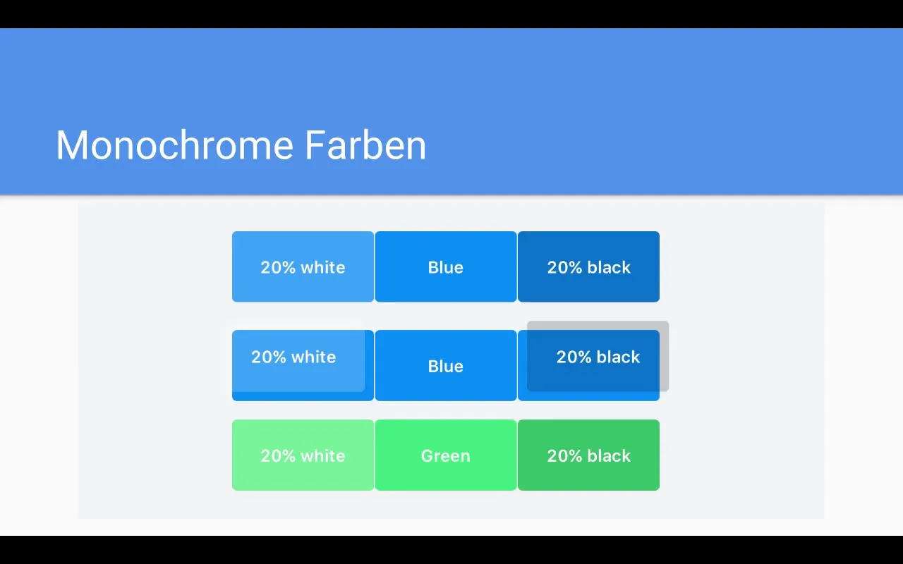
An effective method to create visual variance is by using monochromatic colors. Choose a base color and expand it with different shades of the hue. By overlaying 20% white or black, you can increase contrast and produce subtle differences between elements.
5. Analog Colors
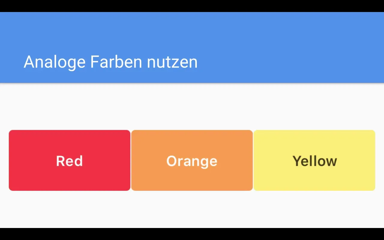
Analog colors, which are next to each other on the color wheel, create a harmonious overall look. You might combine red, orange, and yellow, for example. These colors complement each other and allow you to create a calm and appealing user interface.
6. Complementary Colors
Complementary colors are colors that lie opposite each other on the color wheel, such as blue and orange or red and green. They are particularly effective in highlighting important actions or decisions. Use them strategically to provide the user with clear calls to action.
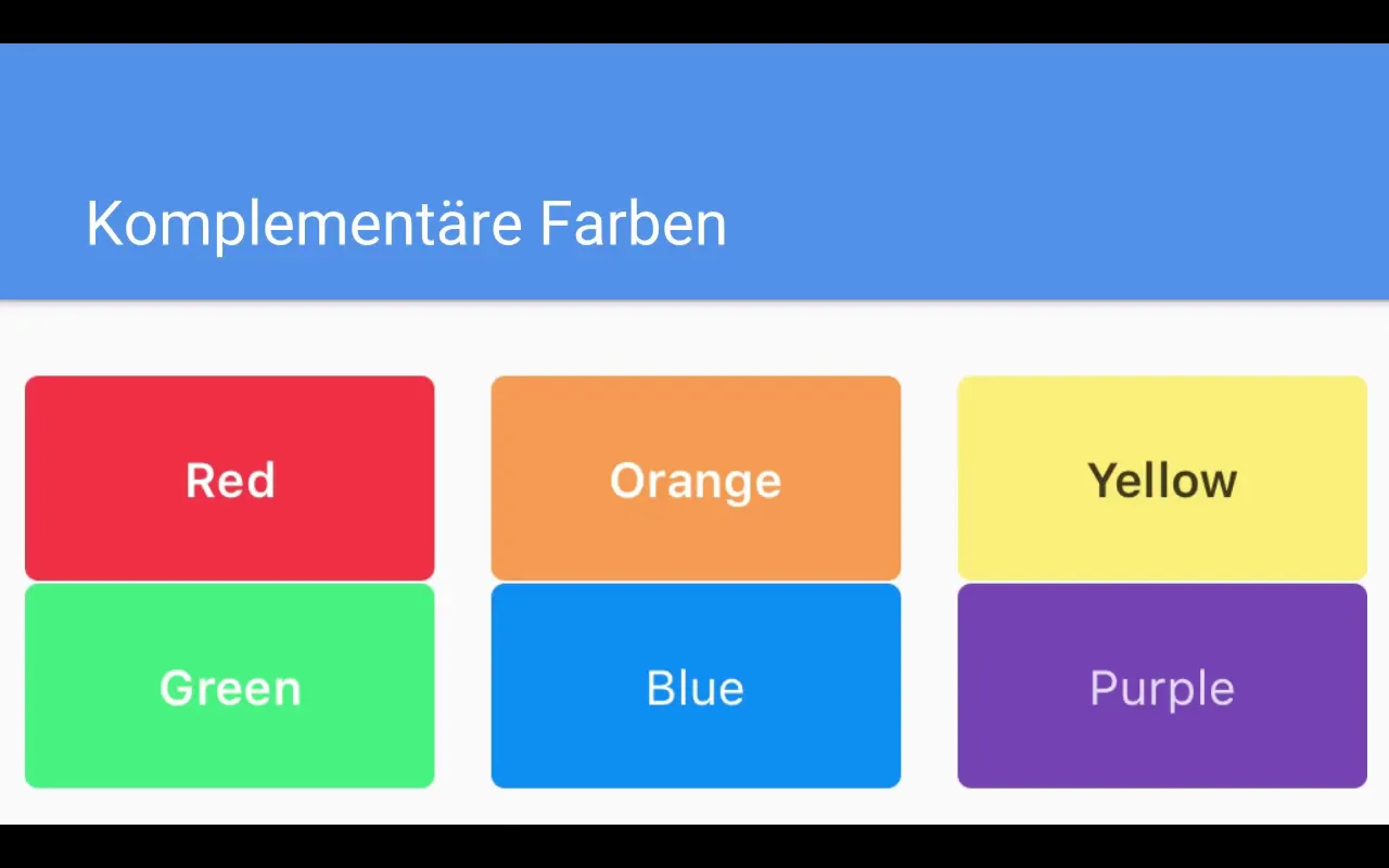
7. Using Neutral Tones
Neutral tones such as grays, beiges, or pastels have a calming effect and do not distract from the main content. These colors are excellent for enhancing the visibility of your app while also being easy on the user's eyes.
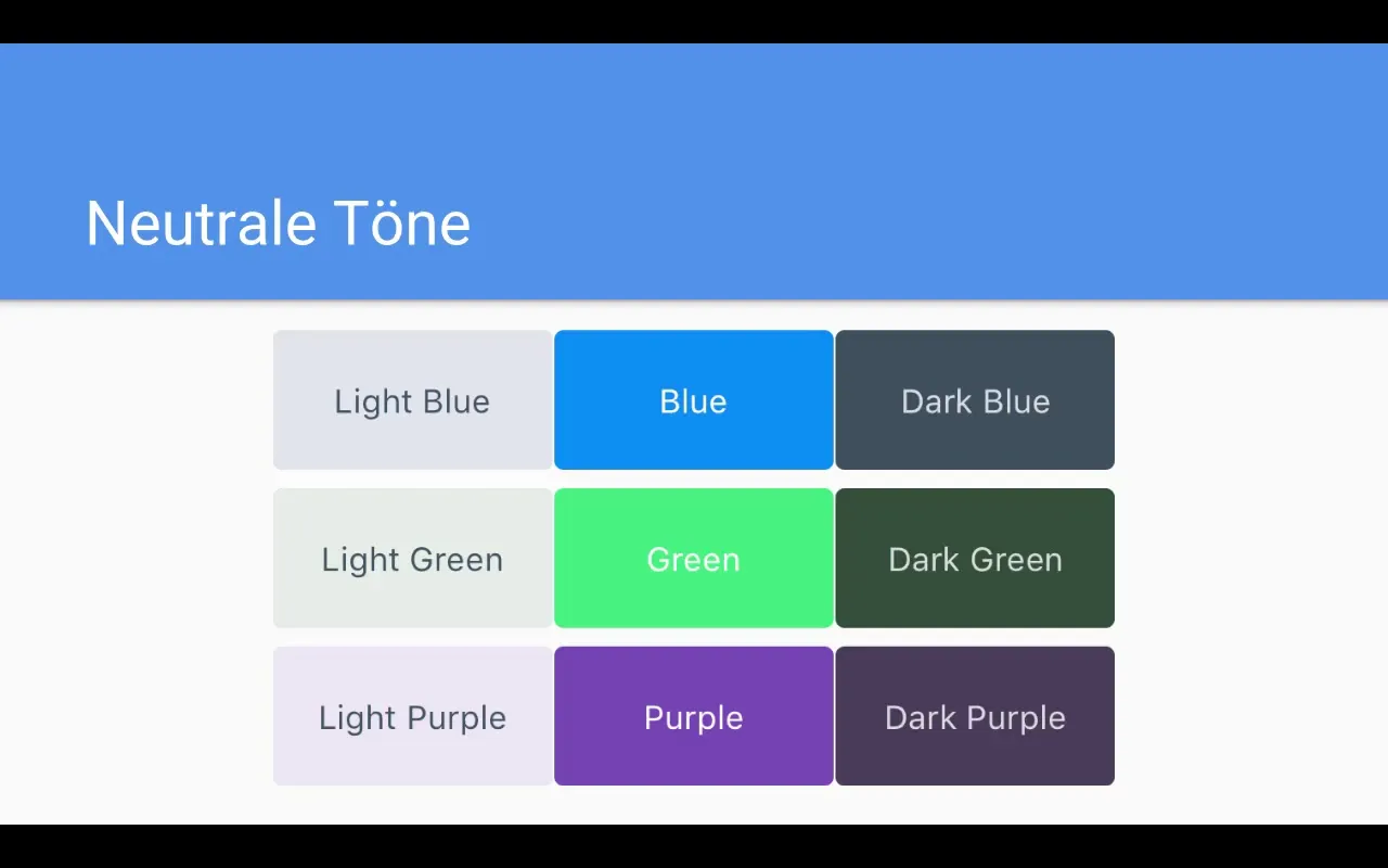
8. Proper Use of Contrasts
The proper use of contrasts is crucial for readability. High contrasts, such as dark text on a light background, increase the accessibility of information. Avoid weak contrasts, as they make the user interface less appealing and harder to read.
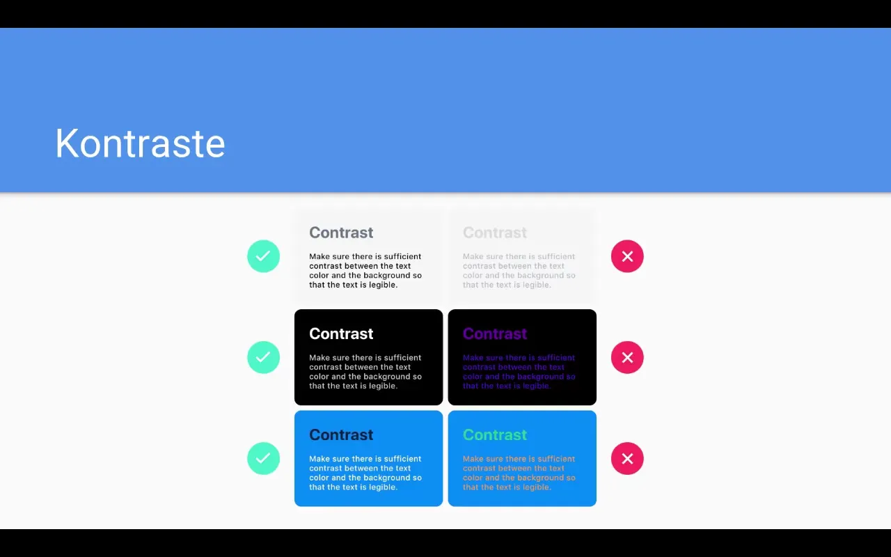
9. Creating the Right Color Palette
To create your own color palette, select several base colors and experiment with different brightnesses and saturations. Combining different hues can help achieve a cohesive and appealing design.
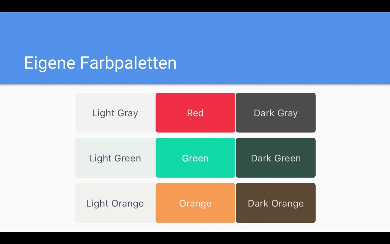
10. Best Practices for Light and Dark UI
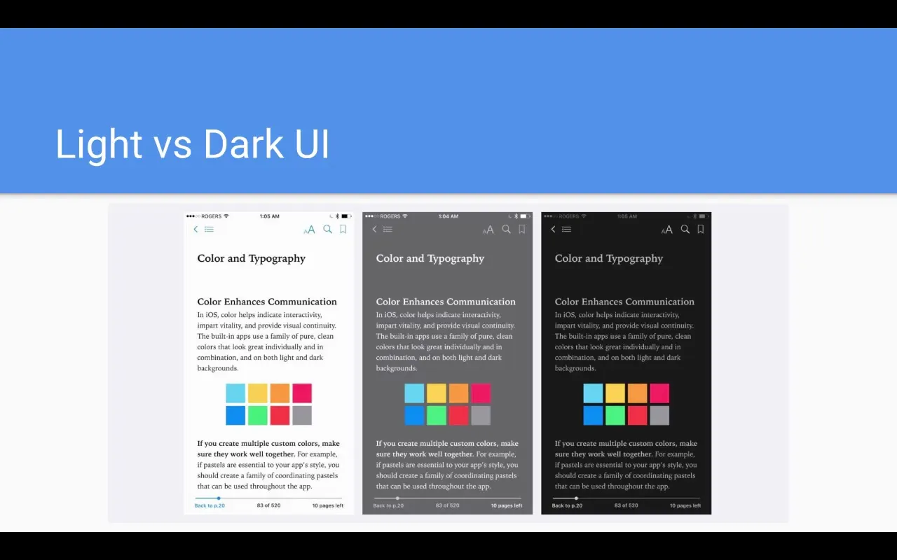
It’s important to optimize the user interface for both light and dark designs. A light user interface should utilize a lot of white and light gray elements, while the dark mode should rely on dark gray and light text. This not only improves user experience but also ensures that the app looks appealing in any environment.
11. Resources for Color Selection
Use online resources to find appealing color palettes. Websites like Flat UI Colors and colors.co offer a variety of palettes that you can use directly in your projects. It's a good idea to browse existing color palettes for inspiration.
Summary - Colors in App Design: Basics and Practical Tips
Colors are a central element in app design. By understanding the basics of colors, their psychological impact, their application in your design, and the use of contrasts, you are able to create an engaging user experience. Remember to choose the right color palettes to support both the functionality and attractiveness of your app.
Frequently Asked Questions
How many colors should I use in my app?It is recommended to use no more than three to four main colors in an app to ensure a clear visual hierarchy.
What are complementary colors?Complementary colors are colors that lie opposite each other on the color wheel and enhance each other.
How can I determine the right colors for my app?Consider the target audience, the app's purpose, and the psychological effects of colors to choose the right shades.
Can I create my own color palette?Yes, you can create a color palette by selecting several colors and adjusting their brightness or saturation to harmonize them.
Are there tools for color selection?Yes, websites like Flat UI Colors and colors.co provide many helpful color palettes and options for designers.


