In this text guide, you will learn step by step how to design a home screen for an app in Sketch. We will focus on the basics and some proven design principles to create an engaging user interface. You will see that the process is simple and understandable, and you will soon be able to create your own designs.
Main insights
- Using Sketch to create home screen layouts
- Important design principles for engaging user interfaces
- Using color codes and symbols to simplify the design process
Step-by-step guide
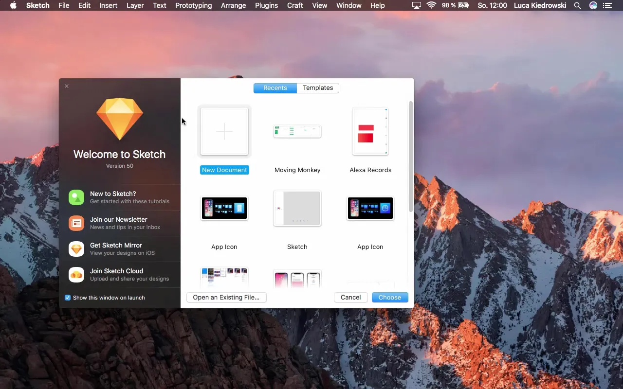
To start your design, open Sketch and create a new document for your home screen.
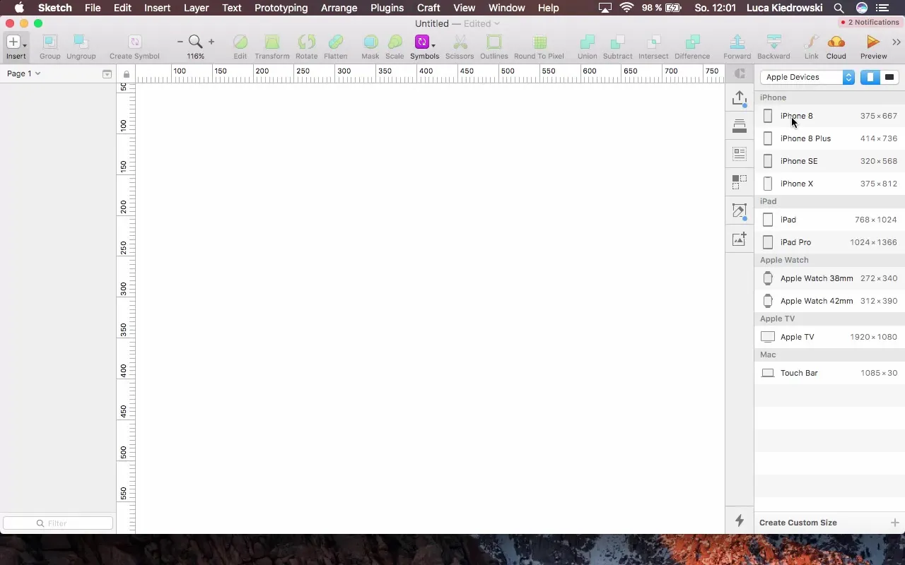
First, select the iPhone 8 as your design frame. It makes sense to start with the smaller screen as this method makes adapting to larger displays easier.
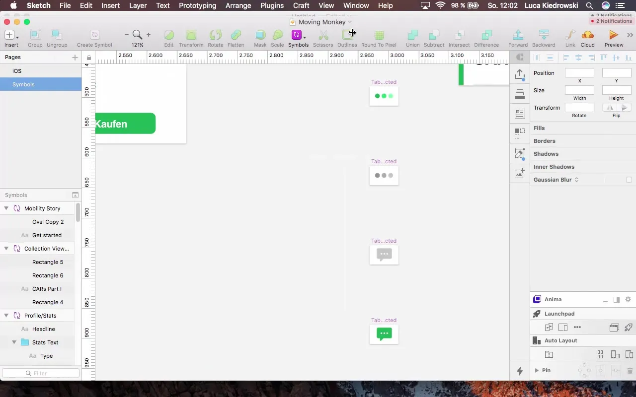
Now open the original app or design that you want to use as a template. We will add navigation that supports the structure of your app. Start by selecting the navigation elements.
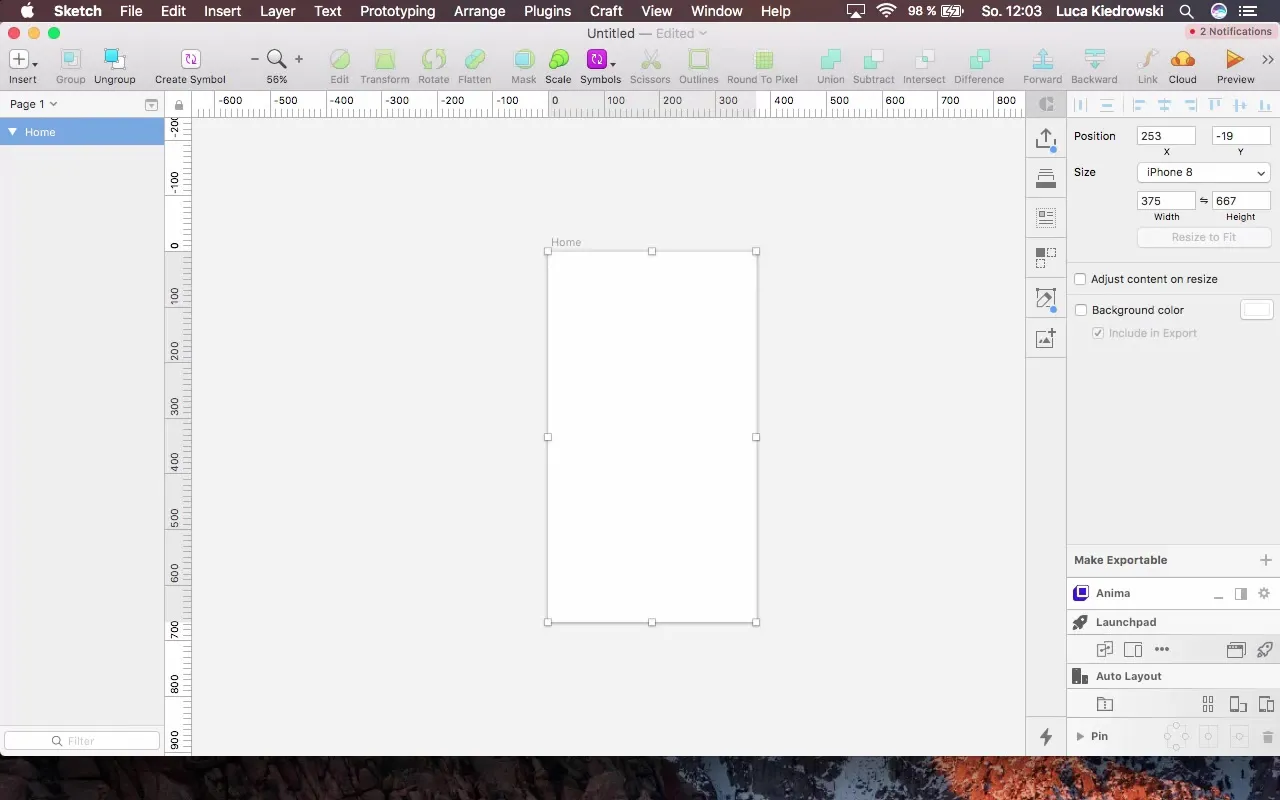
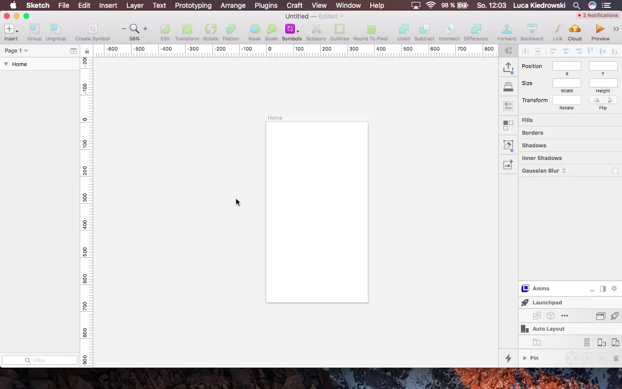
Click on the canvas and name the board “Home Background Color.” To ensure that your background is not transparent later, set a simple background color, starting with white.
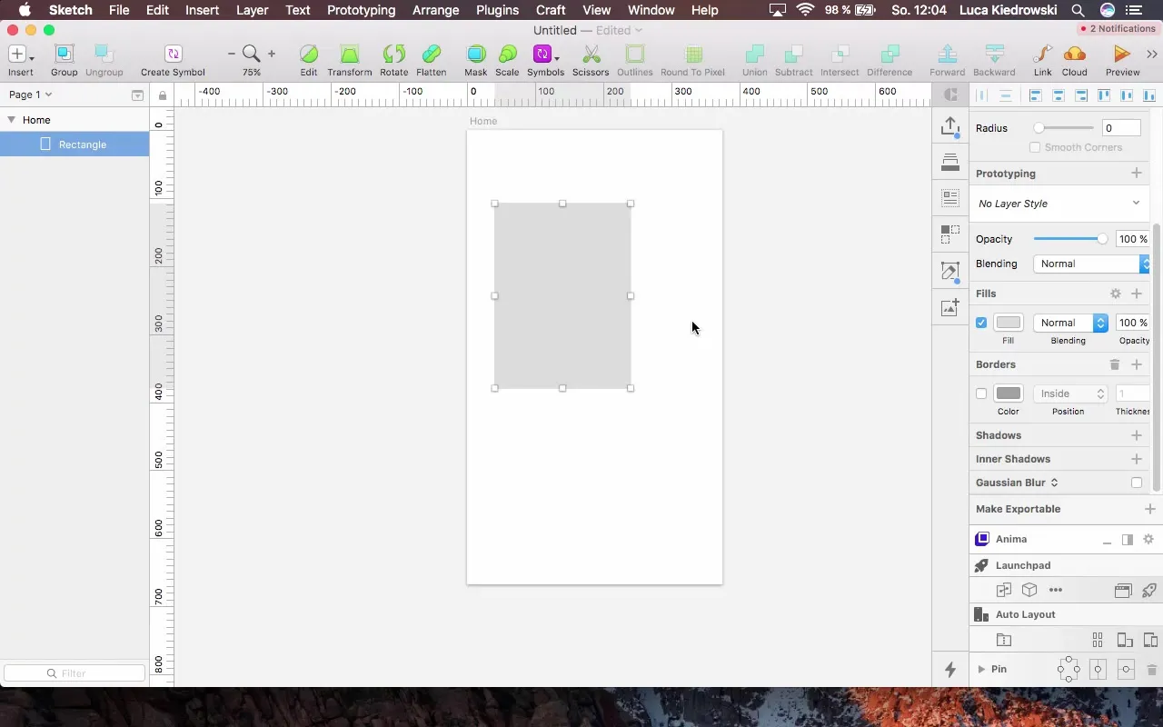
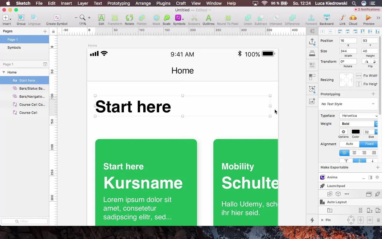
In the next step, focus on creating the course element. For this, click on the area and start designing a course card. You will create the card in a clear, simple design that follows flat design principles.
A background color is important for the card design. You can use a simple blue for immediate visual separation. Alternatively, you can experiment with gradients to add depth and dimension.
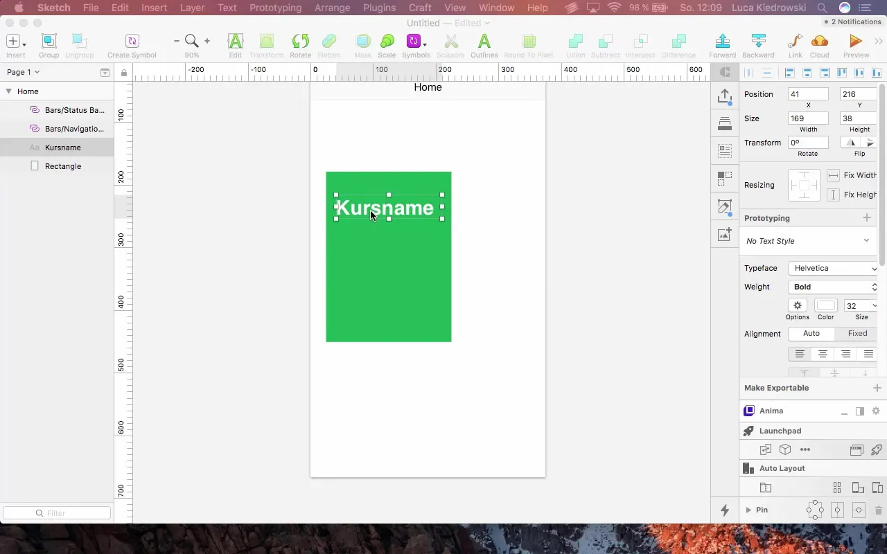
Now insert the text for the course. You can adjust the text box to ensure that the text is centered and easily readable. The spacing around the text is crucial. Make sure to maintain about 16 pixels of space on the sides for a harmonious design.
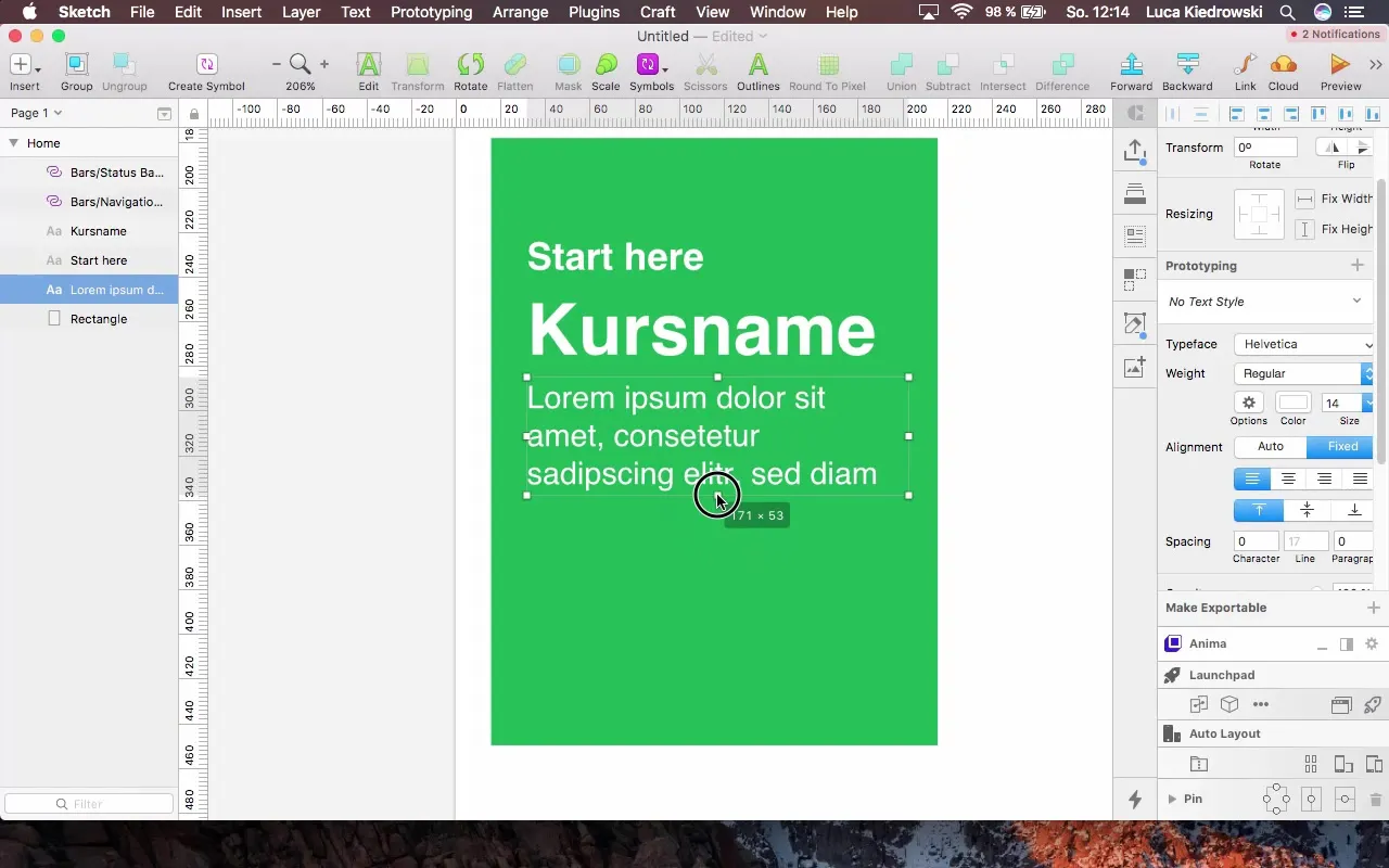
Once you have arranged the spacing and the text box, create a description for the course. It is also important to pay attention to the size of the description label. A value of about 14 point font size ensures good readability.
After implementing the basic elements, you can create additional symbols. They will be helpful if you want to use similar elements multiple times in your design. Create a symbol for the course card so that you can reuse it in other parts of your app.
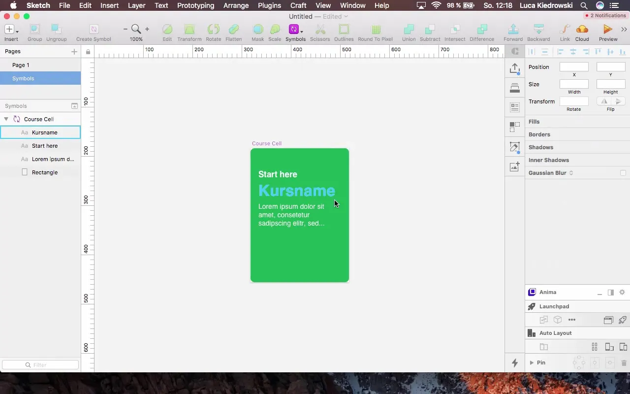
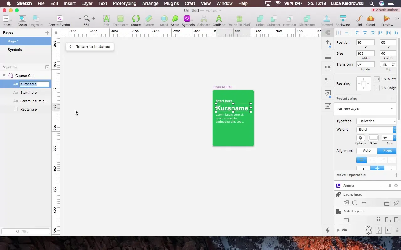
Once you have created your symbol, it will automatically adjust changes in all instances. Now you can adjust the title and description of your course without having to change everything manually. Use simple text labels to ensure clear structure.
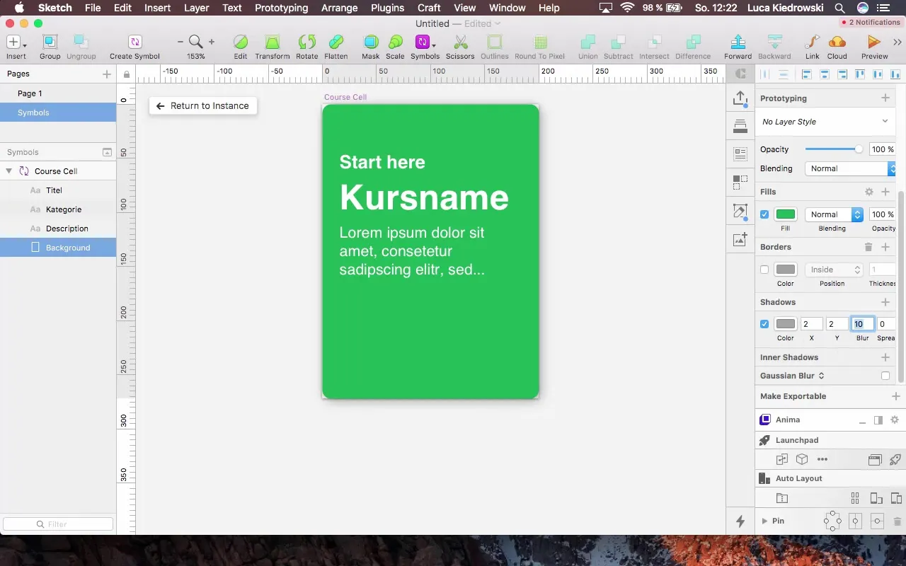
To make your cards visually appealing, add a shadow. Make sure it is subtle to avoid overwhelming the design. A light shadow allows the elements to stand out and fit better into the overall picture.
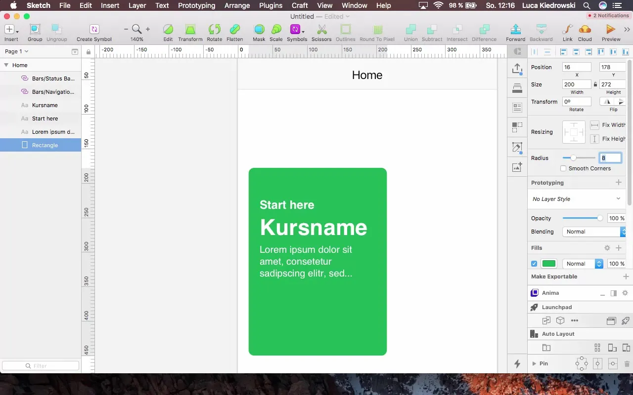
Use rounded corners for your cards to increase visual appeal. A corner radius of 8 provides a modern, clean look that aligns with Apple's design guidelines.
Now create a clear title above the course card to enhance user guidance and better structure the content. Ensure that the height and distance to the previous element remain consistent.

Finally, it is also important to think of a consistent design. Keep the spacing between all elements and the margins uniform to create a harmonious overall picture.
Summary - Design an engaging home screen with Sketch
The steps today have shown you how to design a functional and engaging home screen with Sketch. By applying simple design and user guidance principles, you can create an app that is both visually appealing and functional.
Frequently Asked Questions
How do I start with Sketch?You open Sketch and create a new document.
Which device should I choose as a template?The iPhone 8 is a good choice as it has a standard size.
How important are spacings in design?Spacings are crucial for a clean and engaging design.
What are symbols in Sketch and how do I use them?Symbols allow you to create repeatable design elements and apply changes everywhere.
How can I add shadows to my design?Add shadows through the "Layers" settings in Sketch.


