The design of a user interface can make the difference between a good and a great app. In this tutorial, we focus on how you can use designas a toolto make your app more engaging. We will tackle a new screen that stands out visually from existing elements and captivates the user through appealing design. Let's get started.
Key Insights
- Diverse colors and contrasts enhance visual appeal.
- Clear layout structures help users navigate more easily.
- Consistent font sizes and designs promote a pleasant user experience.
Step-by-Step Guide
Add a New Controller
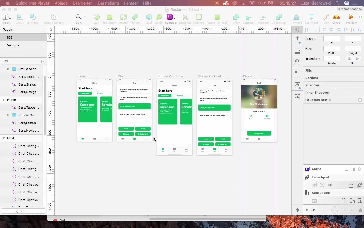
To create the new screen, we start by adding a new controller. Go to your interface builder, click on "Add Controller," and position it so that it fits below the existing screens.
Configure the Controller
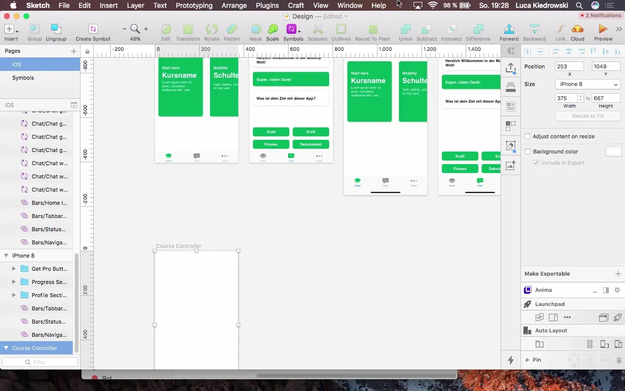
Name your new controller "Course Controller" to facilitate future reference. Ensure that the outdated "iPhone 8 copy" name is replaced by "Profile Controller."
Adjust Background Color
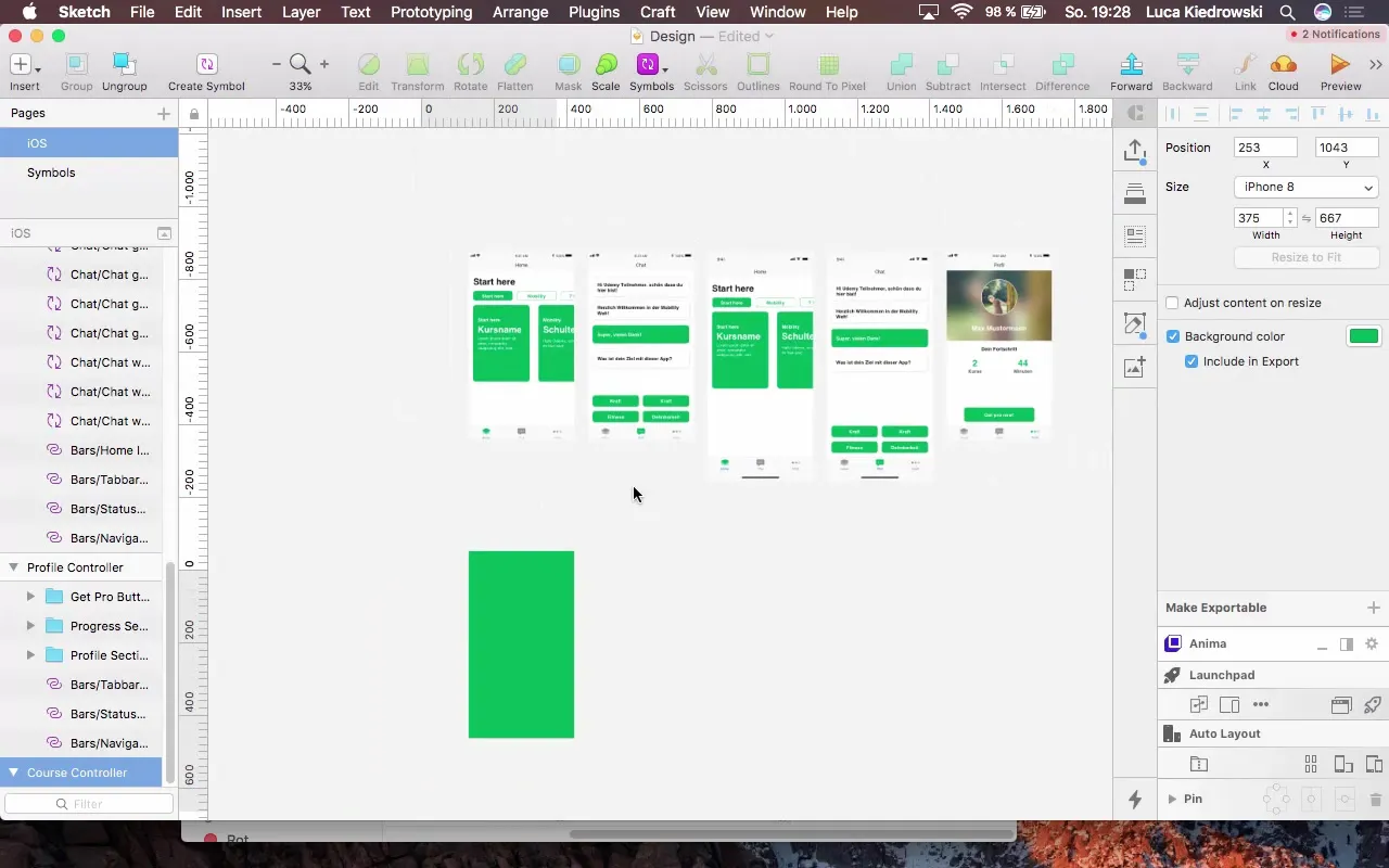
Forthe visual appeal of the app, it’s important to choose a dominant background color. Opt for a vibrant green that is already used in other parts of your app. This strategy enhances the contrast with the white elements and adds more dynamism.
Configure Status Bar
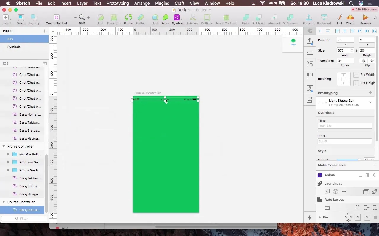
Set the status bar to "Dark" so that the text is easily readable against the green background. Check the position and ensure it is perfectly aligned.
Create Label
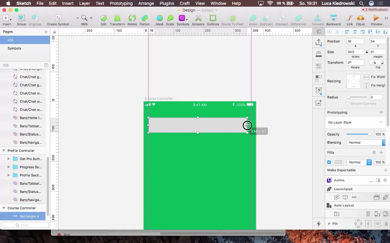
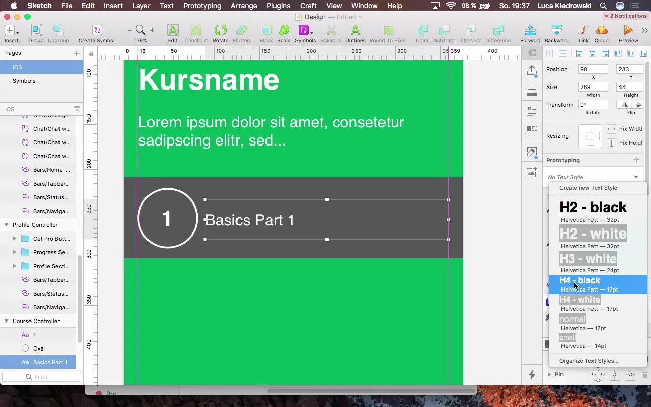
Create a new label for the course display. Start with a heading that spans the entire width of the controller. Choose the font H4 and color the text white.
Add Additional Labels
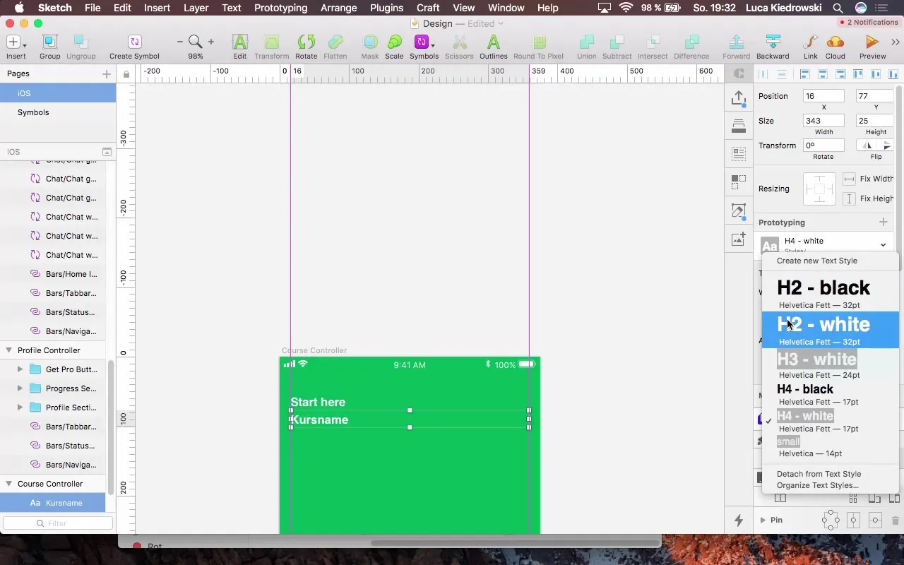
Add another label for the course title. Use a font size of 40 pixels and ensure it is positioned correctly – it should have no gap from the previous label.
Display More Information
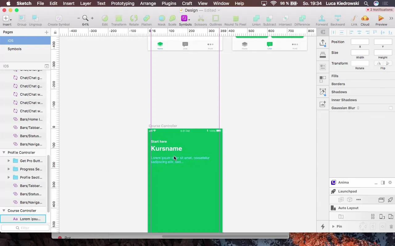
To provide users with more information, add a third label. Use a smaller font size of 17 pixels so that the text does not stand out too much until needed.
Create the Table
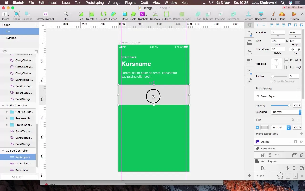
Finally, add a table to organize the lessons clearly. Start with a simple rectangle that takes up the entire width and design the background somewhat darker to work with white text.
Lessons as Cells
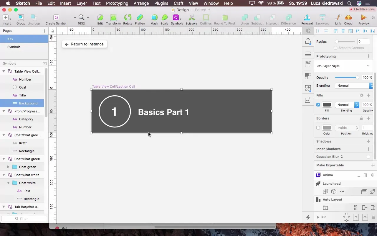
Create a cell for the first lesson titled "Basics Part 1". Pay attention to appropriate spacing and alignment.
Add Separator
To create a clear distinction between the lessons, add a separator (a thin line). This line should be positioned between the cells to achieve a visual separation.
Create Cancel Button
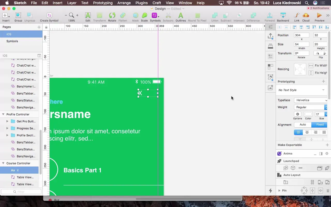
To allow users to exit this view, add a cancel button in the form of an "X". Make sure it is clearly visible in the center of the screen.
Outlook on Next Steps
After the new course controller has been successfully created, the next stepwill be to integrate a login. This allows users to save their progress within the app.
Summary – Design as a Tool for App Refinement
In this tutorial, you learned how effective design of your app can create an improved user experience. From adding a new controller, selecting appropriate colors, to incorporating cells and buttons – you went through all the necessary steps to make your app visually appealing.
FAQ
What are the main goals of the design process?The primary goal is to create an engaging and user-friendly interface that facilitates using the app.
How important are colors in design?Colors are crucial as they influence the user experience and help highlight important information.
How can I ensure that the font sizes are consistent?Use defined text sizes and styles in your design system to maintain consistency.
How often should I review the design of my app?It is advisable to regularly review the design and adjust it based on user feedback and app updates.
What tools are recommended for prototyping?Popular tools include Sketch, Figma, and Adobe XD, all of which offer extensive features for prototyping.


