The beginning of an Appdesignshould always be well thought out and appealing. In this tutorial, you will learn how to revise your app's Homecontroller to add more interactivity and visual appeal. Let's get started!
Key Insights
- The Home Controller can be made more appealing through creative use of colors and layouts.
- SVG files offer advantages in terms of editability and sharpness.
- The use of gradients and different sections can significantly enhance the user experience.
Step-by-Step Guide
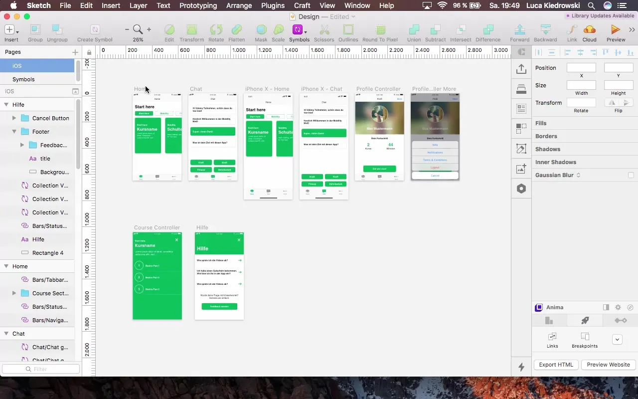
First, let's take a look at the existing Home Controller. Here, you'll notice that we have different sections: an overview of courses, an interactive chat, and the profile. The focus is on the Home Feed. In this tutorial, we will adjust the navigation and optimize the design.
Step 1: Revise Navigation
To improve the design of your Home Controller, we will start by revising the navigation bar. We will first remove existing elements such as the navigation.
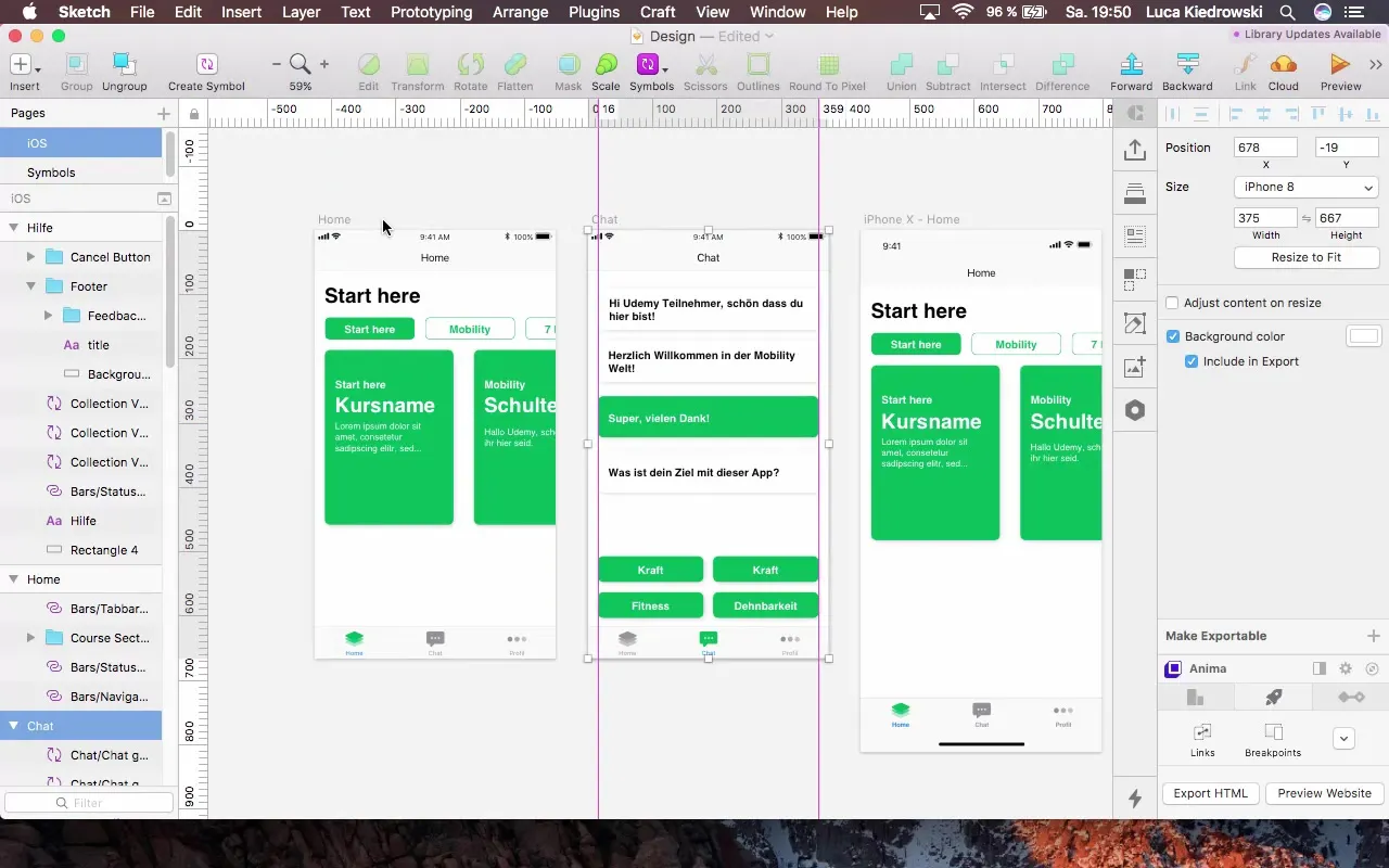
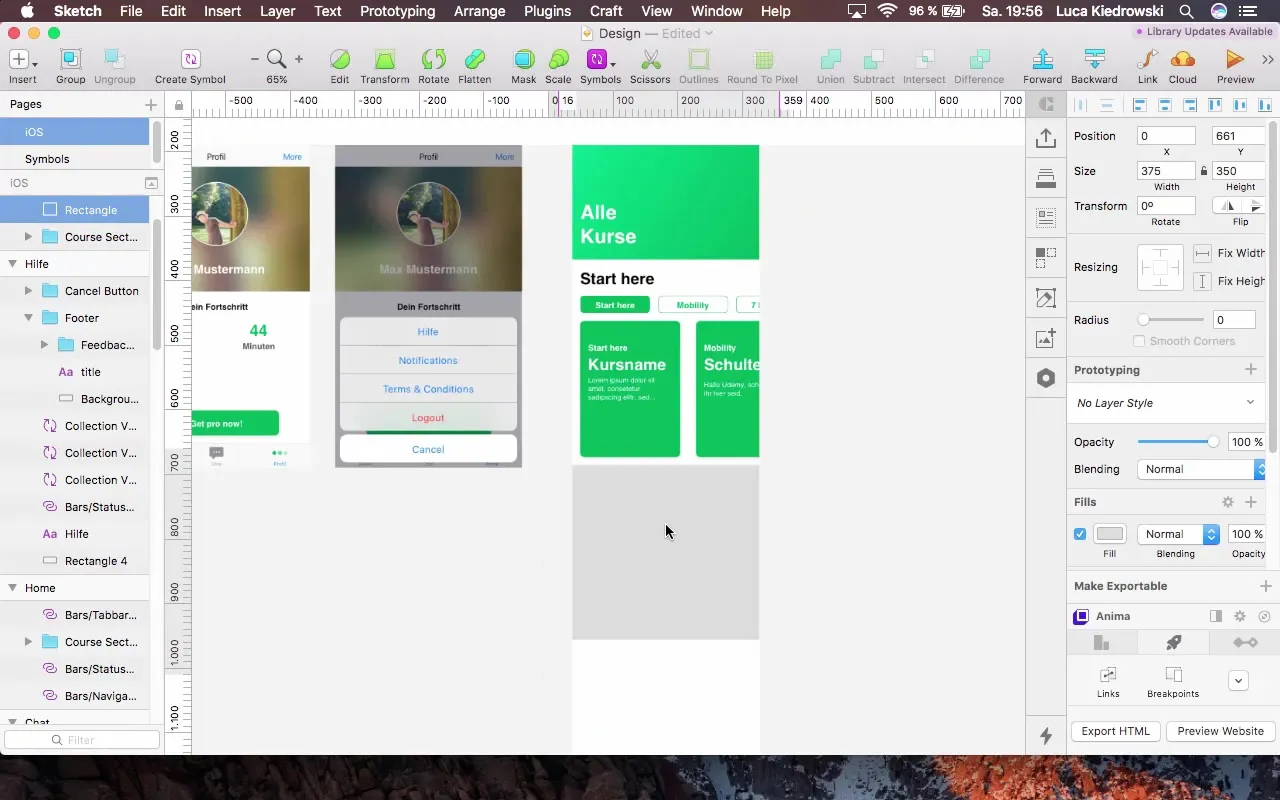
Next, we will add a rectangle as a new header, which should have a height of 250 pixels. The rectangle should not have a border to ensure a clean look.
Step 2: Add Header and Text
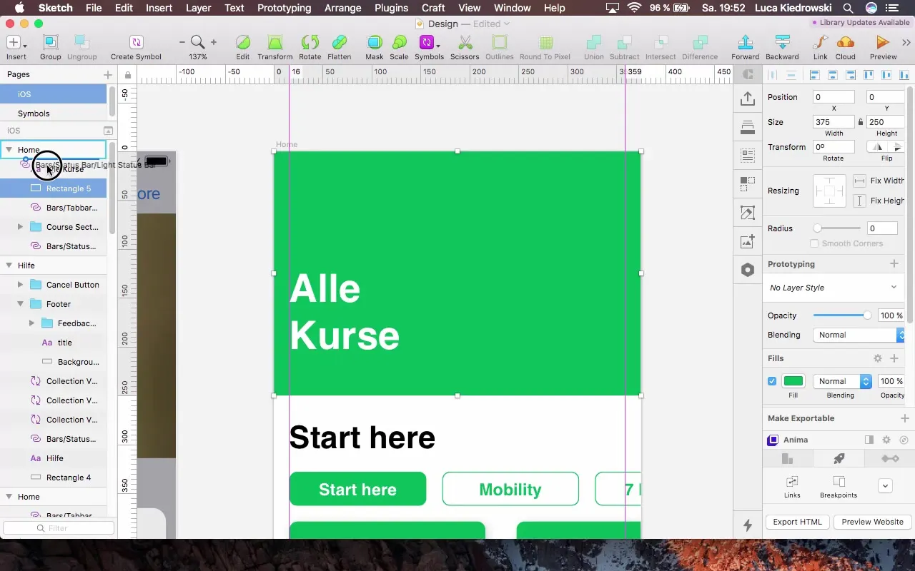
In the next step, select the Document Color and add new text. Set the text to "All Courses" and experiment with text styles. A recommended size for the header would be 110 pixels. It is important to adjust the header to the status bar.
Step 3: Adjust Backgrounds and Colors
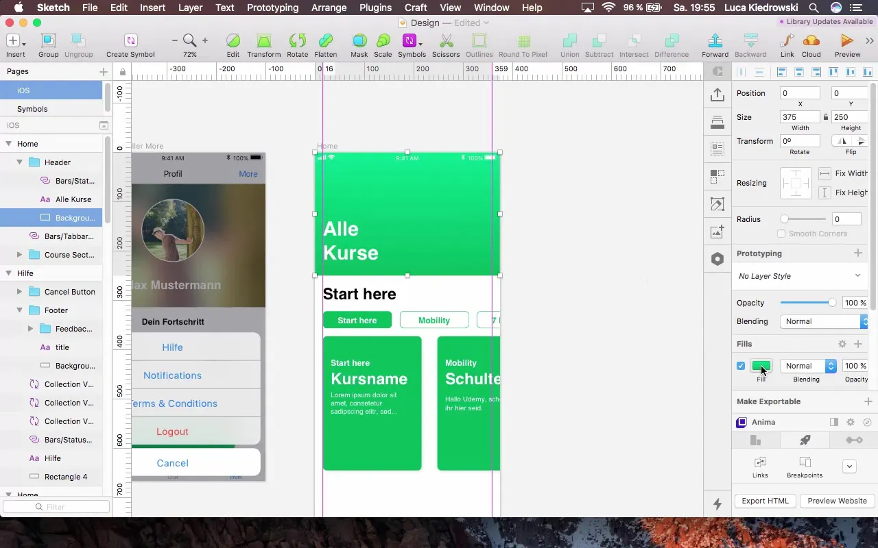
An appealing design also includes the use of gradients. Go back to your rectangle and choose a gradient that is both dynamic and harmonious in the overall layout. A diagonal gradient adds more depth.
Step 4: Add New Section
Now we will create a new section below the header. Add another rectangle with a height of 350 pixels and remove the border. Here, you can choose a contrasting color to bring more life to the app.
Step 5: Content and Icons
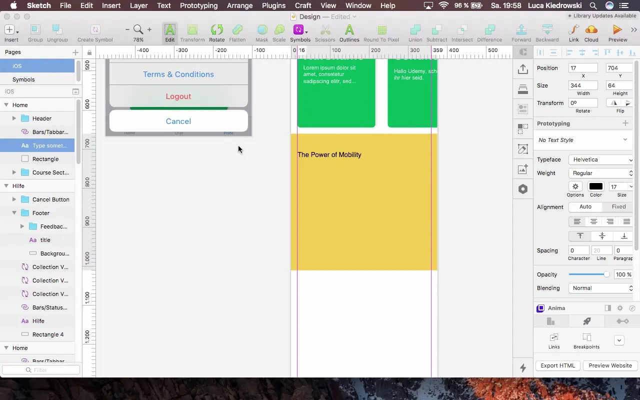
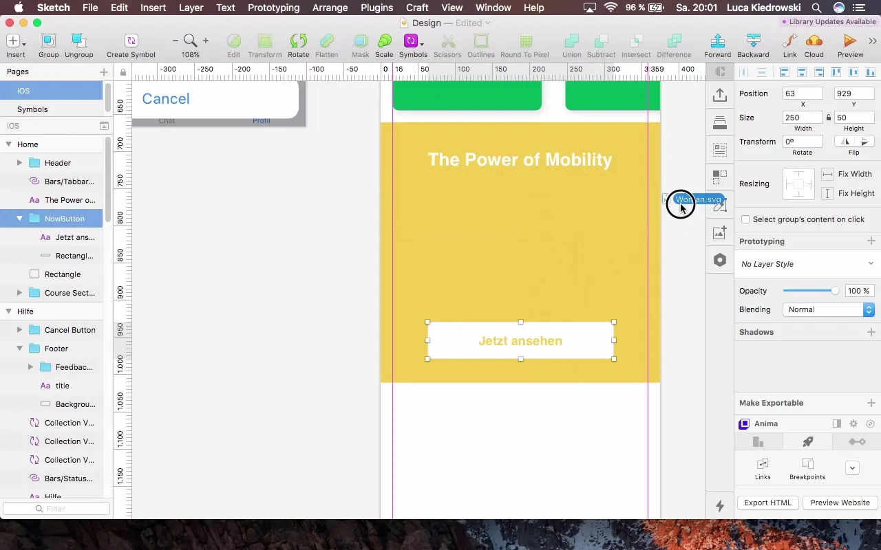
In this section, we could add a button to offer the user more content, e.g., a video. Add the text "Power of Mobility" in H3 format and position it 16 pixels from the top.
Now let's add an icon, which can either be created by yourself or imported from resources. It is recommended to use SVG files as they are easily editable.
Step 6: Create Pro Version Section
Create another section that gives users the option to purchase the Pro version of the app. Add a new rectangle with a height of 250 pixels and place your call-to-action "Get Pro Version" there.
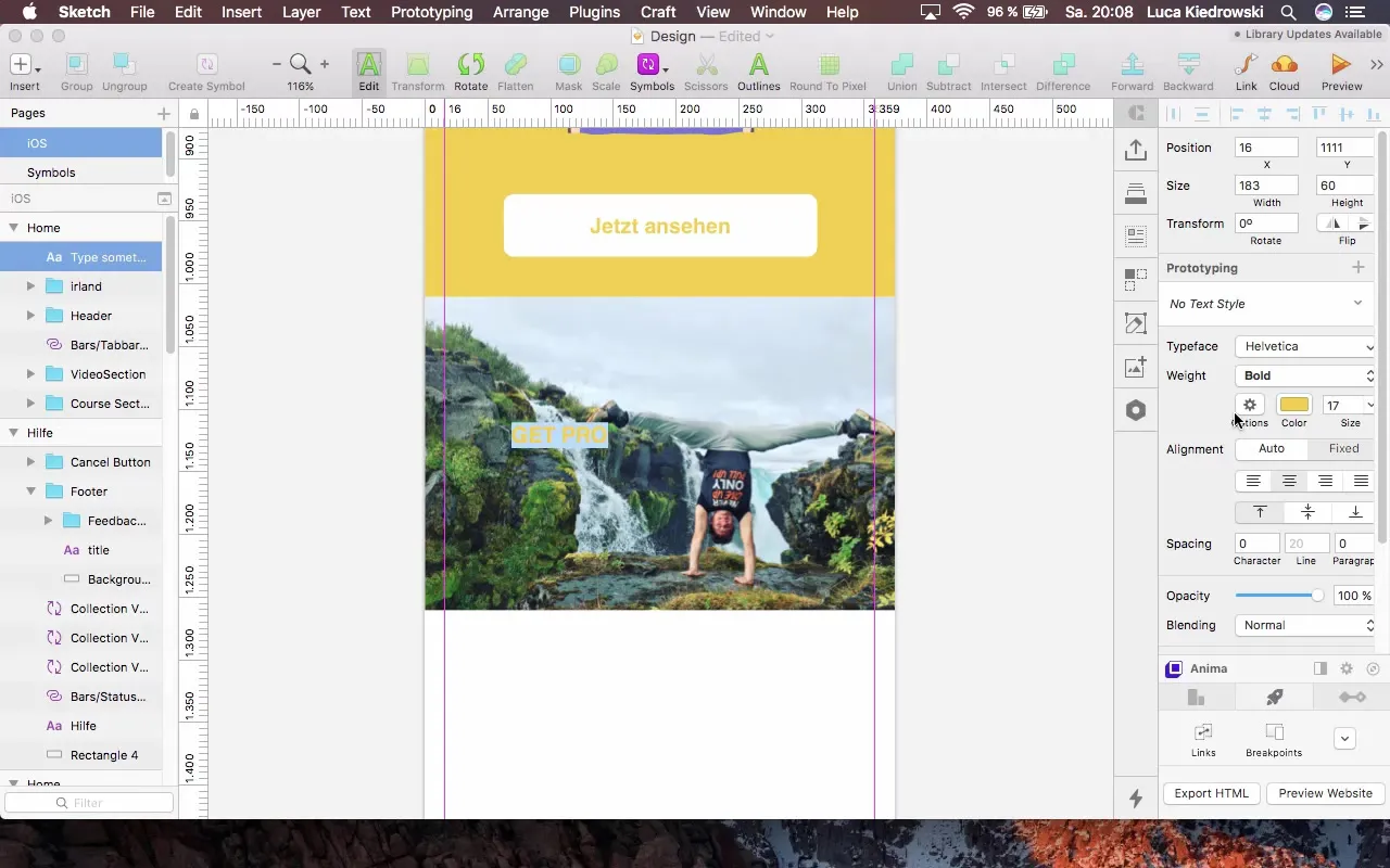
Here, it is important that the text is designed to stand out. You can use a darker color variant to ensure that the text is easily readable.
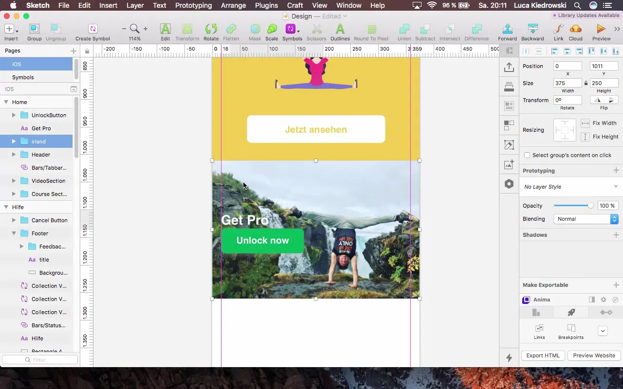
Step 7: Clarity through Groups
Create groups from the various sections to increase clarity. This will help you better organize the different areas.
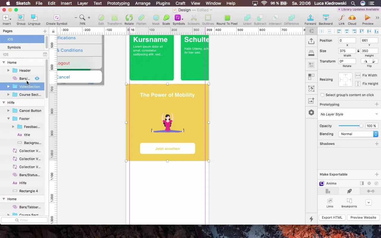
Step 8: Final Adjustments and Alignment
Finally, you can take another look at all elements in the sections and adjust the spacing and positions if necessary, to ensure a clean layout.
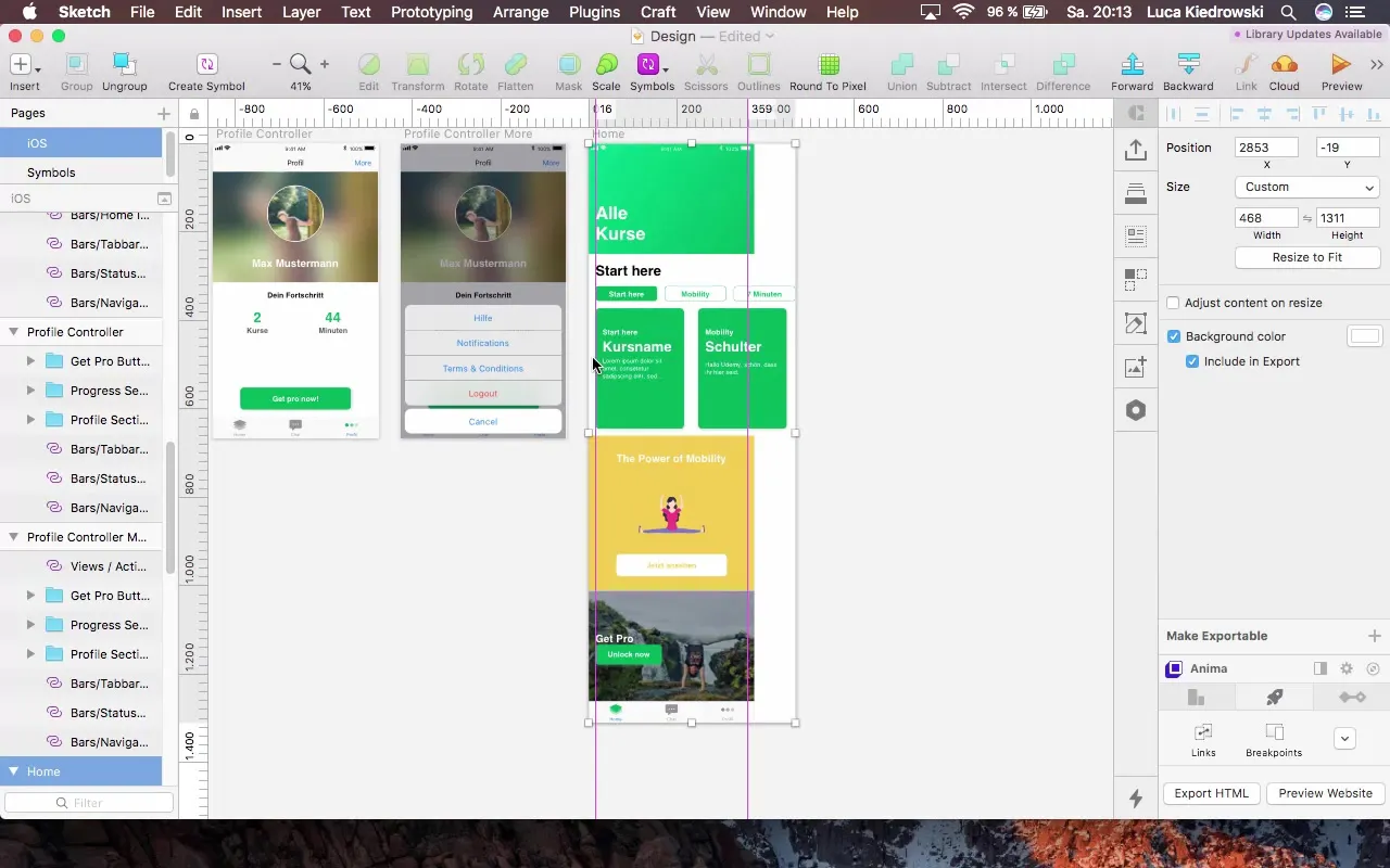
Summary – Home Redesign: Your Effective Way to an Appealing User Interface
You have now learned how to redesign your Home Controller to make it more interactive and visually appealing. Through the creative use of gradients, the implementation of SVG icons, and structuring into sections, you have significantly improved the layout of your app.
FAQ
How can I ensure that my header looks good?Make sure to use appropriate text sizes and color combinations that are coherent throughout the design.
What advantages do I have by using SVG files?SVG files are scalable and retain their sharpness regardless of zoom level.
How can I add gradients in Sketch?Select the desired element, go to the fill options, and choose "Gradient" to create appealing gradients.


