

Imagine your audience isn't flipping from slide to slide, but flying together with you through a large space full of content. That is exactly what makes Prezi special. Anyone who uses the tool only for zooms and rotations quickly loses attention. Those who think structure, design, and movement together, on the other hand, create presentations that stay in memory.
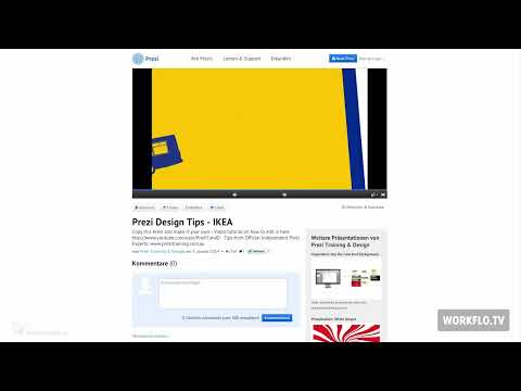
The video is only loaded from YouTube when you play it – data (including your IP address) is then transmitted to YouTube/Google. More in the privacy policy
In the following, I will guide you through three examples: a company presentation by the Swedish furniture retailer IKEA, an overview of the South by Southwest (SXSW) festival, and a case study by the cloud storage provider Box. I will explain which design decisions lie behind them and how you can apply them to your own projects.
Key Takeaways
- A clear introduction immediately shows what it is about and gives the presentation a narrative direction.
- Corporate design belongs in the presentation from the start, so that the audience recognizes the company at a glance.
- Rotations and zooms are tools that should be used subtly so that the flow of speech is not interrupted.
- A zoom-out places details in an overall context and helps the audience understand connections.
- Vector graphics and a consistent illustration style ensure that content looks sharp and coherent even when zoomed in closely.
- Testimonials and standard shapes make a presentation more personal and credible.
Step-by-Step Guide
Step 1: Create orientation with a clear introduction
The introduction determines whether your audience follows you. The IKEA presentation begins with background information about the company and shows where the largest IKEA store is located. For your project, think about which question you want to answer at the beginning, and structure the starting area so that viewers immediately know where they are.

Step 2: Integrate corporate design seamlessly
Colors, logo, and font should be recognizable in every view. In the IKEA presentation, a few clicks are enough, and everyone in the room knows which company it is about. Incorporate your client's design guidelines directly into the Prezi instead of adjusting them afterwards. This way the presentation looks like it is all of one piece.

Step 3: Use rotations and zooms subtly
Movement is Prezi's trademark, but it must never become an end in itself. The IKEA presentation uses rotations and zooms with restraint, so the flow of the presentation is not interrupted. When building yours, make sure that every movement has a reason related to the content: a zoom on a detail makes sense, a rotation only if it clarifies a change of topic.

Step 4: Use the zoom-out as a context tool
A zoom-out is more than a nice movement. It shows individual figures in relation to the big picture. For example, when you present sales figures or locations, let viewers see the detail first and then zoom out so that they grasp the proportions. This technique prevents numbers from seeming isolated and arbitrary.
Step 5: Reduce the visual design
Simple shapes and a restrained choice of colors direct the eye to the facts. The IKEA presentation avoids visual noise, so the content takes center stage. A good rule of thumb is: choose two to three basic colors and use them consistently. At the end of the presentation, you can then show the resolution clearly in the form of a table.

Step 6: Copy the finished Prezi as a template
If you particularly like a presentation, you don't have to start from scratch. The IKEA Prezi can be copied to your own Prezi account for free. There you can view it, analyze it, and adapt it to your content. However, make sure that you replace texts, images, and brands and do not adopt the template unchanged.

Step 7: Offer an overview with the Big Picture
The SXSW presentation works with the so-called Big Picture from the start. The audience sees early on where which event takes place and can orient themselves in the space. Plan an overview that shows all topic areas, and return to it again and again as you go on. This way the structure of your talk remains comprehensible at all times.

Step 8: Design calm camera movements without rotation
In the SXSW presentation, the camera movements are deliberately kept calm, and rotations were completely avoided. This looks professional and relieves the audience. If you incorporate a lot of movement, the presentation quickly becomes tiring. A calm, steady camera movement is often more effective than an elaborate spectacle.

Step 9: Use vector graphics consistently and choose a uniform style
One point that stands out particularly in the SXSW presentation is the consistent use of vector graphics. They remain clear even when zoomed in far and without pixelation. In addition, all the illustrations come from the same illustrator, which is why they look uniform. By the way, this type of design is also excellent for trade fairs, for example to show individual booths one after another. Make sure to create or source images as vectors whenever possible if you zoom in frequently.

Step 10: Use standard shapes purposefully and incorporate a testimonial
The Box case study shows that you can create convincing presentations even with simple standard shapes such as circles and arrows. The arrows guide the eye through the process, and the circles structure the content. In addition, a testimonial video enriches the presentation: an employee talks about the processes there. This gives the presentation personality and strengthens the company's credibility. For testimonials, always choose people who can report authentically about their work.

Summary – Designing Prezi presentations: A guide with three practical examples
The three examples show that good Prezi presentations are based on simple principles. A clear introduction, a consistent corporate design, and restrained movements create orientation. The zoom-out connects details with the whole, while vector graphics and a uniform style ensure quality. Standard shapes and a testimonial finally make the result credible and personal. If you apply these principles to your own project, you will notice that movement does not mean distraction, but guides your audience through your story.
FAQ
Do I have to avoid rotations in Prezi completely?No, but you should use them subtly. The IKEA presentation uses rotations sparingly, while the SXSW presentation avoids them entirely. What matters is whether the movement supports the content.
Can I simply adopt other people's Prezi presentations?You can copy the IKEA Prezi into your account for free and use it as a template. However, replace the content, images, and brands so that the presentation fits your project.
What is the Big Picture for?The Big Picture offers an overview of all topics or areas of your presentation. This way, the audience keeps their orientation even when you zoom deep into individual sections.
Why are vector graphics so important for Prezi?Vector graphics stay sharp when zoomed in, whereas pixel graphics look blurry or pixelated. Since Prezi works heavily with zooms, vectors are a sensible choice.
Is the style of the SXSW presentation also suitable for other occasions?Yes, the design with uniform illustrations is especially suitable for trade fairs where individual booths are to be shown one after another.
What effect does a testimonial have in a company presentation?A testimonial brings real voices into the presentation. It feels personal and strengthens the company's credibility because employees report from their everyday work.

