
A water wave only looks believable when it truly belongs to the background. If the transition is too hard, it looks like a pasted-in element. That is exactly what this finishing touch is about: you soften the edges, work with light and shadow, and bring color into play so that all the layers merge into one image. The technique is not complicated, but it requires some patience and a feel for gradations. Here you are working with layers that influence each other, so it is worth looking closely at every step.
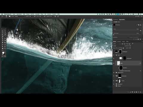
The video is only loaded from YouTube when you play it – data (including your IP address) is then transmitted to YouTube/Google. More in the privacy policy
Key Takeaways
- Soft transitions are created with layer masks at low opacity and a soft brush, not by erasing with a hard edge.
- With the Soft Light blend mode, you can build up brightness or darken selectively without distorting the image too much.
- Clipping masks ensure that adjustments affect only the wave and not the entire image.
- Irregularity looks more natural: gently varying softness prevents an artificial, uniform gradient.
- Color adjustments in Soft Light connect the foreground and background without overloading the wave with color.
Step-by-Step Guide
Step 1: Check the starting point and open the "Wave" group
First, open the "Wave" group in the Layers panel. The wave currently sits above the background, and you should be conscious of this arrangement before you change anything. Many layers were stacked on top of each other during assembly, so the order may seem unfamiliar at first. Over time, though, you will recognize which layer controls which part of the image. Before you start, take your time to click through the layers once and check their effect.

Step 2: Soften the fine transition at the water surface
The transition to the water surface is often still sharp-edged and gives away the composite. Work on this area with a layer mask and a large, soft brush in white to gently blend in the edge. Reduce the brush opacity to about ten percent. This way you build up the effect gradually instead of forcing it with a single stroke. Make sure the distracting artifacts no longer show through. It's fine if it is a bit irregular, because not every area needs exactly the same softness.


Step 3: Roughly trace the wave and blur it in places
Next, go over the entire wave once roughly. Where the transition still looks hard, you can apply a slight blur in places. Moderation is important here: a few areas may stay sharper, while others should become softer. This variation creates natural depth and prevents the impression of a uniformly edited object. You don't have to be perfect here, because the finer details come in the following steps.

Step 4: Build up brightness with a light layer
Now create a new layer above the wave and set its blend mode to Soft Light. You should keep the opacity very low, around three to five percent, so the effect stays subtle. The upper area of the wave is already somewhat brighter, and with this layer you gently reinforce that effect. If you paint with white, you lighten; with black, you darken. Work your way in slowly and check each stroke before continuing.


Step 5: Darken the depth at the bottom and connect it with the background
In the lower area of the wave, the background is very dark. So that the wave transitions smoothly into it, you darken the wave a bit at this spot. A clipping mask is essential: if you attach the layer to the wave correctly, the darkening affects only the wave. Without this mask, the change would affect the entire image, which you don't want. So paint carefully with a soft brush over the lower area and watch as the wave increasingly blends with the background. Apply the effect gradually until the transition looks calm and coherent.


Step 6: Making the Water More Irregular
So that the water surface doesn't look uniform, you deliberately make it more irregular. To do this, use a brush to paint slight differences in brightness in selected areas. Then you can create a layer with the blend mode Overlay. This method produces strong contrasts and makes the water appear clearer and more glass-like. It is a good choice if you want to increase the contrast without completely changing the colors. Compared to Soft Light, the result looks much more precise, so it is often the better option for the water surface.

Step 7: Adding Optional Wave Lines and Structure
In the next step, you can paint fine lines into the water to create additional structure. However, this is optional. Such details are often only noticeable when zooming in, and when viewed at normal size they are easily lost. Therefore, only use this step if the wave still looks too flat in the overall picture. Keep the lines subtle so that they support the composition and do not dominate it.

Step 8: Setting Up a Color Layer as a Clipping Mask
Now comes the color adjustment. To do this, create a new layer and likewise set it as a clipping mask on the wave. Name it something like "Color" for clarity. Set the blend mode to Soft Light and reduce the brush opacity to about ten percent. With this setting, you can transfer color from the depths into the wave without making it look garish. The advantage of this approach is that you can readjust the color effect at any time via the layer's opacity.


Step 9: Painting the Color from the Depths into the Transition
Now use the brush to pick the color from the lower area of the image and paint over the transition with it. The brush size should roughly correspond to the thickness of the wave, so the color looks targeted and not flat. Go over the transition zone a few times until the impression arises that the colors of the background are shining through in the wave. This step connects foreground and background in a way that feels almost unnoticeable. As a result, the outcome looks much more cohesive.
Step 10: Finishing Up and Checking the Overall Image
Finally, you look at the result in the overall image and check whether the wave has convincingly blended with the background. Switch the layers on and off individually to check. If something looks too strong, simply reduce the opacity of the relevant layer. More than this fine-tuning is usually not necessary on the wave. Once the transitions are smooth and the colors are matched, you have mastered the most demanding part of the poster.

Summary ??? Fine-Tuning the Water Wave: Harmoniously Blending Transitions and Color in Photoshop
You have now developed the water wave from an overlaid graphic into a part of the overall motif. You softened the transitions with masks, built up brightness in a targeted way with Soft Light, and darkened the depths. Using clipping masks, you limited the adjustments precisely to the wave, and with a color layer, you transferred the colors of the background. With these techniques, you can make any composite in a poster more believable.
FAQ
How can I tell if my clipping mask is set correctly?You can tell a correctly set clipping mask by the fact that the layer is indented in the panel and shows an arrow pointing to the layer below. Adjustments then affect only the wave and not the entire image.
Why should I keep the opacity so low when painting?A low opacity allows you to build up step by step. This way you avoid harsh jumps in brightness and keep full control over the transition.
When is Overlay a better choice than Soft Light?Overlay is suitable when you want more contrast and a clearer, more glass-like effect. Soft Light is gentler and fits better when you are looking for subtle changes.
Do I absolutely have to add the optional wave lines?No, the lines are not strictly necessary. They are mainly intended for fidelity of detail and often go barely noticed under normal viewing. Only use them if the wave still looks too flat.


