

Imagine a sphere that breaks in two halves at the moment of impact, while a glowing splash of color bursts out of it. You will recreate exactly this scene in this bonus chapter in Adobe Dimension CC. In doing so, you will review camera, transformation, materials, lighting, and render preview, and combine them into your own suspenseful composition.
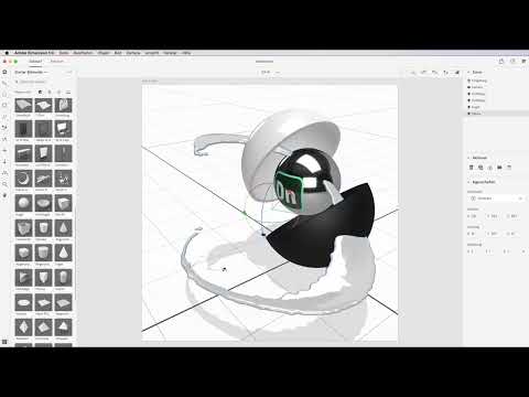
The video is only loaded from YouTube when you play it – data (including your IP address) is then transmitted to YouTube/Google. More in the privacy policy
The guide is structured so that you can take over the values from the video directly. However, you can also make your own decisions, because the goal is not an identical replica, but an understanding of the tools.
Key Takeaways
A fixed camera perspective saves time. Save the view you need for the final as a camera bookmark so that you can return to it at any time.
The pivot point determines how an object behaves. Set it to "centered" before you rotate or position objects.
Scaling with the lock icon stays proportional. Activate the lock so that all axes are scaled evenly.
Materials determine the look. Plastic looks glossy, while metal only becomes matte and high-quality with high roughness.
The render preview is indispensable. Draft mode shows shadows, reflections, and opacity only roughly. Therefore, check the preview regularly.
A targeted color accent is more powerful than many colors. Building the scene with few colors creates a calm, high-quality visual impression.
Step-by-Step Guide
Setting Up the Artboard and Camera
Start with an empty artboard and set it to a square format of 1500 × 1500 pixels. Then click into the artboard and press Ctrl or Command + 0 so that it fits the workspace.
Afterwards, set up the perspective for the final via the camera menu. The values from the video are: 45° field of view, 6 on the X axis, 10.5 on the Y axis, and 85.9 on the Z axis. For the rotation, use 4° for X, 5° for Y, and 0° for Z. Save this view via the star icon and name it, for example, "Cam 1". That way you can return to this perspective at any time later.

Shaping and Positioning the Hollow Sphere
Select the hollow sphere from the left palette and set the pivot point to "centered". You should not skip this step, because otherwise the object will rotate around the wrong center point. The cover shows a sphere that breaks in the middle as it hits the ground. You create this effect by rotating the half shells.
You can use the rotation tools to approximate the shape slowly. However, you will reach the goal faster with direct values. For the first hemisphere, enter 5.5 for position X, 6.9 for Y, and 0 for Z. Then rotate it by 7° on the X axis, 5° on the Y axis, and 37° on the Z axis. The sphere should not rest on the ground, but hover slightly in the air.

Creating the Second Hemisphere
Select the first sphere with the V key and create a direct copy. Two hollow spheres now appear in the Scene panel. Move the second half into the appropriate position. The values are: X −8.1, Y 19.7, and Z 0. For the rotation, set 0° for X, 180° for Y, and 120° for Z. Make sure that both halves stay on the same axis, otherwise the shape will quickly shift.
Inserting and Scaling the Center Sphere
Now drag the sphere from the library into the middle of your scene. It is initially far too large, so you activate the lock icon for the scale and enter 0.6. Since the lock is active, all axes are reduced evenly. You do not need to adjust the rotation for this sphere, as it is equally round from all sides.
For the position, set the sphere to −0.8 on the Y axis, 15 in the Y position, and −0.1 on the Z axis. The deviation on the Z axis is barely visible, but it ensures that the sphere sits cleanly between the two halves.

Assigning Materials
The upper hemisphere gets a white plastic material. Search for "Plastic" in the Materials panel, drag it onto the object, and set the base color to a brilliant white. The result looks slightly glossier than the default scene, which is exactly the desired high-gloss effect.
The lower hemisphere gets metal. Here the gloss is initially too strong, so you counteract it with the roughness slider. Set the roughness to about 62% so that the surface becomes matte. Then you darken the color; in the video, the instructor uses the hex value 363636. The middle sphere also gets a metal material, where you leave the properties unchanged.

Creating the Adobe Dimension logo in Photoshop
You build the logo on the middle sphere as a separate element. To do this, drag the logo from the Adobe Dimension library and shrink it if needed by dragging to the left while holding down the mouse button. If you want to use your own logo, for example that of Photoshop or InDesign, it works exactly the same way.
In the video, the logo is recreated in Photoshop. To do this, create an empty layer with a size of 200 × 192 pixels and take a screenshot of the logo. Then select the two shades of green with the eyedropper. For the basic shape, you take the rounded rectangle tool, set the foreground color to the green, and set the radius to 40 pixels.
Duplicate the layer and give the copy a light stroke of 10 pixels. You do not need a fill for this copy. For the lettering, use the type tool to write "Dim" on a new layer. Use the font Myriad Pro and the color white. Place another copy with light green color above it and reduce its opacity to about 30%. Finally, select all four layers, convert them into a Smart Object, and drag the result into your library.


Adding dynamics with splashes
Now bring three splashes into the scene via the starter assets. The large splash A swings around the sphere. Set its position to X 3.6, Y 12.5, and Z 1.2. Rotate it by 21° on the Y axis; the scale stays at 1. You place splash B in the empty space at the top so that the image doesn't look empty. For it, you choose a scale of 0.5 via the lock icon, and the position is X 6.8, Y 20.3, Z 0.3.
Splash C is the impact splash that lands on the ground. Shrink it to 0.7 and set it to X −10.1, Y 6.6, and Z 0. A slight rotation on the Y axis ensures that it doesn't collide too much with the other elements.


Adjusting the colors and opacity of the splashes
Double-click a splash to define its base color. You can paste the color code of the Dimension green from the clipboard. Set the opacity to 90% so that a slight shimmer shows through. You reduce the roughness to 3%. Repeat these steps for splash B and splash C. The opacity in draft mode is not final; in the rendering, the effect will look somewhat different later.

Designing the background with a gradient
Open the environment settings and select a background. Instead of a solid color, which quickly looks monotonous, you use a horizontal gradient. The foreground color is a dark black, the background color a slightly lighter gray-black. Drag the gradient from bottom to top while holding down the Shift key. If the light area is at the bottom, you can see the cast shadow better. Save the environment with Ctrl or Command + W and return to the scene.

Setting light sources
For the scene, you use three light arcs. Drag them onto the scenery and rotate them by 110°. The refraction effect is particularly visible when the arcs are at different angles. Since the scene looks rather dark without sunlight, you additionally add a sunlight. Activate it at the bottom in the light options.
In the Color panel, choose a bright white for the color that creates a warm feel. Reduce the intensity to 80% so that not everything is overexposed. Set the cloudiness to 40% so that the light looks diffuse, as if through curtains. You set the altitude to about 6° so that the sun is low and the shadow falls long toward the back. A rotation of 30° suits the overall picture.

Fine-tuning the floor reflection and shadow
Activate the ground plane and open the settings for shadow and reflection. You set the opacity of the reflection to 15%. The splash effect from the floor then looks like a subtle reflection. At 15%, the reflection is already clearly visible, so you should not set it any higher. You reduce the roughness of the reflection to 10% so that the image does not look like an exact copy.

Adding abstract objects and groups
In the portfolio, you will find numerous objects. Choose an abstract droplet, scale it smaller and move it onto the ground plane. Make sure that it does not sit directly in the reflection, but is placed slightly offset to the right. A brass material fits the composition well.
Another addition is a sphere, which you scale to 0.1 and place directly on the floor. A torus, which you shrink to 0.2, completes the planetary system. Arrange both objects in a group by selecting them while holding the Shift key and pressing Ctrl or Command + G. Rename the group, for example, to "Saturn". You can move, rotate and scale the group together.


Using the render preview and moving on to the final
Open the render preview before adding further details. It shows errors in shadow, reflection and positioning that are not visible in draft mode. The Photoshop-quality preview can take about an hour and a half, whereas a low-quality PNG preview takes just a few minutes. Export the scene for Photoshop as a PSD so that you can edit layers and material masks afterwards.


Summary – Adobe Dimension: Recreating a product cover step by step
In this chapter, you have learned how to recreate a dynamic product cover using fixed camera perspectives, exact transformation values and suitable materials. The setup of a few colors, a contrast of high gloss and matte, and targeted light sources makes the scene come alive. The rest is up to you: free design with additional objects is expressly your playground.
FAQ
Why is the pivot point set to "centered" so important?Without a centered pivot point, the object rotates around the wrong axis, and the hemispheres no longer fit together.
What does the lock symbol do when scaling?With the lock activated, all axes are scaled uniformly so that the object keeps its proportions.
Why does the metal sphere look too shiny in draft mode?Draft mode only shows material properties in a simplified way. Increase the roughness and then check the result in the render preview.
How much time does the render preview need?A high-quality preview for Photoshop can take about an hour and a half. A low-quality PNG preview is much faster.
Why shouldn't the reflection be too strong?An opacity above 15% quickly looks exaggerated and distracts from the actual subject. A low roughness, on the other hand, makes the reflection look like an exact copy, so you set it a little softer.
Can I use my own logo instead of the Adobe Dimension logo?Yes, it works the same way. The look and the contrasts are more important than the specific logo.
