
A compass only looks credible when the cardinal directions are neatly placed and a pane of glass lies over them. That is exactly what this fifth part of the series is about: you label the four cardinal and four intercardinal directions, align them with guides, and then add the glass layer. With a clipping mask, a circular gradient, and the blend mode "Screen," you create a shine that gives the pane a three-dimensional look.
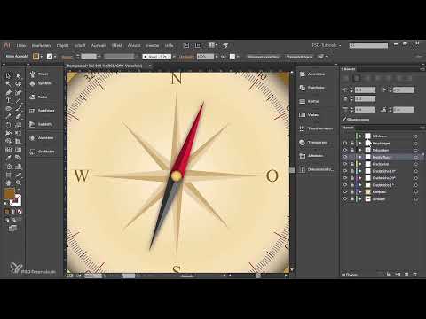
The video is only loaded from YouTube when you play it – data (including your IP address) is then transmitted to YouTube/Google. More in the privacy policy
You don't need any prior knowledge of gradients or clipping masks for this. The steps build on each other logically, and at the important points I explain why I do something this way and not another.
Key Takeaways
The labeling sits on its own layer so that you can edit it independently of the compass. Guides help you align all the letters neatly. A clipping mask restricts the glass layer exactly to the circular shape. With a circular gradient in the "Screen" mode and reduced opacity, the typical shine of a glass pane is created.
Step-by-Step Guide
Creating the Label Layer and Placing North
First, create a new layer above the pointer layer and name it "Beschriftung" (Labeling). Then select the Type tool, click on the top of the compass face, and type "N" or "North." The font will be adjusted later, so the position is more important than the appearance at the moment.

Setting Guides for Alignment
So that all directions lie on a common axis, switch to the layer with the guides and drag a horizontal line to the position of the north label. You place a second line at the bottom edge of the compass. This way you can immediately see whether north and south are exactly centered. The guides serve only for orientation and will be hidden again later.

Defining Font and Color
Now the typography of North is adjusted. Choose the font Times New Roman, set the size to 10 pt, and assign a darker color that matches the compass. A subdued color looks more high-quality than pure black on a light background. You can readjust the settings at any time in the Character or Paragraph panel.

Duplicating South and Centering It
You copy the finished letter for North downward while holding the Alt key. This preserves the formatting, and you don't have to set everything up again. Then type "S" or "South" and align the paragraph to center. This prevents a longer word from shifting to the left or right later.

Placing West and East
For West and East you proceed the same way: copy the letter to the left side and insert "W." On the right side follows the "O" for Osten (East). You first set the positions by eye and then check them with the guides. A small distance from the edge looks more harmonious than a letter stuck directly to the edge of the circle.

Optimizing the Distances to the Edge
Turn off the guides briefly and look at the result without them. Often East then looks too close to the edge, so you pull it slightly inward. Likewise, you can move the north label upward so that it doesn't appear too crowded. There is no fixed rule here. What matters is that all four cardinal directions look balanced.

Creating the Intercardinal Directions
For the intercardinal directions, you copy one of the main letters and make it significantly smaller, for example to 8 pt. In addition, you lower the opacity to 70 percent. This way the intercardinal directions visually stand out from the cardinal directions. Then type "NW" into it and place the text diagonally in the upper left area.

Add Northeast, Southeast, and Southwest
Copy the Northwest to the right while holding down the Shift and Alt keys to keep the formatting and the same height. Change the text to "NE" and move it a bit to the left until it fits the shape of the circle. Then duplicate the Northeast downward for "SE" and afterward to the left for "SW". Make sure that all intermediate directions have a similar distance from the circle.

Fine-tuning the position
Hide the guides again and look at the whole compass. Southeast and Southwest can usually be moved a bit further down, while Northeast and Northwest belong a little higher up. A circle as a guide would help you place all intermediate directions evenly on one track. For this step, however, your eye is perfectly sufficient.

Create the glass layer and reflection layer
Now create two new layers above the main pointer layer. Name the lower one "Glass" and the upper one "Reflections". Lock the labeling layer and the compass so that you don't accidentally move anything. We begin with the glass layer, since it forms the foundation for all further effects.

Transfer the circle shape to the glass layer
Drag the original circle of the compass into the glass layer while holding down the Alt key, so that a copy is created. You lock the original layer in the process. To keep only the basic shape, delete the remaining outlines via the Outline palette. In the end, only the circle remains, which is to serve as a mask.
Create a clipping mask
Select the circle in the glass layer and click the clipping mask icon at the bottom of the Layers panel. The path thereby turns into a clipping path. From now on, every object in this layer is only displayed within the circle. You test the result by dragging a colored circle into the layer. It appears exclusively within the mask, no matter where the mask is located in the layer.

Draw ellipses for the gloss effect
Now draw an ellipse that creates the light reflection. Place it so that its center lies exactly on the edge of the circle. This is important so that the gloss looks like a curvature of the glass. Repeat the process at the bottom of the compass with a slightly smaller ellipse. The shape may well be slightly irregular, because real reflections are rarely perfectly round.
Define a radial gradient from white to black
Assign the ellipse a radial gradient that runs from white to black. Then check whether the black is really deep black, because only then does the effect work reliably. You determine the gradient direction with the Gradient tool by moving the color stops.

Activate the blend mode "Screen"
Open the Transparency palette and switch the mode to "Screen". This makes all black areas transparent, while the midtones partially show through. You set the opacity to about 70 percent. The compass now shimmers through the glass without the labeling being covered.

Add extra shimmer and finishing touches
For the lower area, you repeat the gradient, adjust the size, and reduce the opacity to 60 percent if necessary. You can also simply copy the upper ellipse and place it at the bottom. Many paths lead to the goal here, and the values can be adjusted at any time later. What matters is that the gloss does not become too dominant.

Check the interim result and prepare the reflection layer
Take a calm look at the result. The glass pane should now lightly overlay the compass without making it unreadable. Then lock the glass layer and open the reflection layer. There, in the next part, you will build up the actual reflections that complete the glass impression.

Summary ??? Compass in Illustrator: Labeling the Cardinal Directions and Designing the Glass Pane
In this part, you placed the cardinal directions on a separate label layer and aligned them using guides. Then you limited the glass layer to the circular shape with a clipping mask. Ellipses with a circular gradient in the "Screen" mode provide the first shine. In the next part, the reflections follow, which give the pane the final finishing touch.
FAQ
Why do I need a separate label layer?It can be edited, locked, and moved independently of the compass, without changing the base shape.
Do I have to remove the guides at the end?No, you just hide them. They are not exported as long as they are invisible.
What happens if I move the object in the glass layer?It remains visible only within the clipping mask. The mask itself does not change, unless you edit it directly.
Why does the black value of the gradient have to be pure black?In the "Screen" mode, black areas become transparent. A dark gray value would therefore weaken the effect.
Can I still change the opacity later?Yes, the transparency settings can be adjusted at any time via the Transparency panel, even after you have applied the gradient.


