
A flat lettering quickly looks inconspicuous. With a few effects in Adobe Illustrator, you turn it into a three-dimensional-looking object that then glows like a real neon tube. In this guide, I walk you through the second part of the tutorial. You will learn how to make the text spatial using the 3D effect, duplicate layers for the lighting effect, and create a glow with stylization and blur filters. Finally, you add highlights using ellipses and gradients. The guide is suitable for beginners with basic knowledge of Illustrator who know how layers and panels work.
The video is only loaded from YouTube when you play it – data (including your IP address) is then transmitted to YouTube/Google. More in the privacy policy
Key Takeaways
A text does not necessarily have to be converted into a symbol for 3D effects and color changes, but in this case you change colors via the symbol. The 3D effect, the layer modes, and the filters in the Appearance panel are the heart of the neon look. The depth of the glow is created by multiple stacked copies with different opacities.
Step-by-Step Guide
Step 1: Select the text and open the Appearance panel
Start by selecting your text. You can click it directly on the artboard. If the layer list is very long, it helps to click on an empty area in the Layers panel so that the object is selected. This will save you a lot of searching time later.

Then open the Appearance panel via Window and Appearance. If the checkmark is missing, simply activate it. In this panel you see all effects and properties applied to your object. This is exactly where you will continue working in the next steps.

Step 2: Adjust the color via the symbol
With a normal text, you could change the color directly in the Appearance panel. Since your text has already been converted into a symbol, that doesn't work. Instead, you change the color in the symbol itself. You do this by opening the symbol and adjusting the fill color there. Your object then adopts the new color. With this method, you can readjust the hue at any time without rebuilding the effect.

Step 3: Apply the 3D effect via Extrude and Bevel
You find the 3D effect via Effect, then 3D and Materials, and there Extrude and Bevel. This path leads to the same result as the detour via the Appearance field. The dialog box shows you a preview. Make sure to activate the Preview option so that you can see what is actually happening. As soon as you rotate the cube in the dialog box, the display of your text changes in real time. The colored face of the cube corresponds to the front of your text.

Step 4: Set rotation and perspective
For a three-dimensional effect, you enter the rotation angles directly in the dialog box. You use 20 degrees for the upper rotation, 18 degrees for the middle rotation, and 0 degrees for the lower one. This creates a straight line that gives the text a three-dimensional base. Then you increase the perspective to 20 degrees so that the depth appears stronger.

The extrusion depth determines how far the object extends into space. At 50 points, the effect looks rather flat. Set the value to 210 points, and you achieve clearly visible depth. Also decide whether the body should be open or closed at the front and back. For a solid lettering, choose the closed variant.
Step 5: Refine the bevel and lighting
The bevel determines the shape of the side faces. Before you change it, you improve the lighting so that the details are easier to see. Increase the highlight to 80 percent and set the blend steps to 100. This way you avoid visible color jumps in the gradients, and the transitions become much smoother.
Then, for the bevel, choose the option Complex 2 and set the height to 18 points. The text looks bolder as a result, and the light reflections on the edges already look great. Confirm the settings with OK.

To pan and zoom in the workspace, hold down the Alt key and use the scroll wheel. This keeps your focus on the object without having to constantly switch tools.

Step 6: Duplicate the object and set the layer modes
For the neon look, you need several copies of the 3D object. The fastest way to create them is to drag the object over itself while holding down the Alt key. Alternatively, copy it with Ctrl+C and paste it in front three times with Ctrl+F. Hide the copies at first so that you keep track of everything.

Now work your way from bottom to top. Open the Transparency panel via Window and Transparency. There you select blend modes, similar to Photoshop. Set the bottom copy to 35 percent opacity and the mode to Screen. This makes the object slightly darker and forms the basis for the glow.

The next copy, your actual neon layer, gets an opacity of 90 percent. Also set to Screen, it again looks similar to before. The trick follows in the next step.
Step 7: Create glowing edges using the Stylize filter
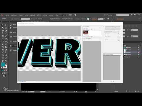
Now comes the actual glow effect. Select the neon layer and go to the Appearance panel. Make sure to use the filter under Effect and Stylize, specifically the entry in the group of Photoshop effects. You can recognize these pixel effects by their position further down in the list. The Glowing Edges entry opens a dialog box with a preview.

Set the Edge Width to 10 and the Edge Brightness to 20. Leave the Smoothness at 1. Confirm with OK. The calculation takes a moment, after which a glowing look appears. You can show and hide the effect at any time using the eye icon to compare the result.
Step 8: Apply Gaussian Blur for the glow
For the next copy, set the opacity to 100 percent and the layer mode to Screen again. This makes the object somewhat brighter. In the Appearance panel, select the Gaussian Blur filter. It is located under the blur filters. Activate the preview and increase the radius to 120 pixels.

After a short wait, the object begins to glow, especially in the middle. It becomes darker toward the outer edges, which corresponds to a realistic glow. Leave the setting as it is and close the panel.
Step 9: Second edges layer and radial blur
Set the next copy to 80 percent opacity and the mode to Screen. Then apply Glowing Edges again, this time with a smaller Edge Width of 3. You keep the remaining values from the previous step.

Next comes the radial blur via Effect, Blur filters and Radial Blur. Choose the Spin option and the quality Best. An amount of 47 offers a good balance. Confirm with OK. A soft, powerful effect appears at the edge. Note that Illustrator recalculates these pixels with every change. This may take a while, but it is normal.

Step 10: Add highlights with ellipses
For additional highlights, create a new layer and name it, for example, Highlights. Above it, create another layer for the color effect. Now select the Ellipse tool from the toolbar. Alternatively, simply press the L key.
Hold down the Shift key while dragging to create perfect circles. By also holding down the Spacebar, you can move the circle while drawing it. This way you place it exactly where the shine should appear. Make sure to choose spots that are bright anyway, such as edges and corners. Shadows are less suitable for this.

Step 11: Set up the black-and-white gradient
The ellipse is initially filled with red. In the swatches, select a black-and-white gradient. So that the gradient works as a highlight, open the Gradient panel via Window and Gradient and change the type from Linear to Center-Radial.
The black is often not a pure black. Therefore, double-click the black color stop and check the RGB values. If the values are around 30, drag the sliders to zero so that you get a deep black. You can move the gradient using the handles. A white handle further to the right enlarges the white area, while the black handle determines the extent of the dark area.

Then, in the Transparency panel, switch from Normal to Screen. The gradient now disappears into the background, and the highlight looks embedded. If you still don't like it, adjust the Gradient panel again.

Step 12: Duplicate and fine-tune highlights
If you duplicate the ellipse while holding down the Alt key, you can quickly place more highlights. Adjust the size of each copy by holding Shift and Alt and dragging at the edge. This keeps the circle proportional and centered. Vary the gradients slightly so that the light points don't look identical.

At the end, look at the overall picture and decide whether you want to add more highlights or remove individual ones. With the right mix of brightness and placement, a convincing neon text emerges.

Summary ??? Three-dimensional neon text in Adobe Illustrator
In this tutorial, you learned how to give a flat lettering a spatial look using the 3D effect. You set rotation, perspective, and depth and refined the beveled edge. Afterwards, you stacked several copies with blending modes and opacities. With Glowing Edges, Gaussian Blur, and Radial Blur, you create the glow. Ellipses with gradients add the final highlights. Feel free to experiment with the values, because every text and every color requires slightly different settings.
FAQ
Why can't I change the color of my text directly in the Appearance panel?The text was converted into a symbol, so you change the color in the symbol itself.
What is the difference between effects in the Effect menu and the Photoshop effects?The upper effects are vector effects, while the lower Photoshop effects work with pixels and create filters such as Glowing Edges or blurs.
How do I quickly create multiple duplicates of an object?Hold down the Alt key and drag the object over itself, or copy it with Ctrl+C and paste it in front three times with Ctrl+F.
Why does applying blurs sometimes take so long?Illustrator converts the vector data into pixels anew for pixel filters with every change, which takes some time for complex objects.
How do I achieve a deep black in the gradient?Double-click the black color stop and reduce the RGB values to zero so that no residual tone remains.


