
Your 3D text already glows, but the colors still look a bit monotonous? Then you've come to the right place with this part. Starting from a blue neon text, I'll show you how to create a colorful rainbow look using a color effect layer, adjust the transparency of the 3D effect, and still change the text easily after designing it. The tutorial is based on the third part of my tutorial series and assumes that you have already built the neon text with the highlights and the 3D effect.
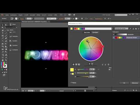
The video is only loaded from YouTube when you play it – data (including your IP address) is then transmitted to YouTube/Google. More in the privacy policy
Key Takeaways
- The 3D effect can be readjusted at any time via the Appearance panel, for example by making the front and back transparent.
- A color effect layer with a gradient laid over the text turns a single-color neon text into a colorful glow.
- The "Color" blend mode merges the gradient area with the text so that the colors appear directly in the lettering.
- With the "Recolor Artwork" function, all colors can be adjusted specifically and independently of each other.
- By working non-destructively, the text remains editable, and the design adapts automatically.
Step-by-Step Guide
Step 1: Open the 3D effect in the Appearance panel
First, activate the top text layer of your neon text and open the Appearance panel. There you will find all the effects that have been applied to the text. Double-click the 3D effect to open the settings again. The 3D function is the key to controlling the depth and appearance of the letters.

Step 2: Make the front and back transparent
In the "Cap" section of the 3D dialog, now select the transparent style. This makes the front and back of the letters look see-through rather than solid. Confirm the change with "OK". You will notice that you can now look deeper into the inside of the individual letters, which gives the neon effect more luminosity.

Step 3: Compare the difference with the original version
A direct comparison helps you find the right transparency. Briefly undo the change to see the solid version, and then apply it again. The transparent version usually looks more vivid, but whether you prefer the solid or the transparent version is purely a matter of taste. Adjust the value so that your text looks harmonious to you.

Step 4: Prepare and lock the color effect layer
Before you work with the colors, open the Layers panel and select the color effect layer. Lock all other layers so that you don't move them accidentally. Then use the Rectangle tool to draw a rectangle that is larger than your text. While doing so, hold down the space bar to move the rectangle as you draw until it sits optimally over the text.

Step 5: Choose a rainbow gradient from the Swatch library
Select the rectangle and open the Swatch library via the menu. There you choose "Gradients" and then the "Spectrums" category. The rainbow gradient is the right foundation for a colorful neon look. Click it so that it is applied to the rectangle. A radial gradient, by the way, would also be an interesting alternative that you are welcome to try out.

Step 6: Merge the gradient area with the text
So that the colors appear only in the text and don't lie over everything as a colored rectangle, open the Transparency panel. There you change the blend mode to "Color". Now the gradient area merges with the lettering. Briefly hide the rectangle once for comparison to see how much the effect has changed. With the many colors, the text now looks much more vibrant.

Step 7: Adjust the gradient colors in the gradient field
Now you can edit the gradient colors directly in the gradient field. Select the gradient area, open the Gradient panel, and adjust the individual color stops. You can, for example, replace the pink with green, yellow, or blue. If you drag the color stops sideways, the proportion of the respective color in the text shifts. This way you can specifically strengthen the blue or push the yellow further to the left until the result matches your vision exactly.

Step 8: Fine-tuning the colors with "Recolor Artwork"
When you select the gradient area, you will find an inconspicuous icon labeled "Recolor Artwork" in the control panel at the top. Click on it to open a dialog. If the grayscale color group is currently active there, select the vibrant colors instead. You can then adjust the colors using the sliders or change them in detail via "Edit". By default, all colors are harmoniously linked with one another. If you drag one color, all the others move along with it, which gives the result extra punch.

Step 9: Editing individual colors independently of one another
If you want to control each color separately, click the icon for unlinking harmony colors. After that, you can move each color individually. For example, swap the orange for green or the pink for yellow. Your creativity is the only limit. Feel free to try out different combinations until you like the design.

Step 10: Changing the text afterwards via the Symbols panel
A major advantage of this design is that it can be changed afterwards. Unlock the layers and open the Symbols panel. There you will find the original text as a symbol. Double-click on it to edit the content. Change the text to "Licht", for example, and confirm your input. Illustrator now needs a brief moment to recalculate the pixel effects, the radial blur, and the glowing outlines. This is because, although Illustrator is a vector program, you have applied numerous pixel effects here.

Step 11: Adjusting the highlights to the new text
After changing the text, you should check the light points of the highlights again. Move them to the appropriate places, adjust their size, and position them so that they fit the new lettering. This step takes only a few seconds, and afterwards the entire design works flawlessly again.

Step 12: Working non-destructively
Finally, an important tip from practice: Work non-destructively in Illustrator and Photoshop whenever possible. If you use effects, gradients, and symbols, you can change the entire image with just a single change, as shown in the example with the text. That is exactly what makes this technique so convenient. You don't have to build anything from scratch, but simply adjust the parameters.

Summary – Neon text in Adobe Illustrator: Changing colors and text afterwards
With a color effect layer, a rainbow gradient in the "Color" blend mode, and the "Recolor Artwork" function, your blue neon text becomes a colorful glowing object. The transparent 3D finishing surface gives the text additional depth. Thanks to symbols and non-destructive working, you can change the lettering at any time without rebuilding the design.
FAQ
Why does it take a moment after a text change?Illustrator has to recalculate the many pixel effects, the radial blur, and the glowing outlines because these effects are applied to the text.
Can I completely change the colors afterwards?Yes, all colors can be replaced at any time via the gradient in the gradient panel or via "Recolor Artwork".
Do I have to lock the color effect layer after creating it?It is not strictly necessary, but it is recommended. This way you won't accidentally move the layer while working on the text.
Why should the blend mode be set to "Color"?The blend mode ensures that the colors only become visible within the text and do not lie over the entire area as a colored rectangle.
What happens if I unlink the harmony colors?After that, you can adjust each color independently of the others, for example replacing orange with green, without the remaining colors changing along with it.


