
Handwritten grass lettering looks alive because every stroke looks a little different. In this second part of the tutorial, you build exactly this effect yourself. You use the basic elements from the first part, turn them into an art brush, and write a word with it using a graphics tablet. Afterwards, you give the text a drop shadow, decorate it with flowers and insects from the symbols library, and place a gradient behind it.
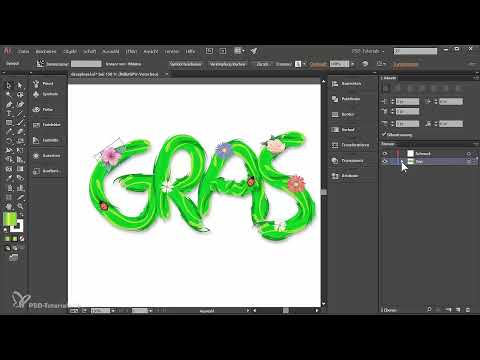
The video is only loaded from YouTube when you play it – data (including your IP address) is then transmitted to YouTube/Google. More in the privacy policy
This guide is aimed at Illustrator users who know the basics of brushes and layers. A graphics tablet is helpful, but a mouse works just as well. The values and colors are examples. You can and should adapt them to your own style.
Key Takeaways
- Save colors before you delete elements by placing them in the Swatches panel.
- An art brush with the "Hue Shift" method takes on the color shading of your base artwork.
- Write with the brush on its own layer and give it a meaningful name, for example "Text".
- The drop shadow is set up via "Appearance" and "FX" with Preview enabled.
- Symbols can be given the appearance of another object by Alt-dragging.
- A background with the "Color" blend mode prevents the gradient from coloring the background.
Step-by-Step Guide
Step 1: Save Colors
Before you remove the two basic elements from the first part, save the colors. To do this, open the Swatches panel via Window > Swatches. Drag the darker and the lighter shade individually into the panel using drag and drop. It is best to arrange them next to each other. Afterwards, you can select and delete the elements, and the colors will remain available to you.

Step 2: Paint Details with the Dark Brush
Select the Brush tool and, in the Brushes panel, choose the brush you want to use, in this example the slightly darker one. Set the matching dark color and paint a few details onto the base. The brush responds to the pressure of your graphics tablet, so you can work with lighter and heavier strokes.

Step 3: Use the Light Brush
Now select the light brush. Make sure to adjust the stroke color so that it matches the light color. Apply the brush at various places in the image, rotating and distorting it until the shape is right. Illustrator handles the scaling automatically. Take your time with this and experiment.

Step 4: Define a Lighter Green Shade with HSB
If you want an alternative color, select the active brush with the selection active and open the color values via HSB. There, increase the brightness slightly until you like the tone. The color value I use in the video is R 94, G 181, B 0. With this tone you can add more details, which may overlap a little.

Step 5: Create the Art Brush
Once your base is finished, select everything. You can drag a frame around the elements with the Selection tool or simply click on an empty area in the layer. Then open a new brush via the Brushes panel menu and choose the type "Art Brush". Name it, for example, "Grass Brush". Set the pressure options so that the thickness of the brush is determined by pressure, and enable "Stretch to Fit Stroke Length". The direction should point to the right.

Step 6: Use the "Hue Shift" Method
Choose "Hue Shift" as the method. This lets you set the color of the brush directly. Select blue, for example, and Illustrator adjusts all the colors. The lighter areas become somewhat lighter, and the dark ones correspondingly darker. Confirm with OK. Test the brush by drawing on an empty area. The stroke can be recolored later if needed, without the brush losing color depth.

Step 7: Write the Text
Choose your brush and the green color you want. Create a new layer or rename the empty brush layer to "Text". Now draw letter by letter with the brush tool. Place the pen down anew each time you don't like a letter. With the example word "Gras", it's a good idea to draw the "a" first as an arc and then as a stroke. This order looks more natural.

Step 8: Add the Drop Shadow
Select the entire text and open the Appearance palette via Window > Appearance. Click on FX there and choose Stylize > Drop Shadow. Activate the preview so you can see the changes directly. As guideline values, use an opacity of 36%, an X offset of 1 mm, a Y offset of 2 mm, and a blur of 1.2 mm. The mode is "Multiply", the color black.

Step 9: Get Symbols from the Library
To decorate the text, open the Symbols palette via Window > Symbols. By default, you will find six symbols there. Via the palette menu, under "Open Symbol Library", you can choose further categories, such as "Flowers" or "Nature". The Nature category also contains grasses and insects. Simply drag the symbols you like into your document.

Step 10: Place, Scale, and Rotate Symbols
It is best to place the symbols on their own layer, for example "Decoration". Hold down the Shift key while scaling at the edge so that the proportions are preserved. To rotate a symbol, move the mouse just outside the corner until the cursor changes. Distribute flowers in different sizes and rotations so that they don't look identical. Ladybugs crawling across the text also look lively if you scale them a bit smaller and rotate them in the right direction.

Step 11: Transfer the Drop Shadow to the Symbols
So that the symbols also receive shadows, you select each individual symbol and apply the drop shadow via the Appearance palette. There is a faster way: The circle next to a symbol in the Layers palette indicates which appearance is stored there. Hold down the Alt key and drag this circle by drag-and-drop onto other objects. Each element thereby receives its own drop shadow without you having to enter the values again.

Step 12: Create a Background for the Gradient
The gradient only works properly in blend mode if there is a background underneath. Therefore, create a "Background" layer at the very bottom. Above it, at the top, create an effect layer. In the background layer, draw a rectangle with a white fill and no stroke. Copy it to the effect layer while holding down the Alt key so that both lie exactly on top of each other.

Step 13: Design the Color Gradient
Open the Gradient palette and choose a linear gradient. Using the color stops, define a shade of green at the left edge and a second shade of green at the right edge. In the middle, you place a light yellow or yellow-orange by clicking on a free area in the gradient slider. The shifting of the color stops determines how much green and how much yellow are visible. The gradient can also be rotated and moved with the Gradient tool.

Step 14: Set the Blend Mode and Transparency
Open the Transparency palette via Window > Transparency and set the blend mode of the rectangle to "Color". If needed, reduce the opacity if the gradient seems too strong to you. Drag the flower layer all the way to the top if you want its original colors to become visible again. You can select the rectangle again at any time and change the colors, for example to a red for an evening mood or an autumnal variant.

Summary ??? Grass Text in Illustrator: Creating Your Own Brush and Decorating Text
In this tutorial, you learned how to build an image brush from basic elements, write handwritten grass text with it, and give the text a lively touch with drop shadows and symbols. With the color gradient in the background, a harmonious overall picture emerges. Try out the values, change colors and symbols, and continue developing your own style.
FAQ
Do I need a graphics tablet for this grass lettering?A graphics tablet is recommended because the brush responds to pen pressure, resulting in more natural strokes. The technique also works with a mouse, but the results will look more uniform.
How do I save colors before I delete elements?Drag the desired colors via drag and drop into the Swatches panel, which you can find under Window > Swatches. They stay there even if you delete the base elements.
Why should I write the text on its own layer?With its own layer, for example "Text", you keep a better overview while editing. You can also show and hide it selectively without affecting other elements.
What is the "Hue Shift" method for the image brush used for?It adapts the brush's colors to the selected color while retaining the differences in brightness. This way, light and dark areas still look three-dimensional.
How do I copy a drop shadow to other objects?In the Layers panel, hold down the Alt key and drag the Appearance circle onto the target object. The appearance is copied, and you don't have to make the settings again.
Why does the gradient need a background?The "Color" blend mode only affects elements that lie beneath it. Without a background, an unwanted effect occurs in the background. With a white rectangle as a base, the mode works as desired.
Where can I find more symbols for my embellishments?You open the panel via Window > Symbols. In the panel menu, select "Open Symbol Library" and choose categories such as Flowers or Nature there.


