
Imagine you want to reword a neon sign lettering later, and all copies in the design change along with it. That is exactly what I'll show you in this tutorial. You set up a document for high-resolution graphics, design a text, and save it as a symbol. This way your design stays editable at any time, without you having to correct each layer individually. This first part takes about eight and a half minutes and lays the foundation for the later neon effect.
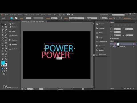
The video is only loaded from YouTube when you play it – data (including your IP address) is then transmitted to YouTube/Google. More in the privacy policy
Key Takeaways
- A document of 3508 × 2480 pixels at 300 PPI corresponds to the A4 format in print quality and ensures sharp raster effects.
- The color mode depends on the intended use: RGB for the screen, CMYK for print, but only after consulting with the print shop.
- You should lock background layers so that you don't move them accidentally.
- A text saved as a symbol can be changed in all places at the same time.
- You can break the link to a symbol if needed, if a single instance is to become independent.
Create a new document
Open a new document via "File > New". Immediately assign a meaningful name, such as "Neontext". This saves you searching later when you have several projects open at the same time. You set the size and the raster effects in this window, and this is where it is decided how sharp your result will look in the end.

Set pixel dimensions for high resolution
First, switch the unit to pixels. Then you'll see how large an A4 sheet actually is at 300 PPI, and it is considerably more pixels than you might expect. Therefore enter 3508 pixels as the width and 2480 pixels as the height. This gives you the A4 format at print resolution. In landscape format the graphic remains easy to read and is suitable for both screen and print.
Select color mode
For graphics that you mainly use on the computer, choose RGB. If you later have the file professionally exposed or printed, I recommend CMYK. However, be sure to check with your print shop beforehand which color space it needs, because a wrong choice noticeably changes the colors.
Set raster effects to 300 PPI
In the same window you will find the setting for the raster effects. Choose the highest value here, i.e. 300 PPI. Illustrator then renders effects such as drop shadow or blur in high quality. This is important because the neon look thrives heavily on soft glow transitions. Then confirm with "OK", and you get your artboard.
Show the Layers panel and name the background
If the Layers panel is not visible, open it via "Window > Layers". Layer 1 is located there automatically. A double-click on the name allows you to rename it to "Hintergrund" (background). This name helps you keep track once you have created more layers.

Distinguish between fill and stroke
An object in Illustrator has two properties: a fill and a stroke. That sounds simple, but it is a common source of errors. Before you assign a color, therefore check in the toolbar whether the fill or the stroke is active. To do this, click specifically on the desired field. The behavior is not always obvious, and that is exactly why you should repeat this check with every color change.
Remove the stroke and fill the background black
You don't need a stroke for the background. So select the stroke and set it to transparent using the "None" field or the corresponding icon. Then activate the fill and choose black. A white background would swallow the neon effect, because glowing colors only look really strong against a dark background.
Fit the rectangle exactly to the page
Take the Rectangle tool and drag out a rectangle that covers the entire artboard. With the smart guides you'll find the way faster. You activate them via "View > Smart Guides". As soon as you move the rectangle, it snaps to the edge of the artboard. This makes it easier to position all objects cleanly as you go on.

Lock and hide the background layer
In the Layers panel, click the small arrow to reveal the contents of the layer. Then lock the layer using the lock icon. This way you can't accidentally move it later. With the eye icon you hide and show layers again, which is useful when working with multiple layers.

Create a new layer for the text
At the bottom of the Layers panel, use the new layer icon to create your own layer and name it "Text". Always separate background and text into different layers. This makes any later correction considerably easier.
Activate the Type tool and enter text
Select the Type tool or simply press the T key. Then click in the center of the artboard and type your lettering, for example "Power". Then enlarge the font significantly, to 476 pt in the video. Since the foreground color is still black, you initially won't see the text on the black background. This is normal and not an error.
Set the text color
Double-click the fill color swatch and set the color using the RGB values. In the tutorial I use 0 for red, 183 for green, and 241 for blue. This gives a nice light blue that prepares the neon effect. Make sure you color the fill and not the stroke of the text.

Position the text and check character spacing
Place the text in the center of the artboard and choose a clear font that suits your design. Then open the Character panel and check the character spacing. The "Optical" setting leads to a harmonious typeface in most cases. Leave it as it is if you like it.

Save the text as a symbol
Here lies the real trick. Open the Symbols panel and drag your text layer into it. Give it a name like "Neontext" and choose "Graphic" as the export type. Confirm the symbol with "OK". Then you can delete the text layer and drag the symbol onto the artboard. The text remains visible but can no longer be edited directly, and that is exactly the advantage, because the symbol stays linked to its copies.

Create duplicates and edit centrally
Hold down the Alt key while dragging a layer onto itself to create duplicates. All copies are linked to the symbol. Double-clicking the symbol in the Symbols panel opens it for editing. Change the text there, for example from "Power" to "Licht", and all linked instances update automatically. This saves a lot of time as soon as a design includes several variants.
Break the link if needed
Sometimes a single copy should become independent. To do this, select the relevant instance and use the "Break Link to Symbol" option. After that, this copy no longer changes when you adjust the main symbol. With "Undo" you can restore the link at any time, as long as you haven't completed the step yet. This way you work non-destructively from the start.

Summary – Neon text in Illustrator: Set up the document and text as a symbol
You have created a document with a print-ready resolution, cleanly separated background and text, and saved a lettering as a symbol. This allows you to make changes centrally, and you keep control over all variants. The next part deals with the actual neon effect, for which this preparation forms the foundation.
FAQ
Do I always have to create the document at 3508 × 2480 pixels?No, this size corresponds to A4 at 300 PPI. For screen-only graphics, smaller dimensions are often enough. For print, however, you should orient yourself to this resolution.
Should I choose RGB or CMYK?Choose RGB if the graphic will mainly be used on a computer. For print, CMYK is recommended, but only after consulting with the print shop.
Why can't I see my text after typing it?The foreground color is often black and therefore sits on the black background. Change the text color, and the text will become visible.
What is the benefit of saving the text as a symbol?A symbol can be changed in all places at once. So you don't have to edit each copy individually.
Can I break the link of a symbol again?Yes, with the "Break Link to Symbol" option an instance becomes independent. As long as you haven't completed the step, you can undo it via "Undo".


