
An architectural photo often only gains expression when you don't edit the entire image evenly, but treat each area according to its role. That is exactly what this section of fine-art editing is about. You work with selections you have already created and refine the contrast of individual areas with curves and levels adjustments. The sky, the main façade, and the edges in the foreground each receive exactly the treatment they need. The tutorial is based on a video of just under nine minutes and guides you step by step through the process.
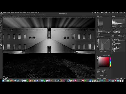
The video is only loaded from YouTube when you play it – data (including your IP address) is then transmitted to YouTube/Google. More in the privacy policy
Key Takeaways
- A loaded selection is automatically adopted as a mask when you create an adjustment layer. All changes then affect only the selected area.
- A curve with lowered shadows and raised highlights produces the typical S-shape that provides more contrast.
- The levels adjustment is easier to handle with its three sliders, while the curve is more sensitive and precise.
- Multiple selections can be combined by holding down the Shift key, so that related areas are edited uniformly.
- Before-and-after comparisons by showing and hiding the layer group reliably show you whether your adjustments are actually working.
Step-by-Step Guide
Step 1: Create a layer group for the final contrasts
Before you get started, create a new layer group and name it, for example, "final contrasts". This keeps all adjustments bundled together and lets you show and hide them later with a single click. This saves you a lot of time when you want to repeatedly compare the original state with the result along the way.

Step 2: Load the sky selection and create a curves adjustment
In the original image, the sky looks flat and has too little contrast. So load your saved sky selection before creating an adjustment layer. Then choose the curves adjustment. Since the selection is already active, Photoshop automatically creates it as a mask. Everything you change now affects only the sky, and the mask shows you this directly in the Layers panel.

Step 3: Use the contrast presets as a guide
In the curves adjustment you will find a series of presets. Linear contrast only strengthens slightly, medium and strong contrast make the sky noticeably darker, and the contrast-enhancing variant raises the highlights somewhat. You don't have to adopt any of these presets. But they give you a quick overview of which direction a change can take before you take matters into your own hands.

Step 4: Understand the curve and shape an S-curve
The curve runs from the shadows at the bottom left through the midtones to the highlights at the top right. If you pull the curve point in the dark area downward, the shadows become darker. If you pull the point in the bright area upward, the highlights become brighter. This combination produces the characteristic S-shape. It stands for contrast enhancement: lowering the shadows, strengthening the highlights. On the sky, exactly this provides more drama and structure in the clouds.

Step 5: Fine-tune with midtones and additional points
You can set as many points in the curve as you like and move points you have already set at any time afterwards. With the middle area of the curve, you change the overall brightness without strongly affecting the extremes. Work in small steps. If you move the curve too much, the result quickly looks unnatural. Hide the layer from time to time to see the difference from the flat original.

Step 6: Compare before and after
A quick look at the before-and-after comparison shows you whether your change holds up. In the video, the sky looks noticeably more interesting after the adjustment, the contrast is balanced, and the mood is stronger. Keep in mind that you can readjust the layer at any time. A fine-art look rarely emerges on the first pass, but through repeated checking on the screen.

Step 7: Editing the Facade at the Staircase with Levels
For the area of the facade at the staircase, you now choose Levels. The procedure is similar to the Curves, but the operation is different. Instead of a curve, you see a histogram with three sliders: black for the shadows, gray for the midtones, and white for the highlights. Levels is easier to handle, but works less finely than the Curves.

Step 8: Working with the Sliders for Shadows, Midtones, and Highlights
If you drag the black slider to the right, the dark areas are darkened further. The white slider brightens the light areas when you move it to the left, and the middle slider shifts the midtones and thereby the overall impression. The slider at the bottom can additionally be dragged outward to weaken shadows or highlights. In the video, after some time it turns out that the facade has ended up slightly too bright in retrospect, which is why the midtones are pulled back.

Step 9: Balancing Shadows and Highlights
From this point on, experimenting is called for. Drag the shadows slightly outward to weaken them, and reduce the highlights if the bright areas shine too strongly. The image then looks more even, but also somewhat duller. Then bring the light back a bit until the mood is right. Compare before and after again and again in between so that you don't lose sight of the effect.

Step 10: Editing the Two Main Facade Parts Together
The main facade on the left without windows and the facade on the right without windows should be treated uniformly. Otherwise, visible differences in brightness arise. To do this, hold down the Shift key while you click on the second selection. This creates a combined selection. Then create another Levels adjustment, pull the midtones back a little, and lower the highlights. The tonal range is thereby distributed better, because the large, very bright area no longer shines as strongly.

Step 11: Darkening the Edges in the Foreground
The edges at the bottom right and bottom left also receive a correction. For this, you can freely choose whether you use Levels or the Curves, because the result is ultimately similar. Simply use the tool you get along with better. In the video, you also reduce the midtones here and lower the highlights until the edges no longer dominate. The path in the foreground, on the other hand, may deliberately remain as a bright accent.

Step 12: Checking the Overall Result with the Layer Group
Now show and hide your layer group to assess the overall picture. In the example, the sky looks significantly more vivid, and the image gains in interest overall. Check each area critically. In the foreground, nothing more is needed in the video, which is a good sign that the adjustments are coherent. If you notice anything else, you can readjust specifically instead of editing the whole image again.

Step 13: Outlook on Camera Raw
Finally, you have two options. You can save the image and continue editing the copy, which is automatically imported back into Lightroom, there. Alternatively, you use the Camera Raw filter directly in Photoshop. The sliders are identical in both programs. In the video, the Camera Raw filter is chosen because switching between the programs and saving would cost too much time. Decide on the path that suits your workflow.

Summary – Curves and Levels: Targeted Contrast for Architectural Photos
With selections, curves, and levels adjustments, you control the contrast of individual image areas precisely. The sky gains more drama through an S-shaped curve, the facades are balanced via shadows, midtones, and highlights, and areas that belong together you edit jointly using the Shift key. What is crucial is repeatedly comparing before and after. This produces a coherent result that gives the image depth and expression.
FAQ
Do I have to load the selection before the Curves?Yes, if you load the selection beforehand, the adjustment layer automatically adopts it as a mask. The changes then only affect the marked area.
What is the difference between Curves and Levels?Levels works with a histogram and three sliders and is easier to use. Curves is more sensitive, but requires a bit more practice.
How do I create an S-curve in the Curves?Drag the curve point in the dark areas downward and the point in the bright areas upward. The curve then forms an S-shape that increases the contrast.
How do I combine multiple selections?Hold down the Shift key while you click on the additional selections. Afterwards, you can edit all marked areas together.
Why should I compare before and after regularly?By showing and hiding the layer group, you can see whether your adjustments really work. This way you avoid exaggerated corrections.
Can I also make the changes in Lightroom?Yes, the sliders in Camera Raw and Lightroom are identical. So you can continue editing the image in both programs.


