
A building in a photo often looks flatter than it actually is. This is exactly where this tutorial comes in. You are not changing the architecture itself, only how it is lit. Using only black and white gradients on separate layers, you shape surfaces, emphasize curves, and guide the viewer's eye. In the end, the image looks like a newly lit studio shot, even though the shape of the building remains unchanged.
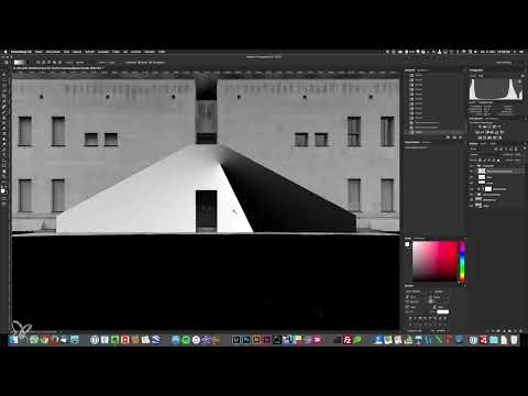
The video is only loaded from YouTube when you play it – data (including your IP address) is then transmitted to YouTube/Google. More in the privacy policy
The steps follow the flow of a complete editing pass: from preparation through the gradients to the fine-tuning of the staircase, landings, and windows.
Key Takeaways
- Each image area gets its own layer with a black-and-white gradient. Clear naming will save you a lot of searching time later.
- The Soft Light blend mode only interprets brightness. 50 percent gray is the neutral zero point, white brightens, black darkens.
- Light shapes form. With soft light-dark transitions, a flat facade looks curved or like a column.
- Opacity controls the strength of an effect, a layer mask determines the precision.
- Before-and-after comparisons are essential to check whether the look is still coherent.
Step-by-Step Guide
1. Prepare the black-and-white base and dark background
Before you set gradients, you need a clean foundation. Convert the image to black and white and reduce the yellow tones so that the facade stands out more strongly against the sky. You then make the background completely black. This makes the building appear to float freely in space, which makes the effect more abstract and graphic.

2. Create a group and structure the layers
Create a group using the folder icon in the Layers panel and name it "Gradients". For each selection you saved beforehand, create a separate empty layer. Name each layer clearly, for example "Meadow", "Facade", "Path", or "Staircase Facade". This initially feels like administrative work, but it pays off: when you want to readjust later, you immediately know which layer is responsible for what.

3. Understand the Soft Light blend mode
The Soft Light mode is the heart of this technique. It interprets only the brightness information of the layer. A 50 percent gray is the zero point at which nothing happens. If you paint over it with white, the underlying area becomes brighter; if you paint with black, it becomes darker. The further you move away from gray, the stronger the effect. You use exactly this property to fine-tune contrasts. Therefore, after creating each gradient layer, switch it from Normal to Soft Light.

4. Toning down the meadow
Load the meadow selection and choose the Gradient tool. Set a gradient from white to black. For the meadow you don't need a striking effect; it should simply recede. Afterwards, paint over the areas that should become completely dark with a black brush. A fine texture is deliberately retained so that the area doesn't look like a black hole. An opacity of about 25 to 35 percent delivers a coherent result here.

5. Shape the facade with a radial gradient
The facade is the heart of the image. Choose the radial gradient and drag it outward from the center of the facade so that the center point is the brightest. Holding down the Shift key, you align the gradient to the 45-degree grid. Set the layer to Soft Light. The edges are now darkened, while the center stays bright. If the effect looks weak at first, that's normal. You control its strength via opacity.
6. Selectively brighten the path
Load the path selection, fill it with white, and set the layer to Soft Light. This makes the path stand out from the facade and draws the eye forward. Since the effect quickly becomes too strong, reduce the opacity to around 70 to 75 percent. Then compare before and after by showing and hiding the group.

7. Getting to Know the Five Gradient Types
At the top of the gradient palette you will find five types, each with its own job. The linear gradient is suited to natural shadow edges: short strokes produce hard transitions, long strokes produce soft ones. The radial gradient is your default for curves and light sources. A very short stroke sets a point of light that, in Soft Light mode, looks like a lantern or a flashlight. The edge shadow gradient aligns itself to an edge and wraps around it in a circular shape. It needs a suitable edge in the subject and is therefore difficult to use. The beam gradient extends from the starting point to the left and right. The diamond gradient creates rays of light, but quickly looks artificial.

8. Using the Beam Gradient for Curved Surfaces
The beam gradient is one of the most effective gradients for architecture. On round objects, light is reflected mainly in the middle and falls off toward the edges. If you apply the beam gradient to a facade and set it to Soft Light, the impression of a curve emerges. Drag it wider to make the effect softer. The most important insight here: light shapes form. Anyone who recognizes this can strengthen or replace light and give a surface a new shape.

9. Duplicating Layers and Strengthening Contrasts
If the contrast of a gradient is not enough for you yet, duplicate the layer with Cmd+J on the Mac or Ctrl+J on Windows. This is often necessary if you greatly reduced the contrast during RAW development. Make sure to give the copy a sensible name as well, for example "Staircase Facade 2". For strongly brightened areas, you instead reduce the opacity or the brightness of the gradient.

10. Refining the Door and Staircase with Masks
In the area of the door, you set a radial gradient that falls in from above. So that the already dark area does not get any darker, you set the dark point to 50 percent gray. The front edge of the steps, on the other hand, is too bright, because it should be in the shadow of the lamp. To fix this, hide the upper layer, create a layer mask on the lower one and paint over the edge with a black brush set to 60 percent hardness. When you show the layer again, the mask ensures that only the desired areas are changed.

11. Emphasizing Landings and Edges with Light Gradients
On the landings, you simulate light falling down from the staircase. Apply a radial gradient from the side and set the layer to Soft Light. You shouldn't overdo it on the landings. For the edges at the bottom left, a radial gradient from the side is more coherent than a crosswise light beam, because the direction of the light then matches the landings. Reduce the brightness to about 75 percent and duplicate the layer if the effect still looks too flat.

12. Shaping Large Areas and the Center Block
For large facade sections on the left and right, you work with radial gradients that get darker toward the edges. On areas with little contrast, it can make sense to layer two gradients on top of each other. Make sure that the left and right facades have the same gradient and the same brightness, so that the building looks calm and symmetrical. The center block can be shaped into a column with a longer gradient. This illusion works because the eye automatically recognizes a curve in a light-dark transition.

13. Placing Windows and Points of Light
You edit the windows with their own layers so that they can be controlled independently of the facade. A light beam falling in from outside the image looks believable on the windows, because brightness arises there anyway. For the overhang, you don't set another gradient, but a small point of light that looks like a lantern. With the windows, pay attention to symmetry and reduce the opacity if they turn out too dark.

14. Using the Before-and-After Comparison
To check your look, hold down the Alt key and click the eye icon of the bottom layer. All layers above it are hidden, and you see the original shot. With a second click on the icon, you return to the finished image. You should do this check regularly so that you don't lose sight of the style.

Summary ??? Fine Art Image Look: Creating Sculptural Architecture with Black-and-White Gradients
With black-and-white gradients on separate layers and the Soft Light blend mode, you can stage architecture sculpturally without altering the building itself. What matters most are a clean layer structure, an understanding of the neutral gray value, and a deliberate choice of gradient type. With opacity, masks, and before-and-after comparisons, you fine-tune the look at the end.
FAQ
Question: Do I need a specific program for this technique?Answer: The technique works in Photoshop and comparable programs that support layers, selections, gradients, masks, and the Soft Light blend mode.
Question: Why is 50 percent gray so important in Soft Light mode?Answer: A 50 percent gray is the neutral zero point. Above it, the mode brightens; below it, it darkens; at exactly this gray, nothing happens.
Question: Do I change the architecture itself with this method?Answer: No. You only change the lighting on separate layers. The shape of the building remains fully intact.
Question: Why should I name every layer?Answer: With many gradients, you quickly lose track. Clearly named layers help you make targeted corrections.
Question: What should I do if a gradient looks too weak?Answer: Duplicate the layer to strengthen the effect, or increase the opacity. If you reduce the brightness instead, the effect becomes softer.
Question: When is the radial gradient worthwhile?Answer: The radial gradient is particularly suitable for round or curved objects such as columns, as it emphasizes the curvature.


