

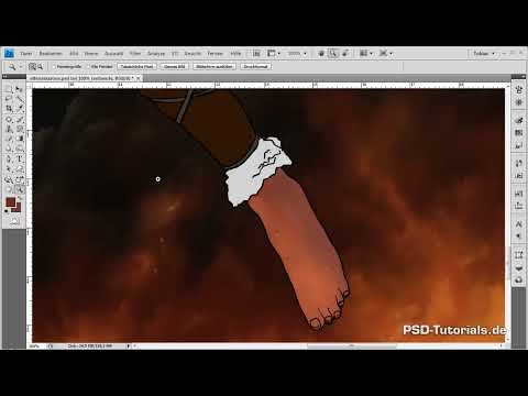
Before you tackle the Amazon herself, it's worth taking a look at your layer palette. In the seventh part of this digital painting tutorial, I'll show you how to apply rough color gradients to existing layers using clipping masks. Skin and hair take up the most space, but the bikini, leather straps, metal parts and the bow also get their first layer of color. You'll see how the light from the background, that is, moonlight from the top right and fire from the bottom left, reappears on every part of the body.
The video is only loaded from YouTube when you play it – data (including your IP address) is then transmitted to YouTube/Google. More in the privacy policy
Key Takeaways
Organize your layers before you start painting. A reduced palette keeps things clear and keeps the file size small. Work with clipping masks so that each color lands only on its object. The background is your color reference tool: Take its light colors over into shadows and highlights. Shadows follow the body's anatomy and the light source. Dirt and grime belong to the character from the start. Work in several thin layers with low opacity and switch between brush sizes.
Step-by-Step Guide
Step 1: Merge Layers and Create an Overview
To begin, you merge all previous objects onto a single layer, provided you don't want to change anything on these parts anymore. The background image stays separate. Beneath it, you place a white layer so that the outlines are clearly visible. This step is not mandatory, but it gives you a clear palette and saves storage space.

Step 2: Add Details to the Bikini
On the bottom piece of the bikini there are fangs, which make for a nice detail. To make the top match the bottom more closely, you add similar tusks there. You have already laid out the base colors on a separate layer. Show it, fill the new areas using the eyedropper with a neighboring color tone, and trace the shape.

Step 3: Create a Clipping Mask for the Skin Gradients
Create a new layer for gradients above the skin layer and attach it as a clipping mask. This way, every color stays within the skin area. Choose a large brush with 0% hardness and low opacity. Activate only the opacity jitter so that the strokes look natural.

Step 4: Set the Base Shadows with a Reddish-Brown Mix
As the color, you take a reddish-brown mix that is darker than the skin color but stays close to it in color temperature. Use it to roughly sketch the darker areas. Keep in mind that the moonlight comes from the top right and the fire acts from below. The shadows should therefore lie predominantly to the left and top. Also trace the muscle groups on the thigh and arms so that the body gains volume.

Step 5: Apply Anatomy and Light Logic
The shadows don't just follow a pattern, but the posture of the body. In the armpit and on the chest, which is turned away from the moon, more darkness arises. Once you have placed these spots, the remaining transitions on the arm almost take care of themselves. On the right arm, several shadows overlap due to the posture. You can slightly exaggerate these areas, because the contrast of dark on the left to light on the right contributes to the effect. On the face, on the other hand, you proceed carefully, because many bright details will be added there later.

Step 6: Build Up Light Skin Areas with a Bluish-Brown Tone
For the highlights, you take a second brown tone with a slight tendency toward blue. At first glance it may seem too dark, but it picks up the color of the mountains in the background, which reflect the light. Between the two tones, you repeatedly leave areas of the base skin tone. Perfectly radiant skin looks irritating, especially since dirt will be applied later.

Step 7: Bring in Firelight from the Bottom Left
Now you choose a light orange tone that resembles the flames. It brings the incidence of light from the fire into the picture, which acts as a counterpart to the moonlight. Work your way in from the skin areas that lie on the far left. The feet receive more light color than the thighs, because they are closer to the fire and the shadow covers them less there. On the thighs and belly, you place lighter spots in the middle to emphasize the muscles. On the upper body, the light appears weaker, since it is the farthest from the fire. On the face, you apply it very gently, because moonlight is supposed to be the main effect there later.

Step 8: Refine shadows with darker tones and a smaller brush
Now you use a darker color again to ground the image. The bluish tone has so far sat on its own on the skin, so you cover it with the reddish-brown mix so that it looks better integrated. You work on the rough gradients with a smaller brush of about 30 pixels. For the fine detail work, you reduce the size further. As soon as you emphasize the upper body more strongly, the posture of the hand looks more three-dimensional.

Step 9: Place deep shadows on a separate layer
Create a layer above the gradients, name it for example "Shadows" and use black as the foreground color. Apply the darkest areas with it at very low opacity. If they initially seem too extreme, you can soften them again with a soft eraser. Black is deliberately in the foreground here because you will darken these areas further with dirt later anyway.

Step 10: Create dirt and grime as a base
The feet and legs receive the strongest darkening, because most mud sticks there from soot and ash when walking. You also darken the elbows strongly to reinforce the effect of the fire from the bottom left. On the face you stay restrained, since you will work in fine mud splatters there later with a small brush. A large brush is the wrong tool for that.

Step 11: Model the lips with two shades of red
Create a new clipping mask layer for the lips and first fill it with a very dark red tone. With a fine brush you then alternately apply a lighter and a slightly darker tone to create volume. This layer serves only as a rough template for the later details.

Step 12: Organize skin groups and hair
For a better overview, you combine all skin layers in one group. The eyes get their own group, as does the hair. Here too you work with a clipping mask layer for gradients. With a soft brush and opacity jitter activated, you first define darker areas in the hair. A light tone marks the places where shine is later supposed to appear. You draw in the moonlight clearly on the right and weaken it toward the left. You deliberately mix in orange so that the hair unites fire and moon and does not just show dull red.

Step 13: Structure the fur with red and orange
You work on the dark fur according to the same principle: a new group, a new clipping mask, and rough light and shadow. Since the fire has an effect here too, you work with red and orange. This makes it easier to bring out the shape of the two-piece. On the bikini, you again trace the incidence of the moon's light along the outlines. Erase overhanging strokes afterwards or smooth them with the blur tool or the smudge finger.

Step 14: Make the bangles look like gold
To make the bangles appear like gold, you combine a very dark brown with a milky yellow. The contrast of these two colors already looks metallic. You color the band on the leg with more reds, because it is closer to the fire. Orange and a stronger red complete the picture. For the leather straps, you set off the individual bands with light-dark gradients so that they overlap.

Step 15: Roughly work out the bow and arrow
The bow gets its own group with subgroups for base color, wood, and reflection. First you darken the wood and then use lighter colors to add the fire as a reflection. At 45% opacity, soft transitions emerge. For the string, you choose a slightly different tone so that it looks like it is made of a different material. The arrow gets a slightly metallic but rusty tip, because it should look used.

Step 16: Check the Overall Image and Hide Outlines
Finally, you hide the black outlines. This shows you how strongly the figure still relies on its lines. When you look at the image as a whole, the parts appear more three-dimensional and tangible. In the next step, you turn to the hair, which will now be worked out.

Summary ??? Coloring the Elf Amazon: Skin and Shadows with Gradients
In the seventh part, you roughly colored the Amazon. You organized the layers, built up the skin with clipping masks and gradients, and consistently applied the light sources of moon and fire. Bikini, hair, fur, leather straps, metal, and bow receive their first layer of color. It remains important to work in thin layers and to switch between brush sizes.
FAQ
Why should I reduce the layers?A reduced layer palette provides a better overview and keeps the file size small when you no longer want to change certain parts.
Why do I work with clipping masks?Clipping masks limit each color to the object beneath it, so that you do not paint beyond the shape.
How do I choose the colors for the skin?Use tones that are darker or lighter than the base tone but close together in color temperature. The background serves as a reference.
Why does the skin not look entirely clean?Radiantly smooth skin looks irritating. The dirt that is applied later needs a dirty-looking base.
Which brush size makes sense?For rough gradients, brushes around 50 to 60 pixels are suitable; for details, smaller sizes down to about 30 pixels.
How do I know whether the incidence of light is right?Compare the lights and shadows with the light source in the background. If the distribution looks logical, it usually fits.

