
A cross look instantly appears high-quality because it tints highlights and shadows in different hues. In this tutorial, you'll learn how to build such a look with curves, color gradients, layer modes, and masks. Merle demonstrates the process using an example image of a young woman with orange and purple accents. You can apply the steps to almost any portrait.
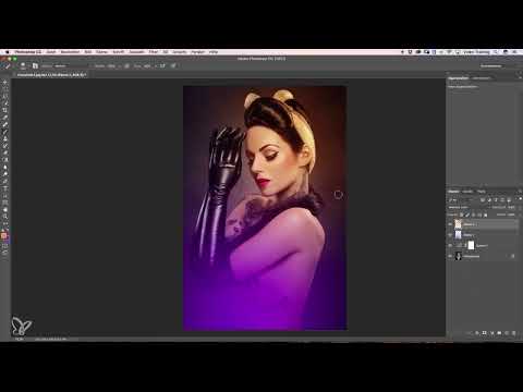
The video is only loaded from YouTube when you play it – data (including your IP address) is then transmitted to YouTube/Google. More in the privacy policy
Key Takeaways
The tonal values can be separated precisely using curves in the blue channel: the shadows become bluer, the highlights more yellow. You build color gradients with an empty layer, two colors, and soft brush dots, which you then transform heavily. Layer modes such as Soft Light bring the colors into the image without changing the contrast. With a mask that you place over a layer group, you hide the effect where it doesn't belong, such as on the skin.
Step 1: Tint highlights yellowish and shadows bluish
Start with the basic look before adding color gradients. At the bottom of the Layers panel, click the icon for adjustment layers and choose Curves. In the dialog, switch to the blue channel. There you can tint the shadows at the lower end and the highlights at the upper end directly.
Pull the shadow point up a bit. The image immediately looks bluer in the shadows, and the adjustment really only affects the dark areas. Then pull the highlight point at the upper end down slightly. This makes the bright areas more yellow. This interplay produces the typical cross look that Merle often uses.
So that the effect doesn't become too dominant, reduce the opacity of the adjustment layer to about 60 to 70 percent. Compare the result with the original image to assess the effect.


Step 2: Build the first color gradient
For the color gradient, first create an empty layer. This approach is unusual, but Merle always works this way. Set the foreground color by clicking on the color swatch. Choose a strong orange for the upper area and confirm with OK.
Then switch the foreground color with the X key and choose a light, slightly purple tone for the lower area. If the hue still looks too bluish, you can adjust it later.
Now take the Brush tool with a very soft edge and place a single dot on the layer. Make sure the brush opacity is at 100 percent so that the color is strong enough.
Then transform the dot with Cmd+T (Ctrl+T on Windows). While dragging one of the handles, hold down the Alt key so that the transformation happens from the center. You also need the Shift key, because it keeps the proportions uniform. Without it, the dot becomes distorted and the gradient doesn't look round. Drag the dot out large and move it to the desired spot in the image, for example toward the bottom. Then confirm the transformation with Enter.
The gradient is now soft and even.


Step 3: Add a second gradient and preserve the contrast
For a second splash of color, create a new layer again and choose the orange foreground color once more. Place a dot, which you deliberately transform far larger than necessary. This creates a very gentle transition. Move the gradient to a spot where it complements the image nicely, and confirm it.
Now you'll notice that the colors look flat and the contrast is lost. This is because the color layers are in Normal mode. So set the upper layer to Soft Light mode. The color remains visible, but the contrasts in the image hardly change. Repeat this step with the lower color layer so that both gradients sit strongly in the image.


Step 4: Remove the gradients from the face with a mask
The colors now look really nice in the image, but they are also on the face, where they appear too strong. Therefore, combine both color layers into a group. To do this, select the two layers and click the group icon at the bottom of the Layers panel. The group can then be controlled with a single mask.
Next, create a selection of the person. To do this, choose the Quick Selection tool on the background layer and adjust the brush size. Drag once over the young woman. A dashed selection line appears and spreads across the image. If the tool detects too much, hold down the Alt key and drag over the affected areas. Photoshop then subtracts them from the selection. You can also exclude a hand or other parts that should not be affected this way. The edges don't have to be perfect, because you will soften the mask later anyway.
When you are happy with the selection, activate the group and create a mask using the mask icon. Hold down the Alt key while doing so, so that Photoshop inverts the mask. The gradients now only appear on the background.


Step 5: Paint the effect back onto the hair and gloves
Some areas should still get a touch of the colors, such as the hair and the gloves. To do this, choose the Brush tool and set the opacity to 20 percent. Keep the edge very soft.
Set the foreground color to white and paint very lightly over the hair on the mask. Keep going over it until the desired intensity is reached. Do the same with the gloves and on the back if more purple should show there. White on the mask means that the effect becomes visible. Black would hide it again.
Step 6: Correct the skin tone with a Color Balance
The image now looks a bit too yellow in the face. To adjust only this area, create a new adjustment layer at the bottom of the Layers panel and choose Color Balance. When clicking the adjustment layer icon, hold down the Alt key until a small arrow appears. Clicking this arrow creates a clipping mask. As a result, the Color Balance only affects the layer below.
Now adjust the sliders. Move the midtones slightly toward blue, slightly toward red and a bit toward magenta. The result may also contain some yellow so that the skin stays warm. If the effect is too harsh, reduce the layer's opacity to about 50 percent.

Step 7: Check the result and refine it
Finally, compare your result with the original image. To do this, show and hide the layers until you see the difference. Zoom in on the edges of the mask and check whether any corners or transitions appear that are not clean.
If you find such spots, take a small, soft brush and touch them up on the mask with black or white. Especially along the contours, it is worth taking a close look at the details so that the transition looks smooth and the look appears harmonious overall.


Summary ??? Crosslook in Photoshop: Creating a gradient with layers and masks
You created the basic look with tone curves, built up two gradients with empty layers and soft brush dabs, and brought them into the image using the Soft Light mode. With a mask on a layer group, you kept the colors away from the face. The Color Balance with a clipping mask allowed you to fine-tune the skin. If you follow this sequence, you get a crosslook that can be applied to many portraits.
FAQ
Why should I edit the shadows and highlights via the blue channel?In the blue channel, shadows and highlights can be specifically shifted toward blue and yellow. This creates the typical crosslook without you having to recolor the image heavily.
Why do I create an empty layer for the gradient?An empty layer can be freely transformed without changing the original image. You can move, scale, or adjust the opacity of the gradient at any time.
What does the Soft Light layer mode do?Soft Light brings the color into the image while preserving the contrast. In Normal mode, by contrast, the gradients often look flat.
What is the Alt key for when creating a mask?With the Alt key, you create an inverted mask. The effect is then hidden, and you can use white to selectively bring it back in where it is desired.
What do I need to consider with the clipping mask of the Color Balance?Hold down the Alt key when creating the adjustment layer and click the small arrow. This way, the Color Balance only affects the layer below and not the entire image.


