
Have you ever retouched skin that ended up looking like a wax figure? This is exactly the problem that frequency separation solves. In beauty and portrait photography, the technique is considered one of the most popular methods because it edits color and brightness separately from the skin texture. You can remove blemishes and unevenness without losing the natural texture.
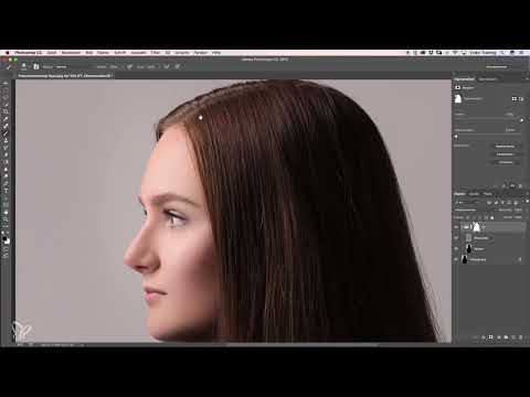
The video is only loaded from YouTube when you play it – data (including your IP address) is then transmitted to YouTube/Google. More in the privacy policy
At first glance, the method seems complicated, but it consists of clearly defined steps. In this guide, I will walk you through the entire process: from preparing the layers, through separating the frequencies, to retouching hair, eyebrows, and color gradients. The explanations are based on Merle's video tutorial, and the timestamps help you look things up.
Key Takeaways
- Frequency separation divides the image into a layer for color and brightness (low frequency) and a layer for texture (high frequency).
- Both layers can be edited independently of each other, so you can remove blemishes without destroying the skin texture.
- The Gaussian Blur creates the color layer, while the High Pass filter in combination with the "Linear Light" mode forms the texture layer.
- The Healing Brush tool only works cleanly if you activate "Current Layer".
- With a mask, you remove tonal breaks that would otherwise become visible in the background.
- The brush in the color layer should be used sparingly with low opacity so that no visible edges appear.
Step 1: Prepare the Layers
Begin by duplicating your background layer twice. This gives you three layers, of which you first hide the top two so that only the bottom one remains visible. This bottom layer will later become your color layer. Make sure you are working on the correct layer, because a wrong click can overwrite the texture.

Step 2: Create the Color and Brightness Layer
On the bottom layer, select the Gaussian Blur. It blurs fine details and leaves only color gradients and brightness information. Zoom the image in the preview window far enough that you can assess the skin accurately. You will quickly see at what point the skin takes on a mushy, plastic look and no texture is recognizable anymore.

Step 3: Find the Right Radius
The radius determines how strongly the texture disappears. You have to choose the value so that blemishes and skin impurities vanish in the blur, but the texture is completely lost. A range between 10 and 15 pixels serves as a guideline. In the video, a value of 12 pixels is used, which is sufficient in most cases. Even if smaller blemishes remain slightly visible, this value is usually a good starting point. You can fine-tune the strength in the next step.

Step 4: Check and Confirm the Result
Now check whether there is actually no texture left in the image. The colors should flow evenly and softly, and the blemishes should have largely disappeared. If that is the case, confirm the blur with OK. Keep in mind that this layer is initially only the color component. The texture comes back in the following step.
Step 5: Prepare the Texture
Now show the top layer again. It holds the original texture, which you will extract shortly. For this to work, you need some preparation. To do so, create a Brightness/Contrast adjustment layer via the menu. Activate the option "Use Legacy", which is an important step, because it prevents the settings from being changed unintentionally. Then set the contrast to -50 percent. Confirm the setting so that the layer is ready for the next step.

Step 6: Apply the High Pass Filter
Now select the top layer and open the "Other" filters section in the Filter menu. There you will find the High Pass filter. Also set it to 12 pixels and confirm the input. Afterwards, the layer shows only a gray surface with the fine textures. This seems incomprehensible at first, but it is exactly what you need. The layer contains exclusively the skin texture, that is, pores, fine lines, and small details.

Step 7: Set the layer mode to Linear Light
Change the mode of the top layer from "Normal" to "Linear Light". Now the gray area is blended with the color layer beneath it, and you can see the result: the structure is visible again, while the colors remain smoothed. Tonal banding may appear in the background. You will remove it in the next step. As a check: if you show and hide both layers, the image must not change. If it does, at least one step was faulty, and you should go through the preparation again.

Step 8: Arrange and name the layers
To keep an overview, put both layers into a group. Use the group icon at the bottom of the Layers panel and give it a meaningful name such as "Frequency Separation". Also name the lower layer "Colors" and the upper one "Structures". This organization pays off as soon as your project includes several layers.

Step 9: Remove tonal banding with a mask
The tonal banding in the background is distracting, so you mask it out. To do this, apply a layer mask to the group. Select the Brush tool with 100 percent opacity and set the foreground color to black. Paint with a soft edge over all areas where the banding appears. At the hair, take care not to paint too far into the area, because you will still work there later with frequency separation. Such banding occurs mainly with a gray background or with gradients in the background. In most cases, the problem doesn't occur at all.

Step 10: Retouch the structure with the Healing Brush
Now comes the actual retouching process. Select the "Structures" layer and take the Healing Brush tool. Very important: set the option "Current Layer". If you work without this setting, the Healing Brush also accesses the layers beneath, and you unintentionally change brightness and color. With the right setting, you can simply retouch away small blemishes. The structure changes in the process, while the brightness gradient is preserved.

Step 11: Edit hair and eyebrows
Frequency separation shows its strength especially with hair. Stray hairs or areas that would look smudged with classic retouching can be removed cleanly with the structure layer. Here too, choose the Healing Brush with the option "Current Layer". Pay attention to the brush hardness: a hardness of about 30 pixels prevents the edges from looking soft and mushy again. The same principle works for eyebrows. Sample a structure and drag it over the affected spot, and distracting parts disappear without any color change.

Step 12: Compare the result
A before-and-after comparison makes visible what you have achieved. To do this, show and hide the layers once and compare the original state with the edited version. Often the skin looks noticeably calmer afterward, while the texture still looks natural. You should repeat this check with every retouch.

Step 13: Transfer structure selectively
Another advantage of the technique is that you can transfer structures to other areas. If you sample an even patch of skin as a template, you can also touch up hair or other areas with it, without the structure looking copied and obviously repeated. Apply this method to all areas you want to look neat, and you will be surprised how clean the image looks afterward.

Step 14: Place a color layer between the frequencies
If you want to adjust the colors of the image, create a new layer between the color and structure layers. The advantage: you apparently work on the color layer, while the structure above remains unchanged. So you can adjust brightness gradients, shiny spots, or discolorations without affecting the skin structure.

Step 15: Correct colors with the brush
Choose a color that matches the skin tone at that spot, and set the brush opacity to about 10 percent. This way you paint layer by layer and prevent the color from standing out unnaturally. For a distracting brightness gradient, you can work with a lighter color; for a shiny spot, a darker tone is suitable. Make sure you don't deviate too noticeably from the original tone. If the result seems too strong, simply erase part of it again or reduce the opacity of the layer.

Step 16: Avoid edges and work selectively
Finally, an important note: if you paint over the edge of an area, unsightly borders quickly appear because the color information of the background is changed as well. Therefore, work selectively and not over large areas. After each brushstroke, check whether the transitions look natural. With a bit of practice, you will develop a feel for where the technique makes sense and where you are better off leaving it alone.

Summary ??? Frequency Separation in Portrait Retouching: Smooth Skin, Preserve Texture
Frequency separation allows you to edit color and brightness separately from the skin texture. You duplicate the background layer, create a color layer with the Gaussian Blur, and bring the texture back with the High Pass filter and the "Linear Light" mode. Then you mask out distracting tonal value breaks and retouch with the Healing Brush on the texture layer. For color corrections, you place a layer between the two frequencies so that you do not change the texture. The right settings, the "Current Layer" option for the Healing Brush, and sparing use with low opacity are crucial. With a bit of practice, you will achieve clean results that look natural.
FAQ
What advantage does frequency separation offer over normal skin smoothing?It separates color and brightness from the texture, so you can smooth without the skin looking artificial and waxy.
Why does the layer mode have to be set to Linear Light?Only with this mode is the texture information of the upper layer blended back with the smoothed color layer, so that the image gets its texture back.
Which radius is suitable for the Gaussian Blur?A value between 10 and 15 pixels is sufficient in most cases; in the video, 12 pixels is used.
What happens if the image changes when showing and hiding the layers?Then at least one step was incorrect. You should check the preparation again and go through the steps from the beginning.
Why should the Current Layer option be activated for the Healing Brush?Without this setting, the tool accesses underlying layers and unintentionally changes colors and brightness.
What is the mask on the group for?It hides the tonal value breaks in the background that can arise when the layers are blended.
Why should I work with low opacity for color corrections?With 10 percent opacity, you build up the color layer by layer. This way you avoid visible edges and unnatural transitions.


