
Imagine an area of skin where you want to even out redness without losing the fine pores. This is exactly where frequency separation comes in. It splits an image into two layers: one with the slow, soft color transitions and one with the fast, fine structures. In this tutorial, you will learn how to do this step by step in Photoshop and how to check the layers.
The video is only loaded from YouTube when you play it – data (including your IP address) is then transmitted to YouTube/Google. More in the privacy policy
Key Takeaways
- Slow, soft transitions such as color gradients belong to the low frequencies. Fast changes between light and dark, such as with spots or pores, belong to the high frequencies.
- The separation works with a radius at which the fine structures are no longer visible.
- After the separation, color and structure are on separate layers and can be edited independently of each other.
- A neutral gray background layer helps you check the individual layers.
Step 1: Recognizing frequencies in the image
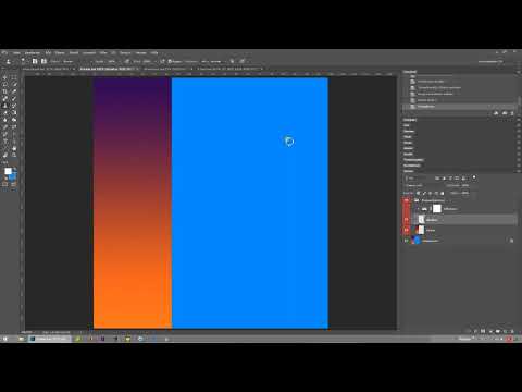
Before you start the separation, it is worth taking a close look at your image. A gradient that starts blue at the top and ends orange at the bottom shows a very soft transition. These are the slow frequencies. Small dots or spots look quite different. There, dark and light follow each other immediately, and the brightness changes within a very small space. These fast transitions form the high frequencies. For the separation, it does not matter whether a spot is light or dark. The only thing that matters is how abrupt the transition is.

Step 2: Performing the frequency separation and choosing the radius
Now you perform the actual separation. You choose a radius at which the small dots in the image are no longer visible. The radius determines how strongly the image is blurred. The larger the value, the more details disappear from the color layer. Try out the value until the structures disappear completely from the blurred image. Then confirm with OK and wait until the action has finished running.

Step 3: Understanding the resulting layers
After the run, you have two layers. One contains the structure, meaning dots, pores, and fine details. The other contains the colors, meaning the soft gradients without fine details. Turn off the visibility of one layer to check the other individually. This way you can quickly see whether the separation was clean.

Step 4: Expanding the canvas for comparison
To view the layers side by side, you need more space. Enlarge the canvas in width, by 300 percent in the video, and toward the right. This creates enough room for three views: the original, the color layer, and the structure layer. Make sure the original stays on the left so that you can use it as a reference later.

Step 5: Arranging original, color, and structure side by side
Now arrange the layers so that the original is on the left, the color layer in the middle, and the structure layer on the right. This direct comparison shows you at a glance which information ended up in which layer. The original remains visible as a comparison image, while the two layers document the split.
Step 6: Checking the layers when zooming in
Now zoom into the image. On the structure layer, you see only the fine dots and edges. The color layer, on the other hand, shows only the large, soft transitions. It is exactly this separation that makes frequency separation so useful. You make color corrections on the color layer without changing the structure. You edit skin blemishes or surface details on the structure layer without affecting the colors.

Step 7: Coloring the background layer neutral gray
For checking purposes, you can recolor the background layer. In the video, the color value 80/80/80 is used for this, a neutral gray. Then create a selection on the background layer and fill it with this gray. Afterward, it becomes clearly visible that the structure layer contains only the dots and the color layer contains only the colors. The combination of both layers gives you the original image again. This way you have verified the separation in a comprehensible manner.

Step 8: Preview of the Practical Example
In the next video, the same method is shown in a practical example. There you split the layers in exactly the same way, so you can see how frequency separation affects a real image. If you already try out the steps of this tutorial on your own image, getting started with the practical example will be much easier for you.

Summary – Frequency Separation in Photoshop: Splitting Layers for Color and Texture
With frequency separation, you break an image down into a color layer with soft transitions and a texture layer with fine details. You choose the radius so that the textures disappear. Then you arrange the original, color, and texture side by side, check the layers by zooming in, and verify the separation with a neutral gray background layer. This way, each layer remains editable on its own.
FAQ
What is the difference between high and low frequencies?Low frequencies are soft, slow transitions such as color gradients. High frequencies are fine, rapidly changing details such as spots or pores.
Why does the radius have to be chosen so that the spots disappear?Only when the fine structures are completely blurred do they lie exclusively in the texture layer and are absent from the color layer.
Does it matter for frequency separation whether a spot is light or dark?No. What matters is only how quickly the transition between light and dark occurs.
Why do I enlarge the canvas?So that you can compare the original, color layer, and texture layer side by side without the displays overlapping.
What is the neutral gray with the value 80/80/80 for?It is used for checking. If you fill the background layer with neutral gray, the remaining layer shows only its own content.


