
Do you know that feeling when your sports photo looks flat straight out of the camera, even though the pose and the moment are perfect? This is exactly where RAW development comes in. In this tutorial, I'll show you how to turn a neutral shot into a crisp, vibrant sports portrait, step by step and with an eye on the histogram, colors and details.
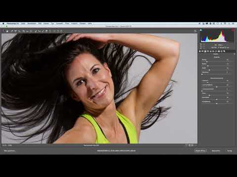
The video is only loaded from YouTube when you play it – data (including your IP address) is then transmitted to YouTube/Google. More in the privacy policy
Key Takeaways
- Before you move any sliders, define your target image. A vibrant sports portrait requires a clear idea of how it should look in the end.
- Contrast, exposure and highlights determine the dynamics of the image. The histogram shows you whether there is still room to go up or down.
- Brightening the shadows brings structure into dark areas such as hair or shoes, without making the image look flat.
- The Vibrance sliders affect the midtones and saturation. With moderate values, the colors stay strong without looking unnatural.
- With the HSL sliders, you control individual hues in a targeted way. This way, you can make a neon shirt pop while skin tones stay natural.
- You check noise reduction and sharpening in the 100% view before you continue editing the image.
Step-by-Step Guide
Step 1: Define the Target Image
Before you even touch a slider, think about what the image should convey. For this sports portrait, you want a crisp, vibrant result in which the colors really stand out and the highlights are allowed to glow a little. This goal guides all the following decisions. If you know where you're headed, you won't get lost in random adjustments.

Step 2: Raise Contrast and Exposure
The first adjustment concerns the basic brightness. Increase the contrast so that light and dark stand out more clearly from each other. Then raise the exposure slightly so that the whole image looks a bit brighter and fresher. Make sure you don't overdo it, because otherwise you'll lose detail in the fine areas.
Step 3: Evaluate the Histogram and Fine-Tune the Exposure
Now look at the histogram at the top right. If the brightness distribution is heavily in the left, dark area, you still have room to go up. In this example, that is the case. You can therefore set the exposure to a value of around 0.4. The histogram shows you at all times whether you are using the tonal values sensibly or already pushing against the edge.
Step 4: Brighten the Shadows
Now you turn to the dark areas. Raise the shadows slightly, especially in the hair. This brings more structure into dark parts, and the hair no longer looks so heavy and deep black. Make sure the result doesn't turn gray and flat. A gentle step is usually completely sufficient here.

Step 5: Raise the Highlights in a Targeted Way
With the highlights, you can be generous. For a sports portrait, it's fine if bright areas glow slightly or become a bit too bright here and there. This gives the image energy. So raise the highlights a bit and pay particular attention to helmets and bright surfaces, so that they shine but don't lose all their detail.

Step 6: Adjust Whites and Clarity
Next, you raise the whites a bit. This makes the overall image crisper and additionally increases the contrast. Complement this with a slight increase in clarity. This slider mainly affects the mid-tone contrast and creates a stronger impression of sharpness in textures, without you having to sharpen the image directly.

Step 7: Balance Vibrance and Saturation
Vibrance is your tool for colors. It mainly affects the midtone brightness values and raises saturation gently. Saturation, on the other hand, acts on the entire tonal range and makes the image more colorful overall. Don't go too far here. In this example, a vibrance of about 20 is enough to make the colors glow without looking artificial.
Step 8: Use the Before-and-After Comparison
To check your progress, keep looking at the before-and-after view. You can click the small icon in the toolbar or use the shortcut P. This way you can immediately see how much the image has changed and decide whether you have gone too far.
Step 9: Check Sharpening and Noise Reduction
In the Detail panel, you can see that sharpening is applied automatically with an amount of 25. You can leave this value as it is, provided the image looks clean. Then switch to the 100% view and take a look at the face. If fine noise shows up, increase the luminance of the noise reduction, here to a value of 25. This makes the image slightly smoother without losing its structure.

Step 10: Edit Yellow Tones in the HSL Panel
Now comes the section for targeted color work. Switch to the HSL sliders and set the view to the overall image, for example with Control plus Zero or Command plus Zero. In the Luminance tab you will find sliders for individual hues. If you brighten the yellow tones, this mainly affects the T-shirt. This gives the shirt the desired neon color and makes it glow noticeably more.

Step 11: Balance Green and Red Tones
The green tones are also present in the image and affect part of the background as well as some details. If you brighten them slightly, the image looks fresher. Then turn to the red tones. They affect the pants and the shoelaces. A moderate brightening ensures that these elements look vibrant without becoming garish.
Step 12: Adjust Orange Tones for the Skin
Orange tones are particularly tricky in portraits because they directly determine skin color. If you pull them down too far, the model quickly looks overly tanned. That is why you only brighten the orange tones slightly, for example by about 5 points. This makes the skin look fresher and lighter without losing its natural look. Always check the result in the face and not just in the overall image.

Step 13: Fine-Tune Aqua and Cyan Tones
The aqua and cyan tones affect the colored areas in the shoes. Here you move the slider a bit to the right until the tones are nicely brightened and fit harmoniously with the rest of the image. The result should look coherent, without individual colors dominating.
Step 14: Brighten Feet and Shoes with the Graduated Filter
At the bottom of the image, the feet and shoes are still a bit too dark. For this you use the graduated filter. Set the exposure in the filter to about 0.4 and drag the gradient from the bottom up to about the middle of the image. Hold down the Shift key while doing so, so that the gradient runs at exactly a 90-degree angle. Afterwards, brighten the lower area slightly and above all raise the shadows. This gives the black areas of the shoes more structure again, without the subject looking artificial.
Step 15: Check the Result with the Histogram
Finally, zoom out to the overall image once more and review your basic settings. The histogram now shows a better distribution, because the tonal values lie mainly in the midrange. The colors look luminous and strong, and the image is bright and clear overall. If that works for you, you are ready for the next editing step.

Summary – Sports Portraits in RAW Development: Contrast, Color and Structure
RAW development gives you all the tools to bring a sports portrait to life. You start with a clear target image, increase contrast and exposure carefully, and use the histogram for orientation. With the shadows you bring out structure in dark areas, and with the highlights you add energy. Vibrance gives the colors luminosity, and the HSL sliders allow you to make targeted adjustments to individual hues. Finally, you check sharpening and noise in the 100% view and review the result in the before-and-after comparison.
FAQ
How much should I increase the contrast?Increase the contrast until the image looks crisp, but details in hair and clothing remain recognizable. Check this using the histogram and the before-and-after comparison.
Why should I brighten the shadows?Brightened shadows show more structure in dark areas such as hair or shoes and prevent black areas from looking too heavy.
Why do I check noise reduction in the 100% view?Only in the detail view can you reliably spot fine noise. In the overall image it often looks inconspicuous until it becomes distracting in large prints.
What does vibrance do differently from saturation?Vibrance mainly affects the mid-brightness values and raises the colors gently. Saturation affects the entire tonal range and makes the image more colorful overall.
Why should I only adjust the orange tones slightly for skin tones?Strong changes to the orange tones quickly make skin look overly tanned or unnatural. A moderate brightening ensures a fresh, lively complexion.
When is the graduated filter worthwhile?The graduated filter is suitable when only one area of the image, such as the feet or shoes, needs to be brightened selectively without affecting the rest.


