
A kayak on a river, wet rocks, and a paddler in the middle of the action: motifs like these thrive on contrast and texture. In this practical example, you'll see how to turn a sports shot into an image with a magazine look in Adobe Camera Raw using just a few basic settings. Along the way, you'll also learn where the limits are, because too much harshness quickly causes important colors to fade.
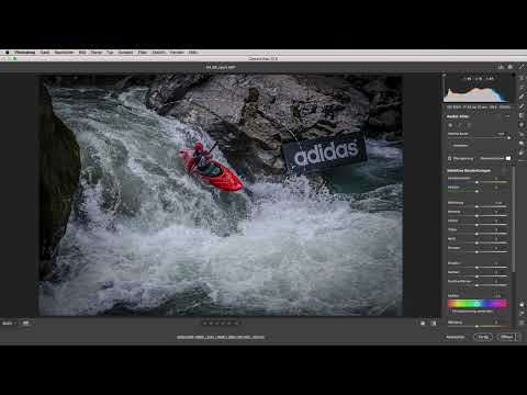
The video is only loaded from YouTube when you play it – data (including your IP address) is then transmitted to YouTube/Google. More in the privacy policy
Key Takeaways
- Lowering highlights and raising shadows brings back detail in bright and dark areas.
- Clarity, texture, and micro-contrast give sports images dynamism, but they need to be used in moderation.
- A vignette and a radial filter draw the eye to the paddler.
- White balance and the Whites slider control how powerful the water looks.
- Regular before-and-after comparisons protect you from overdoing it.
Step-by-Step Guide
1. Recognizing Texture and Dynamics
Open your shot in Camera Raw and first look at the image without any adjustments. In this kayak picture, enormous textures and strong dynamics immediately catch the eye. This is exactly the potential you now want to bring out without distorting the subject.

2. Lowering Highlights Completely
Pull the Highlights slider all the way down. This brings out the maximum detail in the bright areas, especially in the water, which would otherwise quickly blow out. Notice how the spray and the reflections regain contours.

3. Raising Shadows to the Maximum
Next, pull the Shadows all the way up. The dark areas noticeably gain detail, and the rocks show textures that had previously disappeared into the shadows. At a certain point, the limit is reached: there is no more detail to gain without the image looking flat.

4. Dosing Clarity Selectively
Now the Clarity slider comes into play. Push it to the right until you notice that the red in the boat is slowly starting to fade. Then take one step back. Everything else tolerates clarity surprisingly well. So the right strength is not a fixed value, but the point at which an important detail begins to lose color.

5. Comparing the Interim Result
Before you continue, it's worth taking a look at the before-and-after comparison. You'll then see how much has already changed. With this image, a really nice magazine style emerges that would also be suitable as a cover image.
6. Enhancing Texture and Micro-Contrast
Pull the Texture slider up strongly, because it is exactly what makes the spray, rocks, and water surface tangible. Then you sharpen the micro-contrasts further. This emphasizes fine edges without making the entire image look harsh. Here too, check on screen whether noise or halos become visible.

7. Setting a Vignette for the Look
Now think about what look the image should have. For this subject, a vignette that slightly darkens the edges is a good choice. This automatically guides the eye to the center of the image without the effect looking intrusive.
8. Putting the Kayaker in the Spotlight
The paddler should be the center of attention. With a radial filter, you place a targeted brightness spot in the middle. Position the filter so that the ellipse encloses the kayaker, and then increase the exposure within the filter. The area then looks like a spotlight, and the eyes immediately move to the paddler.


9. Check the focus on the paddler
Now compare the state before and after the radial filter once more. Is the hierarchy in the image right? Is the focus really on the paddler, or is another area competing with him? Only when the weighting is right does the image feel complete.
10. Bring out the detail in the black rocks
At first glance the rocks look black, but on closer inspection there is still a lot of detail in them. If you raise the shadows again, brown and green tones appear, and you can see how the moss grows. Especially with wet subjects like this one, it is precisely this fine detail that makes the difference.

11. Adjust the white balance for the water
In the next step you turn to the white balance. The water looks ice cold in this image, and you can influence exactly this mood with the color temperature. Whether you are working with a RAW format or already have a JPEG file, the white balance can be adjusted in both cases, only the reserves differ. Try out different values and make sure that the skin tones and the red of the boat remain natural.
12. Use the Whites slider for luminous water
If you want the water to glow a little more, the Whites slider helps. Carefully move it to the right and watch the lights in the spray. As soon as the highlights become too flat or the colors shift, go back a little.

13. Show restraint and think about printing
Here an important point emerges: with sports images, it is easy to go overboard. An image that looks spectacular on the monitor can quickly appear too dark or too harsh in print. That is why you should always dial back your settings when they stray too far from the natural impression.


14. Final comparison
Finally, open the before-and-after comparison once more. You will see how highlights, shadows, clarity, texture and filters combine into a coherent overall picture. An unremarkable sports shot has become an image with depth and character, and that is exactly what this editing is all about.

Summary – Kayak image in Camera Raw: Bringing out dynamics and structure in a targeted way
With Camera Raw you can get a lot out of a sports shot if you work in a sensible order. You start with the highlights and shadows to recover detail, and then give the image dynamics with clarity, texture and micro-contrast. Vignette and radial filter draw the eye to the paddler, while white balance and the Whites slider shape the mood of the water. Always keep the before-and-after comparison in view, because it is exactly what prevents a strong image from becoming an overdone one.
FAQ
Why should I pull the highlights all the way down?This brings out the maximum detail in bright areas such as the water, which would otherwise quickly blow out.
When is the clarity set too high?It is too high as soon as important colors, such as the red of the boat, clearly lose intensity or look unnatural.
Can I also use the radial filter for other subjects?Yes, the radial filter is suitable for any subject where you want to selectively brighten or darken a specific area of the image.
What does the before-and-after comparison offer?It shows you whether your editing still looks natural and helps you spot exaggerations early.
Why should I think about brightness and contrast when printing?Screens and printed results differ, and an image that looks spectacular on the monitor can appear too dark or too harsh in print.


