

The basic shapes of the elf amazon are in place, now it gets detailed. In this section you will work on the fangs, the details on the fur bikini, and the metal bracelets. The latter are the real centerpiece, because they combine contours, gradients, and surface texture into believable metal. Finally, I will show you how to work in engravings using layer styles, layer modes, and masks without overloading the motif.
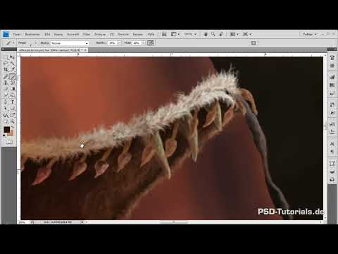
The video is only loaded from YouTube when you play it – data (including your IP address) is then transmitted to YouTube/Google. More in the privacy policy
Key Takeaways
- Fine detail work begins with clean shapes. Work with the outlines first before you add color, and correct the silhouettes only afterward.
- Contrast between two closely related color tones creates plasticity, for example with the teeth.
- Metal looks believable through irregular, wobbly strokes, highlight edges, and shadow edges, not through smooth lines.
- Layer masks are your most important tool when an effect looks too strong. If you erase directly on the layer, you lose the layer effect at that spot.
- Engravings tell a story. Scratches and symbols make a character more believable if they fit the motif.
Step-by-Step Guide
Step 1: Shaping the Fangs
Start with the fangs, which appear on both the top and the bottom piece. Hide the outlines for now so you can assess the shapes. The teeth initially look like spat-out chewing gum, which is why you activate the shape dynamics of your brush. This creates tapering lines that suit sharp teeth. Also incorporate the curvature that emphasizes the hip and the chest area.

Step 2: Refining Gradients and Brush Settings
Switch to print format mode and check whether the shapes are coherent. Then you refine the gradients. To do this, reduce opacity and flow, set the hardness to zero, and replace the shape dynamics with opacity jitter. This combination creates soft, organic transitions that don't feel like computer graphics.

Step 3: Making the Teeth Porous and Furrowed
Now you work on the incidence of light on the sides of the teeth. Place restless lines with slightly varying strokes so that the surface looks furrowed and porous. The association with plastic key chains is helpful here. Then you go over the teeth again with a darker tone. Only the contrast of two colors makes the effect truly visible.

Step 4: Considering Colors and Light Sources
You pick the color values from the white fur at the places where the fire is reflected. Add some gold and very light tones where the moonlight hits the contours. Make sure everything keeps a slightly yellowish touch so that the teeth stand out from the white fur. The teeth also shouldn't be too white, because a wild animal probably doesn't brush its teeth regularly.

Step 5: Creating the Shadows of the Teeth
Pick a color value from the chest piece and enlarge the brush to a radius of about seven pixels. Carefully go over the teeth with it to hint at the shadow to the left. This emphasizes the roundness of the body and shows that the fur lies over the teeth. Repeat the process at the bottom so that the two left teeth are shaded noticeably more. If the result still looks too bright, adjust the brightness and contrast via an adjustment layer in the clipping mask. Activate the preview and work by eye.

Step 6: Designing Lizard Tails as Fluffy Pennants
The pennants serve mainly as decoration. They are meant to make the fur bikini more interesting and underline the dynamics of the jump. First define a light and a dark color and use both to introduce a texture. Imagine that the pennants are made of fur, just a bit fluffier than the rest of the motif. On the right side you create a brightening with light colors, where the moon casts its light. On the left side you emphasize the fire with orange. For the areas facing away you use darker tones. In the upper area you repeat the process with slightly different color values, because the distance to the light sources plays a role.

Step 7: Overall darkening with low opacity
With a size 8 brush at half opacity, you darken all the parts once more. With black paint, you can work this way without the motif becoming too gloomy. Then you merge the group and reduce it to a single layer. Save in between, because you never know what might happen.

Step 8: Ribbons and details of the lizard tails
The ribbons that the pennants are attached with so far consist only of a simple light-dark gradient. Move the layer with the pennants upward so that their shape covers the ribbons. Add darker shadows from above to set off the white fur and enhance the depth. Finally, add some reflection from the fire in red and from the moonlight in light tones. Hold back here, because too many details look distracting in the finished motif. Finally, adjust the brightness via the menu, both for the base color and for the clipping mask.

Step 9: Contours and gradient of the bracelets
Now the bracelets follow. Create a new layer clipping mask for the metal details and work with a drawing brush of about ten pixels in diameter, hardness zero, and 67 percent opacity. As the color, you choose a dark brown. You have already created the gradient from reddish brown to yellowish white. You keep this hue, because the gold tone brings color into the motif that would otherwise be missing. Then reduce the brush to about six pixels to draw finer edges.

Step 10: Drawing shadow lines with a reference
Draw the shadow lines so that differences between light and shadow emerge at the edges. The band in the middle is less curved outward than the edge parts, so less pronounced brightness differences must appear there as well. Your own ring can serve as a reference: while drawing, look at your left hand to see how the light falls on a similar band. Repeat the step for all the bands and vary the hue slightly to do justice to different incidences of light. At the ankle, the fire is already included in the rough gradient. You have to take that into account when working out the details.
Step 11: Setting highlights
Switch to the detail clipping mask and take a lighter tone, with a size of about two pixels. Hide the outlines to better judge the effect. Work your way along the contours from the right, and then place lines on the edges that you would not see without outlines. The shapes thus only come into being through the application of the color. Then trace the band on the hand and the one on the shoulder. On the shoulder you can see particularly well what the refinement of the shadow has achieved.

Step 12: Wobbly strokes and metal traces
Do not paint smooth lines, but wobbly strokes. This creates the impression of dents and corrosion, as with the leather. Once all the shapes have been worked out from the light side, you switch to a darker tone and work your way in from the left. Blend both colors slightly so that the transitions become smoother.

Step 13: Adding gradients and retracing contours
Return to the mask with the gradients and enlarge the brush. Take the color from a spot you have already painted and lighten it somewhat. Add to the gradient a color value that is close to the light edges. Do not use continuous lines, but use broken strokes to simulate the surface. Signs of wear look more interesting to you than smooth objects. On the leg you also have to catch up on the contours that were overlooked when jumping between the areas. Then work from both sides with different colors toward the middle so that the gradient is preserved.

Step 14: Reinforcing the upper and lower edges
Reinforce the shadow of the upper edge with a size 5 brush and rough strokes. In the next step, you go over it with a size 2 brush to refine the structures. On the detail layer, you add shadows on the lower edges so that the whole thing looks more three-dimensional. For a nice gloss effect, you vary the red tone along the lower edges.

Step 15: Final Fine-Tuning with Highlights and Shadows
Create a new layer for the final fine-tuning. Use a size 2 brush with medium opacity and draw the brightest areas as highlights in a creamy tone. Then refine the shadows with almost full black until everything fits. This phase is ideal for experimenting, because the motif is already developed far enough that you can hardly do anything wrong.

Step 16: Engravings with Fantasy Letters
Create a new layer for the engravings. Using a light gold tone, draw imaginative letters and symbols along the edges of the bangles. The characters should look as if someone had written something into them. Repeat some symbols so that the whole thing appears believable.

Step 17: Understanding the Background of Wear and Tear
Signs of wear are not just about brushes or filters. What matters is the silent story an object tells. On an old couch, it is scratches, pet marks, burn spots or wine stains that give the couch character. In the same way, you use cracks and scratches to say something about your character. The engravings can represent wishes for a successful hunt or a safe return home. Such meanings strengthen the motif in terms of content.

Step 18: Setting the Layer Style for the Engravings
Activate the layer style by double-clicking and choose "Bevel and Emboss". Set the edges to outward, and adjust the size by feel. Leave the depth mode at 100 percent opacity. You don't need the light mode. Choose a dark brown instead of pure black as the depth color.

Step 19: Testing Layer Modes and Softening with Masks
Now test the layer modes with the arrow keys. The "Hard Light" mode looks good, but in other places it often appears too uniform. Therefore, you use a layer mask and fill in some areas with black using a soft brush to reduce the opacity. Erasing on the layer itself does not work here, because the layer effect at erased spots would look completely different. With the mask, you can soften individual areas so that the engravings don't stand out too harshly.

Step 20: Adding Engravings in the Rails
Create another layer on top, because engravings should also appear in the rails. Use a smaller brush and dark brown paint with the same symbols so that everything stays consistent. Bevels are used here as well, this time more inward. Reduce the light a little and soften the effect again via a layer mask by drawing over it with black. This makes the engravings look much better embedded.

Summary ??? Digital Painting: Bangles and Fine Detail Work on the Elf Amazon
In this part, you refined the fangs, the pennants and the fur bikini, and worked out the metal bangles in detail. With contours, gradients, highlights and wobbly strokes, a believable metal surface emerges. The engravings, combined with layer styles, modes and masks, round off the motif and give it a story. The leather straps follow in the next part.
FAQ
Why do I work with outlines first and hide them later?The outlines help you recognize the shapes clearly and separate the areas from one another. Once the shapes are right, you hide them in order to assess the fine detail work without distraction.
Why shouldn't I paint the teeth completely white?A pure white quickly looks unnatural and too bright. A slightly yellowish tone suits a wild animal better and also stands out from the white fur.
What is the layer mask used for with the engravings?With the mask, you can weaken individual areas without changing the layer itself. If you erase directly on the layer, you lose the layer effect at that spot.
How do you create believable metal traces?Use wobbly strokes instead of smooth lines and blend two color tones slightly into each other. Add light edges and shadow edges that follow the shapes.
How many details should you include on the bands?Hold back. Too many small lines quickly look distracting in the finished motif, so subtle shadows and reflections are enough.

