
A composite can be technically clean and still look flat. That is exactly what this final part of the tutorial series is about: you give the finished image depth, mood, and vitality. To do this, you work with additional layers that you use largely non-destructively, so you can readjust at any time. The guide takes you through modeling with light and shadow, noise, color style, cloud detail, and rim light.
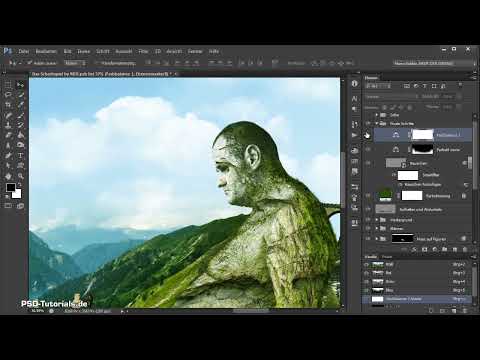
The video is only loaded from YouTube when you play it – data (including your IP address) is then transmitted to YouTube/Google. More in the privacy policy
Key Takeaways
The layer in Soft Light mode with neutral gray is your modeling surface. Gray stays invisible in this mode, and white or black on it selectively lightens or darkens the image. With the Alt key, you quickly switch between lightening and darkening while painting. Noise, color balance, and rim lights only unfold their effect through reduced opacity and masks.
Step-by-Step Guide
Step 1: Preparing the Modeling Layer
Create a new layer above the foreground group. To do this, hold down the Alt key while clicking the layer icon so that the dialog window appears and you can name the layer right away. Name it "Lighten and Darken" and set the mode to Soft Light. Then fill the layer with a neutral gray. At first you won't see any change, because gray is transparent in this blend mode.

Step 2: Modeling with Dodge and Burn
As soon as you paint on the gray layer, the image underneath changes. With white you lighten areas, with black you darken them. The effect corresponds to the Dodge and Burn tools, except that it is non-destructive and sits on its own layer. Paint very softly and with low opacity. Start with the areas below the figures and the chessboard that you want to darken slightly in order to shift the emphasis in the image.

Step 3: Using the Alt Key for Quick Switching
If you made a mistake or want to lighten a spot again in between, you don't have to switch tools. Simply hold down the Alt key, and the brush automatically switches to the opposite function. When you release the key, you're working in the previous mode again. This way you can model the entire image at your leisure without constantly reaching for the toolbar. Take care not to overdo it, because the result should remain realistic.

Step 4: Adding Highlights for Water and Metal
Now you bring the highlights into the image. Selectively lighten the waterfall so that it looks more radiant. The water surface may also glow and shine, so go over it with the soft brush. On the metallic elements on the left side, you lighten edges and surfaces so that they sparkle. Proceed in small steps and zoom closer into the image if necessary to check the transitions cleanly.

Step 5: Adding Shadows and Densifying the Image
You add shadows using the same technique. For example, pick an area that still seems too bright to you and repaint it with black. The caves, areas on the arm, and the lower zone of the image are well suited for this in order to create more tension. This step seems inconspicuous but brings a lot of density to the image. At the end, compare before and after by toggling the layer on and off to assess the effect realistically.

Step 6: Using Grain for a Movie Poster Look
Above the modeling layer, create a new group named "Final Steps". Inside it, you create another layer in Soft Light mode, fill it with gray, and name it "Noise". Zoom to 100 percent and choose an area where sharp and softer parts of the image lie next to each other. Convert the layer into a Smart Object and then apply the noise filter "Add Noise". The strength is a matter of taste. If you want a movie poster look, feel free to go a bit stronger than you initially like.

Step 7: Subtly Fine-Tune the Noise
The noise should not dominate the image. Reduce the opacity of the layer to about 80 to 90 percent, so that the grain shows through but does not look intrusive. Keep toggling the layer's visibility on and off to check the difference. This way, transitions between edited and unedited areas are concealed, and the image looks more harmonious overall. If an area looks too noisy to you, reduce the opacity there further.

Step 8: Adjust the Color Style in the Foreground
For a warmer foreground, create a Color Balance adjustment layer. In the shadows, increase the red portion and add a little green; in the midtones, shift toward red and yellow. Leave the values unchanged in the highlights. Name the layer "Farbstil vorne" and first mask it completely black so that it is invisible. Then paint with white as the foreground color only in the front areas until the effect is right. If needed, reduce the opacity so the change does not look too harsh.

Step 9: Enhance the Highlights of the Overall Image
Now comes a second Color Balance layer, this time for the entire image. Go to the highlights and raise them slightly so that the image looks brighter and a bit cooler overall. The effect is especially easy to see in the forehead area. This step balances out the warm foreground and ensures a well-balanced overall image. Name the layer "Weiß anpassen" so you can easily find it again later.

Step 10: Bring Definition into the Clouds
The clouds still look a bit smooth. For this, create a Levels adjustment layer and name it "Wolkenzeichnung". Leave the black point unchanged and slightly move the gray slider until structures become visible in the clouds. Make sure the layer works in Luminosity mode. Then invert the mask and paint over the clouds with white as the foreground color at full opacity. This way the definition only appears where you want it. You should be a bit more careful with the smoke.

Step 11: Create a Rim Light
A rim light makes figures in front of a bright background look more three-dimensional. Create a new layer, name it "Lichtsaum" and set the mode to Lighten. Zoom to about 50 percent and paint with white and a very soft brush along the contours of the objects that stand in front of a bright background. Be careful not to apply too much white. A lower opacity usually looks more realistic and more natural.

Step 12: Refine the Rim Light with a Mask
Not every spot can handle a rim light. Where the background is dark or blue, the effect does not fit. So create a mask and use a somewhat harder black brush to paint out all areas where the light would be visible within the figures. Pay particular attention to the nose, forehead, hair, and the rock in the background. These small details often catch the viewer's eye unconsciously and contribute decisively to the depth of the image.

Step 13: Complete the Final Polish
Finally, go through the entire image once more. Pull back a bit wherever an unnatural contour appears, for example at transitions between the rim light and the background. Work with soft brushes and small corrections until no distracting edges are visible anymore. Afterward, toggle all layers of the final steps on and off together to assess the overall result. You will notice that the image has become warmer, more three-dimensional, and richer in detail.

Summary – Photoshop Composing: Fine-Tuning with Light, Shadow, and Noise
With a gray layer in Soft Light mode, you shape your composite flexibly and non-destructively. The Alt key helps you switch quickly between lightening and darkening. Noise, color balance, cloud definition, and rim lights give the image the final polish if you use them subtly and control them with masks and reduced opacity. Always pay attention to before-and-after comparisons, because realism comes from restraint.
FAQ
Why is the gray layer in Soft Light mode initially invisible?Gray is neutral, so the image underneath remains unchanged until you lighten with white or darken with black.
How do I quickly switch between lightening and darkening while painting?Hold down the Alt key. The brush automatically switches to the opposite function, and when you release it, you return to the previous mode.
How strong should the noise be?That's a matter of taste. For a movie poster look it can be somewhat stronger, but it should be softened by a reduced opacity of about 80 to 90 percent.
What is the purpose of the mask on the color balance in the foreground?The mask is first filled completely black and then painted over with white only where the warmer color effect is desired. This way the background remains untouched.
Why should I reduce the opacity of the rim light?A lower opacity looks more realistic and more natural. A rim light that is too intense quickly looks artificial.
Where should no rim light appear?Anywhere the background is dark or doesn't suggest a light source, such as in blue areas. There you remove the rim light with a mask and a black brush.


