

Imagine a visitor lands on your website and immediately finds the contact form without having to search for long. That is exactly what a well-thought-out main navigation in the header area ensures. It is the anchor point of every website, and its design determines how quickly users find their way around.
The video is only loaded from YouTube when you play it – data (including your IP address) is then transmitted to YouTube/Google. More in the privacy policy
In this tutorial, you build a navigation bar for desktop views in Adobe XD. You design the bar visually, align it to a clean grid, and link the individual screens together so that a clickable prototype is created. The mobile version is covered in the second part of the training. Here you focus entirely on the desktop.
Key Takeaways
- A clean 12-column grid with fixed side margins ensures that all elements of the navigation sit exactly where they should.
- The navigation items should be distributed symmetrically and aligned to the grid lines.
- Active and inactive states show the user where they currently are.
- Submenus and the search field are separate states that you create as separate artboards.
- In the prototype, you connect each navigation item to the matching artboard so that the developer can directly understand the desired behavior.
Step-by-Step Guide
Prepare the Artboard and Secure the Background
First, create an artboard of 1920 × 1080 pixels. This size is well suited for designing a desktop menu, even if it seems a bit generous for the navigation alone. You can shrink it later once the structure is in place.
Before you get started, insert a background image. To do this, press Command + Shift + I, select your image, and drag it onto the artboard. While scaling, hold down the Alt key so that the image grows proportionally in all directions. Then drag it out to the edges.

Rename the artboard to "Überblick", as it will later serve as the home page. Then lock the background with Command + L so that you don't accidentally move it while working. The small lock icon at the top edge shows you that the layer is locked.


Define the Grid for a Clean Structure
A navigation thrives on clear spacing. So open the grid with Command + Shift + hash or via the grid menu in the properties. Choose the layout with 12 columns, which has proven itself for desktop sizes. Additionally, set side margins of 350 pixels. With the grid, you can orient yourself visually later on, and you can show and hide it at any time.

Create the Menu Bar and Coordinate the Colors
Now the actual bar is created. Select the Rectangle tool with the R key and drag a rectangle across the entire width of the artboard. In the properties, set a height of 80 pixels and remove the border. A white bar would often stand out too strongly from the background. A light gray tone fits the bar into the layout more harmoniously.
Then add the chosen color to your color swatches. That way you can reuse it at any time later without having to re-enter the values.

Place the Logo or Brand Name
On almost all websites, the logo is at the top left. Use the Text tool with the shortcut T for this and click once in the artboard. The wordmark "SmartWatch" serves as an example here. For the entire design, choose the font Ubuntu and, for the brand name, the Bold weight. This makes the logo stand out clearly from the other text elements.
Create and Align Navigation Items
For the main navigation, three items are enough in this example: "Überblick", "Features", and "Kontakt". A suggestion for the start: Set each item with the Text tool and give it a font size of 16 points. Twenty points would be too large for a navigation bar and would clutter the layout.
To duplicate an item, hold down the Alt key and drag it to the desired position. Place "Überblick" on the left, "Kontakt" on the right, and "Features" in the center. Use the grid lines as a guide.
If the spacing doesn't look even, select all three objects and use the symbol for distributing symmetrically in the top bar. Then move the entire group up a little so that it sits vertically centered in the bar.

Designing the Search Field as a Circle with a Magnifying Glass
The search field is the highlight of the navigation. First, you draw a square by selecting the Rectangle tool and holding down the Shift key while dragging. Remove the border and choose a shade of gray, which you also save in your color swatches. Enlarge the square slightly and place it in the middle of the bar.

Next, you drag the corners inward using one of the handles until the square becomes a circle. This gives the shape fully rounded corners. This is exactly the effect that later makes the search button so eye-catching.
For the magnifying glass icon, draw a circle without a fill using the Ellipse tool while holding down the Shift key. Give it a white outline with a thickness of two points. Then use the Line tool to place the handle of the magnifying glass at the bottom edge of the circle. Hold down Shift so that the line stays straight, and color it white as well. Round off the ends so that the magnifying glass gets a softer appearance.
Now select the circle and the handle together while holding down the Shift key. Then choose the "Add" option in the Pathfinder. A single shape is created from both objects, which you insert into the search field as the magnifying glass. Make sure it sits in the center of the circle.

Fine-Tuning with Grid, Accent Color, and Button
Show the grid again to move the search field exactly to the edge and to the center of the bar. With Command + 0, you get a bird's-eye view of all artboards. This way you can quickly see whether the spacing is consistent overall.

A short text in an accent color gives the home page more expression. For example, set the lettering "Ready to start" in orange and save the color in the color swatches as well. For placeholder text, you can use the service lorumipsum.de. Copy the text from there and paste it in the appropriate place to give the layout a realistic look.

Finally, you create a narrow orange button labeled "Try it". It will later be used in the second part of the training to build the responsive menu for mobile devices.
Duplicating Artboards and Defining States
A menu only becomes understandable through its states. Therefore, duplicate the desktop artboard with Command + D until you have a separate page for each navigation item. Arrange the copies clearly and name them after the respective menu item, i.e. "Features", "Kontakt", and so on.

On each page, you mark the active navigation item with a color, for example yellow. So on the overview page, "Überblick" is highlighted in yellow, on the features page "Features", and so on. This way the developer immediately recognizes which state corresponds to which screen.

Adding a Submenu for the Features
The "Features" item gets a submenu that can be opened with a click. To do this, draw a rectangle below the main navigation in the same color as the bar. Make sure it lies behind the menu so that it doesn't float above the items.

Then place text fields with the submenu items, for example "Schlafanalyse" and "Bewegung". To visually separate them from each other, use the Line tool to draw a delicate dividing line in an intermediate tone.
You then reset the color of the main menu to the default value. After all, the user shouldn't automatically see an active state when they merely click on "Features". Duplicate the features page twice and replace the label with "Schlafanalyse" or "Bewegung" respectively. On the Schlafanalyse page, you then mark the submenu item "Schlafanalyse" as active, and on the Bewegung page the item "Bewegung".

On the contact page, the "Contact" item receives the same active state as before. This creates a consistent logic across all pages.

Designing the search state
For the search field, you choose a special appearance. The search field is no longer a circle, but a rectangle that opens to the left. Therefore, stretch the rectangle lengthwise and move the magnifying glass to the left edge. You set the text field "Suchbegriff" in a shade of gray and in the Ubuntu Italic font. This makes the placeholder look more subtle, and the developer immediately recognizes that this is an input field.

Linking the prototype
Now the navigation becomes interactive. Switch to the "Prototype" tab and click on the artboard from which you want to create a connection. Drag the blue handle onto the target artboard. On the overview page, for example, you only need to link the items "Features" and "Contact", because you are already there.
Zooming out to the full view helps you keep track of all connections. On the features page, connect "Overview" to the home page and "Sleep analysis" to the corresponding page. On the "Contact" artboard, you also connect the items to the appropriate pages.

The magnifying glass gets a special effect. For the action, choose not "Transition" but "Auto-Animate", and the search field artboard as the target. As easing, you choose "Ease In Out" with a duration of 0.6 seconds. This way the search field opens smoothly rather than abruptly. You apply this setting to all connections to the search.

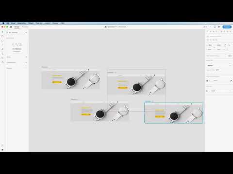
Repeat the linking on all artboards until every navigation item points to its target page. The "Contact" item on the search page must also be linked correctly. In the end, the connection view should look like a tangle of cables, which is quite typical for a fully linked prototype network.

Testing the prototype and fixing errors
Start the presentation using the Play button. Click through the page to check whether all connections work. During a test, you first notice that the "Contact" item on the home page does not respond. This is because you forgot the connections for the navigation items on the home screen. Add them in Prototype mode and run the test again.


Afterwards, the desired behavior appears. A click on "Features" opens the dropdown menu, and a click on "Sleep analysis" activates the corresponding state. If you switch to "Movement", the active state changes accordingly. The magnifying glass works too: it opens the search field with the smooth animation.
Summary – Adobe XD main navigation: Designing an interactive desktop menu
In this tutorial, you have built a complete desktop navigation in Adobe XD. You worked with a grid and fixed spacing, designed the bar with a logo, navigation items, and a round search field, and created each state as its own artboard. In the prototype, you linked the items together and added a smooth effect for the search with Auto-Animate. With this foundation, the developer can understand the behavior directly. In the next part, you will transfer the concept to the mobile view.
FAQ
Why should I use a grid?A grid ensures even spacing and clean alignment of all elements, which makes the navigation clearer.
How do I create a circle from a square?With a rectangle, drag a corner handle inward until the corners are completely rounded. This creates a circle.
What is the difference between Transition and Auto-Animate?A transition switches the page directly, while Auto-Animate animates shared elements between two artboards and thus creates a fluid effect.
Why do I need separate artboards for active states?Each state shows the user where they are. For the developer, this is a clear template from which they can derive the behavior.
How can I test a prototype?Click the Play icon at the top right to start the presentation, and check all connections there for their function.

