

A product rarely sells on its cover image alone. Only the detail page shows sizes, price and multiple views, and that is exactly where this second part comes in. You build a product detail page in Adobe XD, set up an image gallery with slider navigation, and then link the artboards together interactively. The guide is based on the video "Adobe XD-Tutorial: 20 | High-Fidelity-Prototyp kreieren, Teil 2 – Produktdetails" by Stefan Redel. Prior knowledge from the first part will help you follow the steps more quickly.
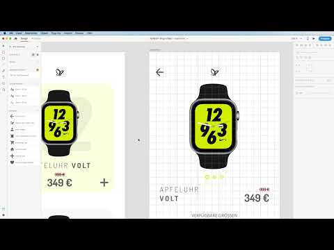
The video is only loaded from YouTube when you play it – data (including your IP address) is then transmitted to YouTube/Google. More in the privacy policy
Key Takeaways
- Each detail page is created on its own artboard, and you carry over existing elements such as the logo, price or names by copying them.
- The slider navigation consists of small circles, where the active dot is larger and gets a colored border.
- The font Dosis is suitable for headlines, while Open Sans is much more readable for body text.
- Recurring elements such as icons and arrows are created as symbols and fixed using the "Fix position when scrolling" option.
- In prototype mode, you link groups with transitions, and you connect slider dots without animation.
Step-by-Step Guide
Create the detail page and carry over the product image
Press the A key to create a new artboard and name it, for example, "Detailseite 1". Then drag out a rectangle from the left to the right edge so that the area completely covers the artboard. Next, open your CC Library and drag the product image from the opener page onto the new area. Reduce its size until the proportions are right, and scale it to the edges while holding the Alt key so that it sits symmetrically.


Build slider navigation with circles
For the image navigation, you need several small dots. Select the Ellipse tool with the E key and drag out a circle. Give it a very light gray as the fill color, one that barely stands out from the white of the background. For the border, choose your predefined accent color. If you duplicate the circle while holding the Alt key and move the copy using the Shift key and the arrow keys, the additional dots are created. Make sure the spacing is even. By holding the Alt key, you can then adjust the spacing and center the group.

The dot for the currently displayed image should stand out. Therefore, enlarge it to about 12 pixels and increase the border width to 1.5. Then adjust the spacing again so that it is 10 pixels and the dots are not too close together.
Carry over product name and price
The product name comes from the opener page. Copy the text field with Ctrl or Command plus C, paste it on the detail page and edit it by double-clicking. Align the text to the left and enlarge the text field if the name runs over two lines. Confirm the input with the Escape key. You copy the previous price in the same way, reduce its size and place it right-aligned next to the name. In doing so, you align the bottom edge with the line of the name. Make sure the price now correctly reads 399.


Design the size selection as text fields
So that users can select their size, you create a text field across the full width and color it in a dark anthracite shade. Write the available sizes in it. If the color is not applied immediately after creating it, select the text again and set the color once more. The sizes should be placed next to each other and each be centered.

Font choice for headlines and body text
The font Dosis looks strong in headings, but it quickly becomes tiring in longer texts. Therefore, switch to Open Sans for body text. This combination is a good mix. However, you should be careful not to use too many different fonts, because too many typefaces look restless. This applies to presentations just as much as to business cards and equally to user interfaces.

Arranging sizes as selection elements
Create a small rectangle for each size with the Rectangle tool (R key) and place the size value as text in the center. Place the elements next to each other, align them to the center, and move them in 10-pixel steps with Shift and the arrow keys. This creates an even grid that looks clear on the smartphone display.

Inserting body text with suitable line spacing
So that the lower area doesn't look empty, you need a description text. It doesn't have to be accurate in content, but only serves to present the design. Drag open a text box, set the font size to 10 and the font style to Light. Copy a placeholder text from your template and paste it in. The line spacing is crucial for readability. A value between 16 and 18 offers pleasant space between the lines. Four to five lines of text are completely sufficient.

Duplicating sections and aligning spacing
Enlarge the artboard if the content needs more space. Then copy the section with body text and size selection while holding the Alt key and place the copy below. Insert new headings such as "Features" or "For Athletes". With the guides, you align the spacing between the areas exactly evenly.

Adding the logo and back arrow
The detail page still lacks the logo and an arrow back to the home page. Copy the logo from the opener page, paste it onto the artboard, and move it to the upper area. You draw the arrow with the Line tool. Activate the grid view for this so that the lines attach cleanly. Increase the stroke width to about 3 and activate rounded corners. Shrink the arrow while holding the Shift key until it fits the layout well.


If you like the result, select the arrow and press Command plus K to define it as a symbol. Name it, for example, "Arrow back". You will then find it in the symbol list.
Cleaning up the symbol list
The symbol list may still contain copies from the smartphone kit that you don't need. These elements do not affect your artboards. You can safely remove them with a right-click and "Delete". This keeps the symbol bar clear.
Fixing the iPhone shape
So that the smartphone frame stays in place when scrolling, copy the iPhone shape from the home page with Command plus C and paste it onto the detail page with Command plus V. Lock the element so that it is not moved accidentally, and activate the "Fix position when scrolling" option in the Properties panel for the detail page.

Designing favorites icons
The icons at the bottom left and right consist of circles with shadows. To create them, draw an ellipse with the Ellipse tool (E key), remove the border, and give it a subtle shadow. Then copy the heart icon from the symbol bar, place it in the center of the circle, and ungroup the existing grouping of the heart. Select both objects, group them with Command plus G, and then create them as a symbol with Command plus K. Repeat the whole process on the right side with the plus symbol.


Fixing icons and integrating symbols
So that the icons always remain visible, activate the "Fix position when scrolling" option for both symbols. If you now scroll through the detail page, the most important functions remain visible at the bottom and overlay all other elements.

Duplicate detail pages and swap images
Duplicate the detail page with Command plus D and rename the copies to "Detail page 2" and "Detail page 3". On each copy, swap the product image for a different view from your CC library and scale it to fit. The arrangement stays symmetrical on all pages. Then adjust the slider dots: the active dot must match the correct position on each page. To do this, simply swap the positions of the two dots, for example by rotating them 180 degrees.


Link artboards in prototype mode
Switch to prototype mode and connect the groups to the respective target page using the rubber band. Choose "Tap" as the trigger and "Transition" as the action. For the direction, set the transition to left or right. A duration of about 0.3 seconds feels smooth. After linking, you can test in the preview whether the switch between the start page and the detail page works correctly.


Link slider dots
Link the dots at the bottom edge without animation so that the image changes immediately. Choose "Transition" as the action and "None" as the animation. If you click the second dot, you go to the second image; if you click the third, you go to the third. Make sure that each dot consistently points to the matching frame.


Test the prototype
Start the preview with the play button and click through the pages. The dots move along when the images change, and you can click them directly. On the detail page, you can also return to the start page.

Summary – Step by step to an interactive product detail page
You now have a complete product detail page with an image slider, size selection, text areas, fixed icons, and linked artboards. The combination of symbols, groups, and fixed elements saves you a lot of time on further pages. In the next part, an overlay effect for the heart icon follows.
FAQ
How do I create a new artboard in Adobe XD?Press the A key, then name the artboard in the properties panel or directly in the layers list.
How do I copy elements without moving the originals?Hold down the Alt key while dragging, and a copy of the element will be created.
What is the "Fix scrolling" option for?With it, elements stay visible in their position while scrolling, such as icons or toolbars at the bottom edge.
Why should I use fonts sparingly?Too many fonts look restless and make orientation harder. Two well-matched fonts are usually enough.
Should I delete symbols from the symbol list if they are not needed?Yes, that is harmless. Deleted symbols have no effect on the artboards in which they are not used.
How do I link slider dots without animation?In prototype mode, choose "Tap" as the trigger, "Transition" as the action, and "None" as the animation.

