

A click without a visible reaction unsettles every user. That is exactly what the last part of this prototype series is about: you will learn how to build a shopping cart flow in Adobe XD that confirms every input, avoids error states, and ends with a closing animation. In the process, you combine overlays, button states, Auto-Animate, and timed sequences into one continuous scenario.
The video is only loaded from YouTube when you play it – data (including your IP address) is then transmitted to YouTube/Google. More in the privacy policy
This guide is aimed at anyone who already knows the basics of Adobe XD. You should be able to confidently use artboards, rectangles, groups, and the prototype view. All steps follow the video tutorial and are structured so that you can rebuild them directly.
Key Takeaways
- An overlay with a background blur reliably draws the eye to the selection.
- Every button needs visible states, for example active and inactive. A gray button with black text wrongly signals that it is clickable.
- When an input is missing, the system must react immediately, for example with a shaking motion and a clear highlighting of the required selection.
- Layers that are supposed to change between artboards need identical names. Only then can Auto-Animate link them.
- In XD, you enter decimal values in English format, so 0.6 instead of 0,6.
- Timed animations only work if you select the artboard and not an individual object.
Step 1: Prepare the Overlay
First, duplicate the detail page with Cmd + D and move the copy down one layer. On this copy, place a rectangle that fills the entire height of the artboard. Give it a background blur, which you set between 0 and 50. A value around 35 looks pleasantly subtle. Also reduce the brightness slightly, for example to -1. More is usually not necessary to make the background recede.

Step 2: Name the Artboard and Zoom to the Center
Give the new artboard a clear name, for example "Add to Card". This helps you later with linking, because you can immediately follow the flow. With Cmd + 3 you zoom to the artboard. Then remove the distracting border line so that the overlay looks clean.

Step 3: Shape the Overlay Rectangle
Draw a rectangle from the top edge to the bottom edge of the viewport. Set the height to about 470 pixels. This gives roughly a split of two thirds to one third, which works well as a bottom sheet. While dragging the corners, hold down the Cmd key so that only the top corners change. Set the radius to 30. Repeat the process for the top left corner.

Step 4: Improve Contrast with a Shadow
If the overlay and the background are too similar, the edge is missing. Therefore, add a shadow with a value of about -3 pointing upward. The edge becomes clearly visible without overloading the design. You can apply this principle in other places as well where surfaces are not sufficiently separated from one another.
Step 5: Insert and Label the Watch
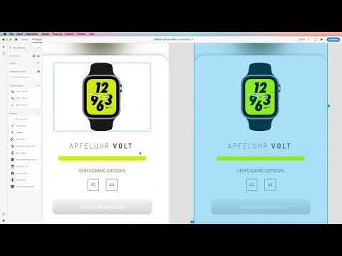
Copy the watch from the detail area with Cmd + C and paste it into the center of the overlay with Cmd + V. You also take the description of the watch from the main artboard. Convert the text field into a point text field and make sure it stays on one line. Then align the elements to the center. Below it, add a neon green divider line that visually separates the areas from one another.

Step 6: Size Selection and Button Styling
The user must be able to select the size before adding to the cart. Therefore, copy the area with the available sizes and paste it in again. This way you prevent a customer from buying a product without having decided on a size.
For the button, you choose the shortcut, draw a rectangle, remove the border, and apply a linear gradient with a delicate shade of gray. The radius is 10. A text field with bold type goes in the center. The gray gradient already indicates that the button is not yet active.

Step 7: Clearly Communicate the Inactive State
Black text on the gray button looks like an active state, and that is exactly what you should avoid. Use white text so it is clearly recognizable that the button is not clickable yet. Group the rectangle and text field with Cmd + G and add the group as a symbol "Button inactive" with Cmd + K. Make sure the spacing is symmetrical and that the elements don't stick too tightly together.

Step 8: Check the Shopping Cart Flow and the Usability Logic
Duplicate the artboard with Cmd + D and move it to a free spot. Imagine a specific scenario: The user sees the overlay but clicks on the shopping cart without having selected a size. This is exactly where the heuristic "Visibility of system status" by Jakob Nielsen and Don Norman comes into play. A click needs feedback, and the user must recognize what to do next.

Step 9: Define the Transitions in Prototype Mode
Switch to prototype mode and connect the "Shopping cart" button to the "Select size" artboard. For the trigger, choose Tap, and for the action, Transition. Set the easing to "Snap" and the duration to 0.6. Make sure to enter the value in the English format with a period. A comma would not be accepted correctly.

Step 10: Design the Error Message as Feedback
Test the flow. The user clicks on the shopping cart but gets visible feedback: The overlay bounces up and down, showing that a selection is still missing. This movement is a short, clear system response that confuses no one.

Step 11: Create the Artboard for the 44 mm Size
Duplicate the selection artboard again and change the design of the selected size. Highlight the 44 by coloring the text neon green and making it significantly larger. Set the frame to neon as well. Name the artboard accordingly "Size selected 44 mm in diameter".

Step 12: Link the Selection with Auto-Animate
Group the selection with Cmd + G so it doesn't matter whether the user taps the rectangle or the number. Connect the group to the "Size 44" artboard. For the action, choose Auto-Animate, set the easing to "Ease In and Out", and keep the duration at 0.6.

Step 13: Activate the Button After the Selection
As soon as a size is selected, the button must visibly become active. To do this, ungroup the inactive symbol, change the color to Volt, and adjust the gradient so the button looks darker. Group the button with Cmd + G and save it with Cmd + K as the symbol "Button active". Afterwards, you can use both button states in your symbol list.

Step 14: Build the Purchase Confirmation as a Final Animation
Duplicate the artboard and name it "Purchase confirmation 1". Remove all elements that are no longer needed. Shape the rectangle into a circle. Hold Alt while doing so to work from the center, and make sure the width and height are equal. Then move the circle upward.
Give the rectangle a unique name, for example "Rectangle 15". This name is the key for Auto-Animate. If you change it, you must adjust it identically on all artboards. This way, the rectangle transforms from the overlay shape into the circle during the transition.

Step 15: Make the Watch Disappear into the Black Hole
Duplicate the circle and move the copy to the right spot. Shrink the digitized watch movement to a pixel size of about 1 mm and align it with the circle. Then reduce the opacity to 0 percent. During the Auto-Animate process, the watch shrinks to a point in the center and disappears as if into a black hole.

Step 16: Add the shopping cart icon and the purchase confirmation
Drag the shopping cart icon from the toolbar, ungroup it, and color it white. Enlarge it slightly and place it in the center of the circle. Then copy the icon to the artboard "Kaufbestätigung 3" and scale it down while holding the Shift, Alt, and Cmd keys. Move it downward so that the transition looks clean.

Step 17: Set up the timing control
So that the animation runs without user input, you work with timing control. It is important that you select the artboard and not a single object. Otherwise, the dialog for the timing control will not appear. Choose Time, with a duration of 0.6, then Auto-Animate. Set the easing to "Ease Out". For the next step, copy the settings and change the easing to "Ease In and Out".

Step 18: Link the shopping cart with the purchase confirmation
Connect the "Aktiv" button in the artboard "Größe 44" with the artboard "Kaufbestätigung 1". Choose Tap as the trigger and Auto-Animate as the action. The easing is Ease In and Out and the duration is 0.6 seconds. Then test the entire flow in prototype mode. First choose the size, put the product in the shopping cart, and watch the animation.

Step 19: Integrate the iPhone shape as an overlay element
Copy the iPhone shape from the start screen with Cmd + C and paste it onto all artboards. This way, the frame stays constant. Then check in prototype mode whether the transition works correctly when clicking the plus icon. If not, link the element to the appropriate artboard again and set the transition to up.

Step 20: Carry out the complete test run
Start the prototype and click through the entire scenario. Tap "Add to Card", initially choose no size, and observe the error message. Then choose 44 mm and have the final animation shown to you. Only when the flow works in this order is your high-fidelity prototype finished.

Summary – Adobe XD prototype: Designing a purchase confirmation with animation
In this tutorial, you built a complete shopping cart flow in Adobe XD. You created an overlay with a blur effect, clearly separated button states, and built in an error message that shows the user the next step. With Auto-Animate and consistent layer names, you implemented a final animation that confirms the purchase. The transitions run on a timer, so no further click is necessary.
The most important idea behind this is feedback to the user. Every action needs a visible response, and every error case needs a clear indication of how it can be resolved. If you apply these principles to your own projects, your prototype will not only be beautiful but also logically comprehensible.
FAQ
Why should I enter decimal values in the English format?Adobe XD reliably accepts decimal values with a period. A comma is often not processed correctly, so animations do not run as planned.
What happens if I change the name of the rectangle on an artboard?Auto-Animate links layers based on their name. If the name is not identical on all artboards, the object does not move cleanly to the new position but is faded in anew.
Why do I select the artboard and not a single object?The timing control applies to the entire artboard. If you select only an object, the corresponding dialog does not appear and the animation is not started.
What is the gray button in the initial state for?The gray gradient with white text shows the user that the button is not yet active. This way, you avoid confusion and unnecessary clicks.
How can I make error cases visible to the user?You can use a short movement such as shaking or bouncing the overlay and clearly highlight the missing selection. This way, the user immediately learns which action is still missing.

