
A cleanly cut-out object often still looks pasted in on the new background. Usually the matching light direction, the right sharpness, or a color mood that fits the surroundings is missing. This is exactly where this tutorial comes in. Using a cut-out dog in front of a rocky landscape as an example, I'll show you the steps in Affinity Photo that turn a mere composite into a believable image.
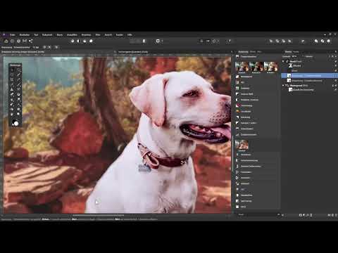
The video is only loaded from YouTube when you play it – data (including your IP address) is then transmitted to YouTube/Google. More in the privacy policy
Key Takeaways
First, pay attention to the light direction. Shadows must match the light source in the background, otherwise the result is immediately noticeable.
Match the sharpness. A background that is sharper than the subject looks fake. A soft blur with a gradient is the better solution.
Adjust the colors of the shadows to the surroundings. Green shadows on an orange rock give away the composite.
Connect foreground and background with tonal values, layer modes, and noise. Only this interplay ensures that all elements merge into one image.
Step-by-Step Guide
Step 1: Insert the cut-out object into the background
Open both your background image and the file with the cut-out object. In the file with the dog, briefly hide the layer mask by holding the Shift key and clicking on the mask. This lets you check whether the cut-out is clean. Then copy the layer with Ctrl+C and paste it into the background image with Ctrl+V.

Step 2: Adjust size and position
The pasted object is usually too large. With the transformation frame of the Move tool, you can shrink it and place it in the right spot. If the magnetic edges bother you while moving, you can disable them via View and Configure Snapping. There, you remove the check mark at Enable Snapping. This lets you move the object freely.

Step 3: Check light direction and shadows
Look at which direction the light in the background comes from and where the shadows fall. In the example, the shadow in the background falls to the right, but on the dog it falls to the left. This immediately looks inconsistent, because there seem to be two different light sources. In this case, flip the object via Arrange and Flip Horizontal. In the example, the shadow direction then matches. Always make sure that the subject and background belong to the same lighting situation.

Step 4: Adjust the sharpness of the background
If the object and the background were shot with different focal lengths or apertures, the sharpness often doesn't match. In the example, the dog's eyes, ears, and snout are sharp, the body becomes blurrier, but the background is razor-sharp throughout. You can either sharpen the subject, which is only possible to a limited extent when image details are missing, or soften the background. The second option is usually the more practical one.
To do this, select the background and create a Live Filter layer. In the example, the Gaussian Blur filter is used. Adjust the radius so that the background is calm but still recognizable. Ideal would be a sharpness gradient, where the rear area is blurrier than the front, just as depth of field produces in reality. This can also be achieved with a Lens Blur.

Step 5: Curves as a clipping mask for the lighting mood
The color mood is the next important point. The background is orange because of the rocks, but the dog comes from a green environment and therefore carries green tones in its shadows. Decide whether you shift the background toward green or adjust the dog's shadows to the background. In the example, the second option is chosen.
To do this, create a Curves adjustment layer and convert it into a clipping mask to the dog via right-click. This way, the correction affects only the subject. With the curve, you can change the shadows selectively without affecting the highlights.

Step 6: Remove Green from the Shadows
Select the green channel in the Curves adjustment. The complementary color of green is magenta. If you take green out of the shadow areas, magenta is mixed in, and the fur immediately looks more fitting for the warm surroundings. Hide the adjustment layer from time to time to check the before-and-after comparison. In the highlights, a slightly reddish tone can also help. To do this, shift the curve in the upper area only very slightly.

Step 7: Match the Brightness of the Fur with the Levels Adjustment
The fur still looks too dark in some places because the sun is shining strongly in the background. Therefore, add a Levels adjustment as a clipping mask to the dog. Hold down the Alt key and drag the white slider to the left until you reach the point where bright areas just barely retain detail. If you pull too far, pure white areas with unsightly artifacts will appear. In the example, the effect is additionally reduced to around 90 percent via the opacity.

Step 8: Prepare the Dark Fur Edge with an Empty Layer
The edge of the fur is often too dark, even though the light comes from the left and the edge should actually be brighter. To fix this, create a new, empty layer and drag it below the adjustment layers, but inside the clipping mask. This way, it takes on the color changes you made previously. Then select the Brush tool and use it with a low opacity.

Step 9: Sample Color and Brighten the Edge
Caution is required here. With the Color Picker tool, you sample a color by holding down the Alt key and clicking on a spot. The source in the tool settings is crucial. With the source set to Global, you pick up the color including all previous corrections. With the source set to Current Layer, only the color of the currently selected layer is taken into account. Therefore, switch to the dog layer, sample a light fur color there, and then switch back to the empty layer. Now paint along the edge with a very soft brush at about 25 percent opacity. Several thin strokes are better than one heavy stroke. Make sure you always select the right layer, and sample the appropriate color with each color change. Do not paint over areas with a different color, such as green grass or the tongue, otherwise new errors will arise.

Step 10: Connect Foreground and Background
To connect the subject and the surroundings even more strongly, copy the background layer with Ctrl+J and drag the copy all the way to the top, that is, above the dog. Set the Gaussian Blur to a strong value and change the blend mode of this layer from Normal to Soft Light. Then reduce the opacity, in the example to about 70 percent. Hide and show the layer once for comparison. This way you can see how strongly the two parts now interweave with each other.

Step 11: Carefully Reduce Saturation
If the result looks too colorful, an HSL adjustment layer at the very top of the layer stack helps. Reduce the saturation slightly there. The aim is not to make the image gray, but to calm the colors a little so that they match.

Step 12: Add Noise for a Realistic Look
Finally, the grain that real camera images usually have is still missing. To do this, create a new, empty layer at the very top and name it, for example, Noise. Fill it with a medium gray via Edit and Fill. Set the blend mode to Soft Light so that the gray becomes transparent. Then apply the Add Noise filter via Filter and Noise. In the example, an intensity of about 60 percent fits. Afterwards, reduce the opacity slightly, to about 95 percent, so that the noise does not look artificial. Without this step, the soft background quickly looks digital.

Summary ??? Affinity Photo: Inserting Objects into Images Convincingly
A convincing composite is created from many small adjustments. First align size, position, and light direction. Then match the sharpness of the background and adjust the colors of the shadows to the surroundings. With levels, a connecting filter in the Soft Light layer mode, a subtle saturation adjustment, and finally noise, subject and background can be connected in such a way that the result looks natural.
FAQ
How do I know if the light direction is right?Look at where the shadows fall. If they fall in different directions in the background and in the subject, the light sources don't match and you need to flip or realign the object.
Why should the background be softer than the subject?With different focal lengths or apertures, the sharpness is usually uneven. A soft background with a gradual falloff in sharpness therefore looks more believable, because it corresponds to the depth of field of a real photograph.
Why do I need to pay attention to the correct layer when using the brush?With the Source set to Current Layer, the eyedropper only picks up the color of the currently selected layer. If you don't switch to the appropriate layer, you pick up the wrong colors and create new errors.
What does the clipping mask do for adjustment layers?A clipping mask limits the effect of the adjustment layer to the layer below it. This way you can change the colors or brightness of the subject without distorting the background.
Why is noise important at the end?Real photos contain fine grain. If it is missing, soft areas often look smooth and artificial. A subtle amount of noise makes the image appear as a unified whole.


