The adjustment of text to graphic elements is one of the most creative ways in Adobe Illustrator to create impressive designs. In this guide, I will show you how to effectively fit text to a path so that it can follow graphic shapes and waves. This is often needed for logo designs, posters, or even illustrations. Let’s dive right in and go through the steps.
Key Insights
- You can apply text to a path using the text tool.
- The path can be a simple line or a complex shape, including waves.
- You can copy existing graphics to use for the text path or create your own shapes.
Step-by-Step Guide
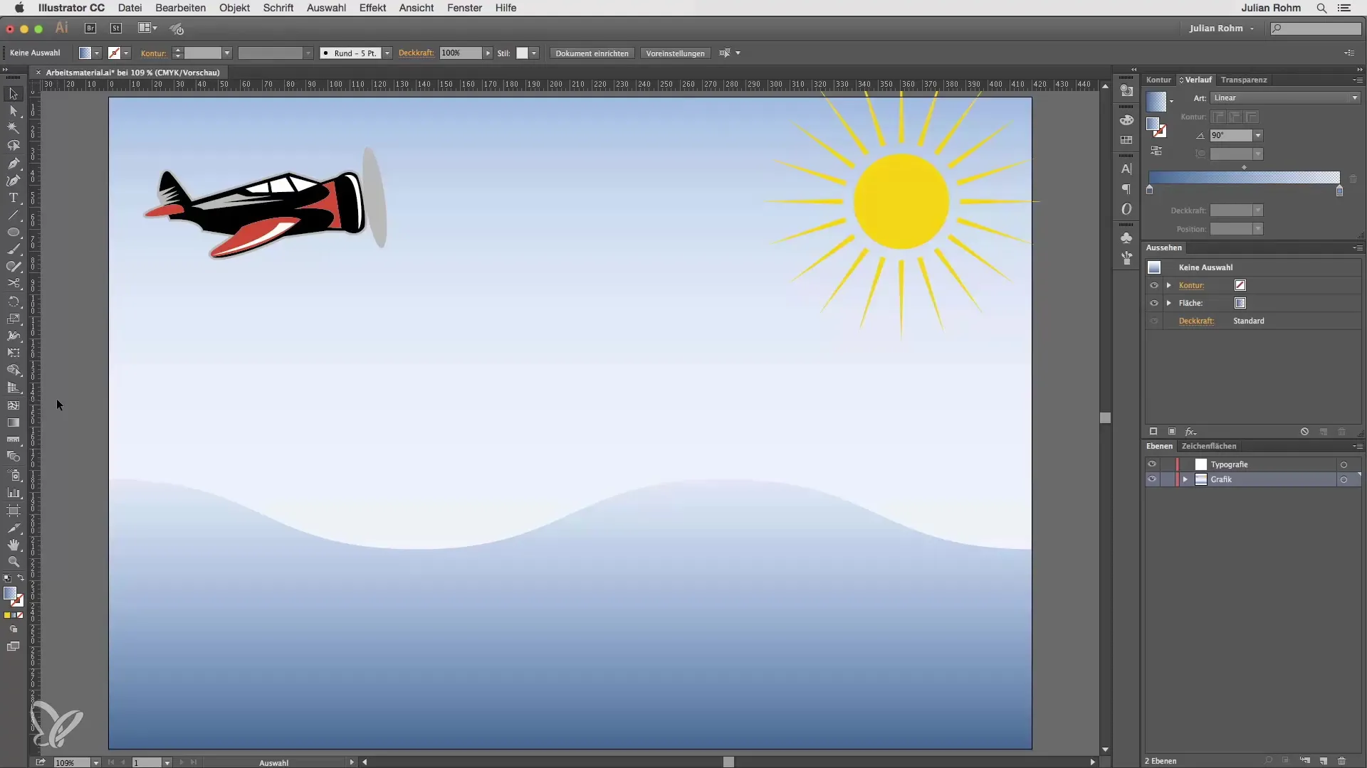
First, you need a vector graphic to work with. In this tutorial, we will use a graphic with wave patterns to lead the text "Wave" along.

To use your graphic layer, first copy the selected element. To do this, select the element and press Command + C to copy it to the clipboard. Then, paste the element back in the same place by pressing Command + F.
Now you need to create the layer for the text. Drag the copied layer into the typography layer so that you can easily use it. To ensure that the underlying graphic doesn’t shift, lock the graphic layer for further editing.
Now select the text tool. If you click and hold on the text tool, an additional menu opens up. Select the "Path Text" option to place the text along a path.
Then click on the path of your graphic. At the moment, only the path will be shown, without any color fill. This is fine, as you can now enter the text. Type the word "Wave" in the text box.
You can adjust the font size as desired. Make the font larger so that it is clearly visible and follows the contour of the path. Depending on the complexity of your graphic, you may need to experiment with the size of the font.
Once you have adjusted the font, you will see how the letters automatically follow the path. This method allows you to make creative text adjustments with ease.
If you are dealing with other graphic elements that are not available as a path, you can choose the traditional way and trace the element with the pen tool. This may be a bit more labor-intensive but offers enhanced options for creating creative designs.
This technique gives you a lot of flexibility to combine graphics and text innovatively. Remember that you can also explore other creative ways to fit text to graphics, and not just on the path of waves.
Summary – Creatively Adjusting Text – Guide to "Text on Path" in Illustrator
In this guide, you learned how to fit text to graphic elements by applying text to a path. The process is straightforward and opens up many new creative possibilities in your designs. Use the text tool skilfully and experiment with different fonts and sizes to give your projects the desired feel.
Frequently Asked Questions
How can I create a path in Illustrator if I don't have an existing one?You can trace a path using the pen tool or create simple shapes with the shape tool.
What do I do if the text does not properly follow the path?Make sure you have correctly selected the "Path Text" tool and check the path settings.
Can I adjust the text after creating the path?Yes, you can adjust the font and size at any time as long as the text stays on the path.


