
A photo often looks completely different just because of its color mood. With the Bi-Color filter in Nik Collection Color Efex Pro 4, you place a color gradient over your image, for example strong blue at the top and warm orange at the bottom. This guide shows you where to find the filter, how to control opacity, blend, and horizon, and how to use both ready-made presets and your own colors.
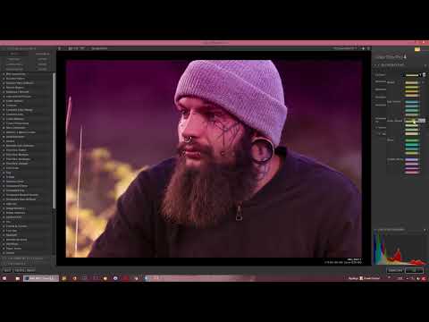
The video is only loaded from YouTube when you play it – data (including your IP address) is then transmitted to YouTube/Google. More in the privacy policy
Key Takeaways
- You can find the Bi-Color filter in Color Efex Pro 4 in the black-and-white conversion section.
- With opacity, blend, and horizon, you determine how strong and how soft the gradient appears on your image.
- You can choose from numerous preset color sets or define your own colors with "Bi-Color User Defined".
- With the eyedropper, you pick up color tones directly from the image, such as a skin tone or a green from the landscape.
- Use the effect sparingly, because a strong color gradient on every image can irritate viewers in the long run.
Step-by-Step Guide
Step 1: Open the Bi-Color filter
Open your image in Color Efex Pro 4. You can find the Bi-Color filter in the black-and-white conversion section. Click on it so that it becomes active and you can see the settings.

Step 2: Keep an eye on the preview
As soon as the filter is activated, the preview immediately shows you how the color gradient looks on your subject. So you don't have to confirm first to judge the result. Check the preview after every change, because this way you can quickly see whether the colors suit your image.

Step 3: Adjust the opacity
With the opacity slider, you determine how intense the color appears. Drag it to the right if you want the gradient to look strong. If you stay further to the left, only a light color tint is laid over the image. A subtle value is often more suitable if the photo should not be completely recolored.

Step 4: Control the blend between hard and soft edge
With the blend slider, you decide what the transition between the two colors looks like. With a low blend, a hard edge is created that clearly separates the color zones from each other. If you increase the blend, the colors merge softly into one another. For natural-looking results, such as with landscapes, a soft transition is usually the better choice.

Step 5: Move the horizon
The horizon determines at which point in the image the color change takes place. When you move the horizon, you either pull the gradient further up from the bottom or let it slide further down. It is best to first reset the value to 50 percent so that you have a neutral starting point, and then adjust it step by step.

Step 6: Rotate the gradient
In addition to moving it, you can also rotate the horizon. This makes the color transition run diagonally instead of horizontally. This option is especially suitable for subjects where you want to emphasize dynamic lines. Try out different angles and watch the preview until the gradient fits harmoniously with the composition of the image.

Step 7: Browse the preset color sets
If you don't want to define your own colors, the filter offers you a large selection of color sets. There you will find, among others, green-yellow tones, warm orange tones, mixtures of cool and warm colors, green-brown combinations, as well as variants in violet and pink. Click through the sets one after another and compare the results directly in the preview. This way you quickly find the look that comes closest to your image idea.

Step 8: Fine-tuning the selected preset
Once you have selected a color set, it is usually worth refining it. Increase or decrease the opacity so that the effect suits your image. Blend the gradient a bit more if a hard edge looks unattractive. Then move the horizon down or up until the color zones are in the right place. This combination of preset and fine-tuning often produces better results than the preset alone.

Step 9: Defining your own colors with Bi-Color User Defined
If the presets are not enough for you, open the "Bi-Color User Defined" option. Here you have the same settings for opacity, blend, and horizon available. In addition, you can freely choose the colors for the upper and lower areas. The advantage is that you can design the gradient exactly as you imagine it.

Step 10: Defining the two colors
Click on the color swatch for the upper area and select a hue there, for example a strong green. Then you set the color for the lower area, such as a magenta. This creates a gradient between the two colors. Whether you like the result is a matter of taste. What matters is that you know the possibilities and try them out deliberately.

Step 11: Using additional colors and brightness
You can create more than two color zones by blending the gradient and combining additional tones. One example would be yellow in the upper area and white at the bottom, which makes the gradient transition into brightness. If you choose black instead, a dark gradient is created from bottom to top. In this way you create moods ranging from airy to dramatic.

Step 12: Picking colors from the image with the eyedropper
A particularly practical function is the eyedropper. First, deactivate the checkbox for the default color so that the selection is free. Then use the eyedropper to click on a spot in the image whose color you want to adopt. If you choose, for example, a shade of green from the foliage, this tone appears as the lower color in the gradient. This way the effect stays closely tied to the subject.

Step 13: An example with skin color
The eyedropper is also suitable for colors from portraits. Select a skin color in the image and use it as the color for the upper area. Then you apply the gradient to the image again. The result shows how harmonious a color gradient can look when it refers to colors in the subject.

Step 14: Using the effect in moderation
Finally, an important tip from practice: don't overdo the effect. Reduce the opacity enough that the impression of a slight color change remains, or apply the gradient deliberately only to selected images. If you apply it strongly to every photo, the series of images can look restless or strange in the long run.

Summary ??? Using bi-color gradients in Color Efex Pro 4 effectively
The Bi-Color filter in Color Efex Pro 4 transforms your images into atmospheric color compositions with just a few steps. You start in the black-and-white conversion area, use the preview, and adjust opacity, blend, and horizon to suit the subject. Then you decide on one of the many presets or create your own gradients with "Bi-Color User Defined," also with the help of the eyedropper. What remains crucial is to use the effect with restraint and awareness.
FAQ
Where do I find the Bi-Color filter in Color Efex Pro 4?You will find it in the black-and-white conversion area of the filter list.
Can I weaken the color gradient afterwards?Yes, simply reduce the opacity until the effect is only subtle.
What does the blend slider do?It determines whether the transition between the colors is hard or soft.
Can the horizon of the gradient be adjusted?Yes, you can move it and also rotate it to adapt the color transition to your subject.
How do I choose my own colors?Use "Bi-Color User Defined" and freely select the colors for the upper and lower areas.
Can I take colors directly from the photo?Yes, with the eyedropper you click on a spot in the image and adopt its hue into the gradient.
Should I apply the effect to every image?No, use it deliberately, because if used too often it can be irritating to viewers.


