
A photo of fabric often looks flat, even though everything is correctly exposed. In that case, the light and shadow that give a fold its shape are missing. This is exactly where Dodge and Burn comes in. With this technique, you brighten highlights and darken the valleys of the folds, so that the clothing looks more three-dimensional and interesting. In this tutorial, I will show you step by step how to work with a small brush and a very low opacity, where you should place highlights, and how to create soft transitions.
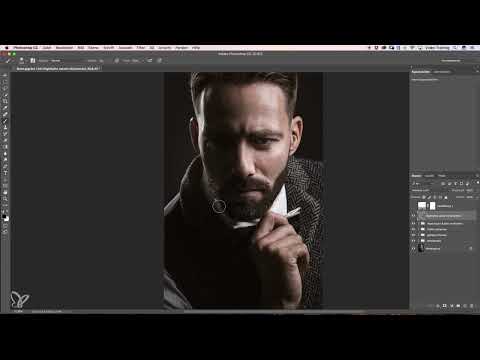
The video is only loaded from YouTube when you play it – data (including your IP address) is then transmitted to YouTube/Google. More in the privacy policy
Key Takeaways
- You apply Dodge (brightening) with white on highlights and edges, and Burn (darkening) with dark or black on the valleys of folds and shadow areas.
- Work with a small brush and an opacity of about 3 percent. This way you build up the result in many thin strokes.
- Place highlights only where the light would actually hit, for example on fold edges and fabric curves.
- Soften your strokes after darkening so that no hard edges appear.
- Check your result regularly with a before-and-after comparison.
Step-by-Step Guide
Step 1: Setting Up the Brush Tool Correctly
Before you get started, select the Brush tool and set a small, soft brush tip. Precision is especially important with clothing, because you want to emphasize fine fabric edges and not cover large areas. Then lower the opacity to about 3 percent. Also set the foreground color to white, since you will use it first to brighten the highlights.

Step 2: Carefully Brightening Highlights
Now place the brush with white on the highlight you want to emphasize. The most important thing is not to work at full intensity right away. Instead, paint briefly over the same spot several times until the shine looks natural. The bright area should only be where light already falls on the fabric. So you are strengthening something that is already present in the image, rather than inventing artificial light.
Step 3: Darkening the Area Around the Highlight
To make the shine appear stronger, you slightly darken the area directly next to it. To do this, switch to the dark color and go over the areas surrounding the highlight with the brush. Be careful to apply only a very small amount of color. You will notice how the highlight immediately stands out more strongly from the image. Also go along the upper area of the clothing once, so that the darkening looks even.
Step 4: Toning Down Areas That Are Too Bright
Sometimes an area attracts too much attention due to the brightening. This is probably the case for you too after the first steps. Here it helps to darken the area in question slightly once more. This way the eye does not get stuck on a single point, but moves harmoniously through the subject. Again, work with small strokes and check after each pass whether the result looks coherent.
Step 5: Brightening Dark Areas and Softening Compressions
Not every dark zone turns out well. Some areas look too heavy or show unattractive compressions in the fabric, which you would prefer to soften. Then switch back to white and gently brighten these zones. Here too the rule applies: better several gentle passes than a single strong stroke. In this way the disturbing compression disappears, and the clothing looks calmer again.
Step 6: Creating an Even Gradient
Make sure that the brightness follows an even gradient across the entire piece of clothing. If you darken in one spot, check whether the transition to the neighboring areas is smooth. Repeat the darkening in the spots that are still too bright, and always stay within the range of a few percent opacity. Over time, this creates a gradient that produces depth without looking obtrusive.
Step 7: Emphasizing the Lower Section and Other Shadow Areas
In the lower part of the fabric, folds often appear that look a little too flat. Darken these sections so that the lengths of fabric stand out from one another. Proceed in the same way with other shadow areas that you notice. I recommend briefly checking the overall effect after each section. Often a slight correction is enough for the image to gain significantly more depth.
Step 8: Working Out the Highlight Edges at the Top
The highlight in the upper area deserves special attention. With white, paint a nice, long line along the edge where the light hits most strongly. This makes the edge look three-dimensional and the shape of the fabric clearly recognizable. If the shine reappears in another spot, follow it with the brush so that the lighting stays consistent.
Step 9: Make transitions smooth and trace the edges with black
If dark spots appear between the highlights, carefully lighten them until a smooth transition is created. Then take black and trace the edge once more to strengthen the contrast. This makes the highlight look clear and strong, without the rest of the image looking overly harsh. It's especially worth being patient at this point, because small corrections make the biggest difference here.
Step 10: Darken bright areas on the shirt
A white part of the shirt that visibly extends into the image draws a lot of attention. Therefore, darken this area slightly so that it blends into the overall picture. Here too, you work with low opacity and many short strokes. The result looks more harmonious, and the viewer concentrates on the important folds and highlights.
Step 11: Deepen folds with a shadow directly next to the fold
To clearly emphasize a fold, you darken the area directly next to it. A trick here: feel free to exaggerate a little, because the effect is very subtle at low opacity. The shadow should be placed as if the deepest point of the fold were exactly there. This creates the illusion of real depth in the fabric.

Step 12: Softly fade out the shadow
So that the shadow doesn't look like a line stuck on, you fade it out softly toward the outside. For this, use a larger brush tip and paint gently into the somewhat darker area. You can additionally emphasize the fold itself a little bit, and in places with a deep hollow, you may add a bit more darkness.
Step 13: Check the result
When you are satisfied with all areas, it's worth taking one last look at the overall image. Compare the original with your edited version, ideally in full-screen view as well. You will see that the folds have gained significantly more depth and the clothing looks more lively overall. This very before-and-after comparison shows you whether your work has achieved the desired effect.
Summary – Dodge and Burn for clothing: emphasizing highlights and folds in a targeted way
With Dodge and Burn, you bring more depth out of clothing without distorting the image. You lighten highlights and edges with white and darken fold valleys and shadow areas with dark or black. Work with a small brush and an opacity of about 3 percent, in many small steps. Fade your strokes out softly and check the result again and again. This creates a coherent light gradient that makes the clothing look more interesting and three-dimensional.
FAQ
What opacity should I use for Dodge and Burn?An opacity of about 3 percent works well, because it allows you to slowly approach the desired effect.
Why should I work with small brush tips?Small brush tips allow precise work on fold edges and highlights without unintentionally altering adjacent areas.
How do I know if a highlight is placed correctly?A highlight looks right if it sits where the light would fall on the fabric, for example on edges and curves.
What do I do if a dark spot appears?Carefully lighten the spot with white until a smooth transition to the surrounding areas is created.
Why should I trace edges with black?This strengthens the contrast at edges and makes the highlight look clearer and stronger.
How do I avoid hard edges in shadows?After darkening, fade your strokes out toward the outside with a larger, soft brush tip.
How can I best check my progress?Regularly compare the original with your edited version, ideally in full-screen view as well.


