
Have you ever placed a person into a photo and had the feeling that they stick to the background like a sticker? This is exactly the problem that color matching solves. You'll look at how to adjust the brightness, contrast, and color mood of a cut-out person so that they fit into the scene.
The video is only loaded from YouTube when you play it – data (including your IP address) is then transmitted to YouTube/Google. More in the privacy policy
Introduction
In photo composites, color often decides whether an image looks believable. A person can be cut out perfectly and still look out of place if their shoes look too brown, their trousers are too flat, or the light doesn't match the cool mood of the background. In this tutorial from the series "The Crime Thriller Look", I show you how to adjust brightness, contrast, and color step by step. You work exclusively with adjustment layers and masks, so you can correct every change at any time. The whole thing takes only a few minutes and can be applied to many other subjects.
Key Takeaways
- The ground and the person should match each other in brightness, contrast, and color temperature.
- With a Levels adjustment layer, you can darken or brighten areas selectively.
- A layer mask with a gradient limits corrections to the desired areas.
- If you place the person in a group, all corrections affect only the person and not the background.
- A color fill layer in the blend mode "Color" or "Soft Light" brings the mood of the background onto the person.
- The opacity of a color layer determines the intensity, and you should usually keep it subtle.
Step-by-Step Guide
Step 1: Check the Initial Situation and Open the Group
Before you change anything, look at the image closely. Pay attention to the ground, the paving stones, the trousers, and the shoes. The paving stones are dark and high-contrast, while the trousers and shoes look flat. This is exactly where you start. Open the "Person" group in the Layers panel, because you will create all of the following corrections inside this group.

Step 2: Darken Feet and Trousers with a Levels Adjustment
Create an adjustment layer of the type "Levels". Move the midtone slider to the right until the trousers and shoes become somewhat darker. For this subject, a value of about 0.9 has proven effective. You don't have to adopt exactly this value, but should judge your result by feel. Make sure the person does not become too dark and lose their details.

The result looks fitting at first, but the correction currently affects the entire image. You can see this because the background also becomes darker. This is important for the next step, because you want the change only on the lower half of the body.

Step 3: Limit the Correction to the Lower Half with a Gradient
Click on the layer mask of the Levels adjustment and select the Gradient tool. Hold down the Shift key and drag a vertical line from bottom to top across the image. The Shift key ensures that the line stays perfectly straight. Repeat the process until the transition looks smooth and the darkening blends seamlessly into the upper half of the body. You can reset the gradient direction and position at any time as long as the mask is active.

Step 4: Restrict All Corrections to the Person
So far, the Levels adjustment still affects the background, and every additional layer would do the same. A clipping mask would be one option, but with many adjustment layers it quickly becomes confusing. The better solution is to drag the cut-out of the person into the "Person" group. To do this, first unlink the chain between the layer and the layer mask by clicking the chain icon. Then drag the layer into the group via drag & drop. All adjustment layers that you now create inside this group affect only the person.

Step 5: Create More Contrast with a Black-and-White Layer and the "Soft Light" Blend Mode
For more contrast, you create a "Black & White" adjustment layer. Since you only care about the contrast, you set the blend mode of this layer to "Soft Light". This intensifies the light and dark pixels without the image becoming colored. The effect is usually too strong at first. Therefore, you invert the layer mask with the keyboard shortcut Ctrl+I so that it is completely black, and then paint with a white brush at about 5% opacity, specifically over the areas that need more contrast.

The trousers play a minor role in the overall effect and can therefore stay a little darker. Apply the contrast mainly to the upper body and the contours. Compare the result regularly with and without the layer by briefly showing and hiding it. This way you can quickly see whether the effect stays natural or already looks exaggerated.

The shoes can also be retouched selectively. Paint over them specifically with the brush to make the transition to the shadow on the ground cleaner. The difference is usually clear when you switch the layer back and forth between the states.

Step 6: Picking up the cool mood with a blue color fill
The background looks foggy, cold and almost wintry, while the brown shoes don't fit in with it. To transfer the mood, you create an adjustment layer of the type "Solid Color". With the eyedropper, you pick up a blue tone directly from the background. Then set the blend mode of the color fill to "Color". The person immediately gets a blue veil, which, however, looks too strong and makes them look like they are from a different scene.

Therefore, reduce the opacity of the color fill to about 10%. This keeps the color subtle and makes the face look less cold. Restraint is especially important with skin tones, because too much blue quickly makes faces look unhealthy.

Step 7: Intensifying trousers and shoes with a second color layer
In the lower area you want a bit more color. To do this, duplicate the color fill and set the opacity of the copy to 100% and the blend mode to "Soft Light". This makes the area higher in contrast and more bluish. Here too, the effect is initially too strong, so you invert the mask again with Ctrl+I and paint with the white brush only over the trousers and the shoes. This creates a blue, hard contrast on the ground that visually anchors the person in the image.

Compare the result with the previous version. The difference is subtle, but it looks much more coherent. The person no longer looks as if they were inserted afterwards.

Step 8: Brightening the face
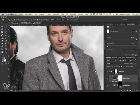
The person's skin type is very light compared to the scene, so you brighten the face a little. Activate the mask option to roughly mask the face and the ear. To do this, take a brush with black foreground color and paint over all areas you don't want to change. Then you close the selection again via the mask icon.

Now create a Levels adjustment that only affects this masked area. Move the midtone slider subtly to the left. In this example, the value is 1.15. Judge the result on the screen, because with small changes, differences are best recognized in normal view. The face then looks friendlier and fits better into the brightness of the scene.


Step 9: Checking the result and adjusting the color flexibly
Now you look at the overall image. The legs, the feet and the face are matched in brightness, the contrast is set and the color mood fits the background. The big advantage of this method is its flexibility. If you later place the scene in a desert or in front of a fire, you only have to swap the color of the color fill. For a desert, a warm yellow or orange is suitable; for a fire, a strong red works. The mask and the settings remain intact.

Your result shows a person who really seems to be standing in the scene. Within a few minutes, you have cleanly matched brightness, contrast, and color mood.

Summary ??? Color Adjustment in Photoshop: Integrating People Harmoniously into Photo Composites
You have seen that a coherent photo composite has less to do with special tools than with a clean order of steps. First you adjust the brightness of the person to match the ground, then you apply contrast in a targeted way and add the color mood of the background. The masks are crucial here, because they ensure that each correction takes effect exactly where you need it. If you place the person in a group, all settings remain clearly organized and affect only the subject. This approach can be applied to almost any subject.
FAQ
Do I absolutely have to work with a group?No, a clipping mask also works, but with many adjustment layers the group is clearer and avoids assignment errors.
Why do I choose the blend mode "Color" and not "Normal"?The "Color" mode transfers the hue without greatly changing the brightness of the subject, so details are preserved.
What happens if the color looks too strong?Simply reduce the opacity of the color fill until the effect appears subtle and natural.
Can I still change the color later?Yes, you can open the color fill at any time by double-clicking and choose a new hue without having to recreate the mask.
How do I tell if the correction is overdone?Toggle the adjustment layer on and off regularly and compare the result with the original state.
Why should the face be brightened separately?Bright faces often look out of place in a dark or cool scene, so a targeted adjustment of the midtones makes sense.


