
If choosing colors is still difficult for you, you don't have to start from scratch. A landscape photo already contains a harmonious color world that you can deliberately extract and save as your own palette. In this tutorial, you will learn how to analyze a photo, take two routes to a color palette, and sort your palette in Photoshop and make it permanently available.
The video is only loaded from YouTube when you play it – data (including your IP address) is then transmitted to YouTube/Google. More in the privacy policy
Introduction
Many beginners in digital painting and matte painting fail not because of the brush, but because of the colors. You paint a sky, and it looks too bright. You apply green for a meadow, and the area tips into the artificial. The solution often lies right in front of you: in real photos. A landscape shows you which tones belong together, how saturation decreases with distance, and how light and shadow change color.
This part of the module shows you a third method. It complements the tonal correction and the monochromatic method from the previous parts and is particularly suitable when you cannot yet judge colors confidently.
Key Takeaways
- Landscape photos provide harmonious color tones for sky, mountains, vegetation, and ground.
- Color changes with distance: the farther away an object is, the more desaturated and bluish it appears.
- The color palette can be generated automatically via the "Indexed Color" mode. However, the assignment of the colors is quickly lost in the process.
- The manual method takes longer, but trains your eye much more and delivers a palette that you can use permanently.
- A palette is saved sorted by areas such as sky, light, shadow, and ground, and backed up as an .aco file.
Step 1: Choosing the Photo as a Color Source
The most important step begins with choosing the photo. You need a landscape with clear areas: a sky with a gradient, a distance with desaturated tones, sunlit areas, and shadows. An image with many different zones gives you more to choose from than a uniform subject. Make sure that the photo does not convey just a single mood.
Then analyze the image with the eyedropper. Click at different spots, such as in the upper sky, in the more distant area, and in the foreground. You will notice that many colors look different from how they appear to the naked eye. Especially in the distance, there is often a distinct blue cast, even if the subject appears green overall.

Step 2: Distinguishing Light, Shadow, and Distance
In the next step, you mentally divide the image into zones. The sky consists of blue tones that fade into white. In the distance, the colors are strongly desaturated, so that hardly any green is perceptible. In the foreground, on the other hand, you find saturated green tones, especially where the sun falls on grass, leaves, or shrubs.
Pay particular attention to the shadow areas. The green tones are still present there, but appear darker and often cooler. As you go further into the depth, blue increasingly dominates. This observation is important because it shows you that a color should never be considered in isolation. Its effect depends on light and distance.

Step 3: The Generated Color Palette via the "Indexed Color" Mode
The first method uses a Photoshop function that automatically calculates the colors of an image. To do this, switch to "Indexed Color" in the Image menu under Mode. Photoshop may prompt you to flatten the layers. Confirm this, as the original image will be changed as a result. Don't worry: you can reopen the image at any time.
Then you determine how many colors you want to take from the image. In this example, around 25 colors proved to be sensible. The result is a heavily reduced image with a variety of tones that you can now use as a color table. You will find this table in the Mode menu under the entry "Color Table".

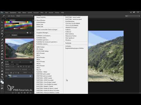
Step 4: Saving and Reloading the Color Table
Now you can save the color table as a file. Save it with a unique name, for example with the number of the part and a label like "Landscape". Also store it in a place that you can easily find again later. In the Preset Manager, you can then load the saved file. If you already have your own swatches, you can reset or replace them beforehand. All default presets can be restored at any time.

However, this method has a drawback. The colors are neatly divided, but after some time you no longer know which color came from which area. Without the original image, the assignment remains unclear. That is why it makes sense to keep the source image in a folder if you work with this method.

Step 5: Preparing the manual method with the mosaic filter
The second method is more laborious, but it trains your sense of color much more. First, reset the image to its original state. Then duplicate the background layer with the keyboard shortcut Ctrl+J or Cmd+J on a Mac. On this copy, you apply the "Pixelate" filter with the mosaic effect.
With the mosaic effect, the details of the image are broken down into large squares, each containing an average color. The colors are preserved but lose their structure. This lets you quickly see which tones dominate in the sky, the distance, and the foreground. Set the size of the squares so that the most important colors are still visible. Do not go to the largest level, because individual tones are often lost that way.


Step 6: Capturing the sky as the first color group
Now the actual work begins. In the Preset Manager, delete all existing entries so that you get a clean, empty swatch table. Then work with a fixed scheme: group by group, each from light to dark.
Start with the sky colors. You do not have to take over all the tones; about four to five are enough. Select the lightest color with the eyedropper, click "Add Color" in the dialog, and then add the other tones up to the almost darkest blue. To get a clear gap between the groups, place a conspicuous separator color in between, such as a strong red. It helps you keep the groups apart when sorting.

Step 7: Building the distance, ground, and shadows separately
In the next section, you build further groups. For the distance, you choose colors that hardly differ from each other, since they are strongly desaturated. These tones initially look similar to the sky colors, but that is exactly where their value lies: they later provide fine, realistic transitions between the sky and the landscape.
For the ground, you can pick up road, earth, or stone tones. These areas are rarely pure gray or brown. You often have to desaturate the colors a little before you take them over. For specific surfaces, do not pick up too many tones, as they are very specific.
You proceed similarly for the shadow areas. Gray tones from stones in the shade are a good example. Add two to three neighboring colors to these tones and then create the green tones in the shadow, both saturated tones nearby and desaturated tones in the distance.

Step 8: Sorting and tidying up the palette
Once all groups have been created, you can re-sort the palette in the Preset Manager. The order does not have to be perfect; it can be adjusted at any time. Drag related colors to the front and remove tones that barely differ.
This step is especially worthwhile for the shadow colors. If two swatches look almost identical, delete one of them. Make sure you do not reduce the colors too much, as the subtle differences are exactly what create the realistic impression. Above all, keep the tones that stand for light, medium distance, and depth.


Step 9: Saving the palette and using it permanently
Finally, place another conspicuous swatch at the end of the palette, such as a strong pink. It is not part of the landscape, but serves as a visual separator and makes it easier for you to find your way around the palette later.
Then save the finished palette as a file with the extension .aco. This extension is used by Photoshop for color swatches. You can then load the palette at any time, use it in a new project, or combine it with other palettes. It makes sense to create a separate palette for each mood, such as for sunsets, fog, or forests. This is especially worthwhile for evening moods with many red tones, because such palettes can be used again and again.
Summary ??? Creating a Color Palette from Landscape Photos in Photoshop
You have seen how to systematically analyze a landscape photo and develop your own color palette from it. The generated method via the "Indexed Color" mode is quick, but loses the assignment of the colors. The manual method with the Mosaic filter is more laborious, but gives you a better feeling for light, shadow, and distance. Save your palettes by mood and area, so they are available to you for every new image.
FAQ
Do I need a specific photo for this method?No, but a photo with clear zones such as sky, distance, light, and shadow is best suited.
Can I also use the method for other subjects?Yes, for example for architecture, such as a city scene or a forest. Perspective plays a big role in architecture, which will be covered in the next module.
Why is the generated palette not ideal?The colors are well distributed, but after some time you no longer know which tone came from which area.
How many colors should I pick?For the manual method, four to five tones per group are often enough. The generated method delivers about 25 colors.
How do I save my color palette permanently?Save it as an .aco file. That way you can load it again in Photoshop at any time.
Why should I add a separator color?A striking color between the groups makes it easier for you to sort and to orient yourself in the palette.
Are online generators for color palettes recommended?They are quick, but give you hardly any influence over the selection. That is why the manual method is usually better suited for learning.


