
Imagine you only need two colors for a landscape and the image still looks coherent, spatial, and almost photorealistic in the end. That is exactly what I'll show you in this tutorial. The method is called a monochromatic palette, and its core is simpler than the term suggests: you work with a single hue and only change saturation and brightness. By the way, you have already often used the "monochromatic" principle if you have ever tinted a black-and-white image with a color fill in Color mode or with sepia.
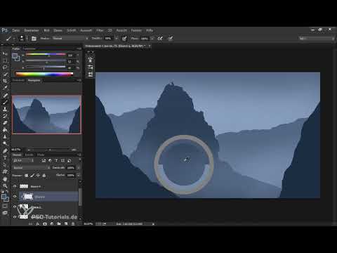
The video is only loaded from YouTube when you play it – data (including your IP address) is then transmitted to YouTube/Google. More in the privacy policy
The example is a landscape during the blue hour, shortly before sunrise in the mountains. The blue tone forms the base, and a touch of complementary color in warm orange later brings the light of the rising sun into the image. The numbers at the edge of the transcript are seconds in the video, so the screenshot placeholders refer to these points in time.
Key Takeaways
- A monochromatic palette consists of a single hue. You only change saturation and brightness.
- The hue in the color picker should remain as unchanged as possible. In the example, it is around 210 degrees.
- Depth is created through layering: the farther away an element is, the lighter, less saturated, and softer it should be.
- The complementary color lies exactly opposite on the color wheel, so for 210 degrees it is at 30 degrees. You can create it quickly by inverting a color layer.
- Use warm light sparingly and deliberately, and the scene will look harmonious and not overloaded.
Step-by-Step Guide
Step 1: Define the Base Color
Start with a blue that you select in the color picker. In this example, the hue is around 210 degrees. Then you reduce the saturation so that a muted, rather cool blue results. This tone will later be the foundation for all layers. Write down the color value, because you will need it again and again.

Step 2: Use the Smudge Tool as a Helper
The Smudge tool is hidden behind the Gradient tool. It is excellent for softly smearing color transitions, for example at edges between mountains and sky. You just have to use it sparingly, otherwise the structures will blur too much.
Step 3: Brighten the Sky
For the sky, you take a soft brush, such as the Big Soft. Here the most important rule of this technique applies: you don't touch the hue. You increase the brightness and reduce the saturation slightly until a light, airy blue tone results, which is brightest near the horizon. This is how you simulate the mood shortly before sunrise. Make sure you don't pull too much, otherwise you will quickly lose control over the gradient. With the Navigator, you keep an overview of the overall image.

Step 4: Draw the First Mountain Range
Now it's time for the mountains. With the Lasso tool, you draw a rough formation, which can be a bit angular. The shape can be changed at any time, so you don't need perfection at this moment. Concentrate on the silhouette and on roughly where the mountain range should run. The lower area of the image will be covered later anyway.

Step 5: Color the Mountain Range
With the Fill tool, the bucket, you fill the selection with your blue. Since this range lies in the midground, you choose a medium brightness and a saturation that is significantly higher than in the sky. For the midground, the values are roughly a brightness of 30 and a saturation of 70, though you may adjust this depending on the image. If the color looks too strong, simply reduce the saturation a little.

Step 6: Depth Layering for the Rear Mountains
For the mountains in the background, you place a new layer beneath the first mountain range. The shapes here are softer and flatter because they are farther away. You fill them with a less saturated blue that is at the same time lighter than the foreground. The following applies: the background must not become lighter than the sky directly behind it, otherwise the logic of the image breaks down. A jump between the layers often looks unattractive at first, but it can easily be mitigated with blurring or an additional atmosphere layer.

Step 7: Design the Foreground as a Frame
A third layer in the foreground frames the image and creates additional depth. Here you start with a color derived from the midground and slightly increase the saturation while lowering the brightness. This makes the foreground appear closer and stronger. After filling, check whether the three layers together form a clear progression: darker and more saturated in front, lighter and flatter in back.

Step 8: Atmosphere Between the Layers
In the morning there is often fog in the valleys, and you bring exactly this mood into the image with a new layer between the mountain layers. Take the Big Soft again, paint with a light color from the image that you pick up directly with the eyedropper, and reduce the opacity to about 50 percent. This makes the layers separate from each other more softly. Repeat the process between the midground and background until the layering is convincing.

Step 9: Add Textures with Brushes
For structure in the rock, brushes such as the Scratches brush are suitable, as it brings an interesting texture. To do this, create a new layer and link it with a clipping mask so that the textures appear only on the mountain layer. A light blue brings the structure to the left side of the mountain, and you can delete the layer at any time if you don't like it. With brushes that have a built-in light source, you should proceed subtly, because too much structure quickly looks artificial.

Step 10: Distance Effect with Haze and Plant Brushes
For the back mountains you can use a haze brush and pick up a light color from the haze. Then you draw mountain ranges, which you reduce a little again if needed. For vegetation, a brush with fir trees is a good choice. You adjust the color via brightness and saturation, not via hue. This creates a forest that blends seamlessly into the blue palette. In the front you should leave a few fir trees light so that there is air between the trees.

Step 11: Determine the Complementary Color
Your base hue is at 210 degrees. On the color wheel, the complementary color lies exactly opposite, that is, 180 degrees away. Mathematically, this gives 30 degrees, which corresponds to a warm orange-red. In the Photoshop color picker the color wheel is not directly visible, so you can help yourself with extensions such as a color picker. But there is a simpler way, which I'll show you in the next step.

Step 12: Create the Complementary Color by Inverting
If you don't feel like calculating, simply invert a color layer with Ctrl and I. This immediately gives you the complementary color. Note down the value before you undo the inversion, and then continue working with a new layer. It is important that you don't forget to restore the original color so that your blue palette stays intact.

Step 13: Insert the Sun in Red
For the light of the rising sun, you create a new layer and paint with the Big Soft in a strong red. Use the brush with a clipping mask or on its own layer so that you can still transform and move it later. The sun must not look too strong. If it does, you shrink it with the transformation and reduce the opacity.

Step 14: Clouds for Reflections
With a cloud brush you add a few soft clouds that pick up and reflect the reddish light. Choose a soft edge and place the clouds only sparingly. A morning directly after sunrise is usually not yet fiery, so the color intensity should remain rather restrained.

Step 15: Apply the Orange to the Rocks
Now the orange goes onto the mountains. You create another layer with a clipping mask so that the light appears only on the rock. With the Rock Small brush, you apply the warm color to the edges that face the light. If it looks too harsh, you carefully erase with a Scratches brush so that some texture is preserved. Make sure that the orange doesn't just sit on the edge, but also emphasizes surfaces and elevations.

Step 16: Setting Backlight and Contrast
As a counterpoint to the warm orange, you place a light blue in the areas that lie in shadow. This creates contrast between light and shadow. With the eraser, you correct the edges until the shape of the mountain is clearly recognizable. A rock with a small elevation in its interior looks especially three-dimensional.
Step 17: Atmosphere and Shadows in the Valley
In the middle of the image, you can tint the atmosphere slightly orange to connect light and haze. A cloud brush with low opacity is well suited for this. For the mountains in the background, you stick to fine structures and a muted orange so that they don't become too dominant. Also make sure that the forest isn't completely in the light: only the edges near the light source should become warm.

Step 18: Refining the Forest with Edges and Sharpness
A quick method for light edges is to duplicate the forest layer and invert the copy with Ctrl and I. Then you shift it slightly with the arrow keys and add a layer mask to leave visible only the areas that are supposed to receive light. Afterwards, you adjust the saturation without changing the hue.
Finally, you can emphasize the edges with the High Pass filter. To do so, you desaturate a copy of the layer, apply the High Pass with a radius of about 1.5, and set the layer to Soft Light or Overlay. This makes the contours look clearer without overloading the image.

Summary ??? Monochromatic Palette: Painting a Blue Mountain Landscape with a Complementary Color
With a single shade of blue that varies only in saturation and brightness, a believable landscape with clear depth layering emerges. The hue remains unchanged. The complementary color at 30 degrees brings the warm light of the morning sun into the image and creates tension without destroying the harmony. With brushes for rock and vegetation, clipping masks, and a clean layer structure, the result quickly becomes photorealistic. The method is therefore especially worthwhile when you want to arrive quickly at a coherent image.
FAQ
Do I really have to use only one hue?No, the basic idea is a monochromatic palette, but for the light you may add a complementary color. In the example, two hues are enough for the whole image.
Why shouldn't I change the hue?The hue is what holds the palette together. If you only adjust saturation and brightness, the image stays harmonious, even if you use many layers.
How do I find the complementary color without calculating?You invert a color layer with Ctrl and I, note down the resulting value, and then undo the inversion.
Which brushes are suitable for rocks and trees?For rocks, brushes like Rock Small or Scratches are suitable; for plants, brushes with fir tree motifs. Make sure to use textures subtly so that the image doesn't look artificial.


