

Imagine you come back from vacation, and your pictures of people and everyday scenes look flat or busy. This is exactly where this tutorial comes in. You will be shown how to develop three street photos step by step in Lightroom or Camera Raw, using basic corrections, local adjustments, and the right crop.
The video is only loaded from YouTube when you play it – data (including your IP address) is then transmitted to YouTube/Google. More in the privacy policy
Key Takeaways
First apply the preset so you can see the original image, and then correct the exposure. Guide the viewer's eye to the main subject with local adjustments, for example using radial filters. Use the crop to control the image's impact and direction, and remove distractions so that the retouching goes unnoticed.
Step-by-Step Guide
Example 1: Portrait of a Person on Location
Start with the preset. Apply it to the image once you have assessed the basic situation. The preset is usually applied automatically on import. If you only switch it on now, you will see the original image as the camera captured it.

The image looked too bright, so I reduced the exposure slightly. Make sure that not only the highlights but the whole image becomes calmer. With the exposure slider you can quickly find the right spot.

Converging lines are a matter of taste. If they bother you, you can either use the crop or use the Upright functions. You will find the automatic alignment in the Geometry section, in Lightroom as well as in Camera Raw.

There was a small blemish in the image that bothered me. I fixed it with the Spot Removal tool. The retouching should remain inconspicuous. If you only notice it once you know where it was, you have done a good job.

The person was a bit too dark in the image. I adjusted the exposure specifically for the subject, without changing the overall impression. A radial filter that you drag over the face helps with this. This creates a local brightening that shows the viewer where the most important part is.

So that the face works as the brightest point, I set a new radial filter and specifically brightened the eyes. The eyes should have expression and not disappear into shadow.

With a character portrait, you may increase the clarity and the micro-contrast to emphasize wrinkles and textures. With a portrait of a woman, I would be more restrained with this. Here, however, the strength suits the subject well.

Finally, I added a light split toning in the highlights and shadows. A before-and-after comparison shows how the image gains in look without appearing artificial.

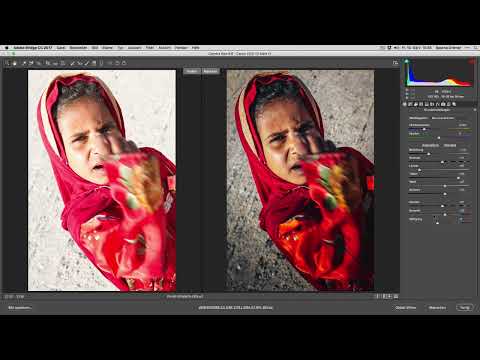
Example 2: Portrait of a Girl with Distinct Corrections
The crop was the first intervention here. The subject works much better in portrait format, and the image immediately looks more focused.

After that, I applied the preset again to create the starting point.

The exposure had to be adjusted noticeably in this image. Make sure to keep a balanced distribution so that no areas blow out or get crushed.

The colors looked unnatural. I checked the automatic white balance and then manually set the temperature to about 4500 Kelvin. That is a good middle ground between the suggestions for daylight and shade.

The bright area in the image was too distracting. I darkened it with a local adjustment. In the face, on the other hand, I brought out the shadows so that the facial features look more three-dimensional.

I shifted the skin color very slightly toward blue. That looks fresher. Finally, I pulled the highlights back a bit more.

A conspicuous spot still bothered me in the end. I marked it with the Heal tool and patched it from an area with a similar structure. Here, too, the rule applies: the correction should remain invisible.

Example 3: Backlight from the Car
This picture was taken spontaneously through the car window, straight into the sun. The starting point was therefore difficult, but with targeted steps you can get a lot out of it.
After applying the preset, the image was already usable. However, it lacked contrast. With the Dehaze slider I brought contrast and clarity back into the image. I stayed at a value of around 50; more would have been excessive.


The car in the lower area should no longer be visible. I therefore cropped the image and left more free space on the right. This makes it look as if the car is driving into that space, which emphasizes the movement.

Then I significantly increased the values for contrast and clarity until the image looked more vibrant.

With a radial filter over the bright area, I reduced the highlights once more. This way you get more detail in the sun without changing the rest of the image.

In the lower area, a remnant of the earlier editing remained. I slightly increased the saturation and lifted the shadows, which gives the image more substance.

Finally, I played with the color temperature in the area of the sun. More warmth and a little red underline the character of the sun. A bit more would quickly be too much, so stick with a moderate setting.

Summary ??? Developing Vacation Photos: Optimizing Landscapes and People in Lightroom
You have seen how to turn unremarkable vacation pictures into expressive photos with just a few editing steps. Always begin with the preset and a comparison to the original. Then correct exposure and white balance before guiding the viewer's eye with local adjustments. Cropping and alignment give the image direction, and retouching should be so unobtrusive that nobody notices it. The same steps work in Lightroom and in Camera Raw, so you don't have to switch between the programs to achieve good results.
FAQ
Can I also carry out the steps in Camera Raw?Yes, the tools and sliders are largely identical in Camera Raw and Lightroom. The operation works exactly the same way.
Why should the preset only be applied at the end or after the import?If you only switch on the preset later, you see the original image and can better judge what really needs to be corrected.
When should I refrain from correcting converging lines?Converging lines are a matter of taste. In architecture they often look disturbing, while in portraits or atmospheric shots they can be left in.
How can I tell that a retouch was successful?A successful retouch is not noticeable during normal viewing. If you have to know beforehand where it was, you have worked unobtrusively.
How do I set the white balance correctly?First check the automatic setting. If the colors are not right, choose a value between the typical values for daylight and shade, around 4500 Kelvin, and judge the result on the image.

