

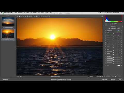
A sunset thrives on colors that the camera often renders flatter than how you saw them in the moment. With a manageable sequence of adjustments, you bring the mood back into the image without it looking artificial. In this tutorial, you follow along as two vacation photos are edited: one of the sea and one taken from a bus window.
The video is only loaded from YouTube when you play it – data (including your IP address) is then transmitted to YouTube/Google. More in the privacy policy
Introduction
Both images are from the same evening but show different situations. The sea image mainly needs warmth in the sky and a little depth in the water. The bus image additionally requires attention to distracting details that got into the picture through the window. You will see that most adjustments involve only a few sliders. The key is to use them carefully and to regularly compare the result with the original.
Key Takeaways
You rarely need many sliders for a sunset. Warmth, gradients, and a clean horizon deliver the biggest effect.
Gradients drawn while holding the Shift key stay exactly horizontal and can thus be applied precisely to the sky or water.
You should reduce image noise generously in areas of the image without fine structures, since it barely suffers visibly there.
An image that is convincing in a small format usually also looks harmonious in print and on a smartphone.
A before-and-after comparison protects you from overdoing the settings.
Step-by-Step Guide
Prepare the images and apply the import preset
Open both shots in your editing program. Select all the images you want to edit and switch to the presets section. There you apply your import preset, which brings the basic tonal values and colors into a usable starting state. This preset is not a substitute for individual editing, but it gives you a solid starting point.

Straighten the horizon
First check whether the horizon is crooked. A slightly tilted horizon is especially noticeable in sea images because the waterline serves as a reference. Use the straightening tool and check the result at the edge of the image. If you have little leeway, compare the correction against the image crop.

Set sunlight and warmth with a gradient
Now it's about the mood. Choose the gradient tool and start it in the lower area of the image. While dragging, hold the Shift key so the gradient stays exactly horizontal. Then shift the color temperature toward yellow and increase the saturation slightly. The effect is reminiscent of sandy evening light and makes the area around the sun begin to glow. Don't overdo it. The difference should be noticeable when you look closely, without destroying the impression.

Fine-tune exposure and shadows
Raise the exposure only minimally so the brightness stays pleasant. Then you can open up the shadows somewhat so that darker areas such as the shoreline retain detail. Pay attention to the sky: if it gets too bright, it loses its color. Therefore, move the slider slowly and check the result again and again.
Use the before-and-after comparison
If you work on an image for a long time, you easily lose your sense of proportion. Therefore, regularly activate the before-and-after view. Some settings that you consider successful suddenly look artificial in comparison. In that case, take them back. Often the more subtle version is more convincing, and that is exactly what you should deliberately check here.

Check the horizon in the composition
Now check the position of the horizon in the image composition. A line exactly in the middle looks static, while in the upper or lower third it appears more dynamic. Deliberately move the sun into one third of the image if you want to give the subject more tension. Whether you leave the horizon or move it is a matter of taste. What matters is that you make the decision consciously.

Remove distracting elements with the repair tool
In the bus image, a distracting detail stands out, caused by the window or a reflection. Select the repair tool and paint over the area once, generously. The program finds a suitable spot as a source and replaces the blemish. If the detail can't be removed completely, repeat the process with a smaller brush. If you take away a bit too much, the undo command helps right away. Afterwards, check the area in magnification so that no unnatural patterns are left behind.

Reduce luminance noise
Even in good light, noise appears in a sunset, especially in the shadows and in the sky. Increase the luminance noise reduction slider gradually. In the example, you end up at a value of around 30. Since these images contain hardly any fine structures or hard contrasts, sharpness suffers very little. Finally, zoom in on a dark area and check whether the noise has disappeared without smearing the surface.

Make the water bluer
In the original shot, the water often looks too neutral. So add another gradient in the water area and hold down the Shift key again. Shift the color slightly toward blue and reduce the exposure in this area so that the surface gains depth. Make sure the transition to the yellow sky doesn't look harsh. A soft gradient looks more natural than a clearly delineated block of color.

Fine-tuning color and gradient
In the next step, you refine the color effect. Apply a gradient horizontally again and make it somewhat smaller. Adjust the color toward yellow and a slight red to make the sunset look even warmer. The red slider should stay restrained, otherwise an unnatural tone quickly appears. Repeat the process until the effect seems harmonious to you.

Check the image at a small size
Reduce the image to a preview size and deliberately view it from a bit of a distance. If the subject still looks convincing then, you're on the right track. Make sure the main subject remains immediately recognizable. This applies especially to prints or screen previews on a smartphone, where details are quickly lost.

Use the lower gradient for more structure
If the water is still too uniform, add another gradient in the lower area and slightly increase the clarity. This makes waves and reflections of the evening light stand out more, without you intervening too heavily. Many images need only a small final touch at this point.

Conclusion and overall view
Finally, look at both images in context. Compare the sea image with the bus image and check whether they match stylistically. Often even a small difference in color temperature is enough for both shots to work as a series. A successful sunset usually doesn't need much more than that. If the result feels right to you, export the images.

Summary ??? Developing a sunset: Getting colors, horizon and blemishes under control
You have seen how to develop a sunset step by step. You begin with an import preset and straighten the horizon. With gradients, which you place exactly horizontally by holding down the Shift key, you bring warmth to the sky and blue to the water. Exposure, shadows and noise reduction provide balance, while the repair tool removes distracting details. Regular before-and-after comparisons and checking at a small size keep you from overdoing it.
FAQ
How many gradients do I need for a sunset?Usually two or three gradients are enough: one for the sky, one for the water, and optionally one for structure in the lower area.
Why should I hold down the Shift key when applying a gradient?The key ensures that the gradient stays exactly horizontal. This is especially important when the horizon serves as a reference.
How can I tell that I have overdone the color?Compare the image regularly with the original. If the sky looks artificially bright or the water unnaturally blue, you should reduce the saturation.
Can I apply a preset to several images at the same time?Yes, select all the desired images and apply the preset. Afterwards, you can adjust individual shots as needed.
When should I reduce luminance noise?Whenever noise is visibly distracting, especially in shadows and in uniform areas such as the sky. However, make sure not to smear fine structures.
Is a horizon line in the middle of the image always wrong?No. A centered line looks calm and balanced. Shifting it to the upper or lower third, on the other hand, creates more dynamism. Decide consciously what you want to express.

