

A vacation snapshot with distracting details at the edge quickly looks random. With a few retouches and a cleanly integrated logo, it becomes a motif that looks like a real advertising poster. This guide walks you through the process step by step: from removing a lamppost and a trash can to inserting a logo on a black background.
The video is only loaded from YouTube when you play it – data (including your IP address) is then transmitted to YouTube/Google. More in the privacy policy
Key Takeaways
Always work on duplicated or new layers so you can go back at any time. Retouching usually works best with the Clone Stamp, the Patch tool, and the "Content-Aware Fill" function. A black background can be made invisible with the "Screen" blend mode, so that only the logo remains.
Step 1: Identify Problem Areas in the Image
Before you get started, it's worth taking a close look at the photo. In the example, two things are distracting: a lamppost that looks unnatural in the foreground, and a trash can at the bottom edge. Make a note of which elements should be removed, and think about which area could serve as a replacement. With this overview, you avoid spending unnecessary time on details that no one will see later anyway.

Step 2: Copy the Replacement Area to a New Layer
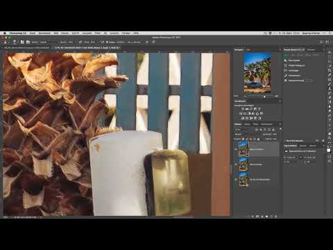
First, create a new layer with ⌘ + J (on Windows Ctrl + J). Then rasterize it via right-click so that you can work pixel-based. Now select a suitable section, such as a part of the fence that covers the problem area. Copy it with ⌘ + C and paste it as a new layer with ⌘ + V. Then move this layer over the lamppost. Reduce the opacity while working so you can see how the section fits with the background.

Step 3: Transform the Section to Fit
The copied fence section initially doesn't fit exactly. Therefore, activate the transformation with ⌘ + T and switch to "Perspective" mode via right-click. Using the handles, you can drag the corners so that the lines of the fence continue in the image. Pay particular attention to the lower area, because that is where you have to distort the motif the most. It takes some patience until all the lines look consistent.

Step 4: Refine Edges with a Soft Brush
Once the rough shape is right, it's time to work on the edges. Choose a small, soft brush and set the foreground color to black to edit transitions in a targeted way. Work piece by piece and zoom out again and again to check the overall picture. A soft edge looks more natural than a hard line, so you should prefer it.

Step 5: Merge Layers
Once the corrections are in place, you can merge all visible layers into a new layer. With ⌘ + Alt + Shift + E (on Windows Ctrl + Alt + Shift + E), a copy of the current state of the image is created above all other layers. You can continue working on this layer without losing the previous steps. Afterwards, you may delete the intermediate layers because they are no longer needed.

Step 6: Fine Work with the Clone Stamp
The Clone Stamp is suitable for smaller spots. Reduce the brush tip size, hold down the Alt key (on Windows Alt) to set the source, and then paint piece by piece over the disturbance. It is important that you change the source regularly so that no visible patterns arise. For edges, it's worth looking from a distance, because what stands out in the close-up view often disappears completely in the finished motif.

Step 7: Content-Aware Fill for Larger Areas
For larger areas, such as the palm trees in the background, Photoshop can take over the work. To do this, duplicate the layer, select the area with a selection tool, and then choose the "Fill" option in the "Edit" menu. In "Content-Aware" mode, Photoshop calculates a suitable replacement. Check the result carefully afterwards. If a spot isn't convincing, you can rework it with the Clone Stamp or the Patch tool.

Step 8: Patch Tool and Post-Processing
For smaller problem areas, the Patch Tool is a quick solution. Select the faulty area, drag the selection onto a clean spot, and let Photoshop match the texture. Afterwards, you can apply "Content-Aware Fill" again. If you no longer see any irregularities when zooming out, the area has usually turned out well.

Step 9: Continuing the Palm Tree and Ground Structures
With structures such as palm trees, stones, or grasses, it is important to continue the natural flow. Set the Clone Stamp at a suitable spot and work with a slight offset so that no pattern emerges. You can create a harder edge with a brush at higher hardness. Stop again and again and check the result from a distance. With fine ground structures such as sand, a small inaccuracy is barely noticeable in the overall picture.

Step 10: Consistently Continuing the Lines on the Fence
The fence requires special care because human eyes immediately recognize straight lines. Continue each line exactly and do not work too quickly. It helps to carry the Clone Stamp a bit further than you need at the moment and then remove the excess afterwards. At the end, check whether all posts and braces run evenly.

Step 11: Checking the Retouching Result
When all problem spots have been edited, zoom out completely once. There, the image usually already looks like an undamaged photo. Then decide whether you want to adjust the image crop. A tighter crop creates tension and draws the eye to the essentials, which is especially important for an advertising poster.

Step 12: Inserting a Logo on a Black Background
A logo on a black background can be inserted without distracting edges. Insert the graphic as a new layer using ⌘ + C and ⌘ + V and scale it with ⌘ + T. While dragging, keep the proportions locked with the chain symbol so that the logo is not distorted. A note from the video: you may not use images and logos from the internet without permission. The example is for demonstration purposes only; in practice, use your own or licensed graphics.

Step 13: Hiding Black with the Blend Mode
Place a black fill layer beneath the logo layer as a test to see how the background looks. You can remove this fill afterwards. Then set the logo layer to the blend mode "Screen" in the Layers panel. The black disappears immediately, and the logo looks as if it were printed directly onto the photo.

Step 14: Positioning the Logo and Adjusting Proportions
To make the logo sit ideally, copy it once more onto a new layer if necessary, set the blend mode to "Screen" again, and deselect with ⌘ + D. Move the logo to the desired spot with the Move Tool. Then select both logo layers while holding the Shift key, activate the transformation with ⌘ + T, and drag them to the final size with proportion mode enabled.

Step 15: Organizing Layers and Adding a Color Look
Organize your layers clearly by selecting the logo layers, putting them into a group, and naming it "Logo". Name the retouching layer accordingly. For a warm summer look, you can choose a preset such as "Crisp Warm" in the color look settings and reduce the opacity to about 50 percent. This makes the subject look more harmonious without appearing exaggerated.

Step 16: Viewing the Finished Advertising Poster
Finally, you zoom out once more and view the result from a distance. The lamppost and the trash can are gone, the logo blends unobtrusively into the picture, and the color mood underscores the message. With this approach, you can turn any similar motif into your own poster.

Summary – Vacation Photo to Advertising Poster: Retouching and Logo Integration in Photoshop
You have learned how to remove distracting objects using layers, transformation, the Clone Stamp, and Content-Aware Fill. You have also seen how a logo on a black background is cleanly integrated using the "Screen" blend mode. With a final color look and a tidy layer structure, you end up with a design that looks like a professional advertising poster.
FAQ
Why should I work on duplicated layers?Because that way you can return to an earlier state at any time without losing the original image.
When is the Clone Stamp better than "Content-Aware Fill"?For small areas and fine edges, the Clone Stamp usually delivers more precise results, while "Content-Aware Fill" saves time on larger areas.
What does the "Screen" blend mode do?It hides light areas while dark areas remain visible. A black background therefore disappears completely, while the logo is preserved.
May I use logos from the internet for an advertising poster?No, not without permission. Use your own graphics or ones whose license explicitly allows their use.
How do I maintain proportions when scaling a logo?In the transformation, activate the chain icon between the width and height fields, and the aspect ratio will be maintained.
Why should I check the retouching from a distance?Many flaws are noticeable in close-up view but not in the finished image. A look from a distance shows what a viewer actually perceives.

