
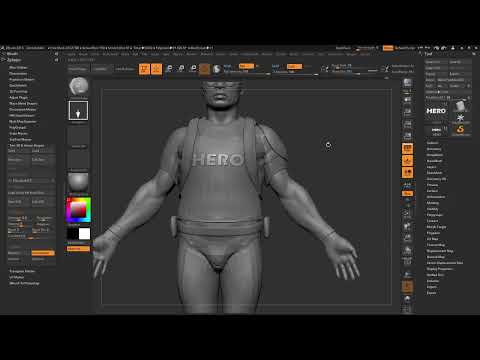
A true hero needs a symbol on his chest that makes him instantly recognizable. In this mini project, you turn a simple Solder in ZBrush into a hero's chest with extruded lettering and a lightning bolt as a clean vector graphic. You don't need years of modeling knowledge for this, but above all patience when aligning and adjusting.
The video is only loaded from YouTube when you play it – data (including your IP address) is then transmitted to YouTube/Google. More in the privacy policy
The process is divided into three sections: First, you place the text directly onto the model in ZBrush, then you create a symbol as an SVG file in Photoshop and import it back into ZBrush. Finally, you refine the edges until the result looks coherent. The tutorial is aimed at anyone who already knows the basic operation of ZBrush, such as Lightbox, Gizmo 3D, and the Move Brush.
Key Takeaways
Key Takeaways
- The extrusion determines how three-dimensional your text looks. If it is too slight, it is worth recreating the text instead of laboriously fixing it later.
- With the Gizmo 3D and the W key, the inserted object can be moved, scaled, and rotated precisely. The Alt key confirms the rotation, so that afterwards you are working cleanly in the normal axes again.
- The Matchmaker and the Move Brush are ideal for adapting text and shape to the body contour.
- A lightning bolt or other symbol can be created in Photoshop as a path, output as an outline, and exported as an SVG. Unlike JPG, GIF, or PNG, the SVG version delivers clean, scalable edges.
- Vector graphics are particularly well suited to hard-surface modeling because, compared with the classic Shadowbox, they produce significantly cleaner edges.
Step-by-Step Guide
Step 1: Load the Solder and prepare the chest
Open the Lightbox and load the Solder, which serves as the basis for your hero. Make sure there is enough free space on the model's chest, because your lettering will be created there later. In the Brushes section, you don't need any settings for this project. The Z-Plugins, on the other hand, contain the tools you will need in the next step.

Step 2: Create the text
Drag the Text tool from the Z-Plugins onto the surface. Enter the word "Hero" as the content. The lettering appears directly on the model, and its shape can already be judged well. Many instructors recommend paying attention at this point to a bold, easily legible font, because fine cuts are quickly lost during extrusion.

Step 3: Set the font, extrusion, and resolution
Now adjust the font to your taste. The extrusion should be chosen so that the letters noticeably protrude from the surface without looking bulky. Also increase the resolution a little so that the curves of the letters look clean. If the resolution is set too high, however, the model becomes heavier and slower, so make sure to keep it at a reasonable level.

Step 4: Choose the normal variant and check the transformation
For this project, choose the normal variant of the text and not the adaptive one. The normal variant is more stable for the following adjustments. Before you continue, check the extrusion. If you feel that it is too weak, delete the text and start over. A subsequent correction is usually more laborious than a complete restart.

Step 5: Position the text with the Move Brush
Activate the Move Brush and move the lettering to the desired spot. Then shrink it until it sits centered on the chest. The 3D Gizmo helps you move the object in all directions. Since working with individual Subtools, navigating in space has become much easier, because you can edit the text independently of the rest of the model.

Step 6: Align with the Gizmo and Transpose tool
Now pull the text closer to the chest until it rests lightly on the body. Then rotate it with the Transpose tool. Make sure to use the red ring and not the white one, because only this way will you get a clean rotation along the X axis. Check the position from several sides so that the lettering sits neither too far forward nor too deep.

Step 7: Adjusting with the Matchmaker
The Matchmaker is excellent for fitting the lettering to the shape of the body. Select it in the Brush section and work with a relatively large brush. Place the brush in the middle of the text and drag it along the body while holding down the left mouse button or the pen. If you create irregularities in one spot, go back one step, shrink the text slightly, and repeat the process.

Step 8: Preparing the symbol in Photoshop
Besides the lettering, your hero also needs a symbol, for example a lightning bolt. If you are familiar with Adobe Illustrator, the work goes faster there. However, the approach works just as well in Photoshop. Open the shape tool and select a lightning bolt from the custom shapes. You can also create your own shapes or download them from the internet. Drag out the shape while holding down the Shift key so that it keeps even proportions. At first, only a path is created, which does not yet have a surface.

Step 9: Creating a stroke and exporting as SVG
For the symbol to be exported, you need a real shape. To do this, use the stroke function and set a width so that the path becomes a closed surface. Then deactivate the path display so that you can check the result. Go back to the layer and export the shape. Be sure to choose the SVG format and not JPG, GIF, or PNG. Save the file and give it a meaningful name such as "Blitz".

Step 10: Importing and aligning the SVG in ZBrush
Switch back to ZBrush and import the SVG file you just saved. The lightning bolt now appears as a vector graphic on your model. Position it with the Gizmo 3D, which you activate with the W key. This method has always been the fastest way to place objects precisely. Drag the lightning bolt to the desired spot below the lettering.

Step 11: Scaling, adjusting the extrusion, and applying rotation
Shrink the lightning bolt until it looks proportional to the lettering. Note that when you shrink it, the extrusion also becomes thinner in relation. If necessary, you have to readjust it so that the lightning bolt stands out just as strongly as the text. Also make sure that the shape is aligned as straight as possible. If the Gizmo is tilted, press the Alt key and apply the rotation. After that, you work in the normal axes again and can conveniently make all settings.

Step 12: Fine-tuning with the Move Brush and Trim Brush
After the import, the lightning bolt still looks a bit rough. With the Move Brush and a smaller brush, you can further refine the shape and smooth out unevenness. For soft edges, the Trim Brush is suitable, with which you soften sharp transitions. Finally, polish the surface carefully so that the lightning bolt and the lettering blend harmoniously with the body.

Step 13: Checking the result
Look at your hero from different angles. Compared to the classic Shadowbox, the vector graphic delivers significantly cleaner edges, because it is not created from a pixel graphic but from mathematically described lines. Especially in the area of hard-surface modeling, you thus get a very clean mesh that is also well suited for further details.

Summary ??? ZBrush Hero Chest: Text, SVG Symbol, and Matchmaker in a Mini Project
With just a few tools, you have turned a soldier into a hero in this mini project. You created an extruded lettering, exported a lightning bolt from Photoshop as an SVG, and precisely aligned both elements in ZBrush. With Gizmo 3D, Move Brush, Matchmaker, and Trim Brush, you finally shape the form cleanly and coherently. The vector graphic ensures that even fine edges stay clean, and it can be reused for many other motifs.
FAQ
Do I need Adobe Illustrator for the symbol?No, Photoshop is entirely sufficient, because there you can create a path, set a stroke, and export the result as an SVG.
Why should I choose the normal variant of the text instead of the adaptive one?The normal variant can be deformed and aligned more stably in the following steps, which is why it is better suited for this project.
Which Gizmo axis do I use to rotate the text?Use the red ring to get a clean rotation along the X axis, and not the white ring.
What do I do if the Gizmo's rotation stays tilted?Press the Alt key and apply the rotation, then you are working in the normal axes again.
How do I avoid messy edges on my hero?Use an SVG vector graphic for the symbol, because it delivers significantly cleaner edges compared to the Shadowbox.


