
Do you know this? You have a portrait in front of you as a reference, and the hair in the shadows blurs into a dark area. On screen the photo still looks fairly clear, but as soon as you print it out or place it next to your airbrush artwork, fine shading, textures, and the course of wrinkles are lost.
The video is only loaded from YouTube when you play it – data (including your IP address) is then transmitted to YouTube/Google. More in the privacy policy
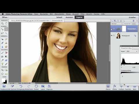
In this tutorial you will see how to make hidden image information visible with a single adjustment layer. You don't need complicated software for this, just the Levels adjustment and a printer. The method helps you recognize which details you actually want to transfer into your artwork, and which ones you can safely leave out.
Key Takeaways
- Dark areas of a reference often hide textures that only become visible when brightened.
- The Levels adjustment is a simple tool that you can apply non-destructively on its own layer.
- Printouts at different brightness levels show you which information you need for your painting.
- Comparing with and without the adjustment layer sharpens your eye for shadows, strands of hair, and clothing folds.
Step-by-Step Guide
Step 1: Check the reference for hidden areas
First, look at your photo calmly. Pay particular attention to places where you cannot clearly make out the shading. Typical problem areas are the hair, transitions between the face and shadow, or dark clothing. That is exactly where the information lies that you may not see yet but need for your subject.

Step 2: Create a new Levels adjustment layer
In your image editing program, open Levels as a new adjustment layer. The advantage of this approach is that your original image remains untouched. You can adjust the correction at any time or switch it off completely without damaging the reference.

Step 3: Drag the gray slider to the left
The middle gray slider controls the midtones. If you drag it to the left, the entire subject becomes noticeably brighter. Be careful not to overdo it, because otherwise the highlights will be lost as well. For most references, a moderate shift is enough to achieve the desired effect.

Step 4: Recognize hidden structures in the hair
After brightening, structures emerge in the hair area next to the head that were previously in the dark. These strands were barely visible on screen and even less so in the printout. With the correction, you can now see exactly where light edges, transitions, and individual bundles of hair run. This observation is the foundation for a lively depiction of hair in the airbrush artwork.

Step 5: Create printouts at different brightness levels
Now print the image at different brightness levels. To do this, move the Levels slider further or less far each time and save the variants. Place the printouts next to your airbrush illustration and, for each sheet, ask yourself which image information you still need in order to implement it in the artwork, and which you don't. This way you make conscious decisions instead of guesses.

Step 6: Check before and after in a direct comparison
Switch the Levels adjustment off and on again. The difference is immediately visible: without the correction, the hair looks dark and almost solid; with the correction, plenty of contrast and depth emerge. This quick switch shows you how strongly the reference without brightening influences your decisions, and it helps you realistically assess the brightness of your reference.

Step 7: Plan additional strands deliberately
If you want to add a few extra strands to your airbrush artwork, the brightened reference now provides the necessary reference points. You now know the position of the structures and can transfer them into your image, even if they are not clearly visible in the original. Your artwork gains liveliness as a result, without you distorting the reference.

Step 8: Analyzing Dark Areas in the Dress
The same procedure also works for clothing. Drag the sliders again so that part of the image becomes significantly brighter, for example by working with a bar in the Levels adjustment. In the video's example, the dress in the original is so dark that hardly any folds can be seen. After the correction, the individual fold paths stand out clearly.

Step 9: Emphasizing Fold Paths and Defining Colors
Once you can clearly see the fold lines, you can decide how strongly you want to emphasize them in the airbrush motif. One option is to paint the dress in a different color so that the line work stands out even more clearly. Make a note of the paths of the folds before you start with the airbrush. That way you keep track of everything, even when you are working with several layers of paint.

Summary – Airbrush Templates: Making Details Visible with Levels Adjustment
With the Levels adjustment, you bring out information from dark areas of the image that would otherwise remain hidden. Hair, shadows, and clothing folds become recognizable as soon as you brighten the midtones. Working with a separate adjustment layer protects your template, and printouts at different brightness levels help you decide specifically which details you want to carry over into your airbrush motif.
FAQ
Do I need expensive image editing software for this method?No, any common program with a levels adjustment or tone curve is sufficient.
Does the adjustment layer change my original image?No, the adjustment layer is non-destructive. You can adjust or turn it off at any time.
How much should I brighten?Move the slider only far enough for the desired structures to become visible, and take care not to blow out the highlights.
Why should I print out if I work on the screen?On screen, details often look different than in print. Printouts next to your motif show you more realistically what you actually need.
Can I also use the method for other motifs?Yes, especially with landscapes, animals, or fabrics with dark areas, it is worth looking beneath the surface.


