
An airbrush motif only looks spatial once a foreground guides the eye. This tutorial helps you do exactly that. You move a landscape you have already painted upward, bring in a photo reference as an additional source of color, and blend both layers into each other so that a coherent overall image emerges. The video runs a good four minutes, and you can follow the steps directly in your own project.
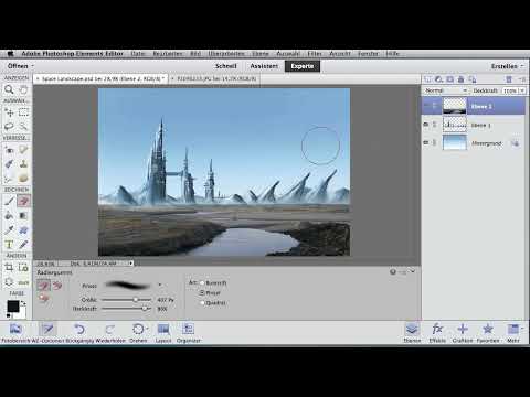
The video is only loaded from YouTube when you play it – data (including your IP address) is then transmitted to YouTube/Google. More in the privacy policy
Key Takeaways
- Move the painted landscape upward early on so that there is room for further image elements at the bottom.
- A photo reference quickly brings additional color tones into the motif without you having to repaint everything.
- A reduced opacity makes visible where the elements in the background are located.
- A large, soft round brush with medium opacity gently erases hard edges.
- Hue saturation only affects the photo in a targeted way if you restrict it to the photo layer.
Step-by-Step Guide
Step 1: Create Space for the Foreground
Start with the finished landscape. Select the selection move tool, select the corresponding layer, and move the object up a bit. Even a small offset creates enough space at the bottom to integrate another image later. Make sure the landscape does not stick directly to the top edge of the image, because the fog will appear there later.

Step 2: Use a Photo Reference Instead of Repainting
You could paint the landscape entirely yourself. With a photo reference, however, it goes much faster, and you immediately get additional color tones. Choose a suitable landscape photo and drag it into your document with the move tool. The photo lands as its own layer above your illustration.

Step 3: Reduce Opacity and Check Layers
First set the opacity of the photo layer to about 50 to 60 percent using the slider. This lets you see through the photo to where the painted elements in the background are located. This transparency is the most important orientation aid for all of the following steps, because without it you are working almost blind when positioning.

Step 4: Position and Shrink the Photo Landscape
Move the photo landscape as a whole until the horizon strip of the photo connects to your painted landscape. Then grab the square handles at the edge of the transformation and shrink the photo step by step. Your goal is for the horizon strip of the photo landscape to blend harmoniously with the landscape you just created. Keep checking the proportions by eye, because elements that are too large quickly look out of place.

Step 5: Confirm the Transformation
When you are happy with the position, confirm the transformation with the Enter key or with the checkmark in the options bar. Only then is the change applied, and you can continue working without losing the scaling.

Step 6: Erase the Upper Area
Now only the lower landscape should remain visible. For this, use a soft round brush at a large size and medium opacity. Carefully erase the upper part of the motif. Leave some fog at the transitions, because a soft haze connects the layers more naturally than a hard edge.

Step 7: Reset Opacity and Readjust
Set the opacity back to 100 percent. With the move tool, pull the landscape up a little higher once more. Then use a small eraser to remove everything you no longer need. This creates a clean zone where the two landscapes meet.

Step 8: Integrate Painted Mountains into the Photo Landscape
Move the landscape upward again until the previous landscape is docked at the bottom. Then use the eraser to integrate the painted mountains into the photo landscape. Work slowly, because this is exactly where it is decided whether the result looks like it was made in one piece or like two images glued together.

Step 9: Apply Hue/Saturation to the Photo Only
Now you adjust the colors. To do this, open the Hue/Saturation setting. So that the change affects only the photo and not the entire image, you restrict the adjustment to the layer beneath it. To do this, click the option at the bottom of the settings window that limits the effect to that layer. From this moment on, all sliders affect only the photo layer, and you can test the saturation at your leisure.

Step 10: Compare Before and After
At the end of the video, the instructor shows both states side by side. Use this comparison for your own work as well: briefly hide individual layers and show them again. This way you can quickly see whether color, transitions, and proportions really fit together.

Summary – Creating a Foreground Landscape Digitally with a Photo Template
You have now seen how to integrate a foreground into your airbrush motif with just a few steps. First, you create space by moving the landscape upward. Then the photo template brings new colors into the image, and the reduced opacity helps you with positioning. With soft erasing, smooth transitions emerge, before you apply the hue/saturation specifically to the photo layer.
FAQ
Do I absolutely have to paint the landscape myself?No. A photo template is a quick alternative that provides additional color tones. You can also combine both methods.
Why do I first reduce the opacity to 50 to 60 percent?With reduced opacity, you can see through the photo and recognize where the painted elements are located. This makes precise positioning considerably easier.
Which eraser is suitable for soft transitions?A large soft round brush with medium opacity works well. It removes areas gently and leaves behind mist that connects the layers.
What does restricting the effect to the layer below do in Hue/Saturation?The adjustment affects only the photo layer and not the entire image. This way the painted parts remain unchanged.


