The design of websites often fails due to the correct specification of the dimensions of elements. Here it is crucial to use the right CSS properties for width and height. In this guide, you will learn how to effectively define the properties width and height. It is about using both static and percentage values and understanding the advantages of responsive design.
Main findings
- The properties width and height determine the dimensions of HTML elements.
- You can specify fixed pixel values or percentage values to adjust your layout.
- Percentage values help create responsive designs that look good on different screen sizes.
Step-by-step guide
To set the width and height of elements, start with the basic CSS properties.
Step 1: Define fixed width and height
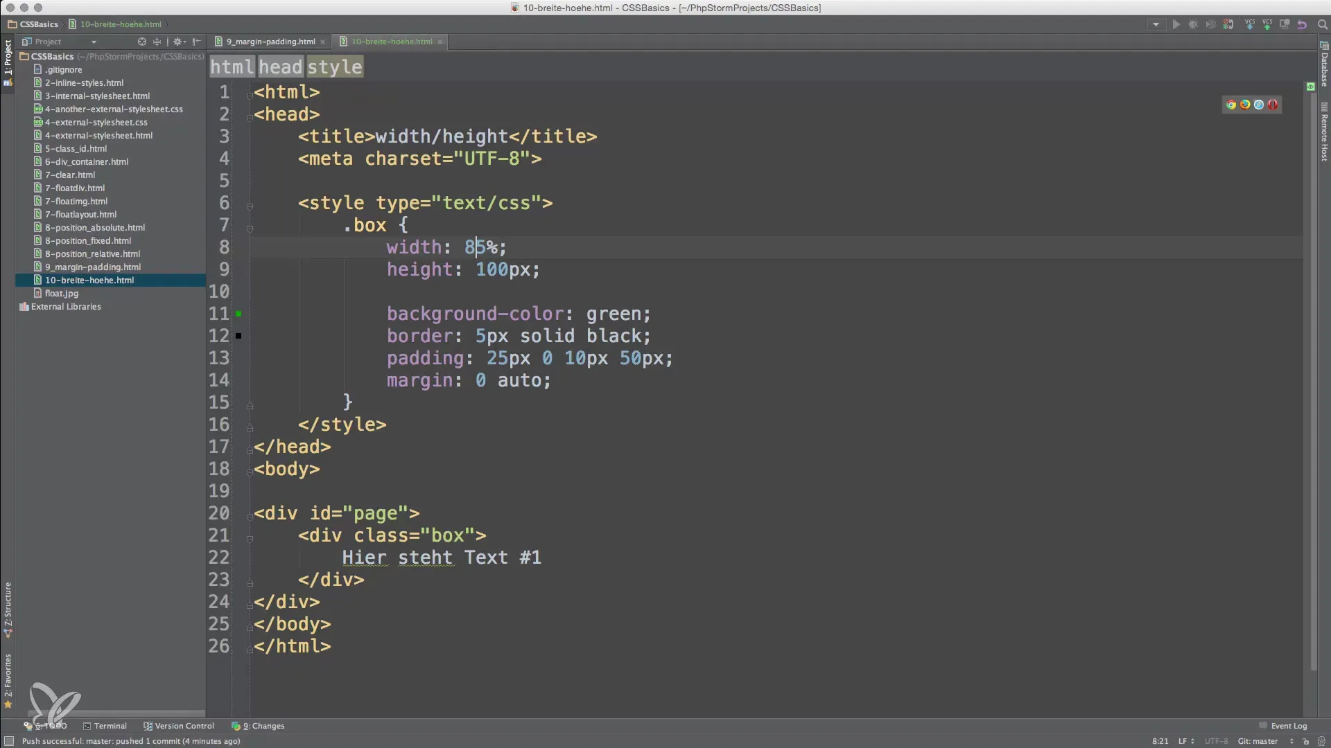
You can use a fixed width and height for an element to ensure it looks exactly how you want it to. A simple method here is to use CSS with pixels.

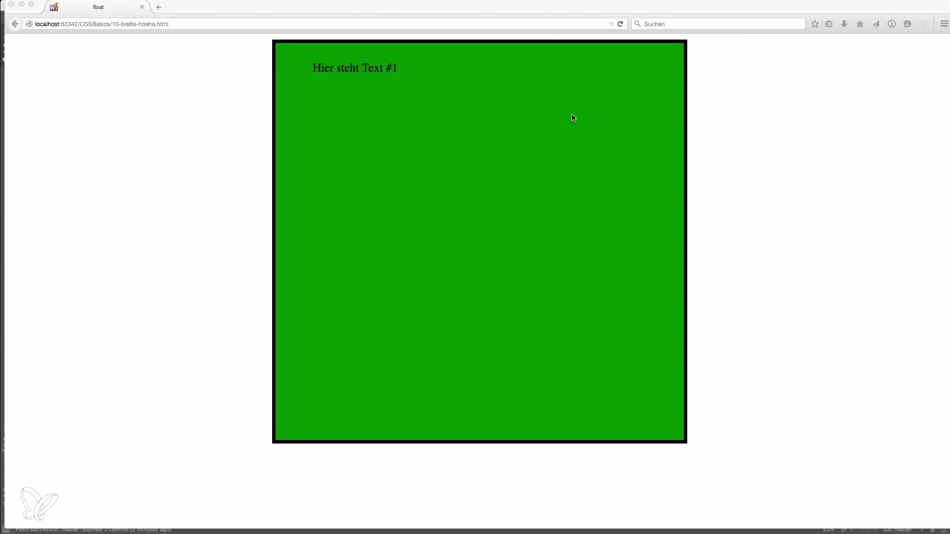
The result is a square element of 500 x 500 pixels that always remains the same. You can adjust the values to create rectangles or other shapes. It is important to consider the dimensions of your designated layout concepts.
Step 2: Use percentage width and height
With responsive designs, you gain flexibility. Instead of fixed pixel values, you can use percentage values. For example, if you define width: 85%;, the element will take up 85% of the available width. This ensures that your layout adapts to different screen sizes.

Test this by resizing the window. You will see how the element grows or shrinks with the width of the browser window. This prevents the need for scroll bars that occur when fixed widths don't fit within the view.
Step 3: Set height in percentage
Similarly to width, you can also set the height in percentage. When you use height: 100%;, the element will take up the full height of its container.

Observe how the element adapts to the width of the container and the scroll bar disappears as long as there is enough space. If you instead use height: 85%;, the element will scale according to the height of the parent element and remain flexible.
Step 4: Create a dynamic layout
The right understanding and application of width and height specifications are essential steps in your development. By mixing fixed and percentage values, you can create a dynamic layout that adapts to various requirements. This knowledge is the foundation for advanced topics such as Responsive Design, which you can explore in later lessons.
Summary – Basics of width and height in HTML and CSS
To make your websites appealing and user-friendly, it is crucial to define the dimensions of elements wisely. With fixed pixel values, you can create stable layouts, while percentage values give you the freedom to create responsive designs that adapt to different screen sizes. The combination of these approaches enables you to create dynamic and engaging websites.
Frequently Asked Questions
How do I define a fixed height for an element?Set height in CSS to a fixed value in pixels.
What happens if I specify the width in percentage?The element will scale relative to the width of the parent element.
Why should I use responsive designs?Responsive design ensures that your website looks good on different devices.
How do pixel values affect the layout on smartphones?Fixed pixel values can cause content to be outside the screen.
Can I combine both fixed and percentage heights?Yes, combining both values can help you create more flexible and engaging layouts.


