The design of texts is an essential part of every web application. The choice of the right font not only affects readability but also the overall appearance of your website. Font families play a crucial role, as they ensure that your website is presented consistently across different devices and systems. In this guide, I will show you how to define effective font families and effectively combine different fonts.
Key Insights
There are countless fonts, but defining font families is important to achieve consistent results on different devices. You will learn how to use the CSS property font-family, specify multiple fonts, and define fallback options to ensure that your texts always look appealing.
Step-by-Step Guide
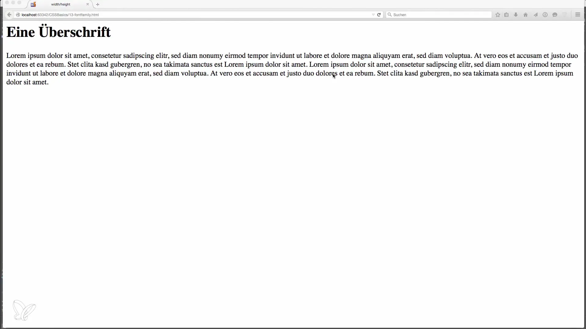
First, it is important to understand the basics of font families. Fonts can be divided into two main categories: serif fonts and sans-serif fonts. Serif fonts have small embellishments at the ends of the letters, while sans-serif fonts do not.

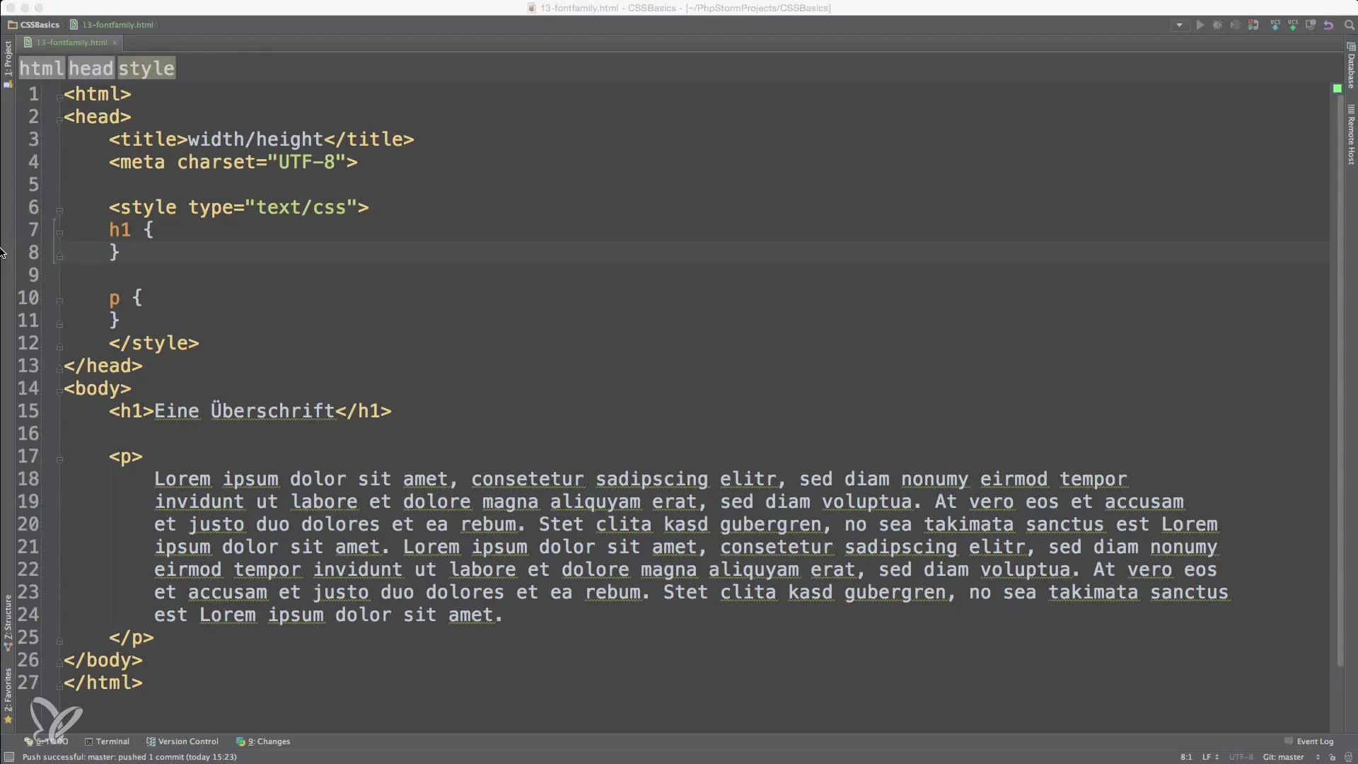
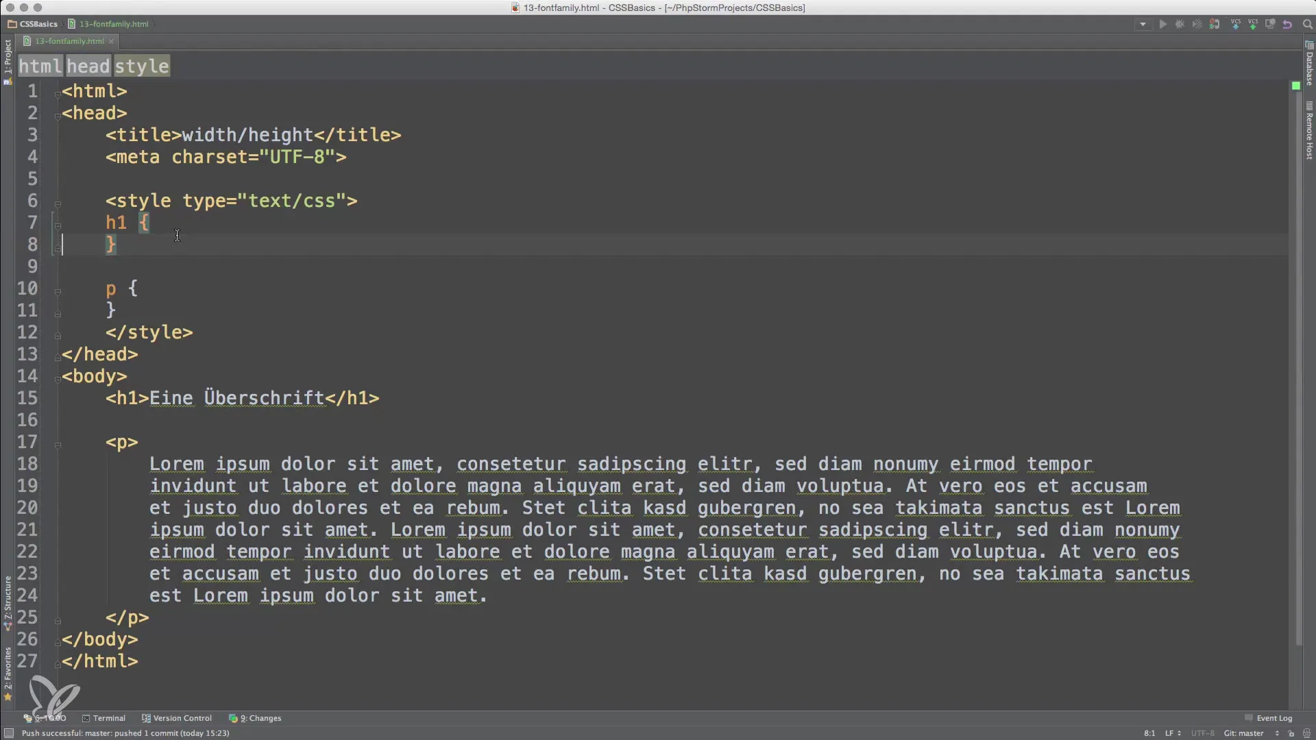
To set a font family in CSS, you use the font-family property. Start by setting the font for a heading. A commonly recommended font for headings is a serif font. In our example, we will choose the Droid Serif font.
Here, you specify multiple fonts. The font that appears first in the list is used first. If it is not available, the next font is used until an available font is found.

For body text, I often recommend a sans-serif font like Droid Sans. These fonts are often clearer and easier to read.
Importantly, when using fonts that contain multiple words, you should put them in quotation marks. This is necessary to avoid misunderstandings with the fonts.

After you have defined the fonts, you can view the result in your browser. Normally, you have the opportunity to check the fonts used to see if everything has worked correctly.
If you find that the desired font could not be loaded, you might consider using Google Fonts. Google Fonts offers you a wide selection of fonts that you can easily embed in your website. You can download the required font directly from the Google Fonts website and insert it as a CSS link in your HTML document.
Here is a simple example of how you can do this. Go to the Google Fonts website, select a font, and click on the link button to obtain an embedding code.
You can now directly use your fonts from Google. This gives you access to a variety of beautiful fonts that may not necessarily be installed on the user's device.
The beauty of this approach is that Google Fonts can also cache the fonts, allowing them to load faster on repeated visits to the website. Use this to enhance the user experience.
Another aspect that is important with font families is the fallback options. You have the option to specify multiple alternatives that the browser should use if the preferred font is not available. This protects your website from display issues.
Make sure to choose your fallback fonts well to ensure a consistent or similar appearance. For example, you could use optional fonts like Georgia or Times New Roman as fallbacks for a serif font.
As with any design, it is useful to experiment. Try different combinations to see which fonts work best together and leave the desired visual impression.
Summary – Basics of Font Families in HTML, CSS, and JavaScript
Defining font families is a crucial step in designing your website. By using CSS font-family and incorporating fonts via Google Fonts, you can ensure that your texts are presented in an appealing and readable manner across various devices. Experiment with different fonts and fallback options to find the best combination for your application.
Frequently Asked Questions
How do I define a font family in CSS?Use the font-family property followed by the desired font and optional fallback fonts.
Can I use fonts from Google Fonts?Yes, you can embed fonts from Google Fonts by using the provided link in the -section of your HTML file.
What are fallback fonts?Fallback fonts are alternative fonts that the browser can use if the preferred font is not available.
Why are quotation marks around fonts necessary?Quotation marks are necessary when a font contains multiple words to avoid misunderstandings.
Which fonts do I adjust for body text?For body text, sans-serif fonts like Arial or Helvetica are often clearer and more readable.


