

A design only really comes to life when the colors are right. Adobe Illustrator offers you two panels for this: the Color panel and the Swatches panel. Both work closely together, but they serve different purposes. With one you mix and select colors, with the other you collect and manage them. In this tutorial, you will learn how to open both panels, color objects, distinguish between fill and stroke colors, incorporate spot colors such as Pantone, and finally save your own color library that you can reuse in every new document.
The video is only loaded from YouTube when you play it – data (including your IP address) is then transmitted to YouTube/Google. More in the privacy policy
Key Takeaways
- You open both panels via the Window menu, either directly via Swatches or via Color.
- The box that is in the foreground, i.e. fill or stroke, determines which color your selection changes.
- With the eyedropper or the color spectrum, you can freely choose colors. The live preview shows you the color before you apply it.
- For most projects, process colors are sufficient. You mainly need spot colors such as Pantone for demanding print projects.
- You can reload a swatch library you saved yourself later via the menu Open Swatch Library.
Step-by-Step Guide
Step 1: Open both panels
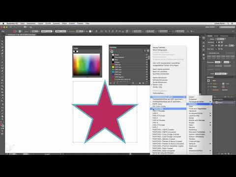
You can find the Color panel and the Swatches panel in the Window menu. There you can open the Swatches panel directly via the Swatches entry. You reach the Color panel via the Color entry, which is located further up in the menu. Both panels then remain open as independent windows, so that you can switch between them without having to use the menu again.

Step 2: Select an object and pick up a color with the eyedropper
First, select the object whose color you want to change. Then, in the Color panel, take the eyedropper and move it over a spot in the document whose color you like. You don't have to click right away, because the Color panel shows you in real time, in a small box and in the lower area, which color is currently under the eyedropper. This way you can see exactly what you are picking up before you decide.

Step 3: Choose free colors in the color spectrum
If you don't like any existing color, you can freely select a color in the color spectrum of the Color panel. To do this, move the mouse pointer over the spectrum and click to find the desired hue. Here too, the live preview updates continuously. With this method, you can approach your desired shade step by step without having to know an exact color value beforehand.
Step 4: Add a color to the Swatches panel
Once you have decided on a color, for example in the lower area of the Color panel, you can save it permanently. To do this, click on the color box in the Color panel, hold down the mouse button, and drag the color into the Swatches panel using drag and drop. Release the mouse button there. The color immediately appears as a new swatch in the list, and you can reuse it in the future with a single click.
Step 5: Use preset swatches for the fill
If you need simple colors that are already preset in Illustrator, you don't need the Color panel. Simply click one of the default swatches in the Swatches panel. The color is applied to the fill of the selected object. As long as you only work with fill colors, the procedure remains straightforward and quick.
Step 6: Change the stroke color
If you want to change the stroke color instead, click the stroke box in the toolbar or in the Color panel. This box automatically moves to the foreground, while the fill box moves to the background. If you then select a swatch from the Swatches panel, the stroke of the object now changes. The fill remains unchanged.
Step 7: Understand the foreground principle
The most important principle is: the box that is in the foreground is affected by your selection. If the stroke is in front, only the stroke changes with the eyedropper or a swatch. If the fill is in front, only the fill changes. So before every color change, briefly check which box is active so that you don't accidentally overwrite the wrong attribute.

Step 8: Adjust the display of the swatches
The Swatches panel can be displayed in different ways. You can either view the colors as small thumbnails, which makes it easier to get an overview when you have many colors, or you can display a list. The list additionally shows the color name and the color values. Which option you use depends on whether you prefer to work visually or by values. You can switch between the views at any time via the panel menu.
Step 9: Opening Swatch Libraries Such as HKS and Pantone
In addition to your own colors, additional swatch libraries are available to you. Via the Swatches panel menu, you can find, for example, the HKS colors or the Pantone colors. After you open one, a new panel with the corresponding shades opens. These libraries are particularly helpful when a client or a print shop specifies exact spot colors for you.

Step 10: Searching for a Specific Pantone Value
If you are looking for a specific shade, use the search field in the opened library. Enter the Pantone value there, and the panel shows you matching results. As soon as you apply a spot color, it is also automatically added to the Swatches panel. This way you always keep track of the spot colors you have used.

Step 11: Distinguishing Between Spot Colors and Process Colors
In the swatch, you can recognize a spot color by the small white corner in the corner of the swatch. This symbol means that it is a spot color channel. For a normal color, on the other hand, the Color panel shows the entry Process Color as the color type. With Pantone colors, you can no longer change the color. Whether a color is set up as a spot or process color is also visible in the color settings area of the panel.

Step 12: Creating Your Own Swatches
If you want to create a new swatch yourself, choose the command for a new swatch in the Swatches panel menu. You can then decide whether to create a spot color or a process color. For most projects, the process color is completely sufficient. The spot color only becomes important for more demanding print projects, for example when a specific spot color must be reproduced exactly.

Step 13: Removing Unneeded Colors
Before you save your colors, it's worth tidying up. The default colors are always available to you anyway, so you don't need to have them in your own library. Select the superfluous colors in the Swatches panel while holding the Shift key and then click the small trash can icon. You can usually keep black and white, because you often need them.

Step 14: Saving the Swatch Library
Now you save your remaining colors as your own library. To do this, open the small menu at the bottom of the Swatches panel and choose the command Save Swatch Library. Assign a meaningful name, for example Test Colors, and confirm with Save. Illustrator automatically opens the appropriate folder. On a Mac, it is located in Application Support, then in Adobe, Adobe Illustrator, in the language folder, and finally in the Swatches subfolder. Then confirm the saving process with OK.

Step 15: Loading the Saved Library Again
The saved library is available to you in every new document. So create a new document and open the Open Swatch Library menu. At the very bottom, you will find the entry User Defined. Your library named Test Colors now appears there. Clicking it opens a separate panel with exactly the colors you saved earlier. This saves you a lot of time on recurring projects.

Summary ??? Illustrator Swatches and Color Panel: Using Colors Correctly
The Color panel and the Swatches panel complement each other ideally. With the Color panel, you select colors via the eyedropper or spectrum; with the Swatches panel, you save, organize, and manage them. Always pay attention to which box is in the foreground, as it determines whether the fill or the stroke is changed. With libraries such as HKS and Pantone, you are also well equipped for print projects. If you save your most important colors in your own library at the end, they are immediately available to you in every new project.
FAQ
How do I open the Color palette and the Swatches palette?You can find both in the Window menu, the Swatches palette directly under Swatches and the Color palette under Color.
What happens when I pick up a color with the eyedropper?The color the eyedropper is positioned over is applied to the field that is in the foreground, either fill or stroke.
How can I recognize a spot color?You can recognize a spot color by the small white corner in the swatch, and Pantone colors can no longer be changed.
Which color type should I choose for normal projects?For most projects, a process color is enough; you mainly need spot colors for demanding print projects.
Where do I save my own swatch library?You save it via the menu of the Swatches palette with the command Save Swatch Library, and Illustrator automatically suggests the appropriate folder for you.
How do I load my saved library in a new document?You can find it in the Open Swatch Library menu at the very bottom under User Defined.

