
A button is often the decisive point on a website, because this is where it is decided whether visitors click through. With Elementor's button element, you create such calls to action directly in the page editor, without writing a single line of code. You define which text appears, where the button links to, what it looks like, and how it behaves when you hover over it with the mouse.
The video is only loaded from YouTube when you play it – data (including your IP address) is then transmitted to YouTube/Google. More in the privacy policy
This guide takes you through all the important settings of the button widget. You will learn how to insert the button, set the type and text, create internal and external links, add an icon, and customize the appearance with typography, colors, borders, shadows, and spacing. In the end, you will have a button that not only works but also looks good.
Key Takeaways
The button is a widget that you drag and drop into a section. You define the text, type, and link directly in the content area. Links can point to pages on your website or to external addresses, and you can specify whether they should open in a new window. With icons, hover effects, borders, corner radius, and shadows, you give the button its own character. You determine the size via the padding, and with the link function you control whether values change together or individually.
Step 1: Insert the Button into the Page Editor
First, open the page on which the button should appear, and create a new section if needed. Search the widget list for the button element and drag and drop it into the section. As soon as the widget is placed, you will initially see it displayed quite small. Adjust the size of the preview if needed so that you can see details better.

Step 2: Select the Button Type
The first important point is the type. Here you define what visual effect the button should convey. Elementor offers predefined variants: Information in blue, Success in green, Warning in yellow, and Danger in red. You do not necessarily have to use these type colors. If a different design is more important to you, you can also leave the type unchanged and freely define the colors later in the style area. For a standard button, the Information setting is usually perfectly sufficient.
Step 3: Define the Button Text
In the text field, you enter what should appear on the button. Make sure the text is short and clear, for example "Buy now" or "Learn more". A clear call to action significantly increases the willingness to click. For testing purposes, you can also enter a sample text that you replace later.
Step 4: Link an Internal Page
Directly below is the field for the link. If you click into it, a selection of your pages opens. If you select the home page, for example, the button leads directly there after saving. It is important to know that the button does appear in the preview in the editor, but initially behaves statically when you hover over it with the mouse. Only after saving and opening the published page can you really test the link.
Step 5: Include an External Address
The link does not have to point to your own website. You can directly enter a complete address, such as a YouTube channel or an Instagram profile. Enter the address in full, including the domain, so that the link works correctly. Linking works exactly the same as with internal pages. The loading time may be minimally longer for external targets, but the result remains the same.
Step 6: Set Link Options
Next to the link field, you will find a gear icon. If you click on it, the link options open. Here you decide whether the link should open in a new window. This makes sense if visitors should not leave your page, for example with external profiles. You can also set the "nofollow" attribute. This option tells search engines that they should not follow a link and should not attribute any ranking value to it. Save your changes and then test the button in the preview. You will see that a new window opens.

Step 7: Add an Icon
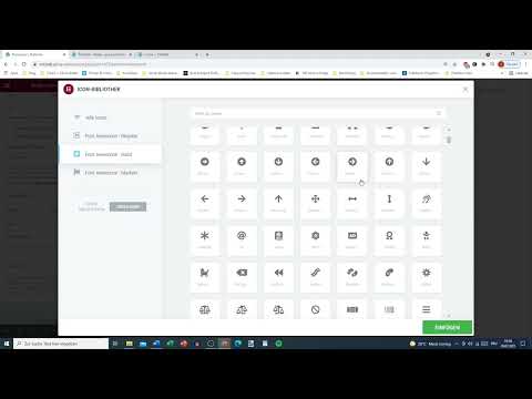
An icon makes the button instantly recognizable. You have two options. Either you upload your own SVG file, that is, a vector graphic, or you choose a suitable symbol from Elementor's icon library. The library is organized by categories and contains regular, solid, and brand icons. For payment methods, 社交 networks, or arrows, you will usually find suitable motifs. For example, choose an arrow pointing right if the button should lead to the next step. It is important that the symbol fits the action in terms of content.

Step 8: Determine the Position and Spacing of the Icon
Once an icon is selected, you can specify whether it should appear before or after the text. For an arrow pointing to a next page, placing it before the text usually makes no sense; after the text is more appropriate. For a contact symbol such as an envelope, on the other hand, placing it before the text feels more natural. In addition, you can adjust the spacing between the icon and the text. A small spacing looks compact, while a larger spacing provides more breathing room.

Step 9: Assign a Button ID
In the advanced settings area, you can assign a button ID. Enter only letters and numbers, without the hash key in front. The length should be roughly between one and nine characters. The ID is needed if you later want to target the button specifically via anchor links or custom CSS adjustments. For simple buttons it is often not necessary, but for more extensive projects it can be very helpful.
Step 10: Adjust the Typography
Now switch to the Style tab. This is where the design work begins. In the Typography section, you change the font, size, weight, style, line height, and letter spacing. A bold font with slightly increased letter spacing often looks stronger and is noticed more. Italic or strikethrough text is generally not suitable for buttons, so you will mostly not use it. You already know these settings from other widgets, so you will make progress quickly here.
Step 11: Set a Text Shadow
In the Text Shadow section, you can add a shadow to the text. This effect affects only the text, not the box of the button. A slightly blurred shadow adds more depth, but is not strictly necessary. Use this effect sparingly, because shadows that are too strong quickly look restless and reduce legibility.
Step 12: Define Colors for the Hover Effect
The hover effect shows what happens when a visitor moves the mouse over the button. For example, you can change the text color on hover, say from black to red. Here you can clearly see how important a clean separation between the normal and hover states is. The normal state should be calm and legible, while the hover state may stand out without going overboard.

Step 13: Choose a Background Color or Gradient
You can set the background color as a simple solid color, for example white, red, or orange. Alternatively, you can choose a color gradient. To do this, you add a second color and determine whether the gradient should be linear or radial. You can also set a separate background color for the hover state. Make sure that the text color and background have enough contrast so that the button remains easy to read even on smaller screens.

Step 14: Select a Hover Animation
In the Animation section, you determine how the button moves on hover. You can choose between effects such as Pulse, Grow, or Shrink. Pulse makes the button pulsate, growing larger and smaller; Grow simply enlarges it; Shrink makes it smaller. Animations attract attention but should be used subtly. A single, well-chosen effect looks more professional than several at the same time.
Step 15: Design a Border
With the border type, you determine whether the button gets an outline. By default, no border is active. If you choose "solid", you can set the width and color. A border of ten pixels already looks very striking; at twenty pixels, a conspicuous effect results that is only suitable for certain designs. For most projects, a thin border or none at all is sufficient.
Step 16: Adjust the Corner Radius
The corner radius determines how round the corners of the button are. With a value of about 15 to 20, a modern, slightly rounded shape results. At 100, the button becomes almost a circle or a pill. You should choose the value so that it fits the rest of your page's design. If your other elements are designed with sharp corners, a strongly rounded button quickly looks out of place.

Step 17: Add a Box Shadow
The box shadow makes the button stand out from the background. You define color, position, blur, and spread. A slightly transparent shadow that surrounds the button on all sides usually works best. However, you can also place the shadow inside, which creates a different, more pressed-in impression. Make sure not to make the shadow too strong, so that it does not distract from the actual content.
Step 18: Set the Padding
The padding determines the inner spacing between the text and the button edge. There is a special feature here: with the link icon, you can change all values at the same time. When the link is active, all values adjust as soon as you change one of them. When it is deactivated, you can set different values for top, bottom, left, and right. A value of around 25 pixels looks balanced for many buttons. Smaller values like five pixels create a very narrow, compact button, while larger values like 100 pixels make it noticeably bulkier.
Step 19: Save and Test the Changes
After you have made all the desired settings, save the page. Then you should test the button on the published page. Check whether the link works correctly, whether the hover effect behaves as desired, and whether the design remains consistent on different screen sizes. Only this test shows whether all the settings work convincingly together.

Summary – Designing an Elementor Button: Step-by-Step Guide
You have now learned all the important steps for creating and designing a button in Elementor. You insert the widget via drag and drop, choose a suitable type, write a clear text, and set the link. Then you adjust the appearance with icon, typography, colors, animation, border, corner radius, shadow, and padding. Always test the button on the published page after saving so that you can be sure everything works as desired.
FAQ
How do I add a button in Elementor?Drag the button widget from the widget list into a section of your page using drag and drop.
Can I link a button to an external website?Yes, enter the full address in the link field, for example a YouTube or Instagram address.
How do I open a link in a new window?Click the gear icon next to the link field and activate the option for the new window.
How do I add an icon to the button?You can upload your own SVG file or select a symbol from Elementor's icon library.
What does the padding do for the button?The padding defines the inner spacing between the text and the button edge and thereby determines the size of the button.
How can I change the padding values at the same time?Activate the link icon. Then all directions adopt the same value as soon as you change one of them.
What is the hover effect?The hover effect describes the change in the button when a visitor moves the mouse over it, for example a different color or an animation.


