
An image gallery is the fastest way to present portfolios, references, or photo series attractively. Elementor Pro offers the Gallery widget for this, with many settings options. In this guide, you'll learn how to add images, create one or more galleries, choose the layout, set up links and filters, and fine-tune the appearance with animations, overlays, and typography.
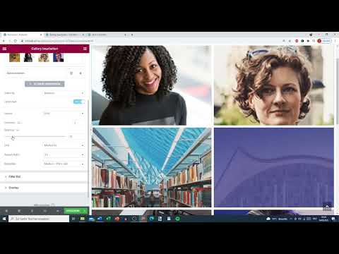
The video is only loaded from YouTube when you play it – data (including your IP address) is then transmitted to YouTube/Google. More in the privacy policy
Key Takeaways
- You drag the Gallery widget from Elementor Pro onto the page using drag and drop.
- Images come from an upload or the media library, not automatically from blog posts.
- With "Single" you create one gallery, with "Multiple" you can combine several galleries.
- Layout (Grid, Justify, or Masonry), number of columns, lazy load, and spacing determine the display.
- Linking, aspect ratio, filters, as well as hover effects and overlays make the gallery interactive.
Step-by-step guide
Place the Gallery widget on the page
Open the page in Elementor and look for the Gallery widget in the widget list. In Elementor Pro, it is the third element in the list. Simply drag it to the desired spot in your layout.

Select images from upload or media library
Before you insert images, you should know where they come from. The gallery does not access images from blog posts. Instead, click on the plus sign. There you can upload new images from your computer or select existing files from the media library. You select multiple images one after another and confirm the selection.

Create and caption the gallery
Once you have selected the images, confirm with "Create new gallery". Then take a moment for the captions. Make sure the title of each image matches the subject, and add a short description if needed. This information will appear later in the gallery and helps visitors put the images in context.

Choose Single or Multiple
In the "Gallery type" section, you decide how many galleries the widget should contain. With the "Single" option, you work with a single media library or a single gallery. If you choose "Multiple", you can add more galleries via the "Add item" button. This is practical if you want to show, for example, one section with "About me" and a second one with "My work" on the same page.

Fill the second gallery with its own images
After adding a second gallery, you give it its own title, for example "My work". Then you add suitable photos. This way you keep an overview even on extensive pages, because each gallery stands for its own topic.
Define the selection and order of the images
In the next step, you define which images are displayed. You can use all images in the gallery or only certain groups, for example only the portrait photos or only the work samples. For the order, you have two options: you keep the arrangement you set when selecting, or the images are displayed randomly.

Enable or disable lazy load
With the "Lazy Load" option, you determine when the images are loaded. If it is disabled, all images appear immediately. If it is enabled, they are faded in gradually as soon as they slide into the visible area. This effect usually looks more elegant and reduces the page's load time, especially with many large photos.

Choose the layout
Under the layout settings, three variants are available. With "Grid", all images get the same grid. With "Justify", the images are adjusted so that they form a clean justified block. "Masonry" makes the best use of the available space, because images of different heights line up precisely next to one another. Try the variants with your own motifs, because each looks different depending on the image format.

Set the number of columns
You control the number of columns directly in the widget. Three columns work well for larger collections of images, while two columns often look calmer with large-format photos. Compare in the preview which option fits your design.

Adjust the spacing between the images
Under the "Spacing" option, you set the distance between the individual images. A small value creates a cohesive look, while a larger value lets each image stand on its own. With Masonry in particular, it is worth testing, because irregular edges quickly look messy if the spacing is too large.

Define the linking of the images
Under "Link", you specify where a click on an image leads. You can open the image in a lightbox, display it as a Media File, or enter any Custom URL. If you want to link to the "Portfolio" page, for example, you enter the address there. With the "Open in new tab" option, the current page remains in place while the target page opens in a new tab.

Adjust aspect ratio and image size
With the aspect ratio (Aspect Ratio), you determine the format of the thumbnails, for example 4:3, 3:2 or 1:1. A uniform ratio creates a calm overall appearance. In addition, you can adjust the image size to visually reduce or enlarge the gallery.

Set up the filter bar
The filter function allows visitors to browse specific categories. In the filter section, you specify what the first tab is called, for example "All Works". If you do not want to display this tab, you deactivate it. Then the viewer can only switch between categories such as "This is me" and "My work".

Define the animation for switching
When switching between filters, you can choose an animation, for example "Slide" or "Dropout". The animation should remain subtle so that the transition feels smooth and the images stay in the foreground.

Show overlay and caption
When you hover over an image with the mouse, an overlay appears. You can specify whether the image is darkened or grayed out and whether the title should also be displayed. A caption or a description can also be shown, provided you have saved them with the images. Make sure the text remains legible. If it is too small, you should enlarge it later in the typography.

Border, CSS filter and hover animation
In the "Style" tab, you will find settings for borders, that is, the outline of the individual images. You can also set CSS filters to change the color look of the photos. For the mouse pointer effect, hover animations such as Zoom or Move Right are available. These effects bring life to the gallery, but should not be overdone.

Design a gradient as an overlay
The overlay can also be designed with a gradient. To do this, select the background type "Gradient" and set the colors. Then test the effect by moving the mouse over the image. Some gradients look inconspicuous in the normal state but only show their full effect on hover. If the result looks too striking, reduce the opacity or choose a more neutral color.

Adjust the title in the typography
In the "Content" section, you edit the title and description. Through the typography, you enlarge the font, choose a suitable typeface, and adjust the color. Pay attention to legibility. Oversized titles quickly become unreadable, especially when they wrap in narrow columns.

Set the hover animation for the title
The title can also get a hover animation. A downward shift quickly seems restless to visitors, because the text only becomes visible on hover and jumps in the process. A more elegant option is an animation in which the title flies in smoothly. Try out several variants and decide after viewing them in the frontend.

Final check of the filter bar and spacing
Finally, you check the filter bar as well as other fine details such as spacing and alignment. These options aren't necessary for every gallery, but on larger sites they often provide the final improvement. Then save the page and check the gallery on smartphone and desktop.

Summary ??? Creating a gallery in Elementor: layout and effects
With the Gallery widget in Elementor Pro, you can build an appealing image gallery in a short time. You select the images from upload or media library, choose between Single and Multiple, and set the layout, columns, and spacing. Through linking, aspect ratio, and filters, you control the behavior of the gallery. With overlays, borders, hover animations, and typography, you finally give it its individual look. Test the settings regularly in the frontend, and the result will look consistent on all devices.
FAQ
Can I take images from blog posts directly into the gallery?No, the Gallery widget uses images from upload or the media library. You add them via the plus sign.
What is the difference between Single and Multiple?With Single you work with one gallery, with Multiple you can add further galleries on the same page.
What does Lazy Load do?Lazy Load only loads images when they come into the visible area. This shortens the loading time and often looks more elegant.
Which layout is best suited?Grid provides an even grid, Justify creates a justified layout, and Masonry makes optimal use of space. The best choice depends on your image formats.
How do I set where a click on an image leads?In the Link section you choose between Lightbox, Media File, or Custom URL and can specify whether the page opens in a new tab.
Can I have certain categories filtered?Yes, in the filter function you define tabs and can hide the "All" tab if needed, so that only your categories are available for selection.
How do I customize titles on the images?In the Content section you change the typography, font, and color of the title. You can also set up a hover animation.


