
Have you ever seen a notice box that seems to float freely above a web page, or a menu that stays at the top while scrolling? Behind these effects there is almost always the CSS property position. It decides whether an element stays in the normal text flow or is detached from it and appears at a specific spot in the browser window.
The video is only loaded from YouTube when you play it – data (including your IP address) is then transmitted to YouTube/Google. More in the privacy policy
In this tutorial you will learn about the values static, absolute, fixed and relative. You will find out how to define the exact position with top, right, bottom and left, and why a reference point determines where an element actually ends up. This topic is one of the fundamentals of layout, even if you will only need it intensively later. If you understand it now, you will find your way around future projects much faster.
Key Takeaways
- The
positionproperty determines whether and how an element is detached from the normal text flow. staticis the default value and changes nothing about the arrangement.absoluteremoves an element from the flow. The remaining elements move up as if it had never been there.- With
top,right,bottomandleftyou define the distances. Vertically you use eithertoporbottom, horizontally eitherleftorright. - An absolutely positioned element refers to the nearest parent element with
position: relative. Without such an element, the reference is the browser window. fixedstays in the same place in the window while scrolling and is suitable for menus or notices that should always be visible.relativedoes not move the element, but creates an anchor point for absolutely positioned child elements. This is the foundation for expandable submenus.
Step-by-Step Guide
Step 1: Understanding the Default Value static
Start by looking at the initial state. Every HTML element has the property position: static by default. This means that it stays in its natural place in the document and arranges the elements around it as usual. Since this value already applies, you usually don't need to set it. Nevertheless, you should know it, because it forms the basis of comparison for all other values.

Step 2: Placing the Info Box in the Text Flow
Now create an info box as a div container and place it directly below a heading. Below it follow several paragraphs of body text so that the page becomes scrollable. Since the box is static, it is placed in the flow as a completely normal element and the paragraphs come below it. This starting point will show you very clearly later what changes through positioning.

Step 3: Detaching from the Flow with position absolute
Now set the property position: absolute for your info box in the CSS. The element immediately disappears from its original spot. The text below moves up as if the box had never been there. This is precisely the strength of this positioning: You can deliberately take an element out of the layout and put it where you want it, without shifting the rest of the content.

Step 4: Defining the Distances with top, right, bottom and left
An absolutely positioned element needs information about where it should appear. For this you use the values top, right, bottom and left, each in pixels. An important rule applies here: Vertically you use either top or bottom, horizontally either left or right. So you can combine, for example, top and right, but not top and bottom at the same time. top: 0px means a distance of zero pixels from the top edge, while top: 100px means a distance of one hundred pixels.

Step 5: Placing the Info Box in the Top Right Corner
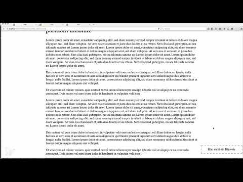
Now give the box top: 0 and right: 0. After reloading the page, the notice box sits exactly in the top right corner of the browser window. Afterwards, try out different values. For example, set top: 15px and right: 15px, and you will see how the box shifts downward and to the left. This way you quickly understand how the numbers relate to the position. In this case, the alignment is made relative to the outer edge of the page.
Step 6: Position at the bottom and observe the scrolling behavior
If you want to place an element at the bottom right, you use bottom: 0 instead of top. Note an important difference here: An absolutely positioned element remains part of the page when scrolling. When you scroll down, the box moves along with the document and eventually is no longer visible. The same applies to positioning at the top. The box does sit in the corner, but it is not a fixed component of the window.

Step 7: Stay permanently visible with position fixed
If an element should always stay in view, such as a newsletter signup, an advertisement, or a menu, you replace absolute with position: fixed. The offsets using top, right, bottom, and left work exactly as before. The difference only becomes apparent when scrolling: The box stays in the same place in the window while the rest of the text moves past. Especially with navigation bars, this effect is very useful because the user has access to the menu items at all times.

Step 8: Create a reference point with position relative
Until now, the absolute positioning was relative to the browser window. You can change this by assigning position: relative to a parent element, for example the body tag or a surrounding div. This element remains unchanged in its position and the layout does not change. It merely serves as a new reference point for all absolutely positioned child elements. If you remove the declarations, you will see that at first nothing changes in the layout of the body.

Step 9: Use the reference point in practice
Now keep the info box set to position: absolute with top: 0 and right: 0, while the body gets position: relative. Now the box no longer refers to the browser window, but to the area of the body. It sits at the top right within this container. You need exactly this principle for submenus, for example. A dropdown menu is displayed below the main menu item with position: absolute, while the main menu item itself is marked as position: relative. This way the submenu stays exactly where you want it, even if the page changes.

Step 10: Take a look ahead at sticky
Besides the values covered so far, there has been position: sticky since CSS3. This value initially behaves like relative and sticks to the edge from a certain scroll position onward. It is considered an advanced topic and will be covered in detail later. For now, it is enough to have heard the term once so that you will recognize it later.

Summary – CSS position: absolute, fixed, and relative explained clearly
The position property is a central tool for designing layouts. The default value static leaves elements in the text flow, while absolute removes them from it and places them precisely. With top, right, bottom, and left you define the offsets. fixed keeps elements in place when scrolling, and relative creates a reference point for absolutely positioned child elements. Once you have understood these relationships, you can confidently implement menus, notice boxes, and overlays.
FAQ
What is the difference between position absolute and position fixed?An absolutely positioned element scrolls along with the content of the page, while a fixed element stays in the same place in the browser window.
Why does my element not move to the right place with position absolute?Often a parent element with position relative is missing. In that case, the positioning refers to the browser window instead of the desired container.
Can I use top and bottom at the same time?Vertically, you should only use one of the two values. You position an element either via top or via bottom, and horizontally analogously via left or right.
Does position relative change the layout?No, an element with position relative stays in its place. It merely serves as a reference point for absolutely positioned child elements.
What is position static actually needed for?The value static is already the default. You therefore usually don't need to set it, but you should know it in order to better understand changes.


