
A text can carry a layout or destroy it. So that you can confidently control both in Affinity Designer, you will get to know two tools here: the Artistic Text Tool for individual words, headlines and short sentences and the Frame Text Tool for extensive body text. Both work similarly, but are suited for different tasks.
The video is only loaded from YouTube when you play it – data (including your IP address) is then transmitted to YouTube/Google. More in the privacy policy
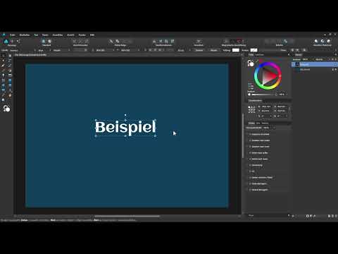
The tutorial follows the flow of the video. You will learn how to create, format, outline and place text along a path, and how to make body text flow into a shape. The screenshots show you the point in the video where the described step is demonstrated.
Key Takeaways
The Artistic Text Tool is suited for headlines, single words and short sentences, the Frame Text Tool for body text.
The context toolbar and the Character and Paragraph panels offer all the important formatting options.
Stroke, layer effects and text paths can be applied directly to text without having to convert it to paths.
A frame text can be shaped using paths so that the text flows around objects.
Step-by-Step Guide
Accessing the Artistic Text Tool and entering text
You can find the Artistic Text Tool in the toolbar. Alternatively, simply press the T key. Select the tool and simply click on the desired spot in the document, for example in the middle. Then you can get started right away and type in your text.

Once the text is in place, switch to the Move Tool. Using the handles, you enlarge the text object and place it where it belongs. You then change the fill color via the color swatch, for example to white. It is important that the layer remains selected.
Using the context toolbar for font and size
When you switch back to the Artistic Text Tool, the context toolbar appears at the top. It contains the most important settings. Via the font menu you see all fonts installed on your system. The name is on the left, next to it a preview and a heart icon. With this heart you mark fonts as favorites so that you can find them again more quickly.
Above the list you will find further sections: Under "All" all available fonts are displayed, under "Recently Used" the most recently used ones, under "Used" the fonts that appear in the current document, and under "Favorites" your marked fonts. However, you can also simply type the name of a font directly.

To the right of the font you set the font size. Pay attention to the text cursor. If it is only behind one letter, your change affects only that letter. If you want to adjust the entire text, briefly switch to the Move Tool so that the entire object is selected. Then enter the desired value and confirm with Enter.
Setting font style, text style and alignment
In the context toolbar you will also find the font style selection. Here you set, for example, bold, italic or similar. Also located there are options for underlining, text styles, paragraph styles as well as left-aligned, centered or right-aligned alignment, plus justified variants.
Opening the Character and Paragraph panels
For detailed settings, you open the Character and Paragraph panels via the two buttons at the top. The Character panel offers significantly more options than the context toolbar. With artistic text there are a multitude of ways to refine the text. You don't have to memorize all of them. For a basics topic, it is enough to understand the structure and look things up specifically when needed.

You adjust the fill of the text either via the color swatch or via the color wheel with the layer selected. In the Character panel you also have the option to define text colors more precisely.

Upper and lower case, all caps and small caps
Sometimes it helps not to leave texts in their original spelling. In the Typography section, with one click on the capital letters you can have all letters displayed in all caps, regardless of how you entered them. Alternatively, you choose small caps. In this case, all letters are displayed as capitals, but the first letter is larger than the rest.
Note: If you change the text afterwards, the typography options may remain grayed out. In this case, it helps to Ctrl-click the layer once to deselect it, and then click it again to select it. After that, the settings are available again.
Adjusting Character Spacing and Underlines
In the Character panel, you also set the character spacing. To do this, select the Character Spacing area and enter a value or use the presets. This lets you set letters tighter or wider. Underlines, double underlines, and strikethroughs are also available.
You should use the fields for distorting, skewing, or scaling the text with care. They often change the font so much that the original letterform is lost. If you want to skew the text, you can also drag it directly by the handle to the left or right while holding down the mouse button.
Adding an Outline Around the Text
An outline gives the text more impact. In the Stroke area, you open the settings, choose a color, for example black, and set the width. Since an outline can by default be pushed inward into the text, it is worth switching the direction to "outside". Legibility is then preserved and the outline looks cleaner.
Adding and Removing Layer Effects
Just as with shape objects, you can also assign layer effects to text. To do this, select the text layer, click the FX icon, and activate, for example, the outer shadow. You adjust the effect via radius, intensity, and opacity. If you want to remove it later, open the effects again and uncheck the box.

Placing Text Along a Path
Text can also be placed on a line or curve. To do this, you first create a path with the Pen tool. While holding down the Shift key, you place anchor points at exactly the same height. If you want to quickly turn a line into a curve, hold down the Ctrl key, click in the middle of the path, and drag the line in the desired direction while holding down the mouse button.
When the path is finished, you select the layer and go via the Layer menu to Convert to Text Path. A text cursor then appears on the line, and you can start typing right away. Using the green handle, you move the text along the path. Here too, font, size, and outline can still be adjusted.

When working with text paths, a display error may occasionally occur in Affinity Designer. In that case, it helps to simply zoom in and out briefly. After that, the display is usually correct again.
Using the Frame Text Tool for Body Text
For longer texts, the Frame Text tool is much better suited. You will find it within the same tool group as the Artistic Text tool. To do this, click the group with the left mouse button and select Frame Text. Then click and drag to draw a frame. A frame text now appears in the Layers panel, and the text cursor is already blinking in the frame.
If you don't have your own text at hand yet, you can insert a sample text. To do this, select the option Insert Placeholder Text in the Text menu. If you want to remove it again, open the menu again and uncheck the box. The placeholder text then disappears completely, without you having to select it manually.

Designing and Adjusting the Frame Text
With frame text too, you can adjust font, font size, and font style via the context toolbar or the Move tool. Using the handles on the frame, you change the width and height. The corner handles allow you to make shapes taller and wider at the same time. If you instead drag the outer handle, the frame changes, and the font is scaled accordingly. You can also rotate the frame.
Setting Paragraph Formatting for Body Text
In the Paragraph panel, you determine how your body text should look. You can choose between left-aligned ragged text and justified text, center it, or align it right. For long texts, left-aligned ragged text often feels more pleasant. In addition, you define the spacing before and after a paragraph. This value then applies to every new paragraph you insert.

Letting Text Flow Around a Shape
The Frame Text Tool becomes especially effective when the text follows any shape. To do this, draw a rectangle, for example, and place an ellipse on top of it while holding down the Shift key. Select both layers and click Subtract in the context toolbar. This creates a cutout in the middle, and its contour forms the path for the text. Then convert the layer into a text frame via the Layer menu and insert placeholder text. The text now flows along this path, including the curve.
However, the ellipse disappears in the process. If you want to keep it visible, duplicate it beforehand with Ctrl and J. The copy stays on top while you continue working with the original. If you shrink the remaining shape while holding down the Ctrl and Shift keys, the result is a layout in which the text flows around a circle. Designs like this are perfect for flyers or brochures.

Summary ??? Affinity Designer Tutorial: Placing Text with Artistic Text and Frame Text
With the Artistic Text Tool, you place headlines, words, and short sentences, format them via the context toolbar as well as the Character and Paragraph panels, and refine them with outlines, effects, or a text path. The Frame Text Tool is the right choice for body text. You can adapt it to your layout using handles, paragraph options, and paths. This creates designs in which text runs cleanly around objects.
FAQ
What is the fastest way to select the Artistic Text Tool?You select it from the toolbar or press the T key.
How do I change the font size for only part of the text?Place the text cursor before or after the desired letters and select them. If the cursor is only at one position, the change affects only the next letter.
How can I tell whether the change affects the entire text?Briefly switch to the Move Tool. If the text object is selected, changes apply to the entire text.
How do I remove a layer effect again?Open the layer's effects via the FX icon and uncheck the respective effect.
Why are the typography options sometimes grayed out?Click the layer once while holding down the Ctrl key to deselect it, and then again to select it. The options will then be available again.
How do I get sample text into a frame text?In the Text menu, select the Insert Placeholder Text option. Calling it again removes it.
Can I also let text flow into any shape?Yes. Create a path, for example by subtracting two shapes, convert the layer into a text frame, and insert text.


